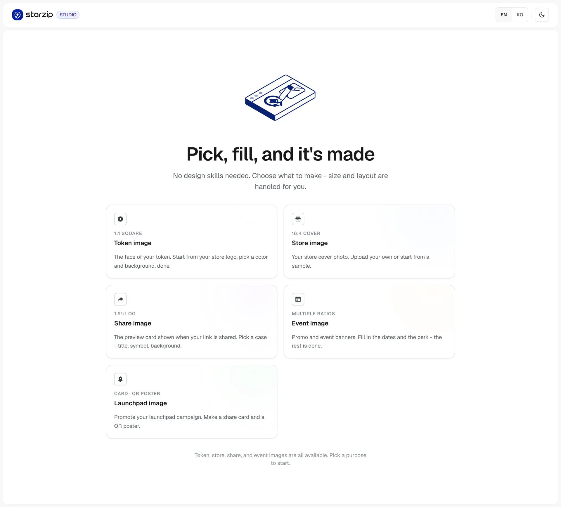
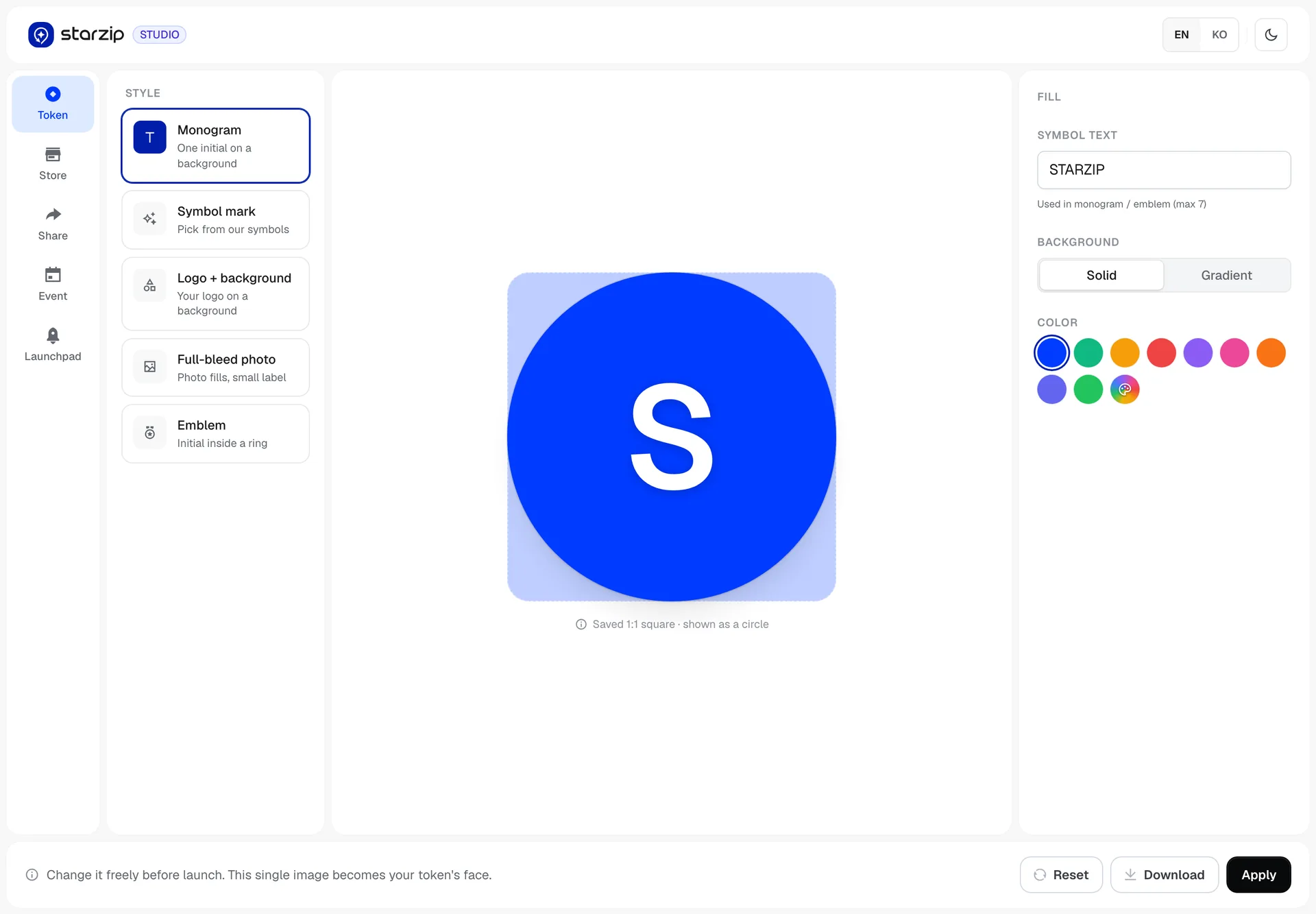
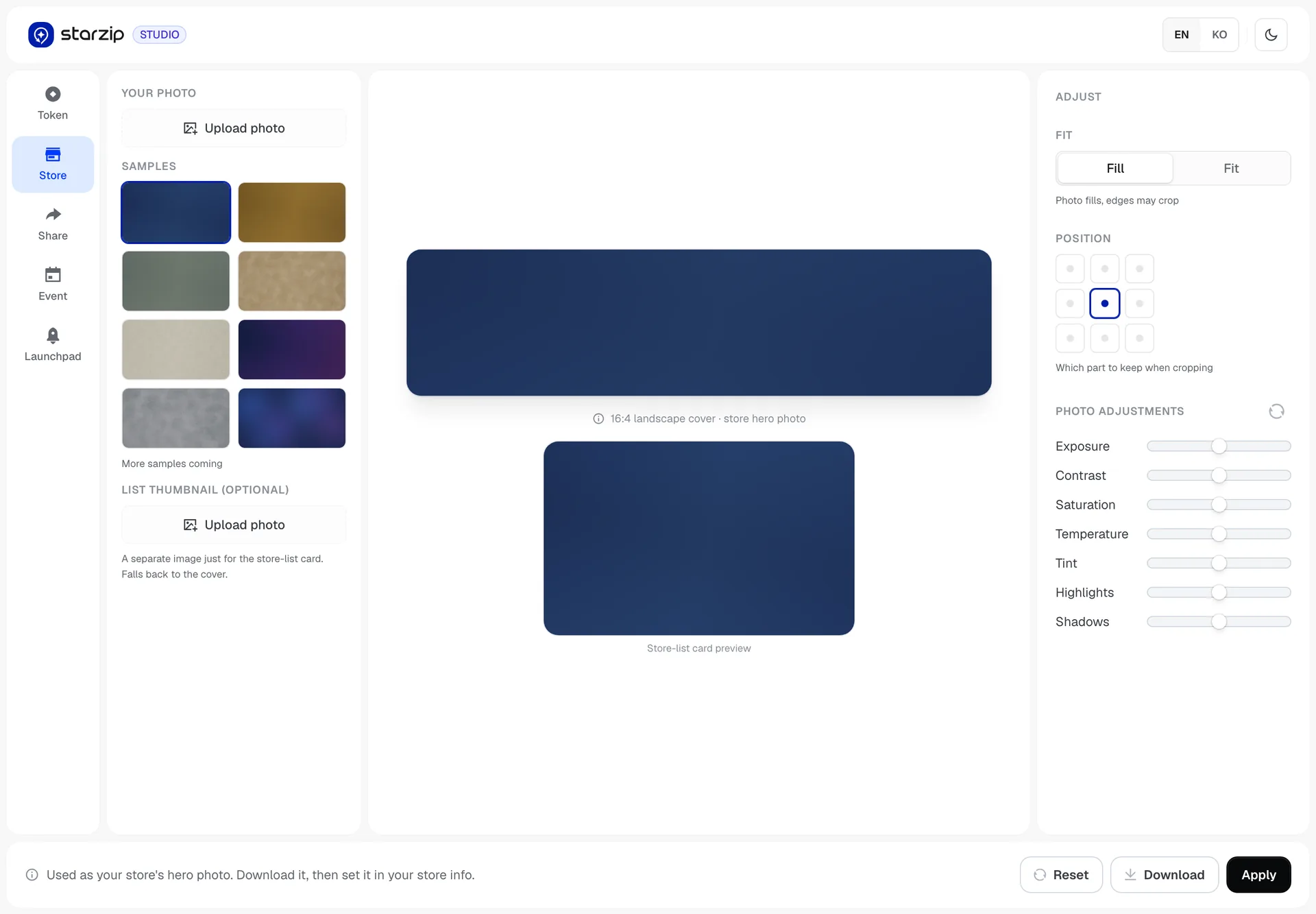
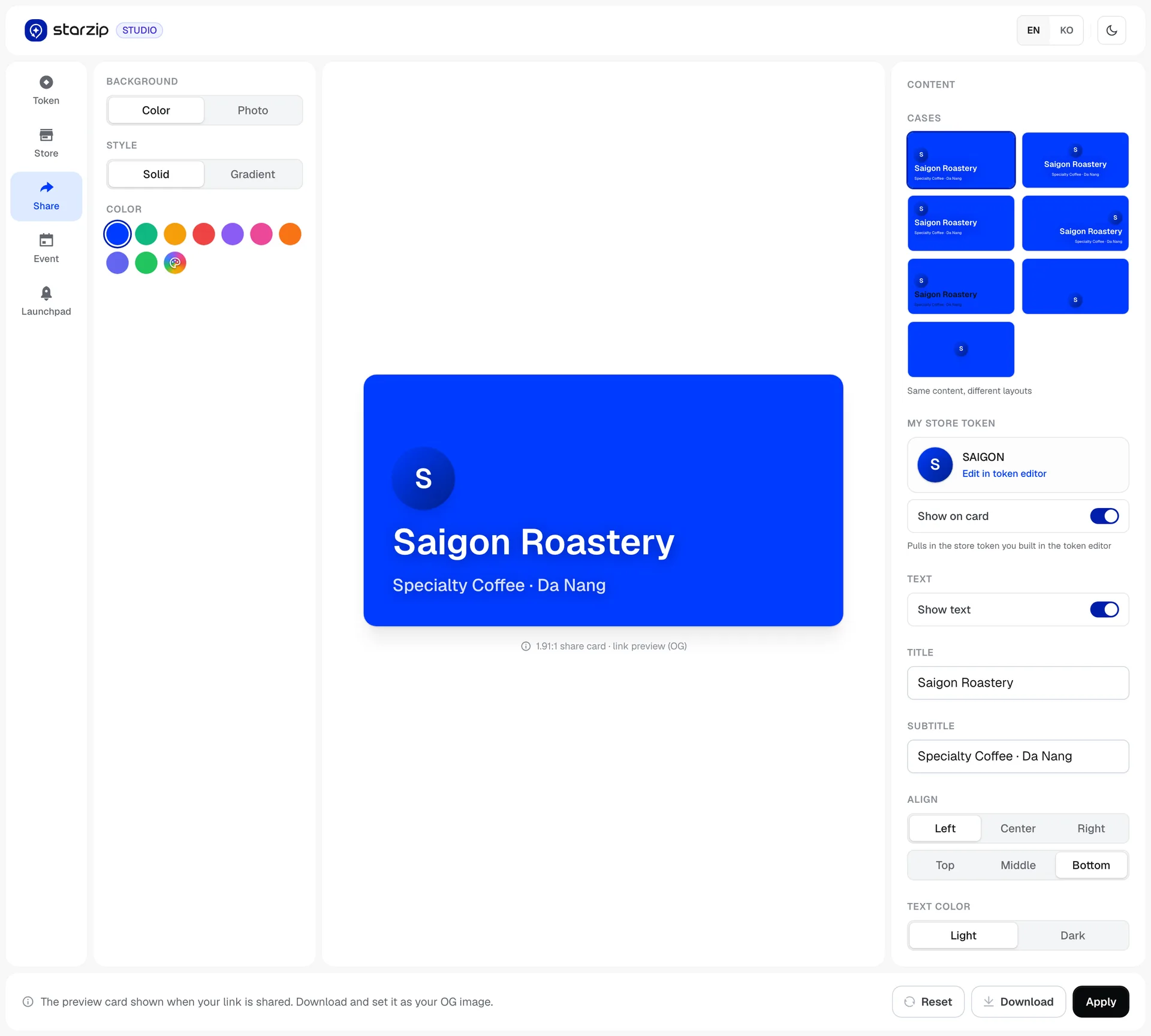
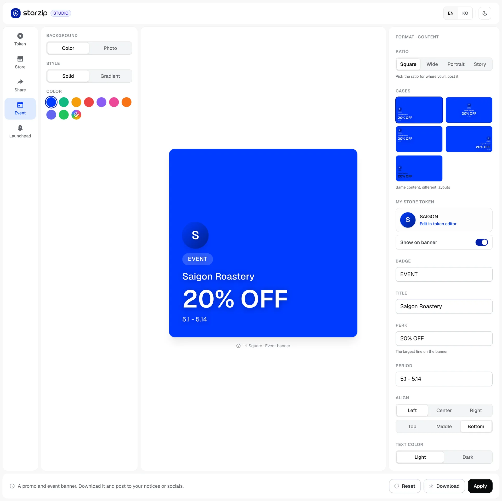
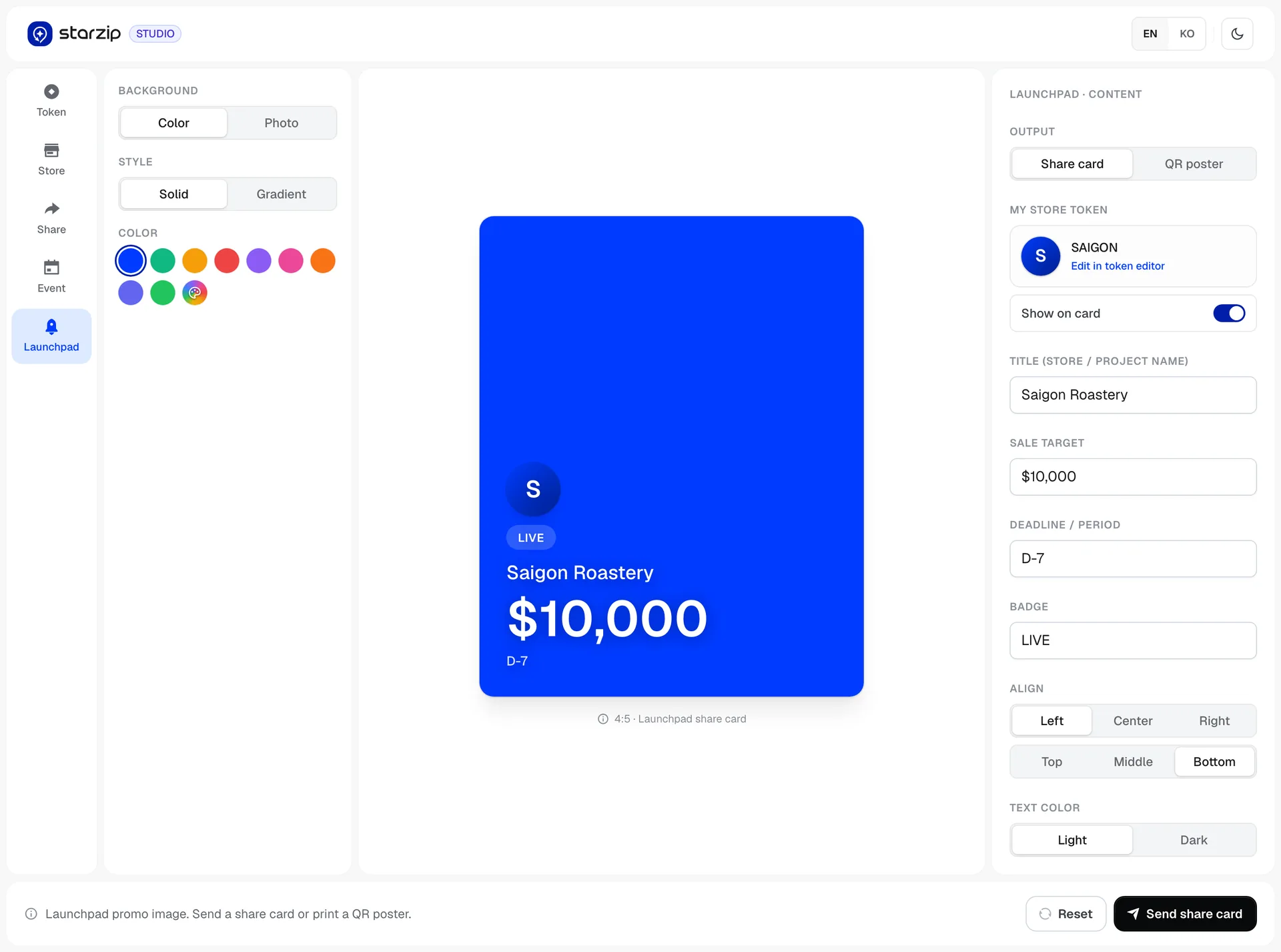
Pick a purpose - the spec is already setFive cards by purpose under "pick, fill, and it's made - no design skills needed", each labelled with the spec it produces: 1:1 square, 16:4 cover, 1.91:1 OG, multiple ratios, card and QR poster. Choosing what to make is the whole decision; size and layout are already handled.Token image - five ways to make oneFive ways to build one: monogram, symbol mark, logo on a background, full-bleed photo, emblem. The symbol field states its use and its limit - used in the monogram and emblem, seven characters - under the input. Three buttons sit bottom right: reset, download, apply. That apply is the marker of this generation.Store photo - you choose what survives the cropA 16:4 cover crops no matter what, so it asks which part to keep first - fill or fit, then a three-by-three position grid. Seven sliders for exposure, contrast, saturation, temperature, tint, highlights and shadows come after the crop. A separate list thumbnail can be uploaded, and falls back to the cover if not.Share card - same content, different layoutsThe 1.91:1 card that appears when a link is shared. Seven layouts sit ready in the cases panel under the line "same content, different layouts" - you swap the arrangement rather than rewrite the words. The store token is pulled in from the token editor and can be shown or hidden.Event banner - ratio firstRatio comes first - square, wide, portrait, story, labelled "pick the ratio for where you'll post it" - then one of five layouts. Only four fields need filling: badge, title, perk, period, with a note under the perk saying it becomes the largest line on the banner.Launchpad promo - made, then sentEnter the sale target and deadline and it produces a share card or a QR poster. The final button in this generation reads send share card - the tool went as far as sending what it made.