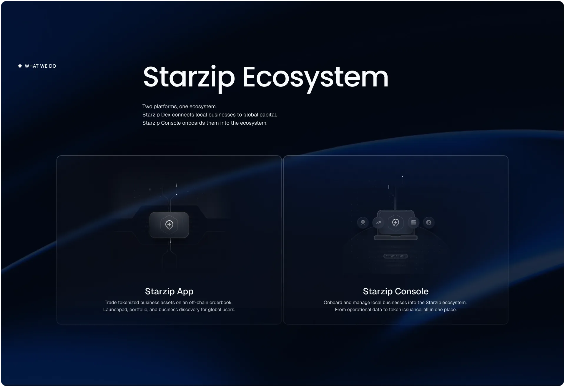
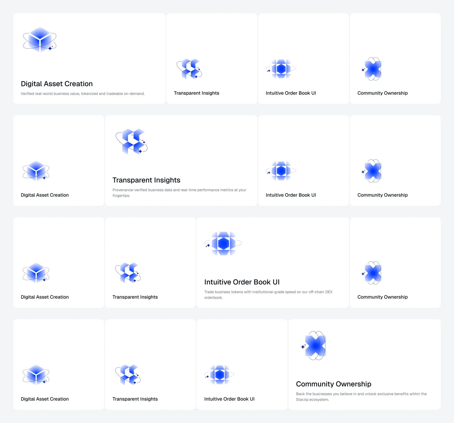
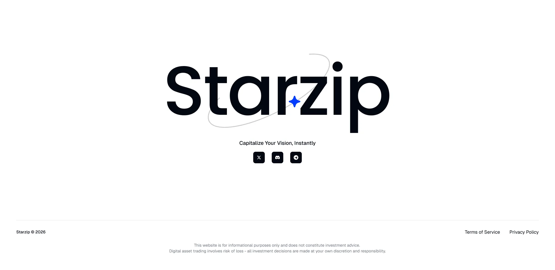
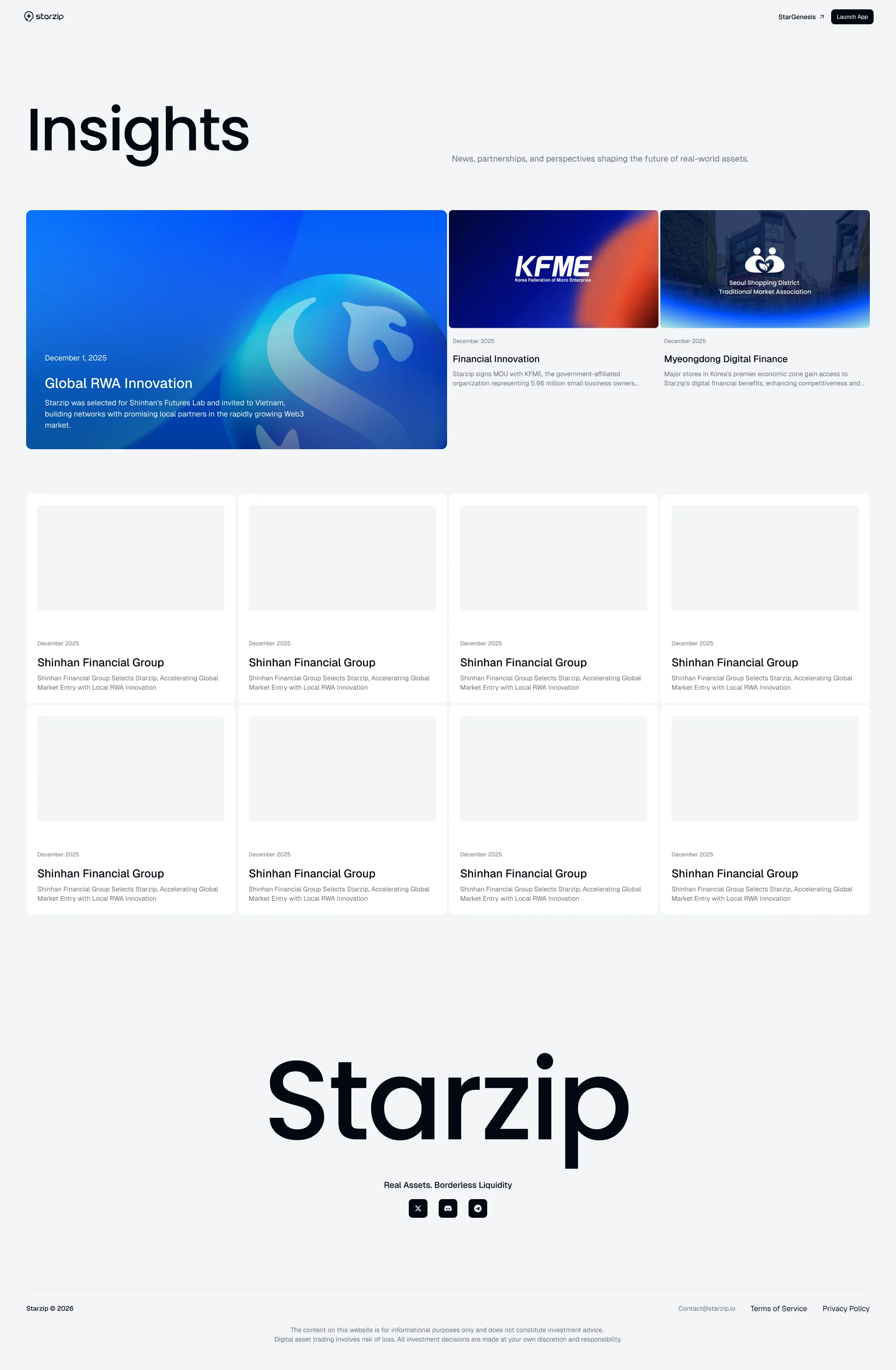
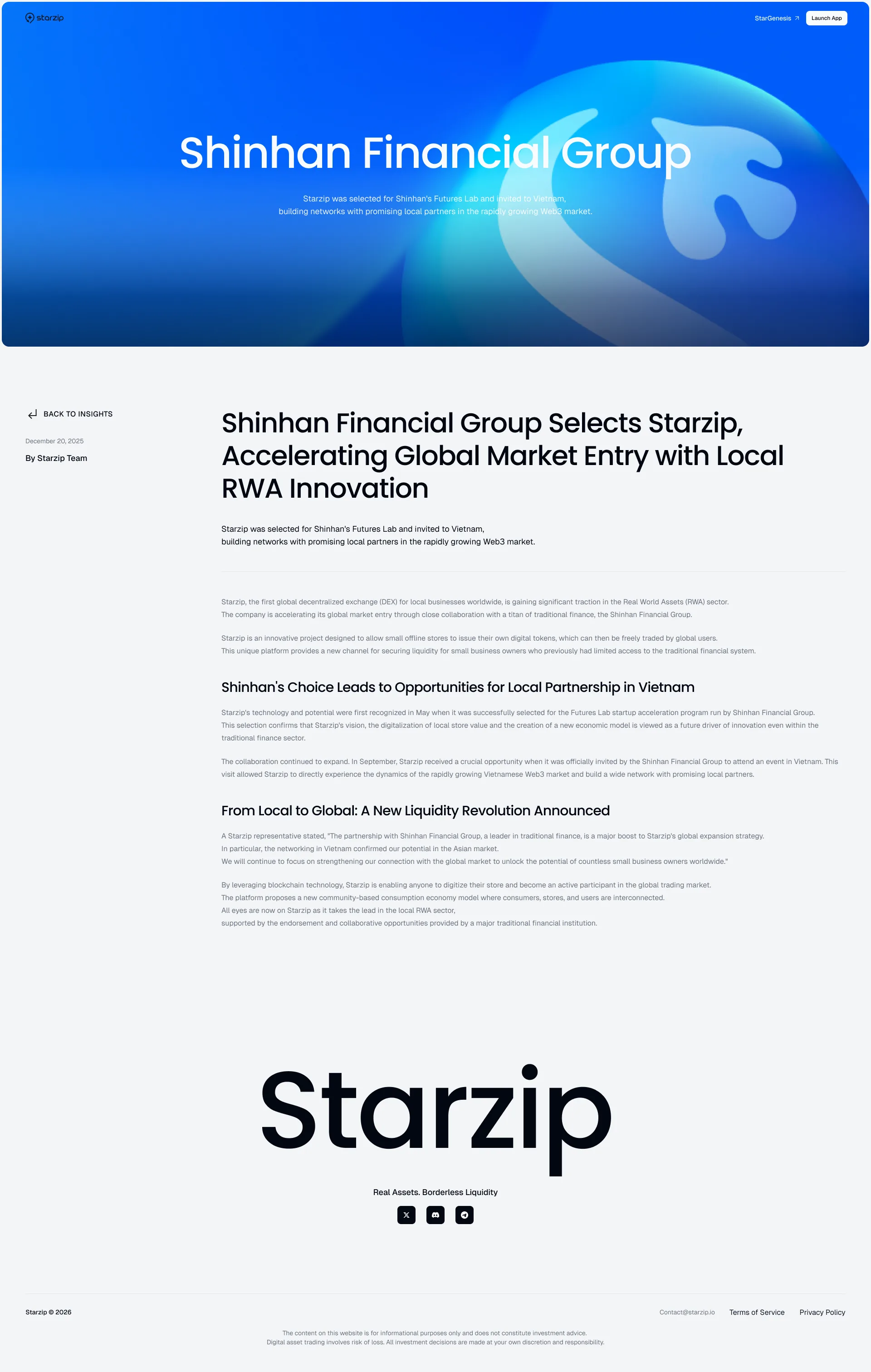
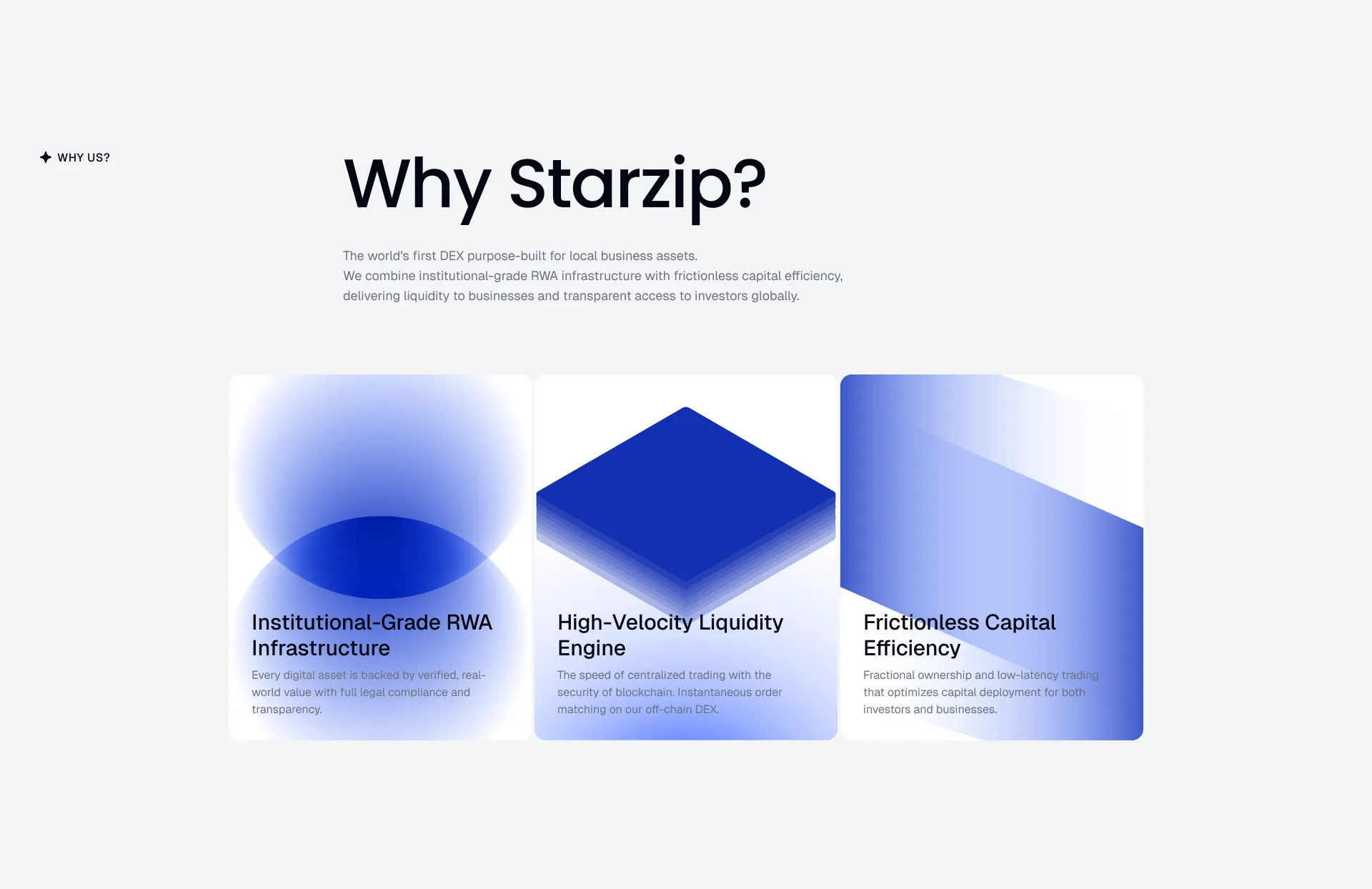
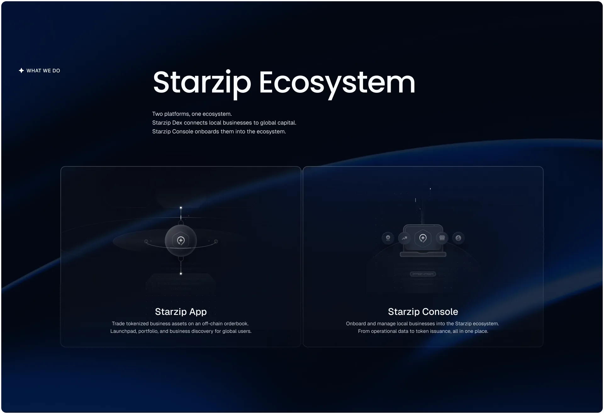
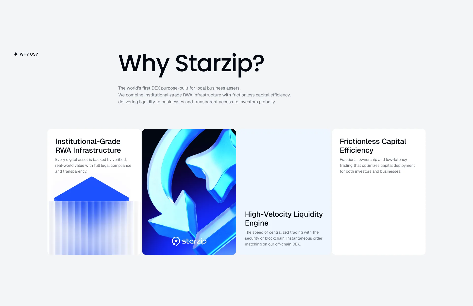
The marketing site, end to endHero to footer in one frame. Dark and light bands alternate, and that alternation is what separates the chapters.The rewritten passSame structure, new sentences. "Why Starzip?" becomes "Infrastructure", and the closing line becomes "Local Business. Global Market."Hero on mobileThe headline breaks to four lines and the four figures stack instead of sitting in a row - nothing dropped, just restacked.The ecosystem bandApp and Console split in one place. Both sides had to carry equal weight, so the two cards sit level.Feature grid, four statesOne of four opens at a time, drawn four times in order. Only the open cell carries its description; the rest keep just a name.FooterThe name set large, one line and three icons under it. No column of links.Insights listOne piece runs large with two beside it and eight in a grid below - a layout that doesn't look empty while there are still few posts.ArticleThe title rides a blue gradient band and the body runs in a single column, with only a back link and a date on the left.Hero into the mapThe moment the hero slides up and the dark map band takes the screen - two frames overlapped to show just that hand-off.Why StarzipThree reasons as cards, the artwork unified as gradient solids.Ecosystem, taller cropThe same band with more room above and below so the background curve reads. The cards don't change.Recruiting partnersWhat a scout gets, in three cards: trading fee share, launchpad fee share, and a token bonus.Why Starzip, other artworkThe same three cards with a 3D render mixed in. Solids or renders - that is the whole difference from the frame before.The full page, darker passThe Why cards and the ecosystem band go dark, the partner logo strip is dropped, and the FAQ moves up.