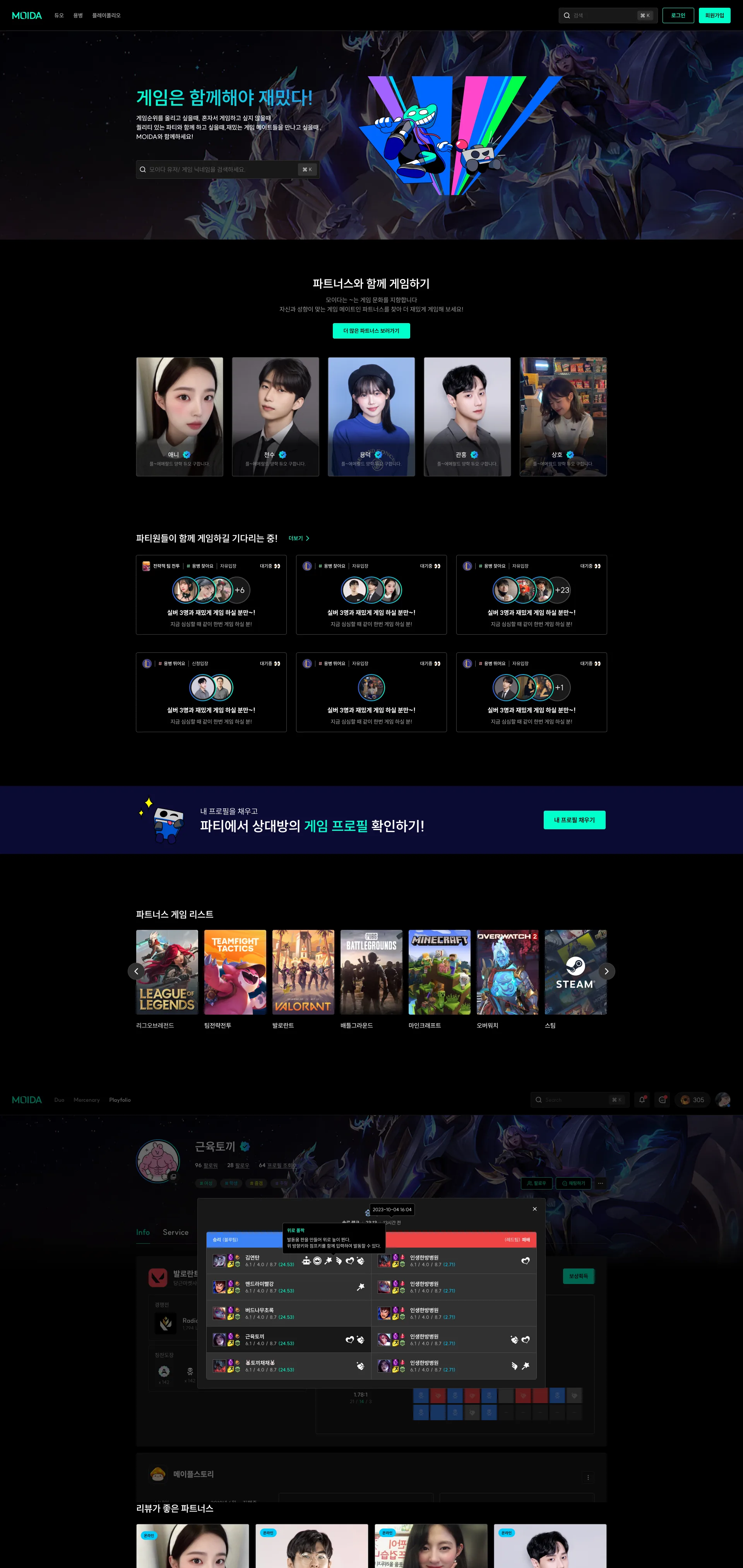
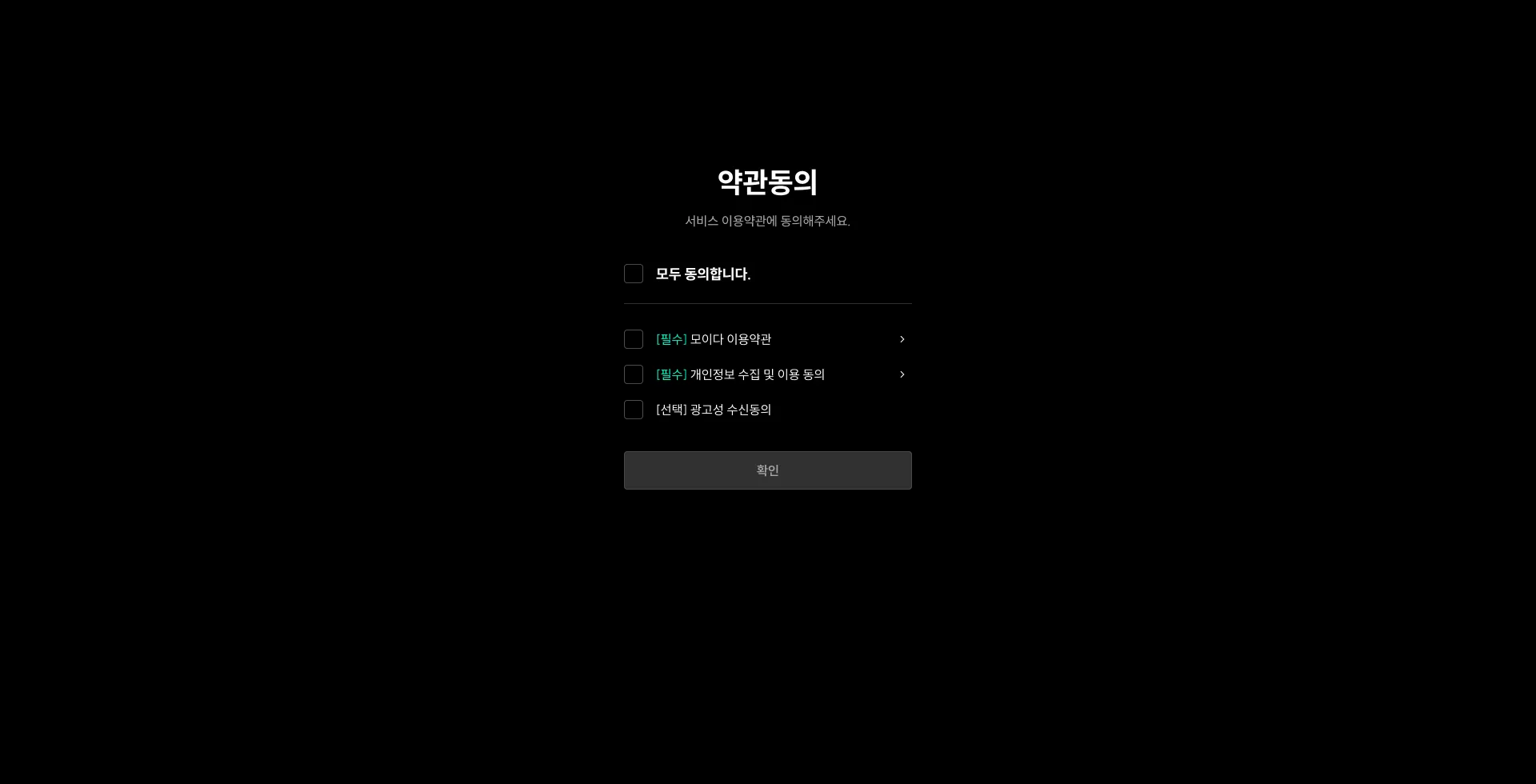
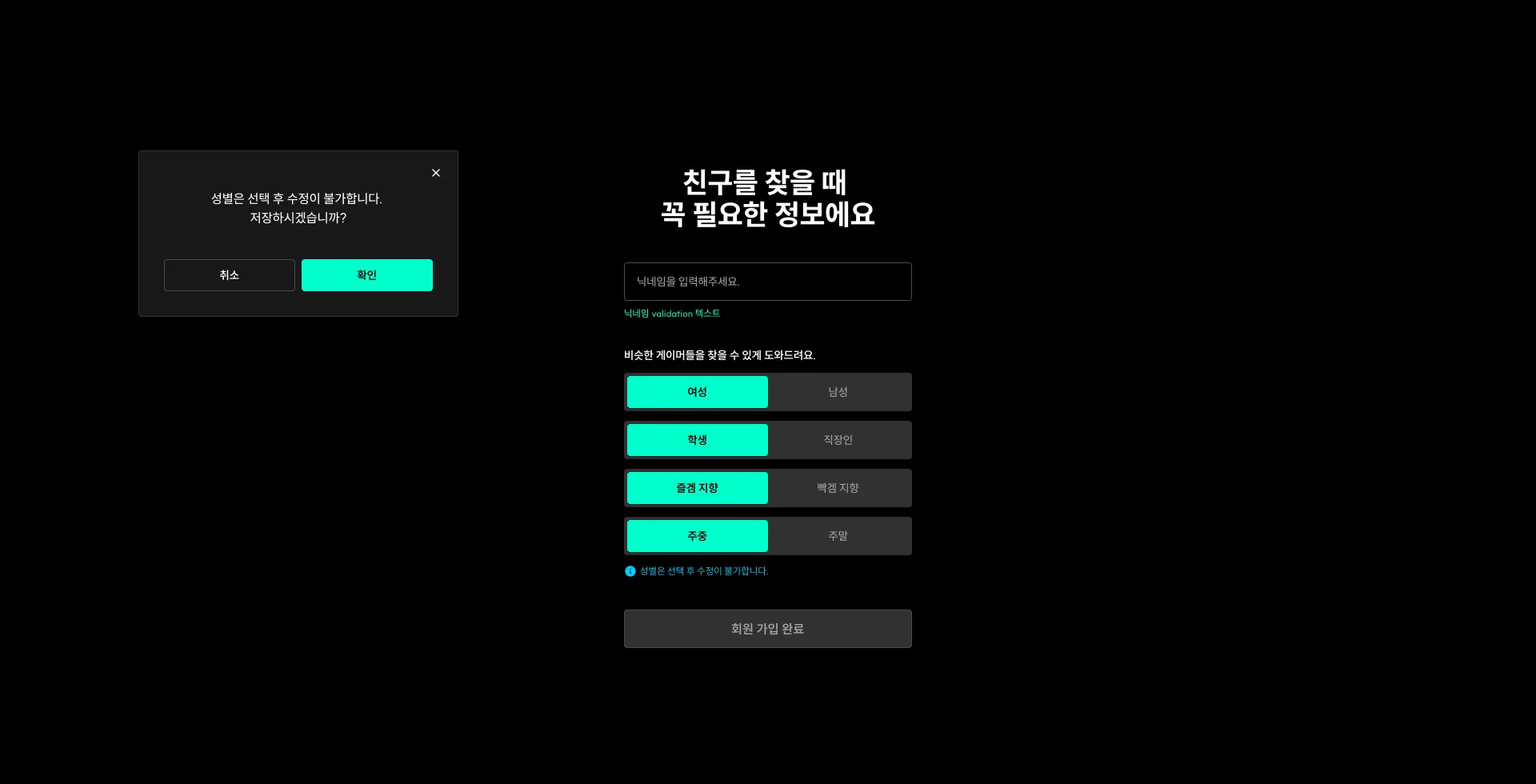
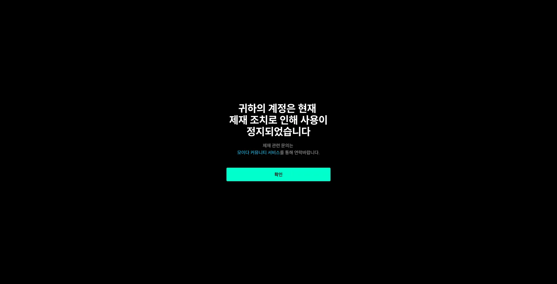
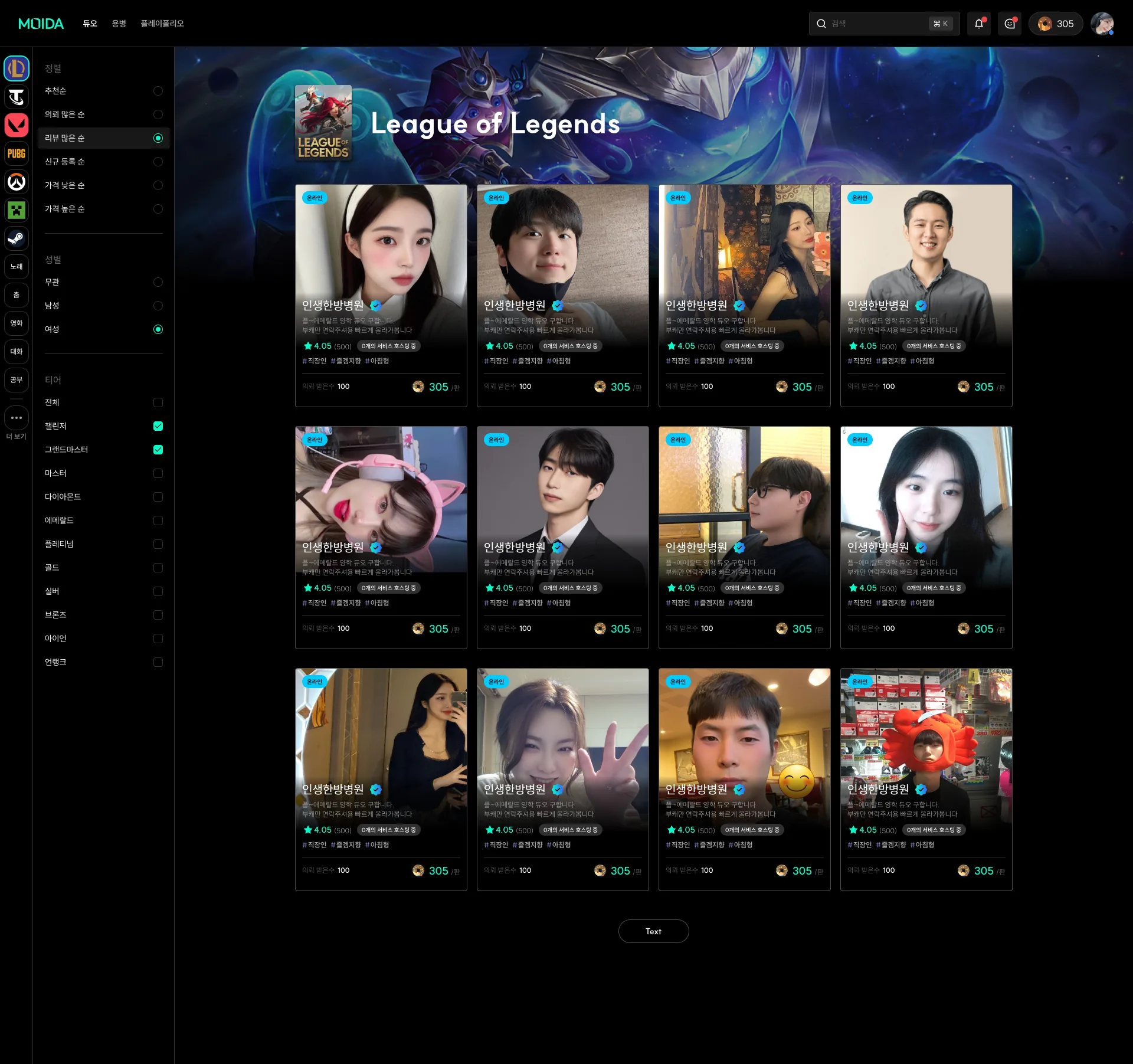
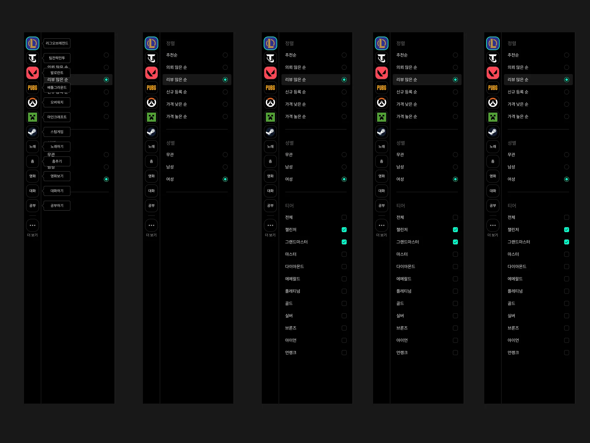
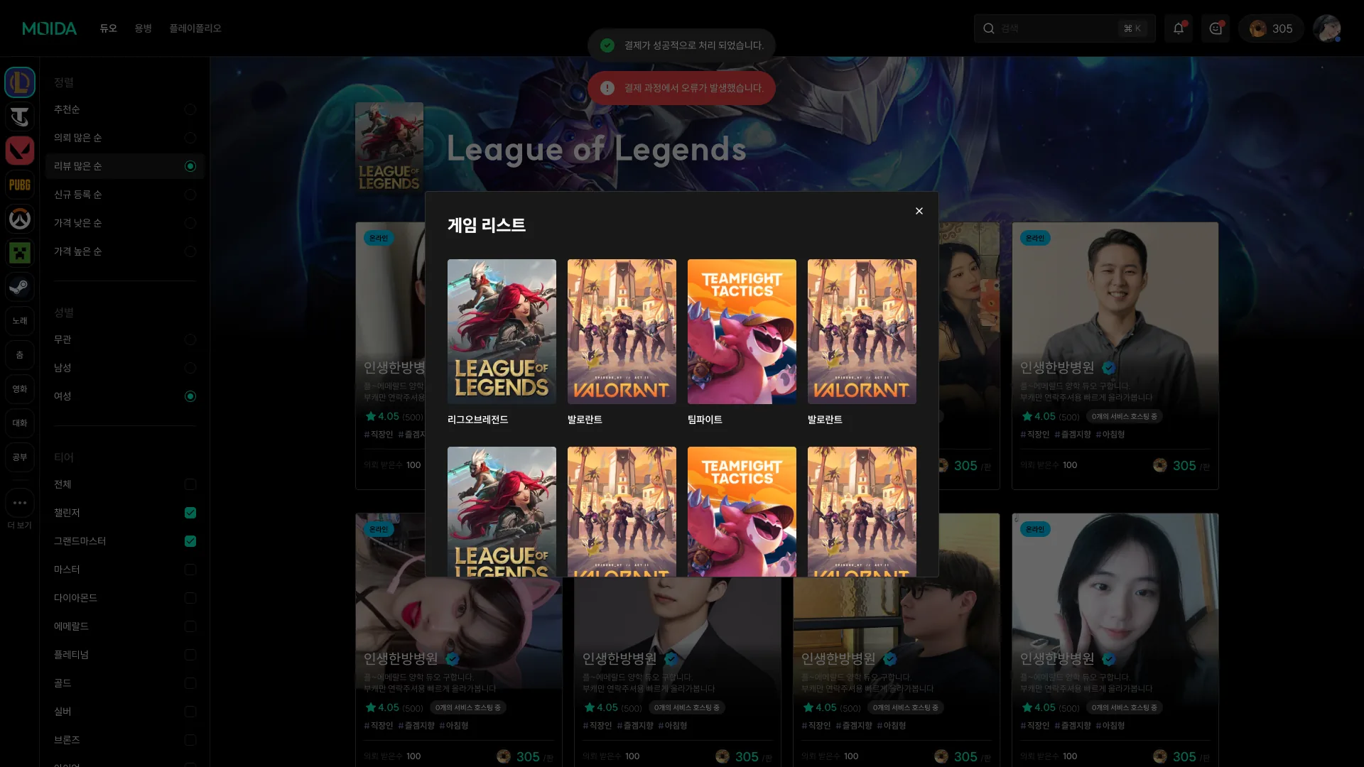
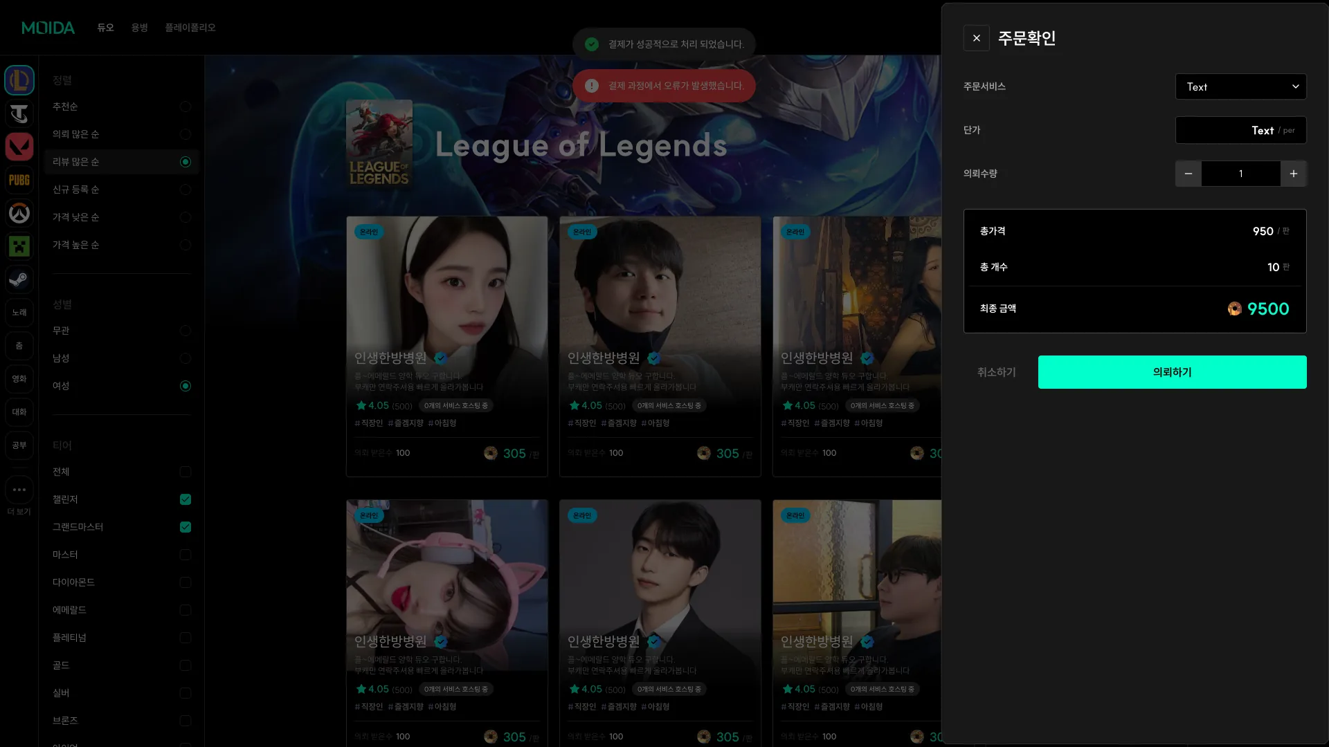
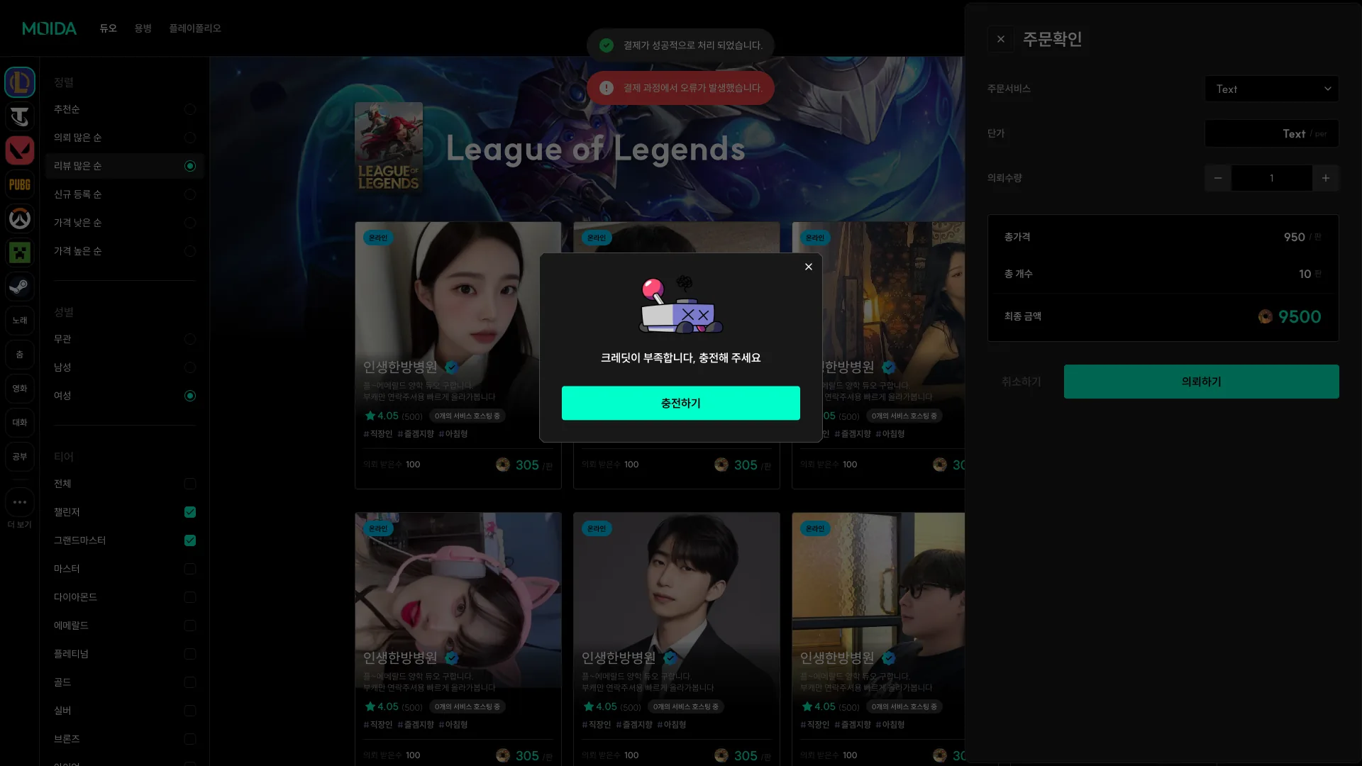
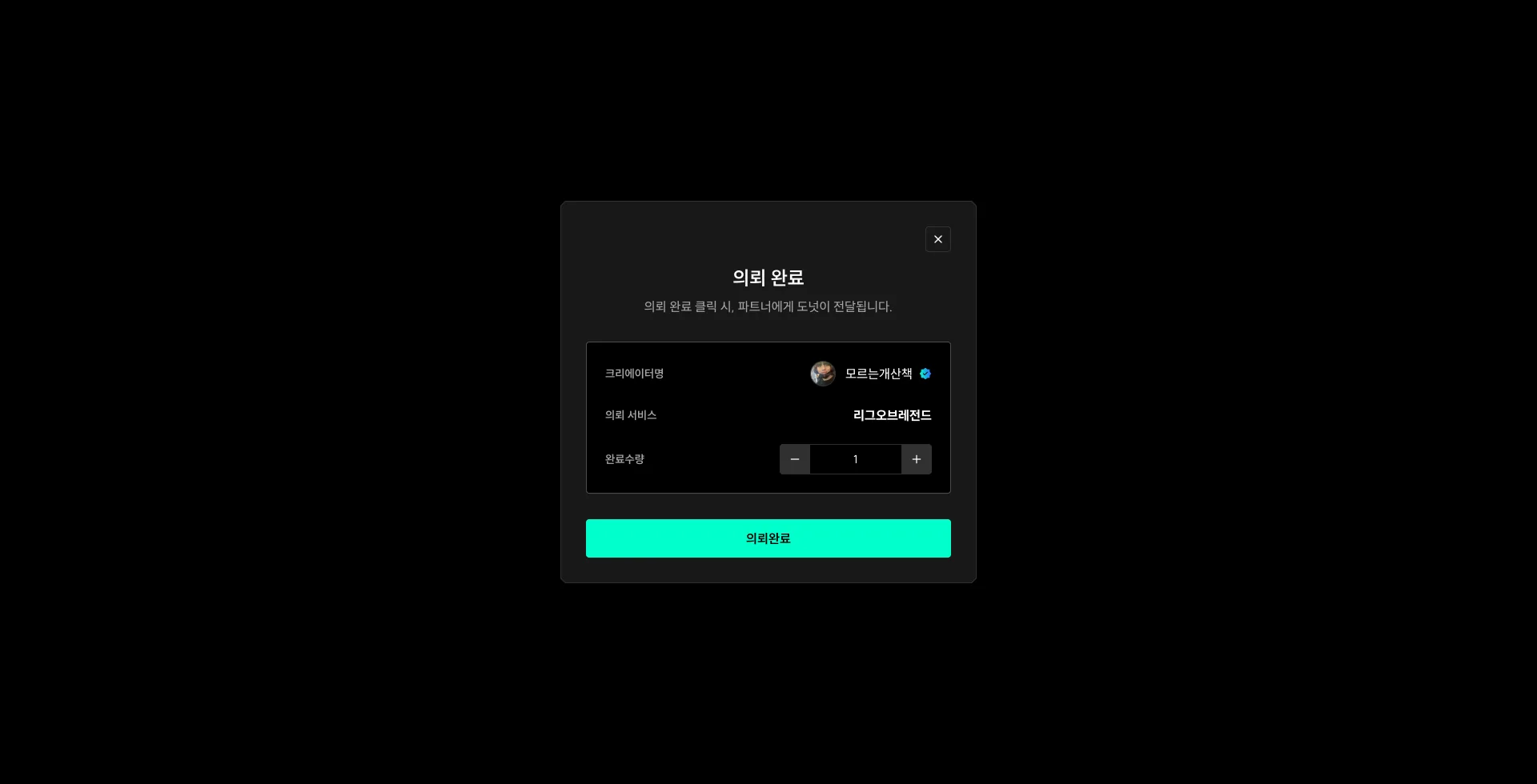
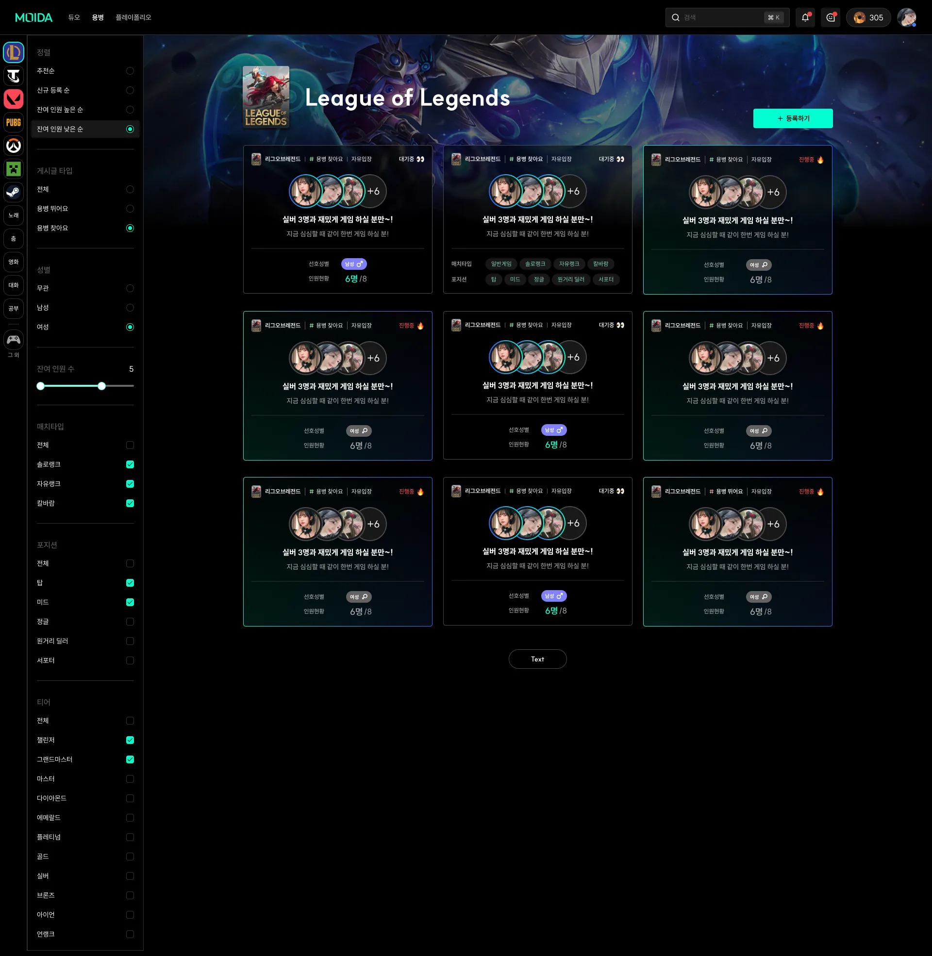
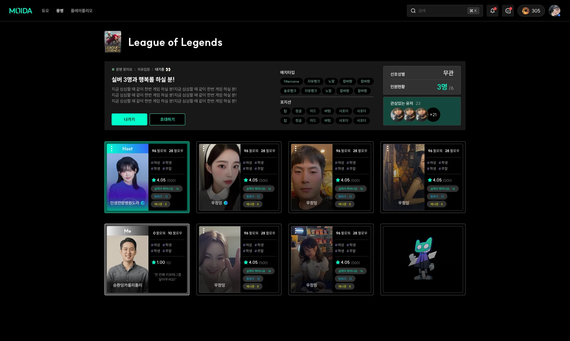
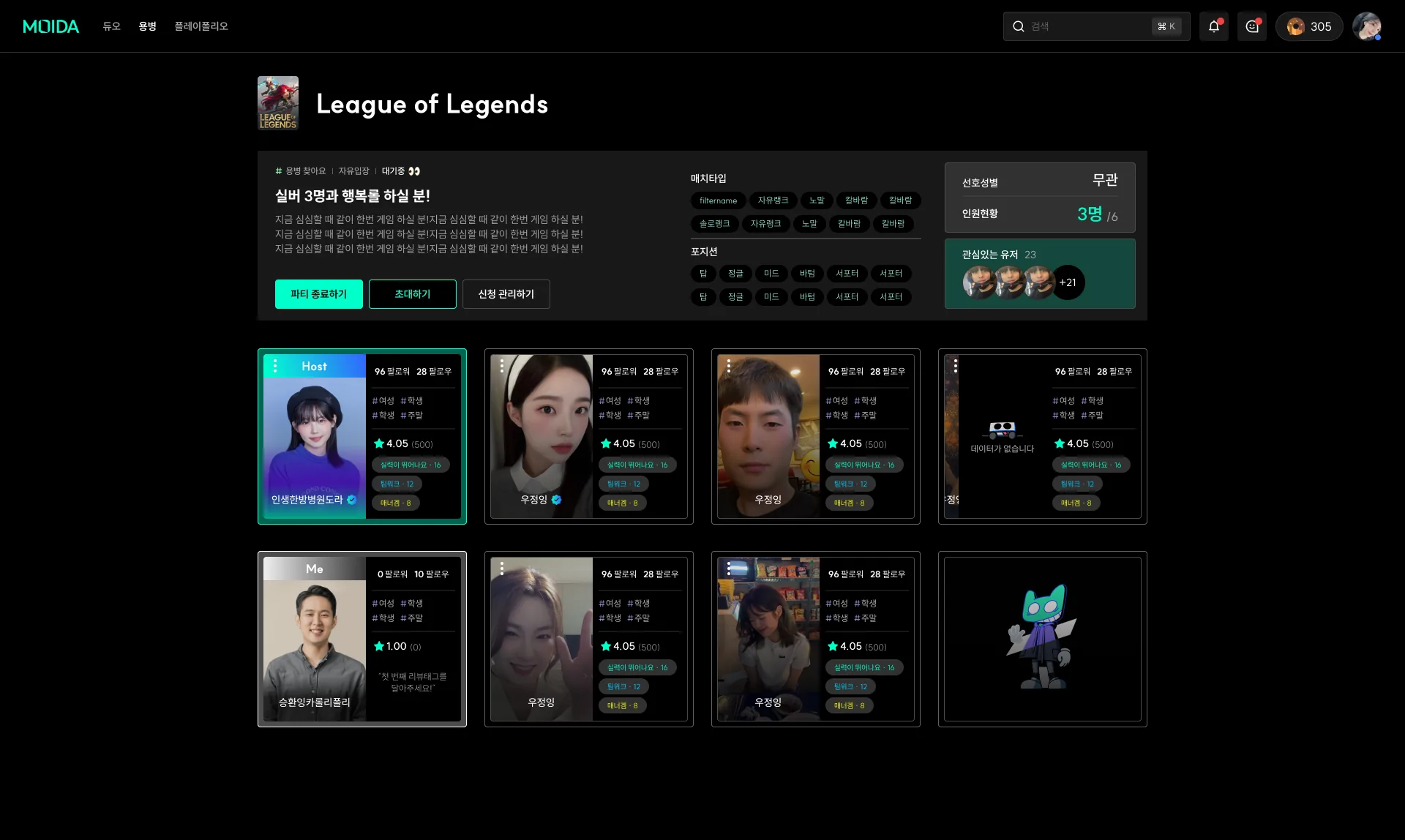
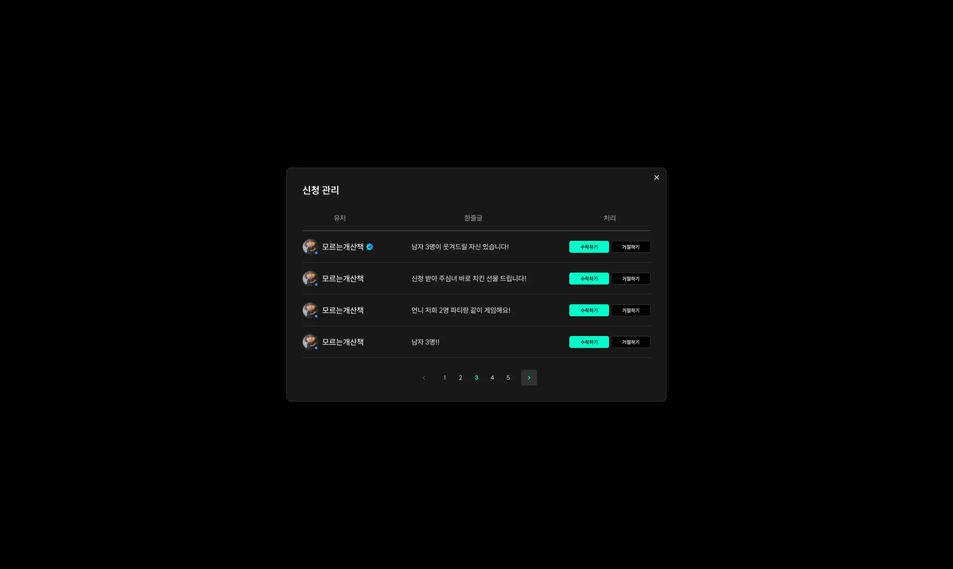
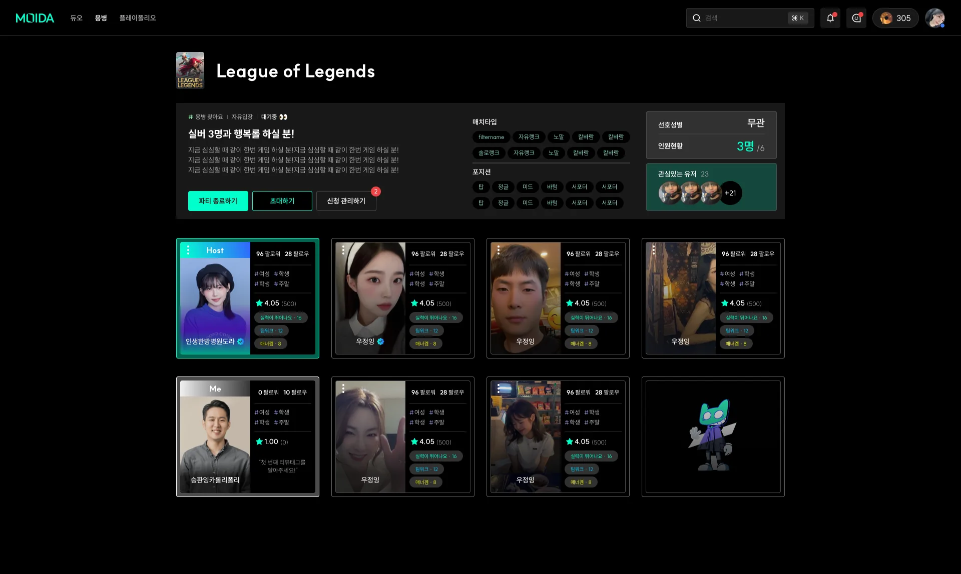
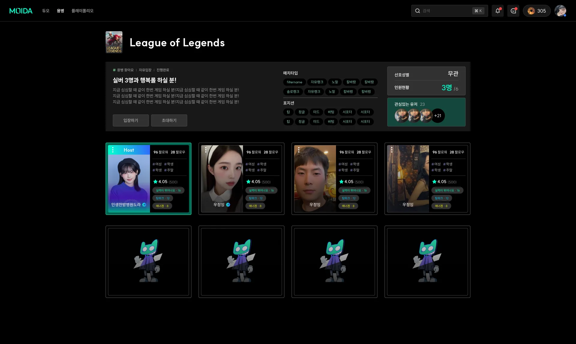
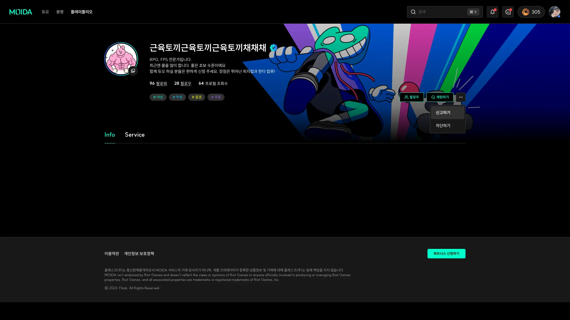
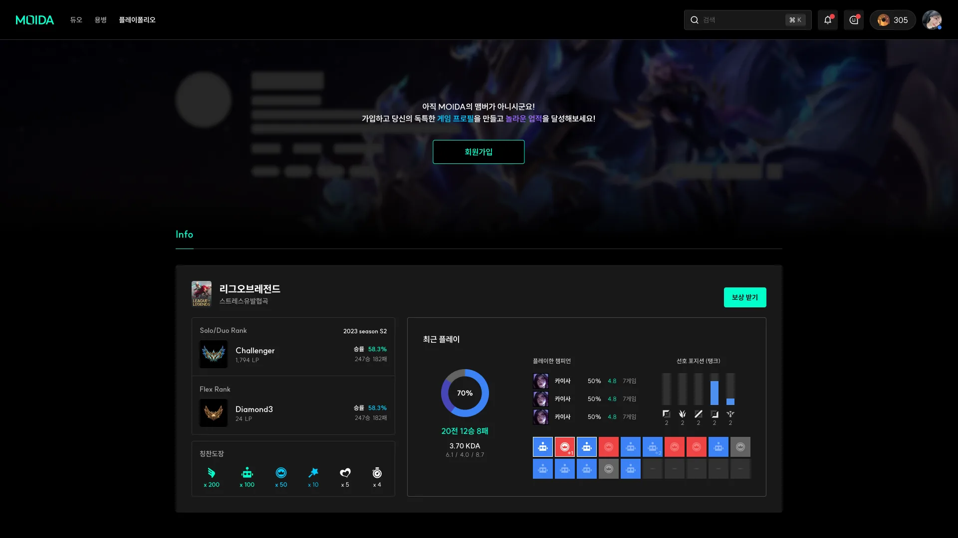
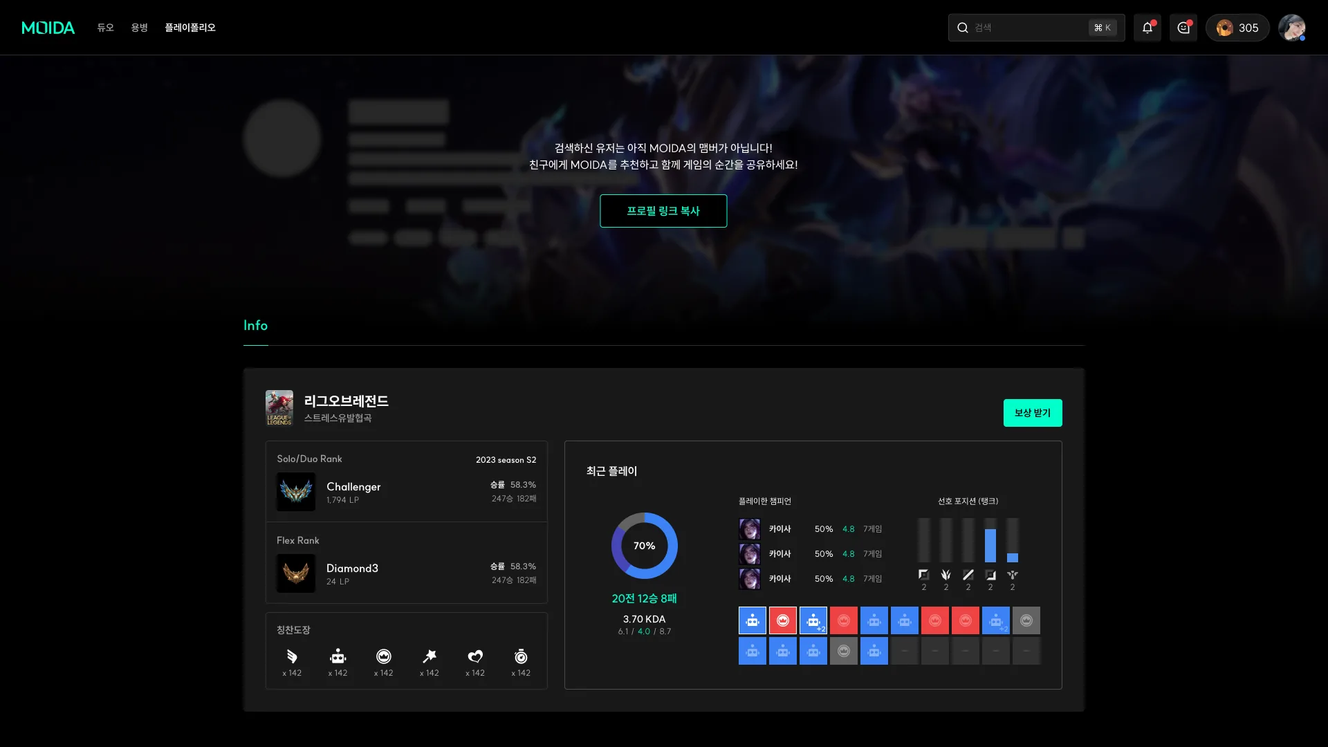
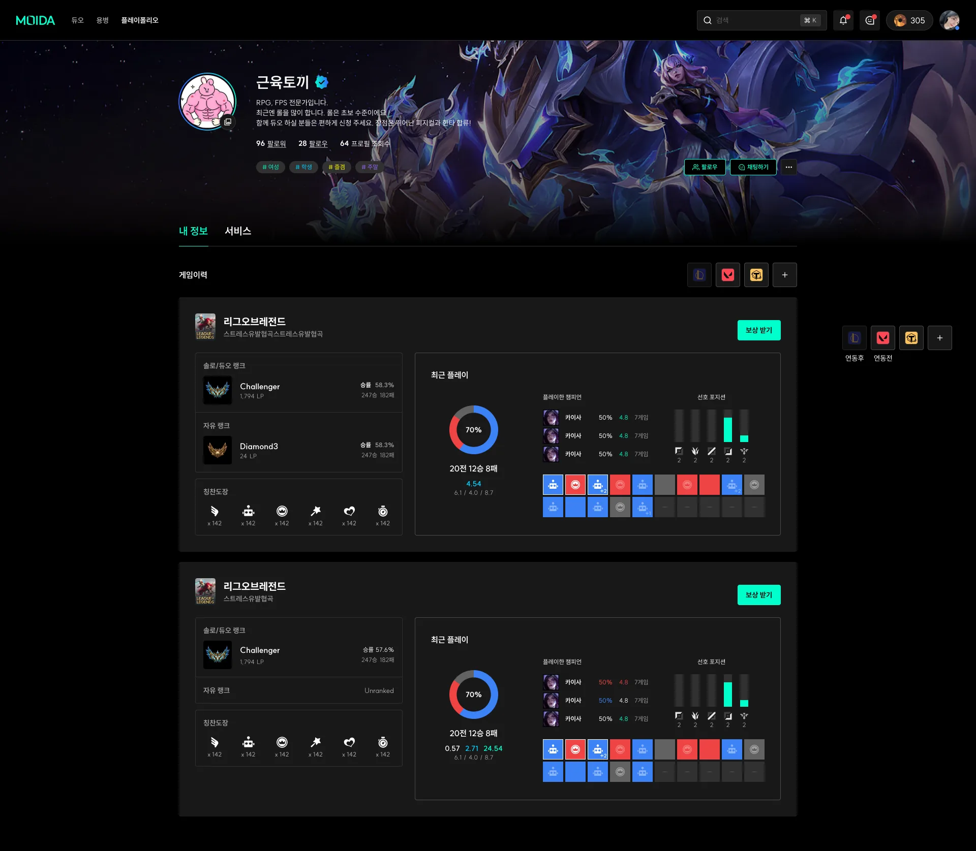
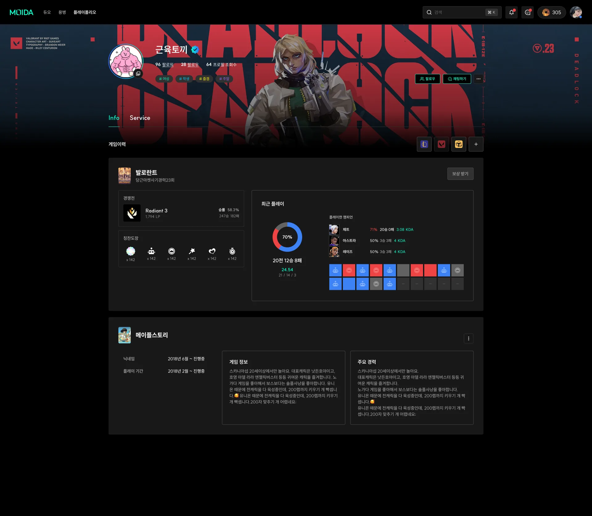
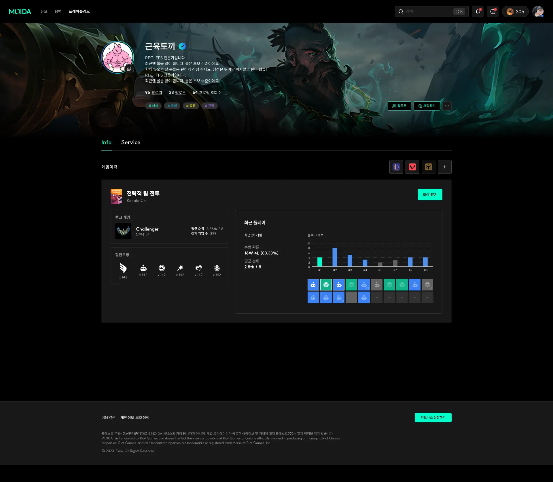
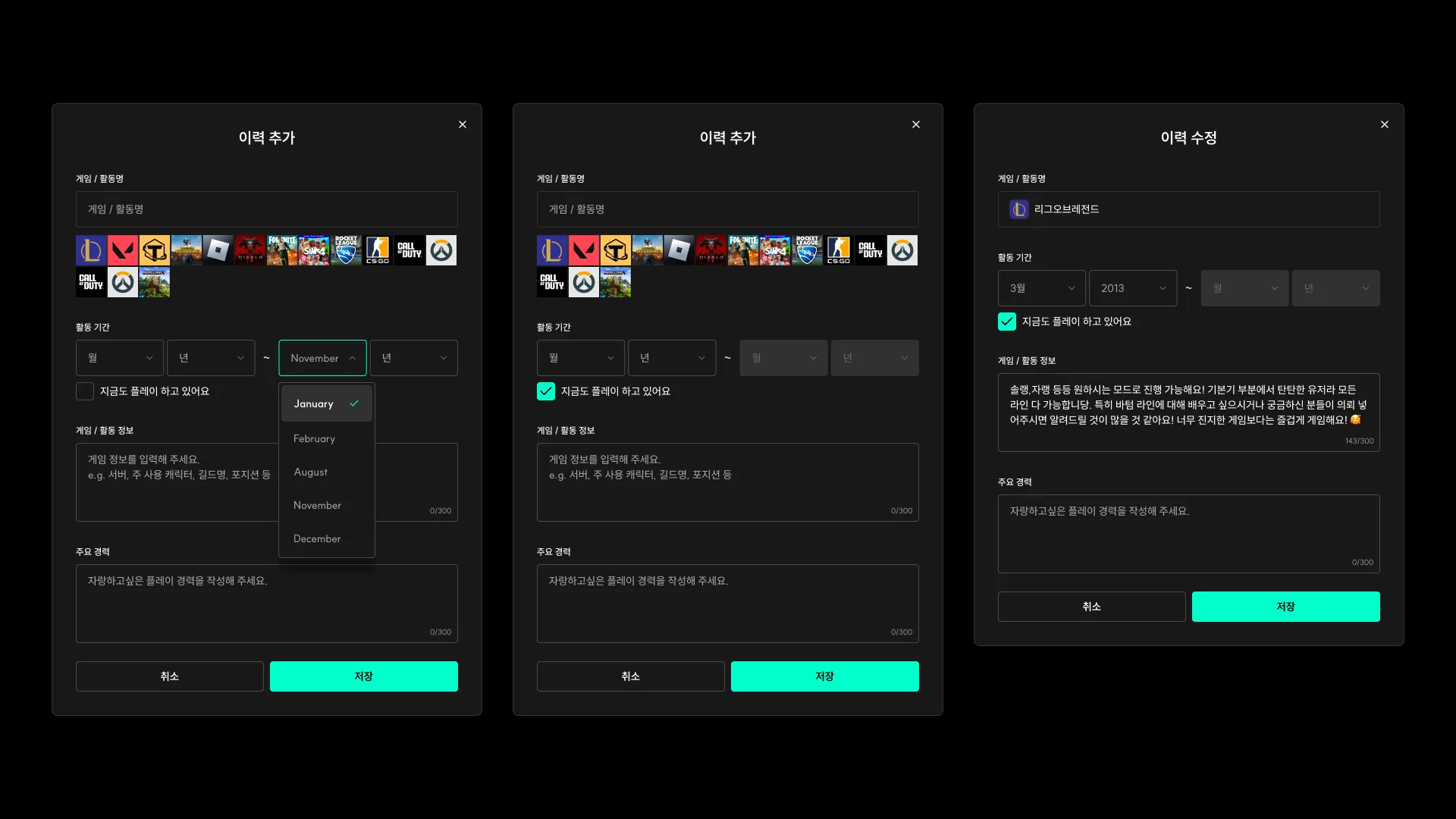
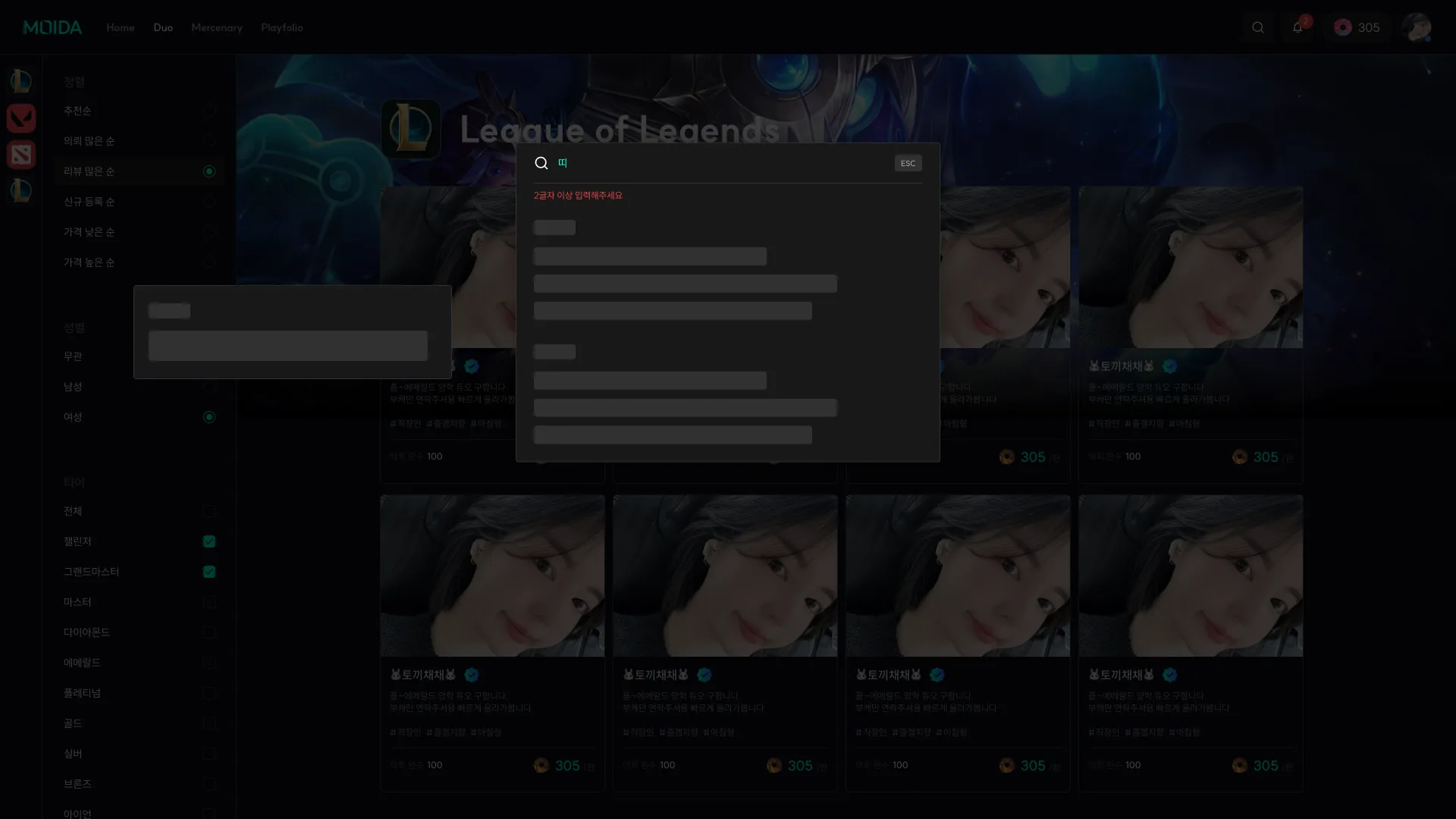
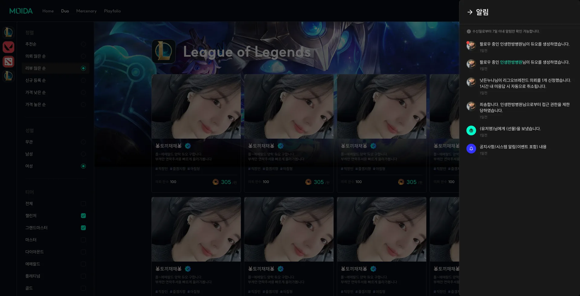
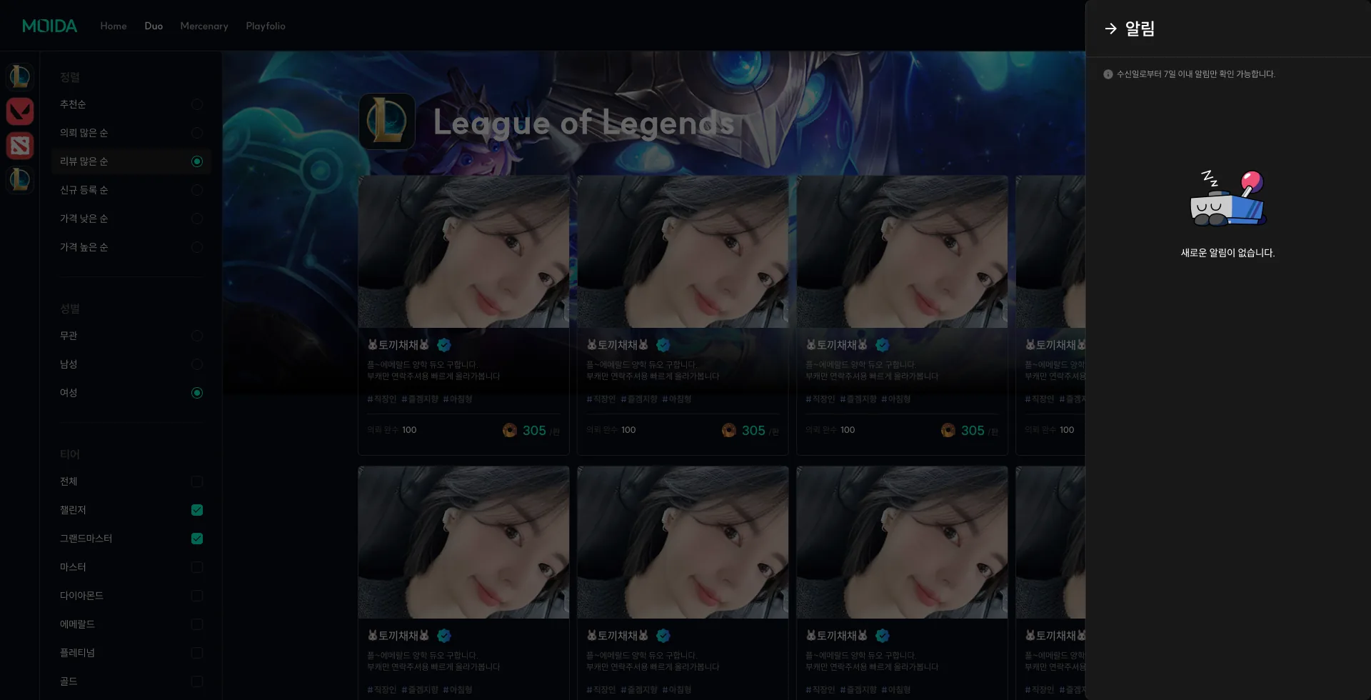
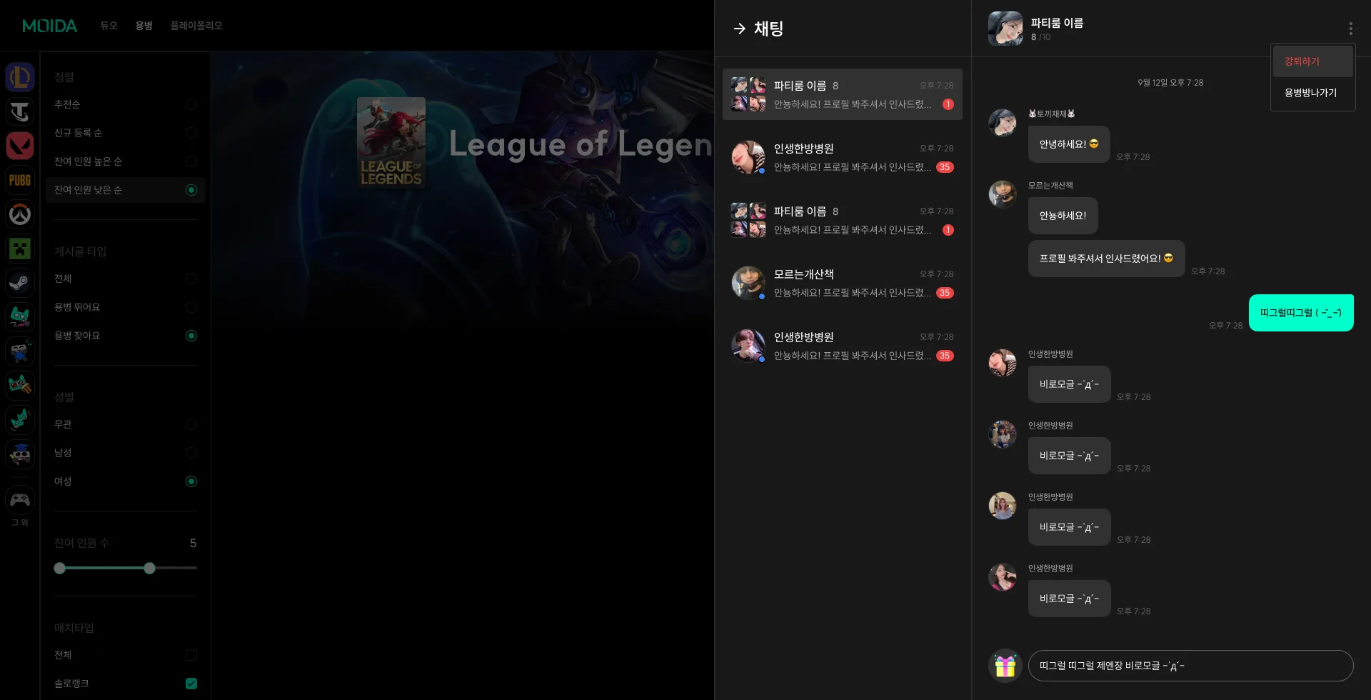
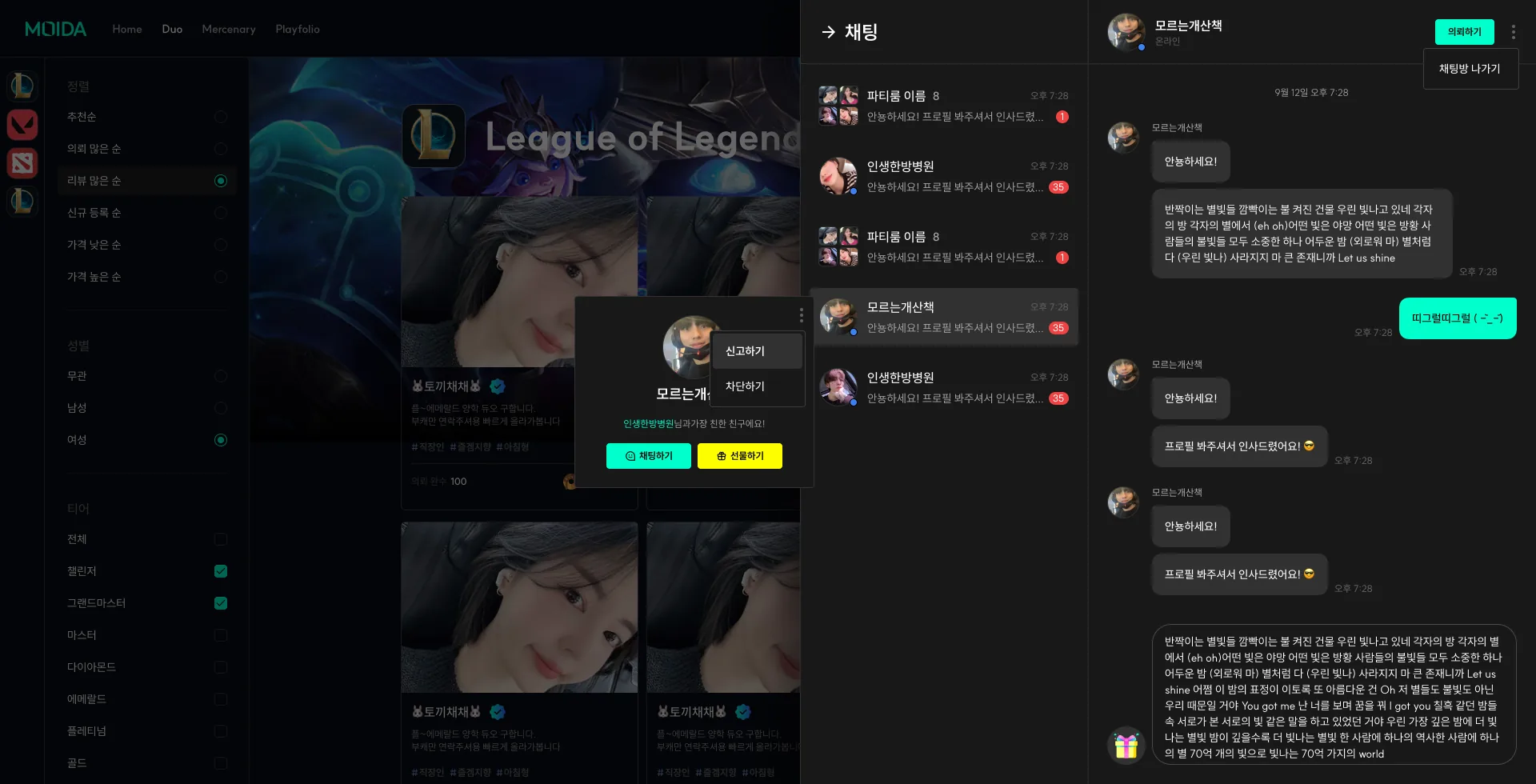
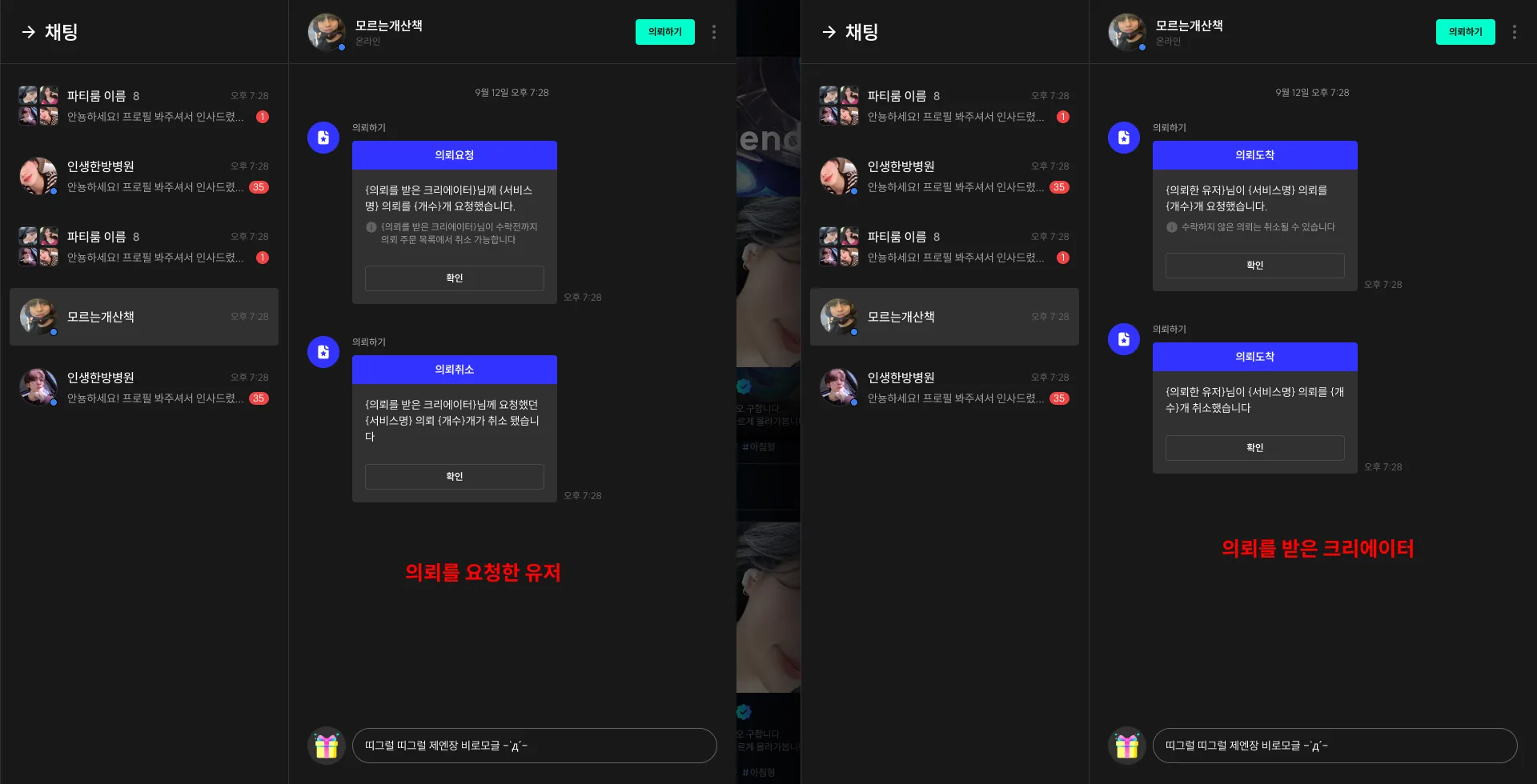
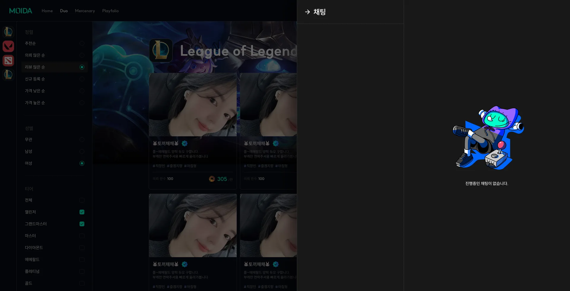
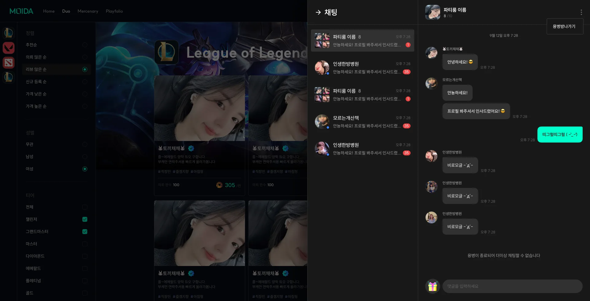
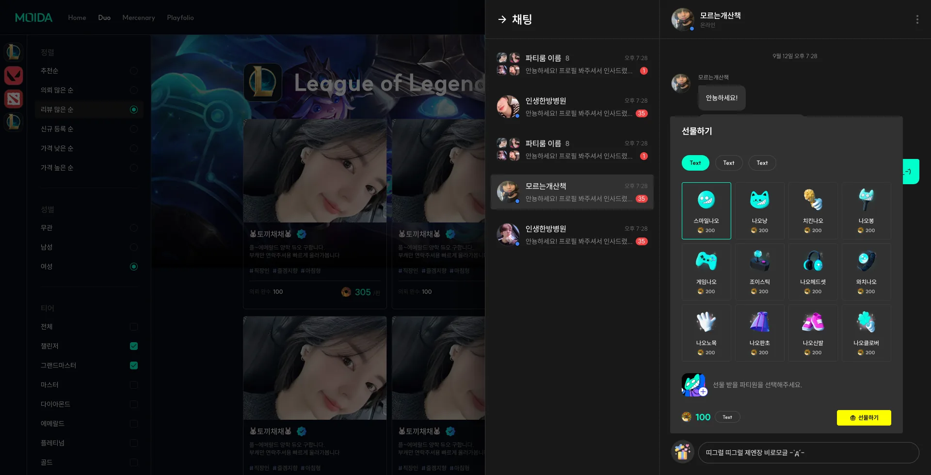
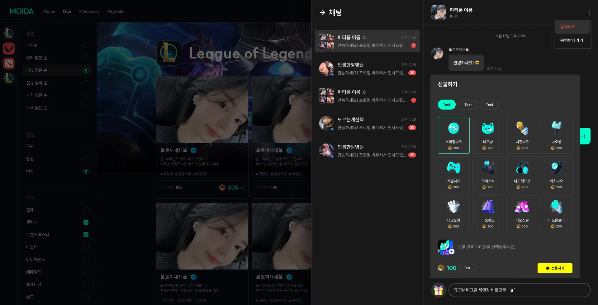
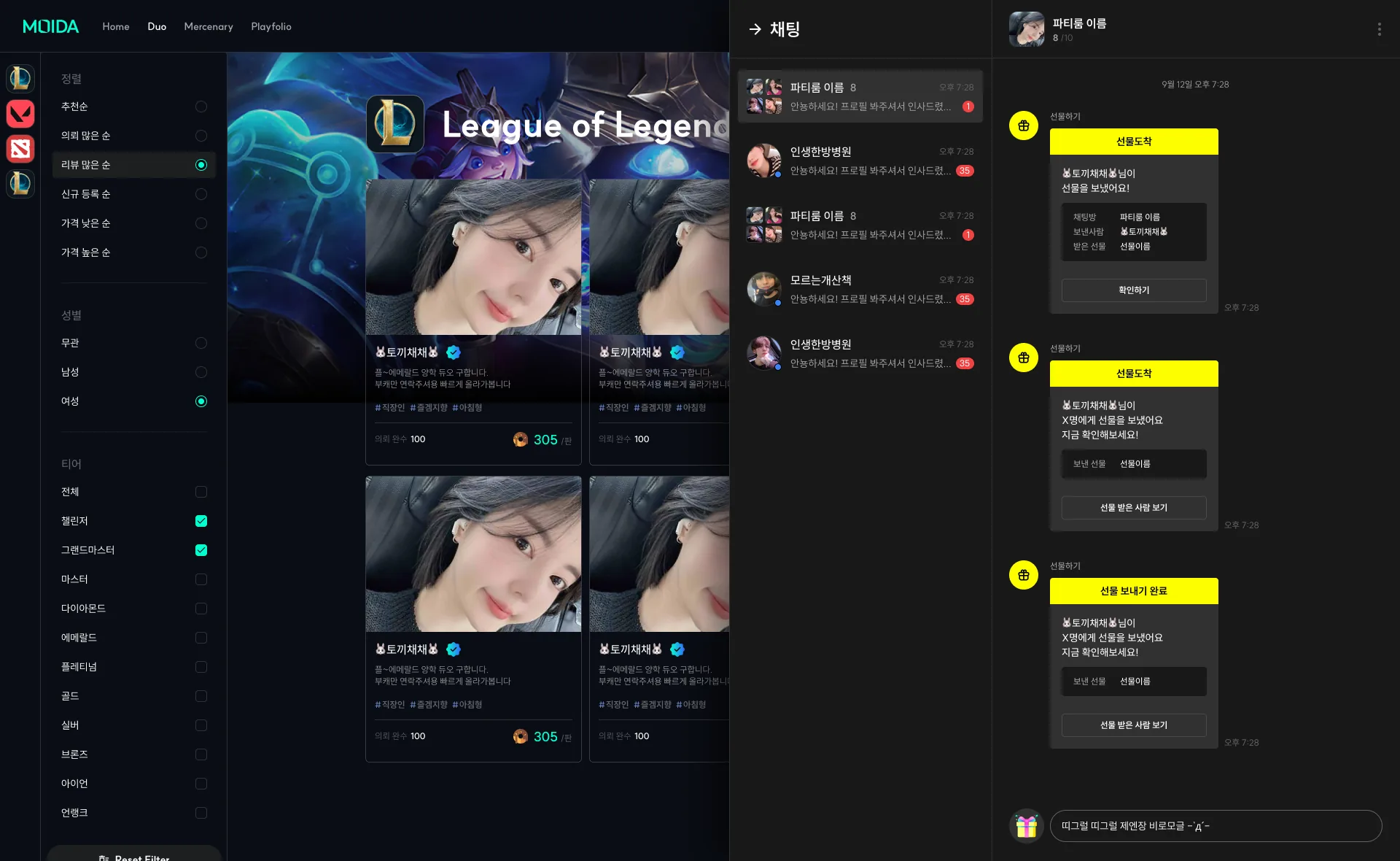
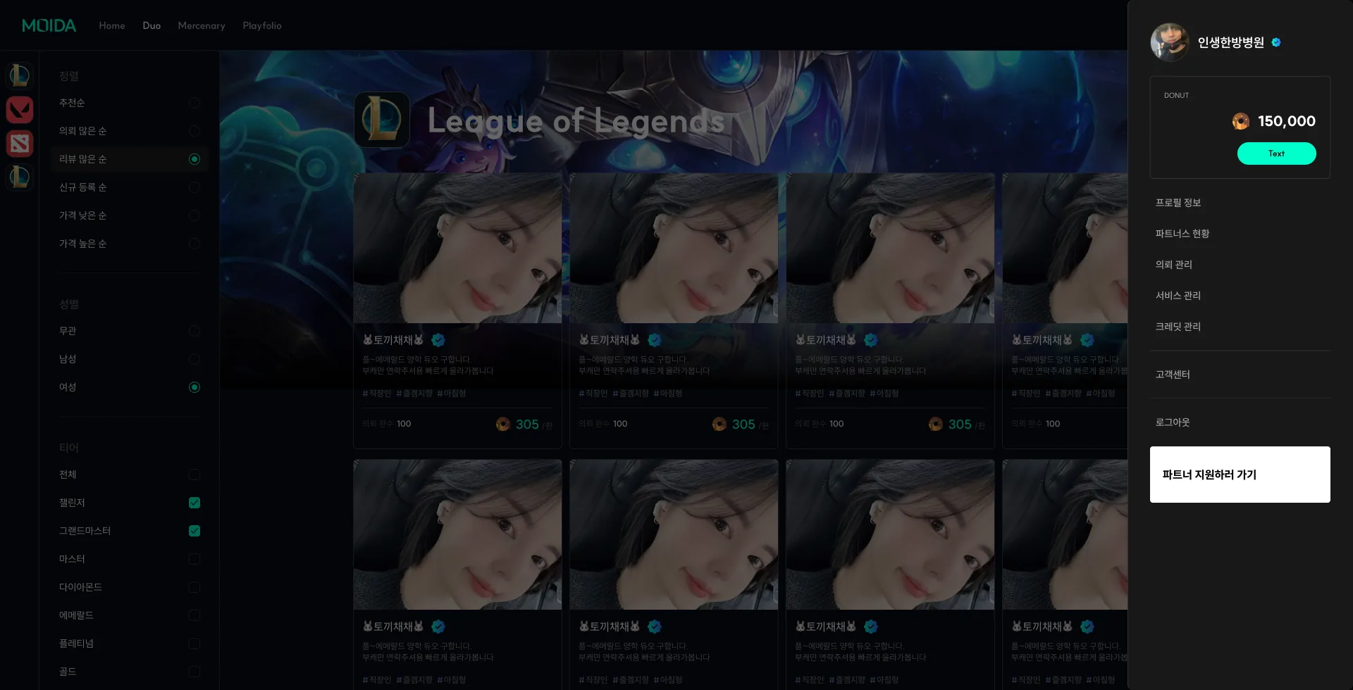
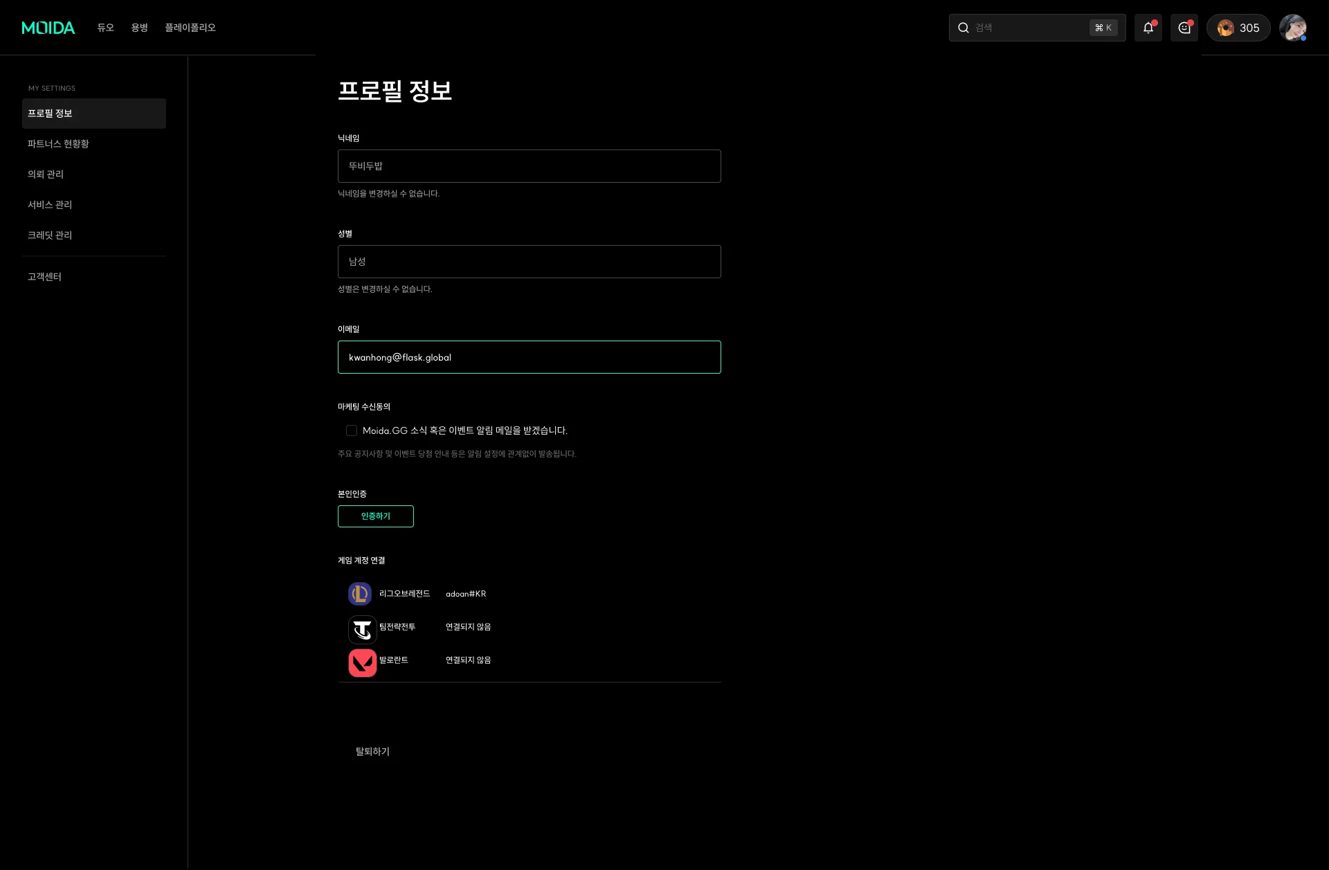
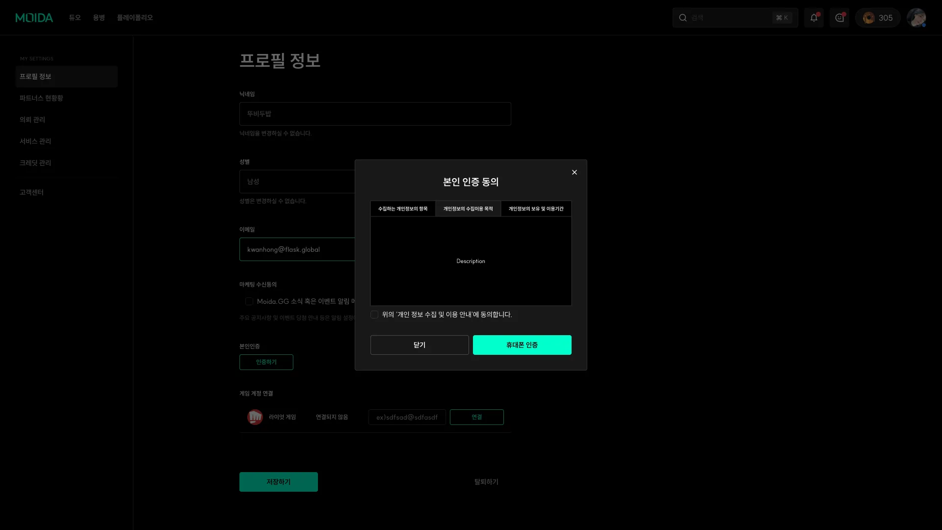
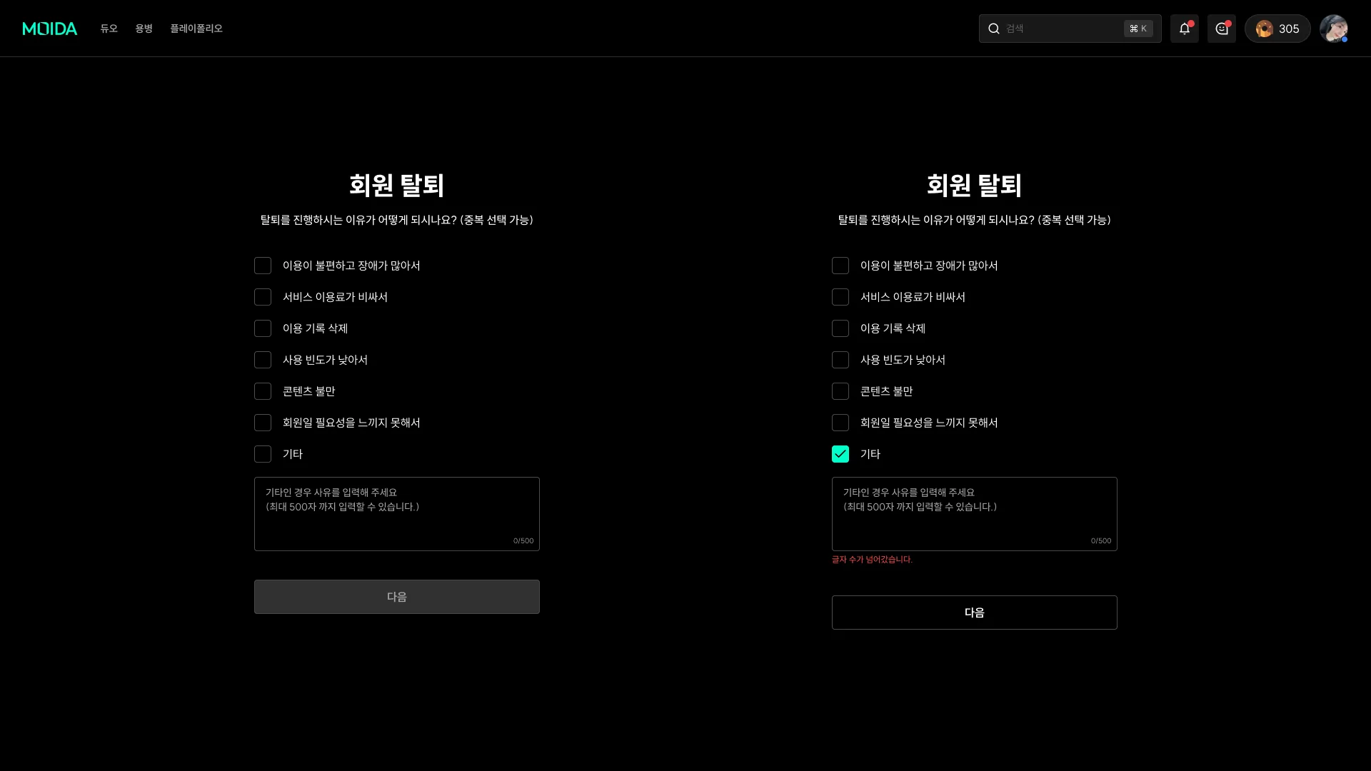
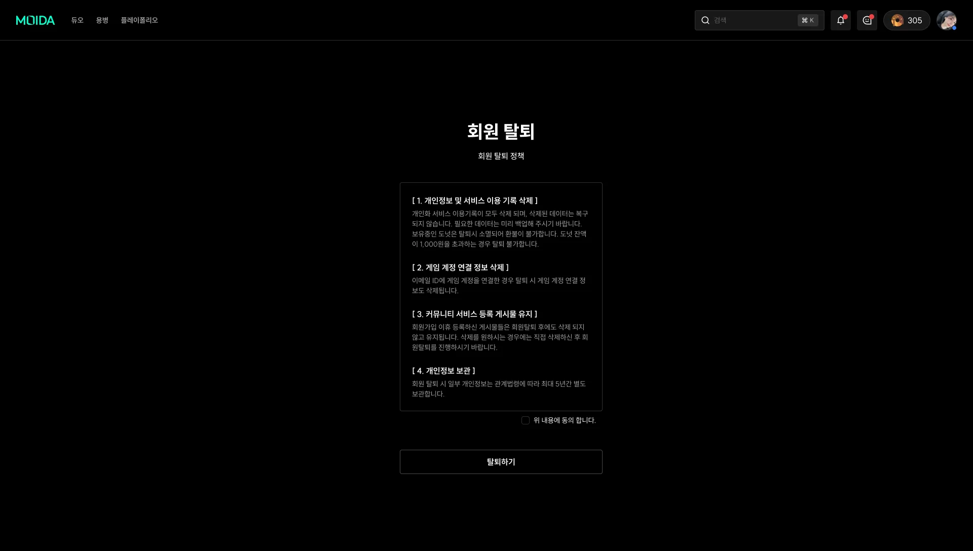
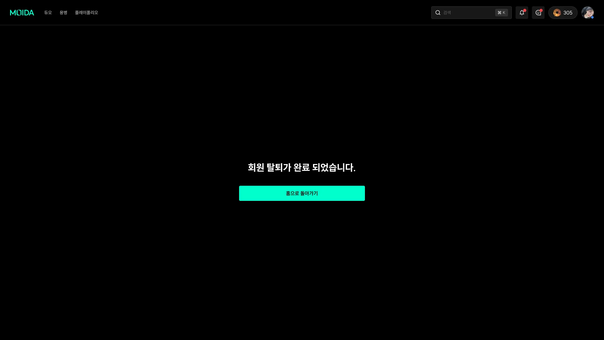
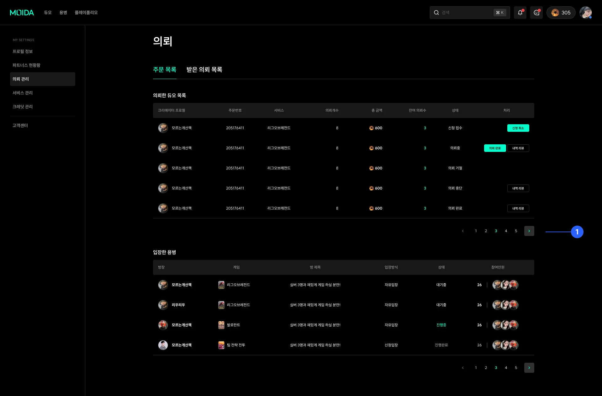
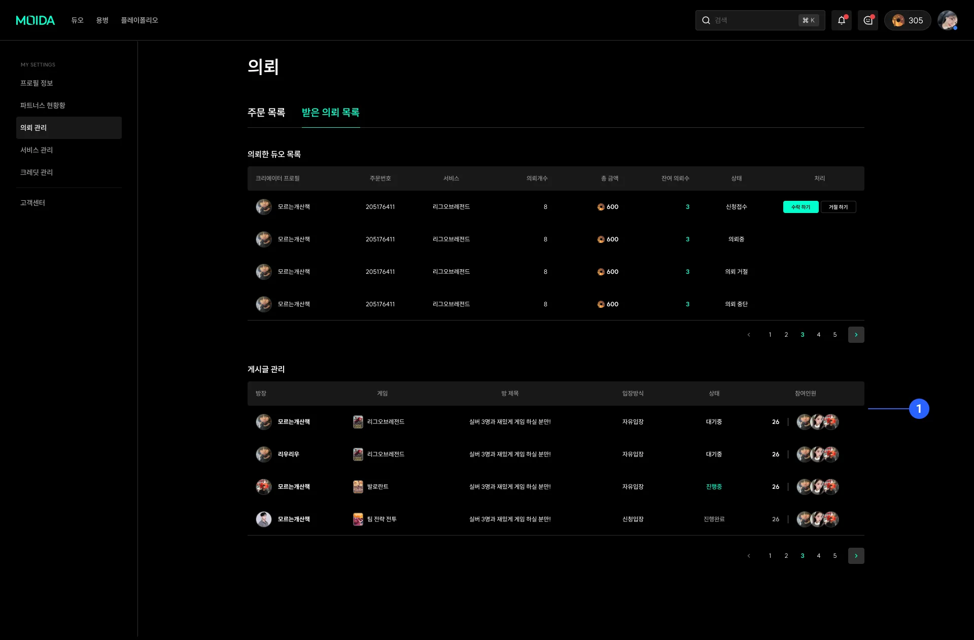
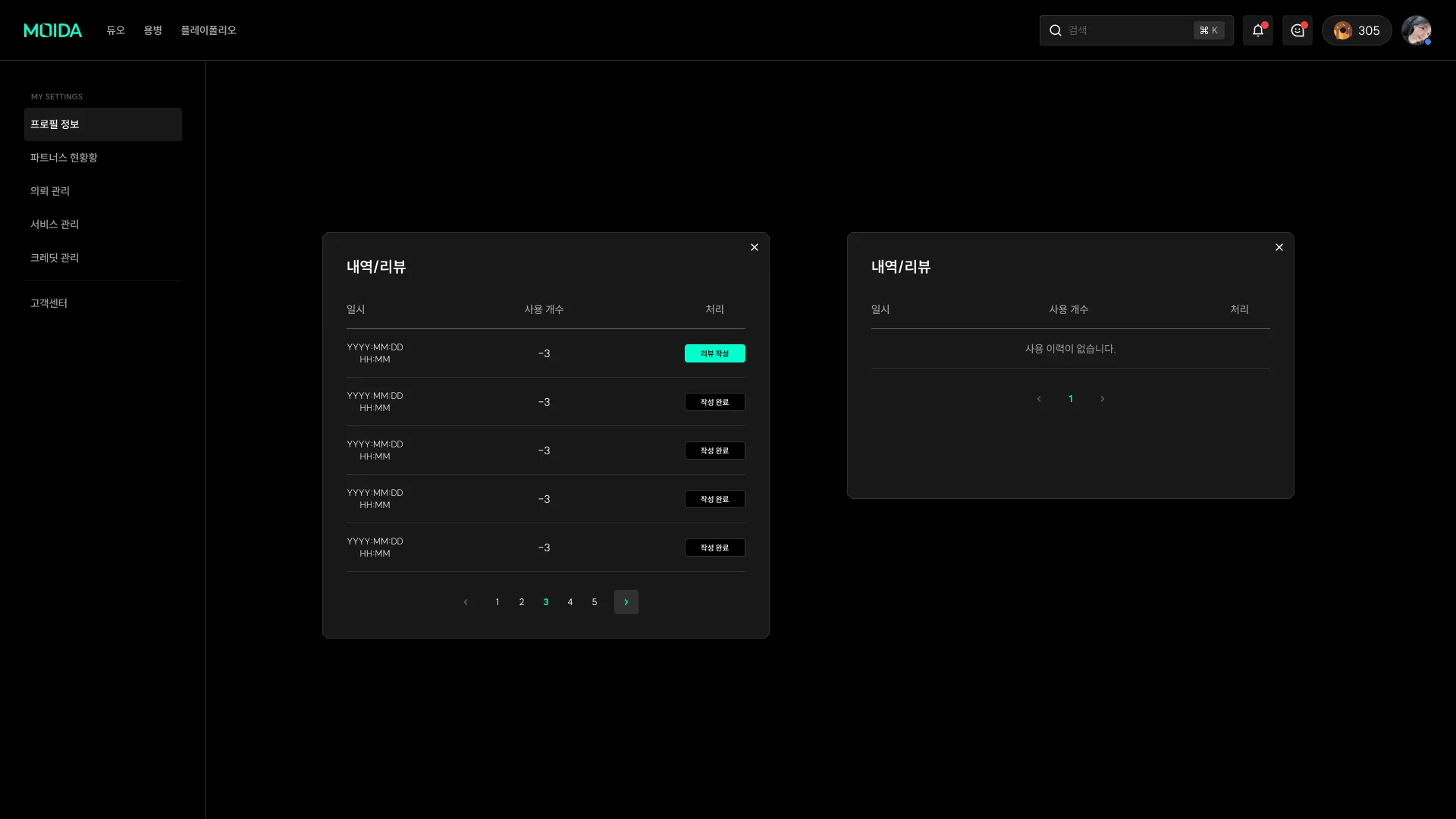
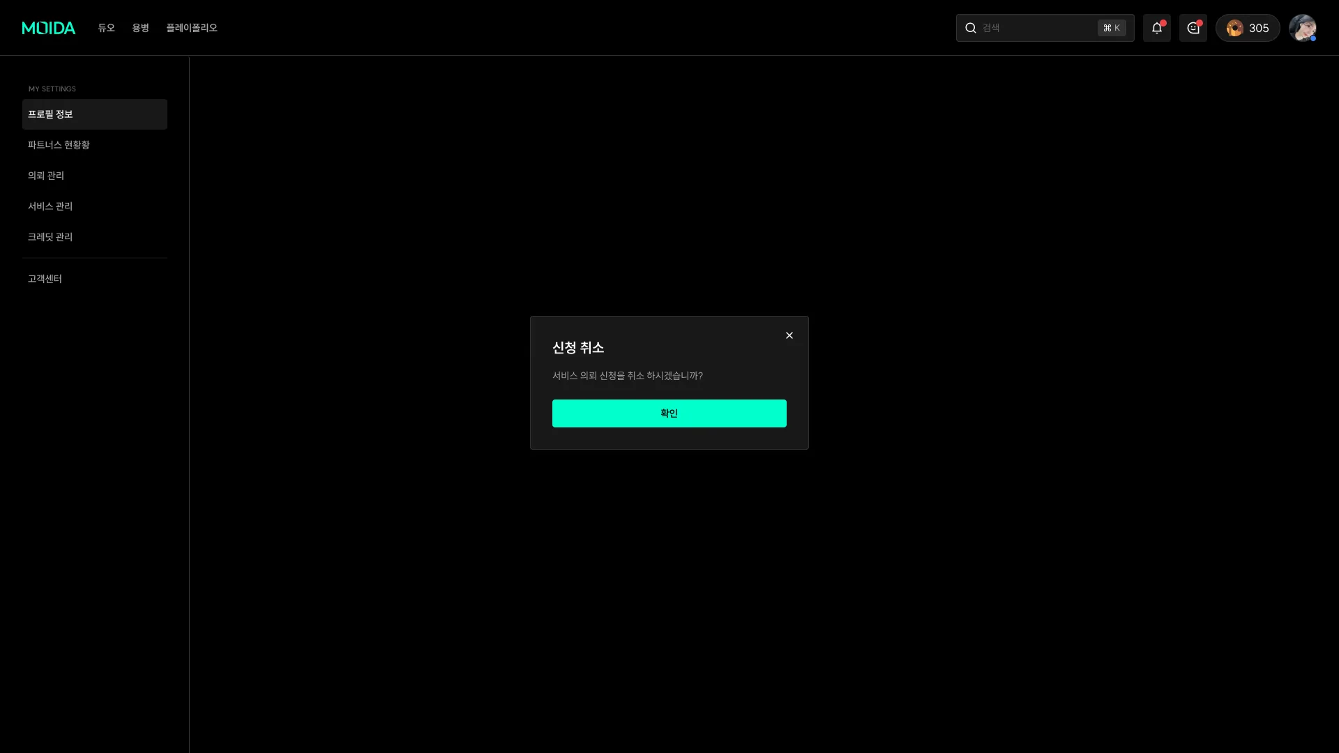
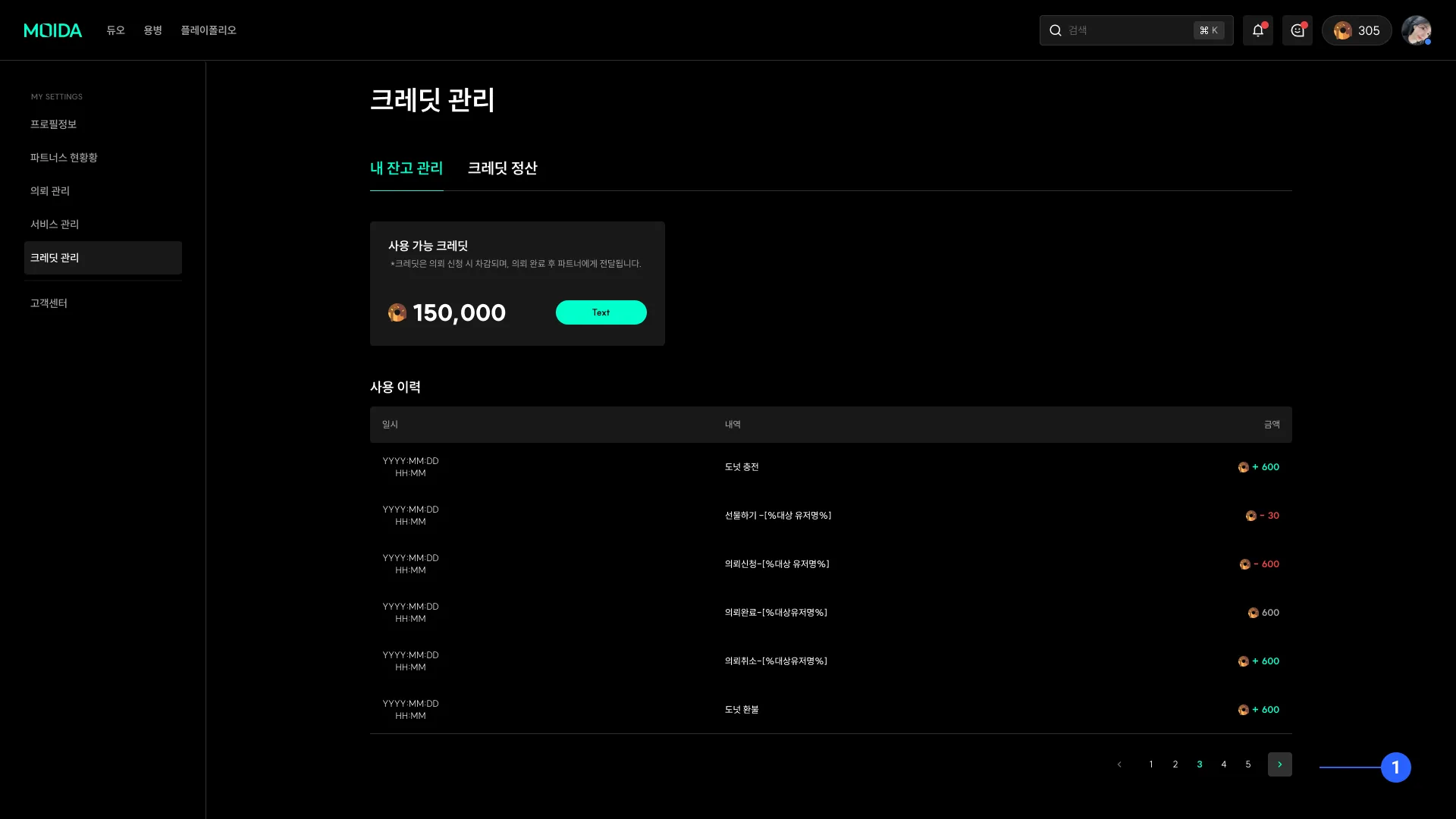
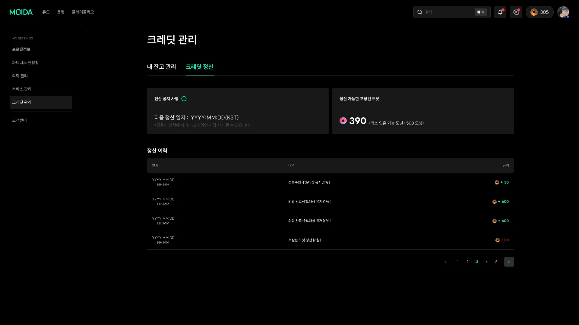
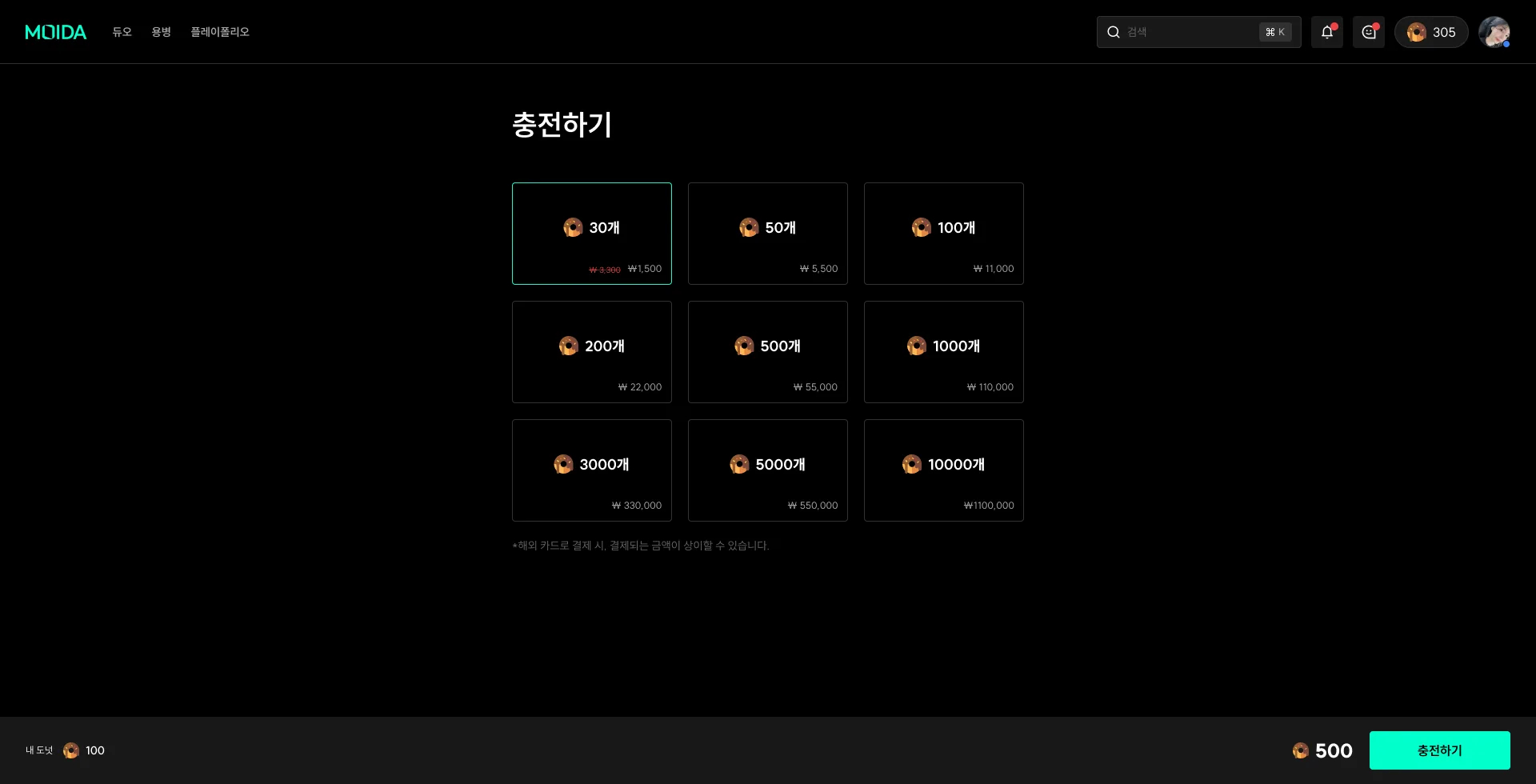
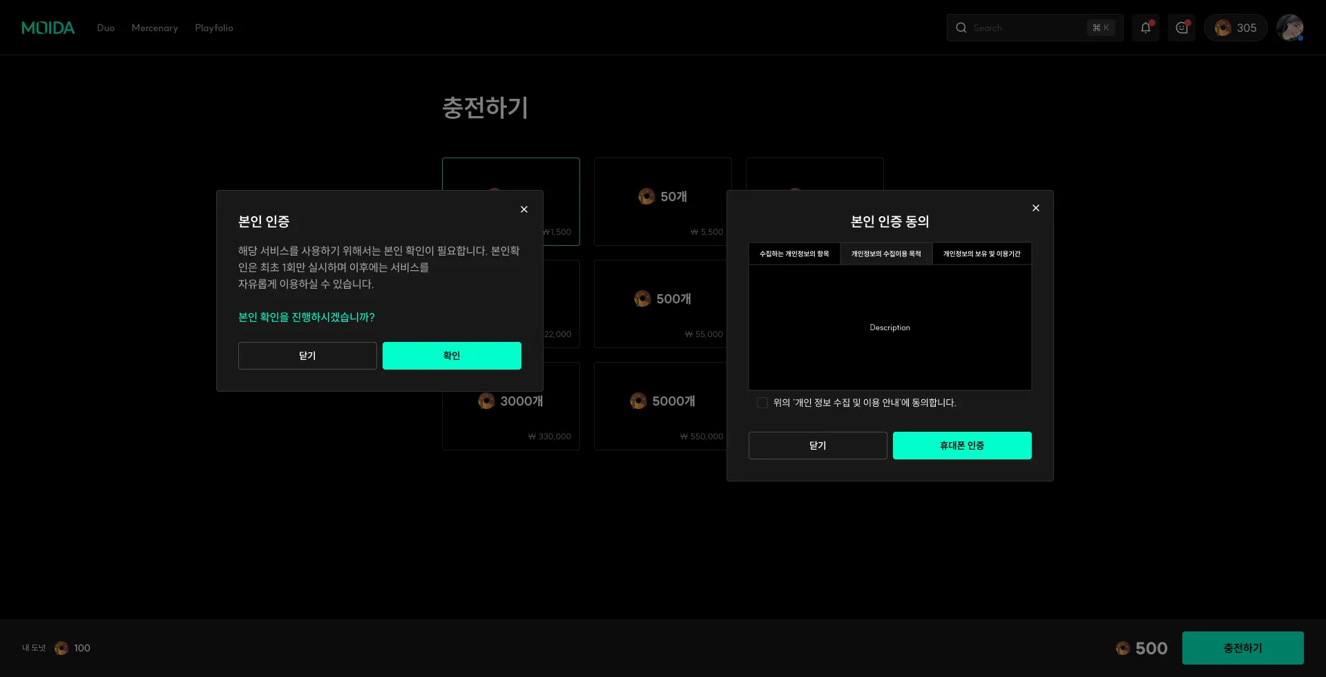
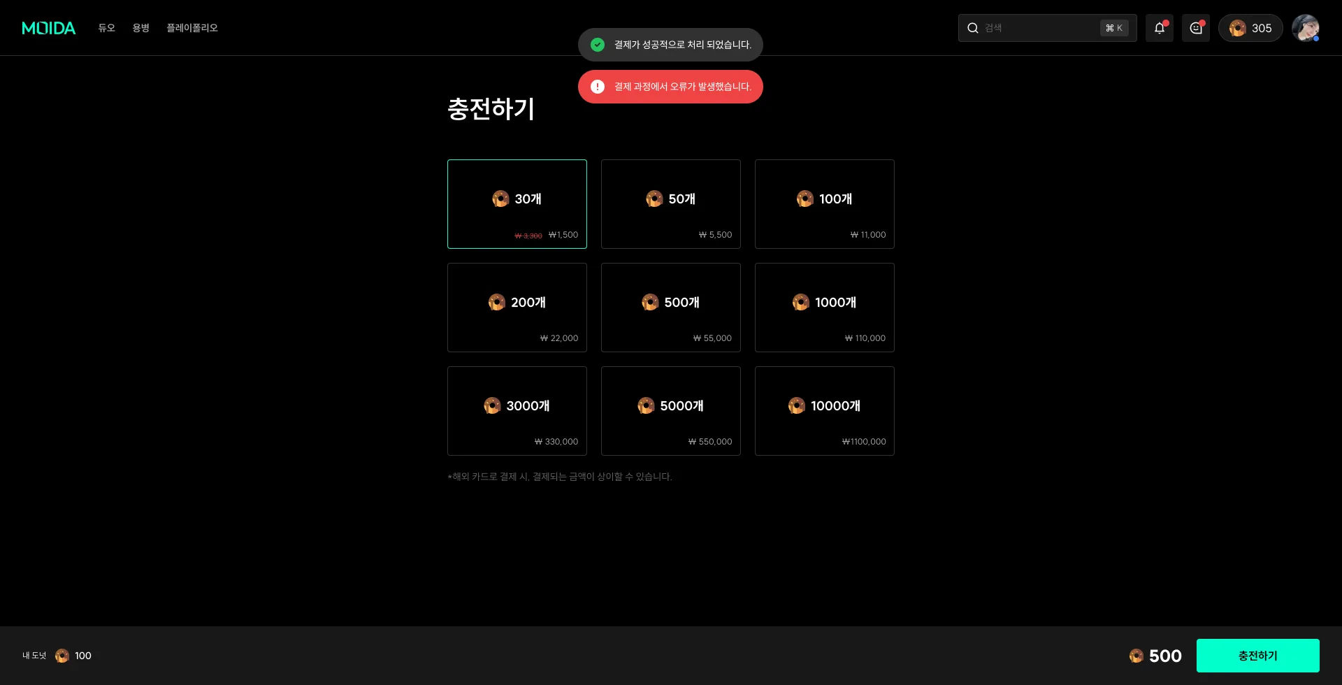
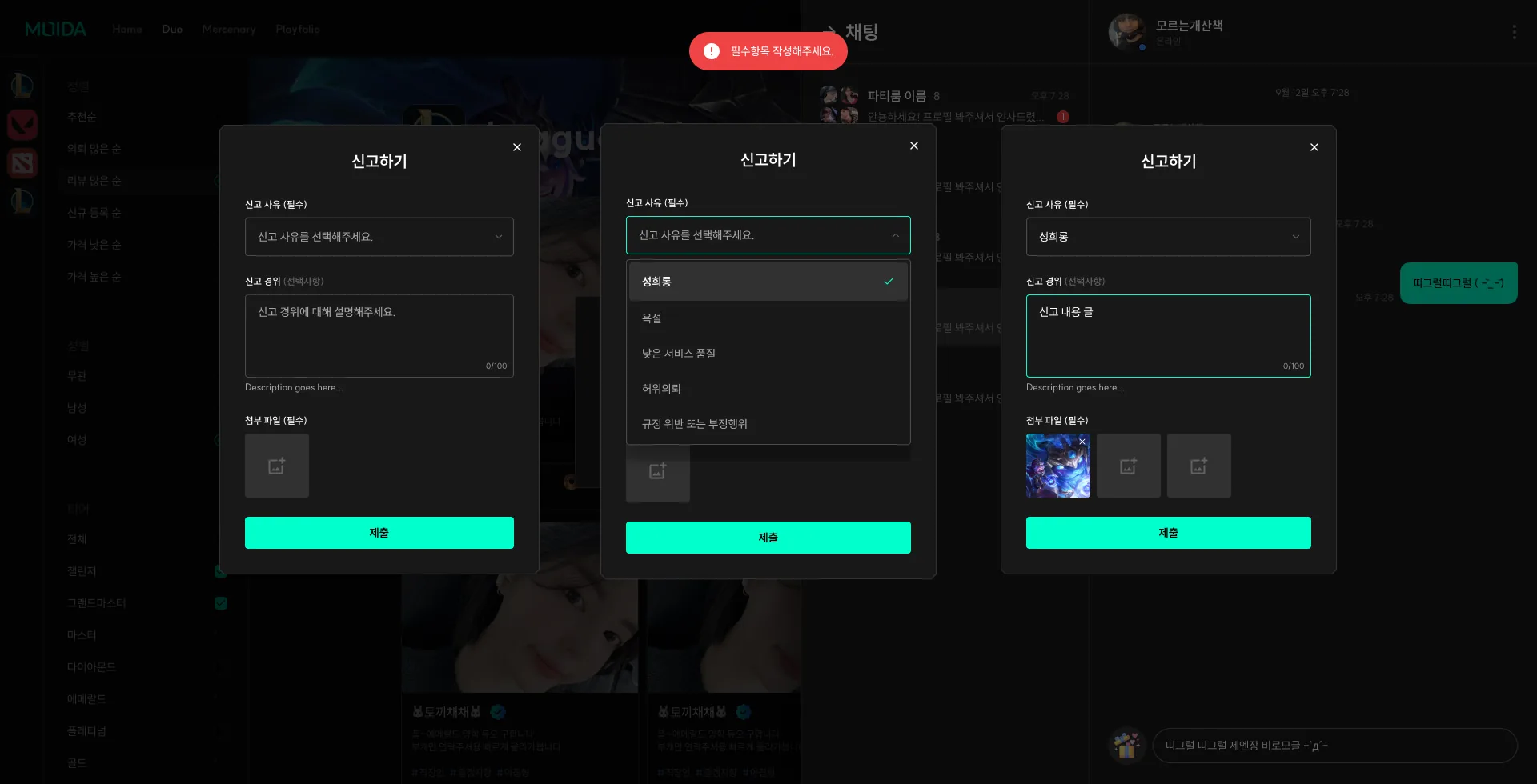
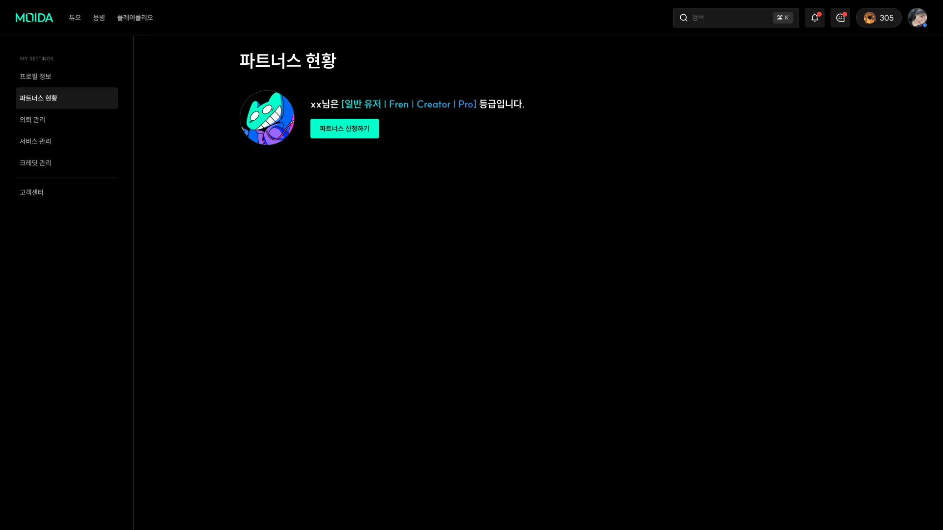
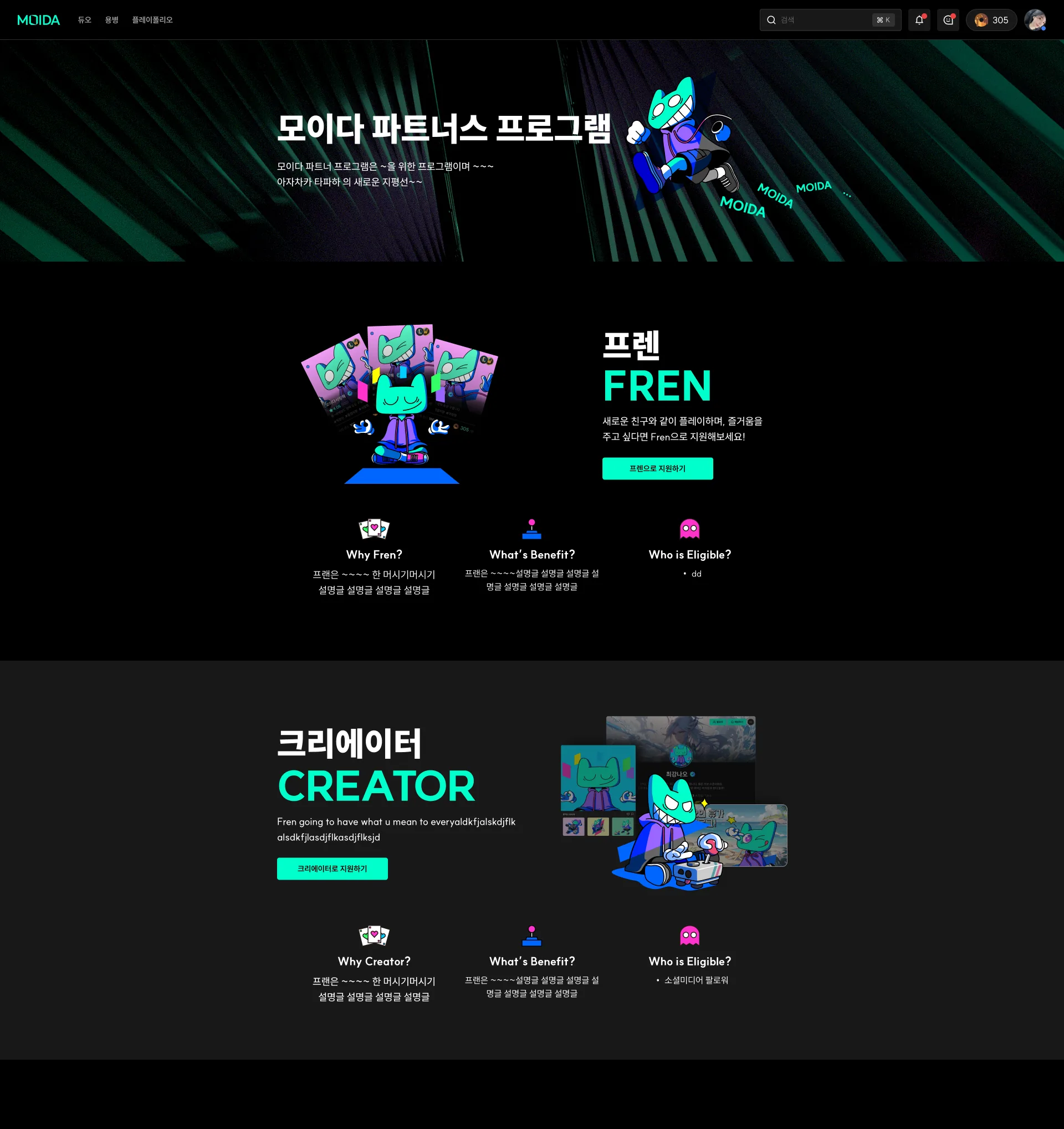
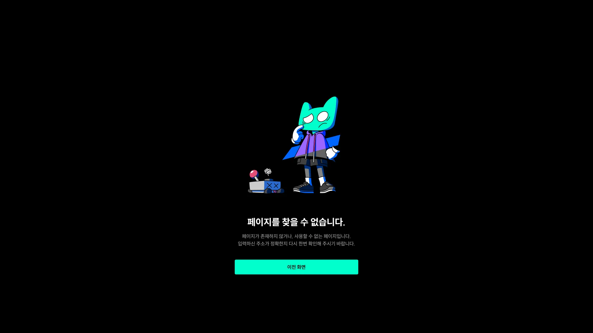
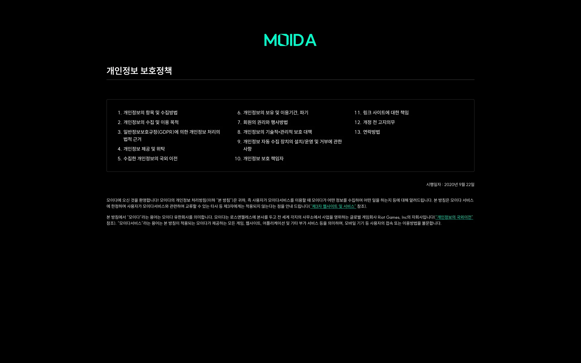
Home, signed outThe whole first page in one frame - hero and search, partner cards, open parties, the game list.Sign-up reuses NAODANot a screen but a note left in the source file: sign-up follows NAODA's flow as-is.Sign-in verification, undecidedA placeholder reading "delivery method / legal review in progress". Undecided, so nothing was drawn.Sign-up verification, undecidedThe same placeholder, repeated on the sign-up side.TermsTwo required, one optional. "Agree to all" sits on top, the items split out below.Extra detailsA nickname and four either-or preferences. Gender can't be changed later, so it asks once more before saving.Signed upOne line and one button. Nothing more is asked right after sign-up.Suspended accountShown when a sanctioned account signs in. Where to appeal is linked inside the message.Home, signed in - top bar onlyThe body was never drawn. Only the signed-in header - search, alerts, credits, profile - is here.Duo listGames and filters run down the left, partner cards fill the middle. Each card carries a rating, order count, and price per game.Duo filtersThe left rail opened out in five steps. Picking a game appends the tiers that only that game has.More gamesGames that don't fit the rail open in a modal.Place an orderA sheet slides in from the right. Change the service or the count and the totals restate themselves in place.Not enough creditsIt doesn't dead-end - it sends you to top up. The order sheet stays behind, untouched.Payment toastsSuccess and failure drawn stacked in one frame to spec the slot. Only one ever shows.Order completeConfirming hands the payment to the partner, so the modal says so right under the title.Mercenary listDuo is where you pick a person; this is where you pick a party. Each card leads with seats left.Mercenary filtersBefore and after a game is chosen. Without one, match type, position, and tier drop out entirely.Post a partyTwo kinds of post - joining or recruiting - each drawn before and after a game is picked.Party detail, visitorConditions above, the seat grid below. Someone who hasn't joined sees only Join and Invite.Ask to joinThe note to the host is capped at 25 characters. The over-limit state sits right beside it.Party detail, joinedJoin becomes Leave and my card is marked Me. With no reviews yet the rating reads 1.00.Party detail, hostEnd, Invite, and Manage requests appear. One seat is deliberately drawn as a failed load.Manage requestsApplicants and their one-liners in a table, accept and decline on the right. It paginates.Requests waitingA red count rides on Manage requests - the one place a host sees a backlog without opening it.Party endedWaiting turns to finished and the buttons go dead. Seats that never filled stay as empty cards.Playfolio, someone elseCover, bio, Follow and Chat. Report and Block live under the three dots.Not a member yetThe match record shows while the profile stays blurred - the game history exists before the account does.The same, signed inSign up gives way to Copy profile link - the visitor becomes someone who can invite.My profile, entering editEdit profile floats over the cover. Button studies are still parked at the bottom.My profile, editingThe 200-character bio and the preference toggles open in place. The avatar splits into view and replace.Avatar, full sizeThe original, shown as-is. Nothing cropped, nothing overlaid.My info, still emptyTwo empty slots side by side - link an account, or write it yourself.Someone else, no historyNo prompt in the empty state. It's not your profile, so there's nothing to ask of you.History, League linkedRank, the last twenty games, and commendations as one block. The icon states before and after linking sit off to the right.History, ValorantThe same block with Valorant in it. The cover follows the game, so the whole screen changes colour.History, TFTA placement game, not a win-loss one, so the donut gives way to a placement chart.Add and edit historyPick the game by icon, give a month and year. Ticking "still playing" kills the end date.Games with no APIGames that can't be pulled in get typed by hand, and stand in the same card as the automatic ones.Services, visitorWhat's for sale and what's open on top, reviews below, the sponsor and gift rankings down the right.Services, ownerOrder becomes Manage services, and every comment grows a three-dot menu.Manage servicesHiding the profile comes first, with a note that no new orders arrive while it's hidden.Reviews and commentsPaid reviews and free comments split into two tabs. Only the reviews carry an order count.Writing a reviewA star rating and up to three tags. Comments pick a game first; deleting asks once more.Search, openedIt lays over the page. The no-recent-searches state is drawn at two widths.ResultsMOIDA users and in-game nicknames are counted separately - one query, two things to find.No resultsIt reads the typed term back to you.Too short, and loadingUnder two characters it stops with a red line; past that, a skeleton holds the space.NotificationsA line at the top says only seven days are kept. Follows, orders, sanctions, gifts, and notices share one stream.Nothing newThe seven-day line stays, so empty isn't mistaken for expired.Party chatThe list and the thread stack on the right edge. In a party room the host also gets Kick.One to oneTapping a name opens a small profile that branches straight into chat, gift, or report.Orders inside chatRequests, cancellations, and arrivals appear as system bubbles, worded differently for each side.No conversationsOnly the list panel stays; the thread panel folds away. No fake rows in an empty list.After the party endsPast messages stay, only the input closes - with the reason written right above it.Picking a giftA drawer rises over the thread: twelve priced items, with your own balance below them.Gifting in a partyThe same drawer, plus one more line: choose who receives it first.After a giftArrivals and sends stay as yellow bubbles; a group gift adds a link to see who got one.Account drawerBalance on top, five settings in the middle, and Apply as a partner set apart at the bottom.Settings, profileA six-item rail on the left. Each locked field says outright that it can't be changed.Identity checkWhat's collected, why, and for how long - split into tabs, then on to phone verification.Leaving 1 - whySeven reasons, multi-select. The text box only wakes up when Other is ticked.Leaving 2 - what goesFour blocks on what's erased and what isn't. Over ₩1,000 of unspent balance blocks the exit.Leaving 3 - doneOne line and a way home. No last-minute hold.Orders I placedDuos ordered and parties joined, in two tables. The right-hand button follows the state.Orders I receivedThe same table from the partner's side. Only the pending row gets accept and decline.Usage and reviewEach use listed by time, with the review written from that row. The empty case sits beside it.Cancel a requestOne confirmation, because it can't be undone.Credits, my balanceTop-ups, gifts, orders, and refunds share one ledger. Only what leaves is written in red.Credits, payoutThe partner's side. The next payout date and the minimum sit right next to the number.Top upNine bundles in a grid, with the chosen amount and the button pinned to the bottom of the screen.Verify before payingIt says up front that this is asked only once, then hands off to the consent sheet.Payment resultSuccess and failure stacked over the top-up page - the frame specs the slot, not the moment.ReportFive reasons to choose from and a required attachment. Skip one and a red toast drops from the top.Partner statusOne line for the current tier and a button to apply. Four tiers: user, Fren, Creator, Pro.Partner programmeFren and Creator explained side by side on one page, each with its own apply button. Why, what, and who, twice over.Not foundThe mascot, and one way back to the previous screen. It doesn't shove you home.Privacy policyThirteen clauses laid out in three columns up front, with the text flowing underneath.