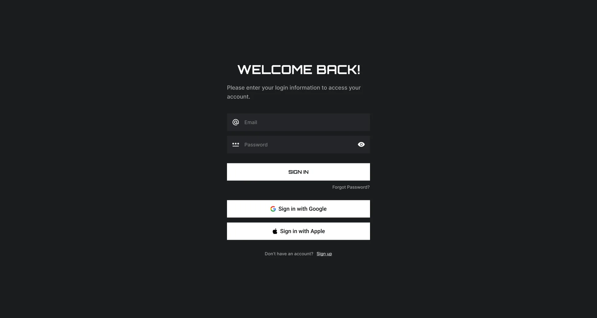
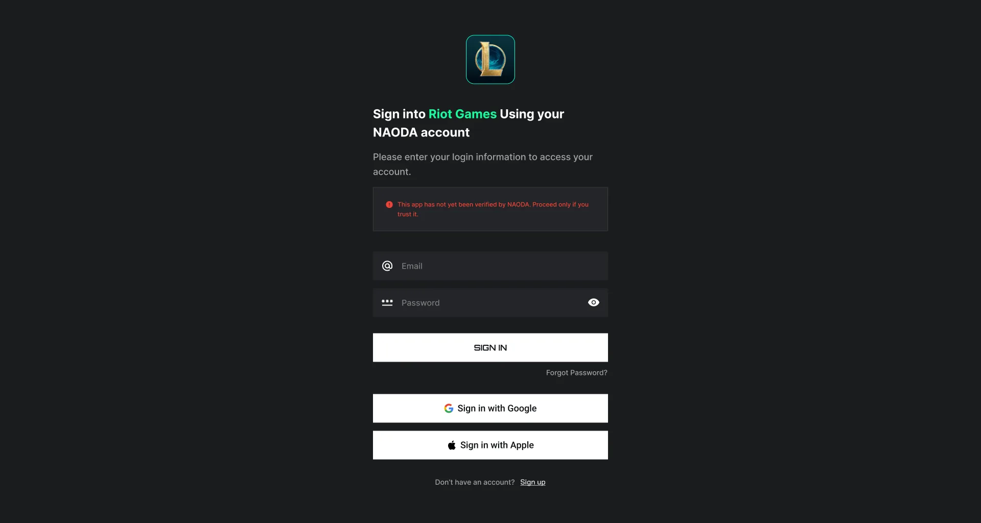
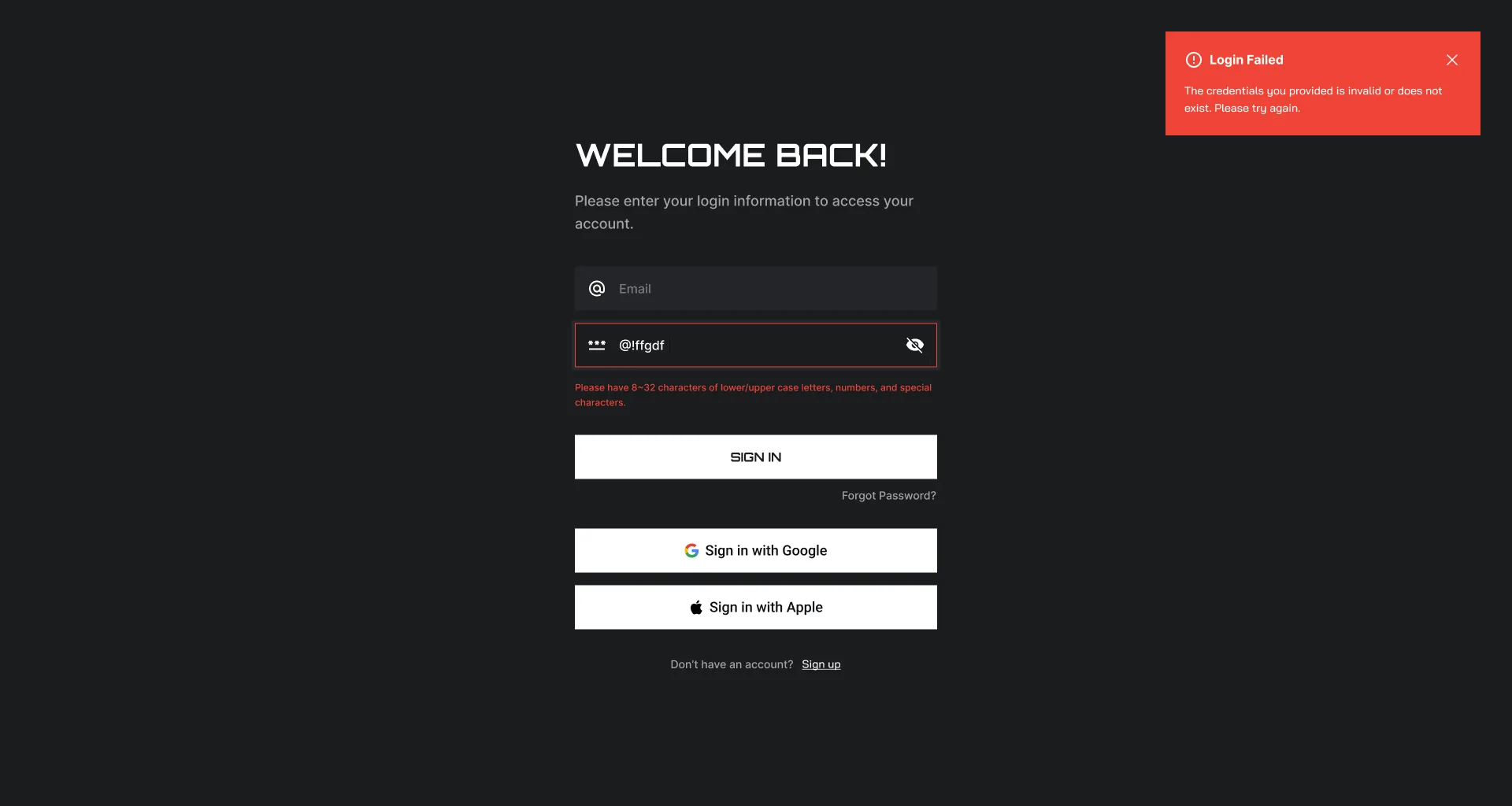
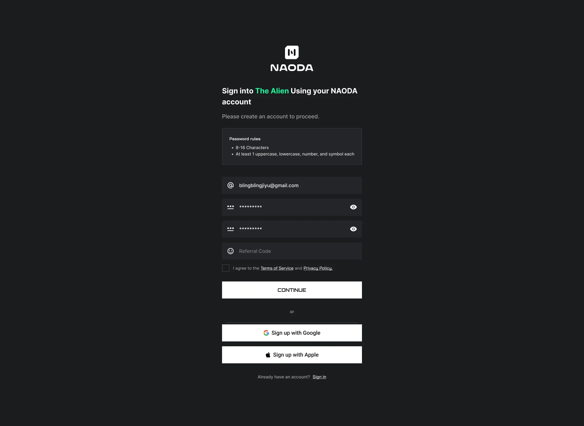
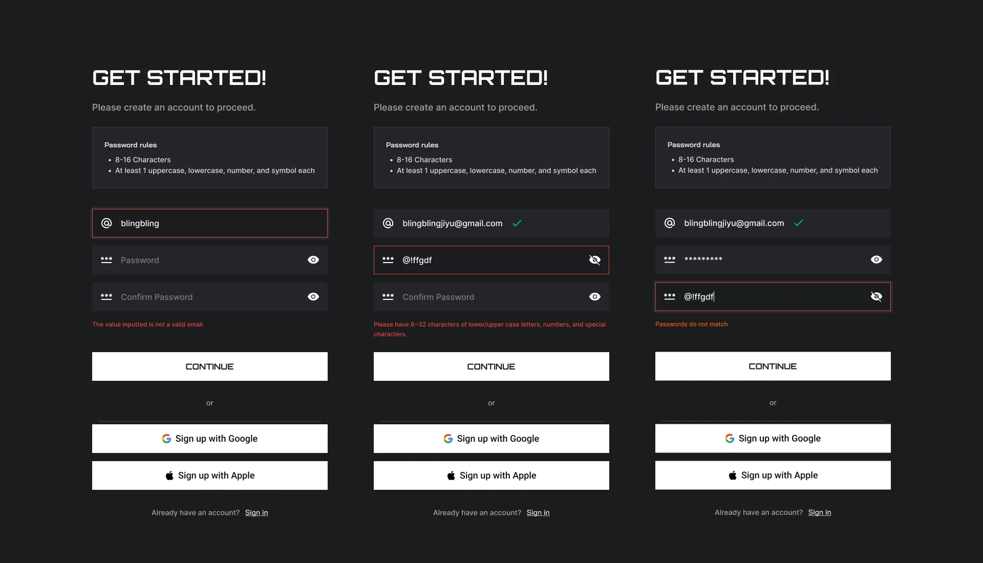
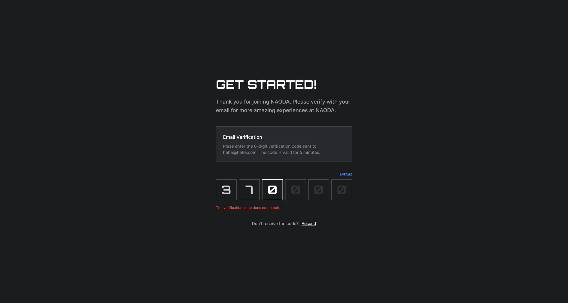
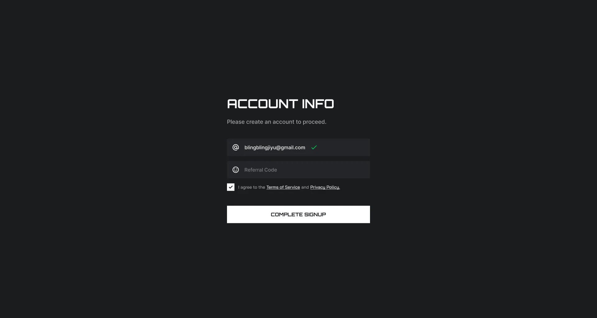
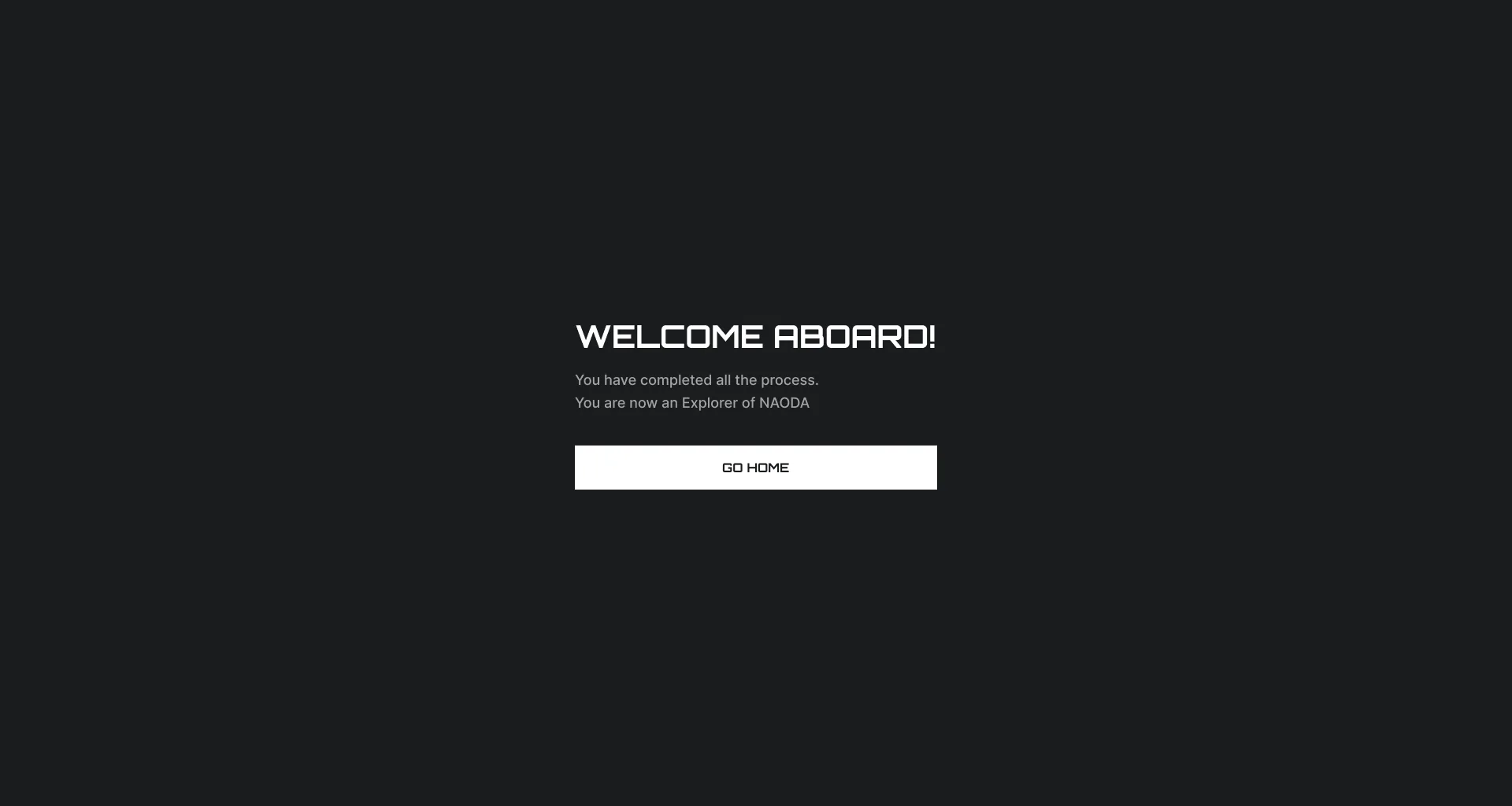
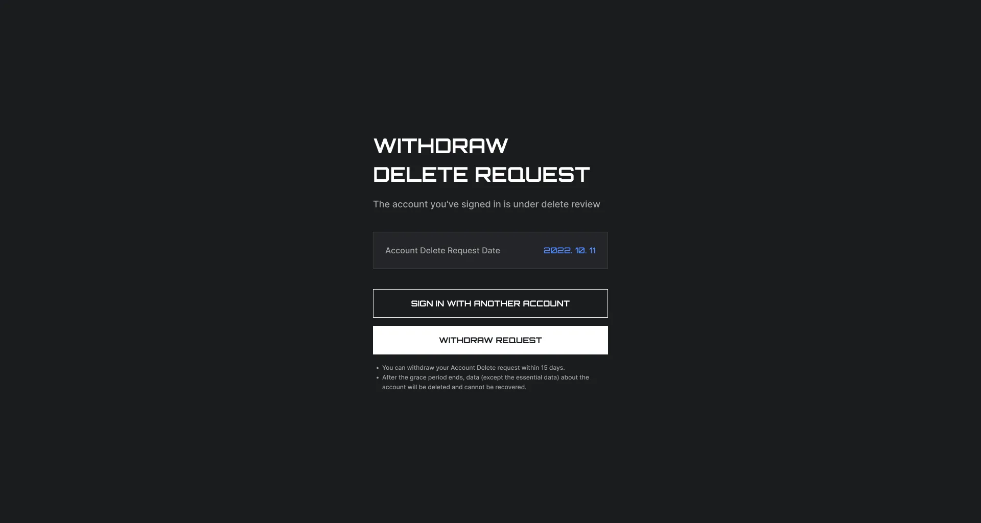
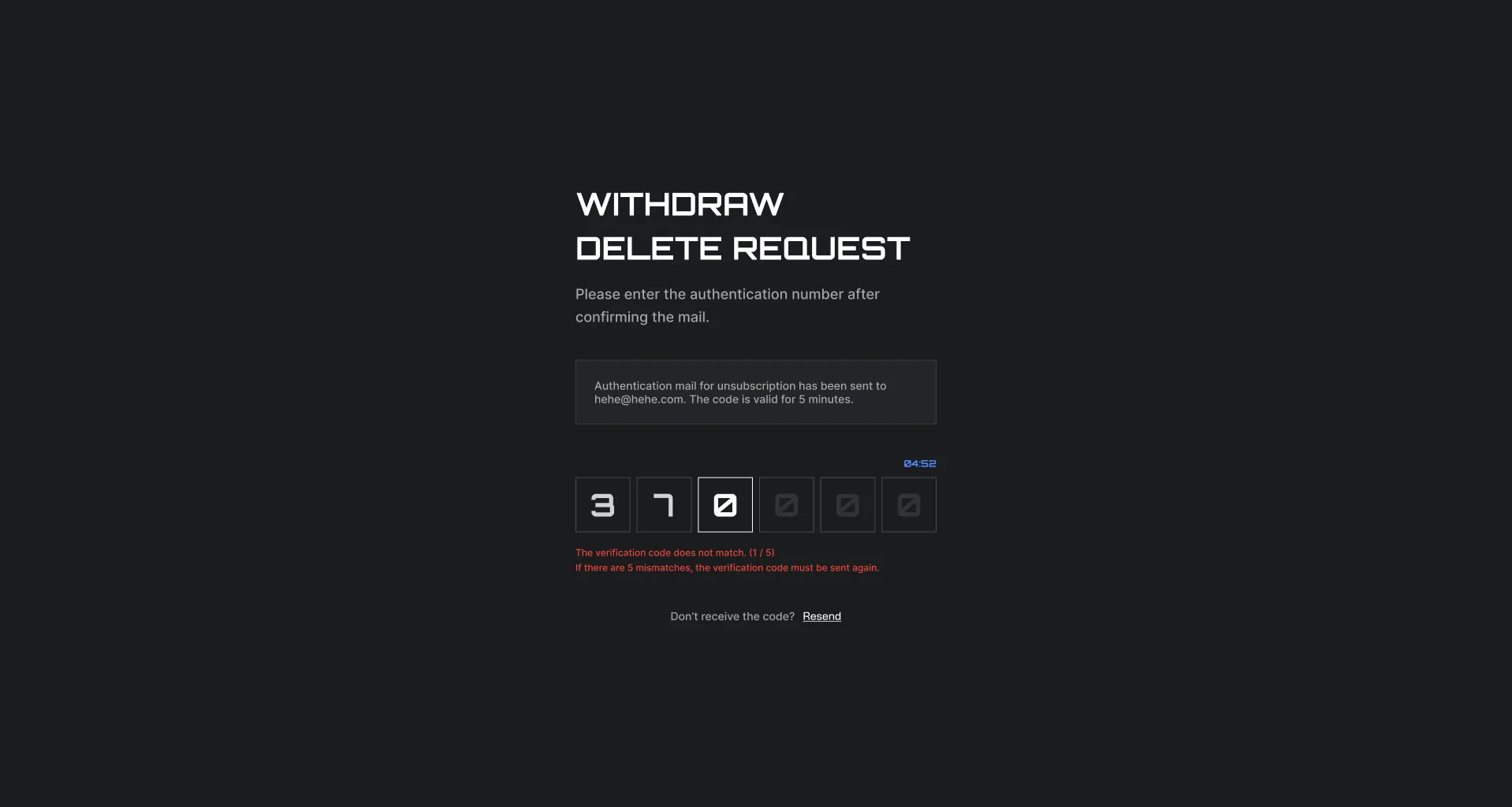
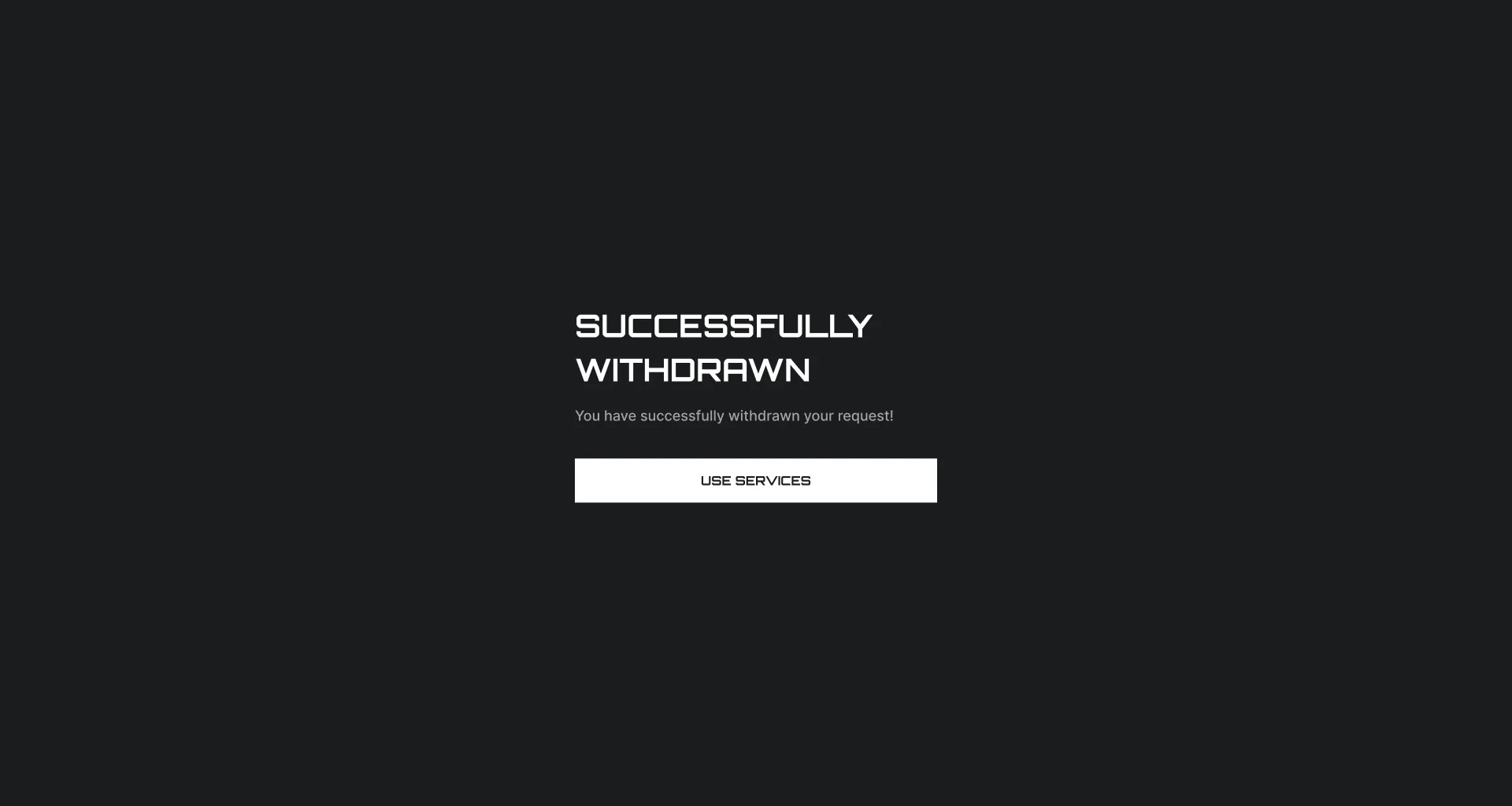
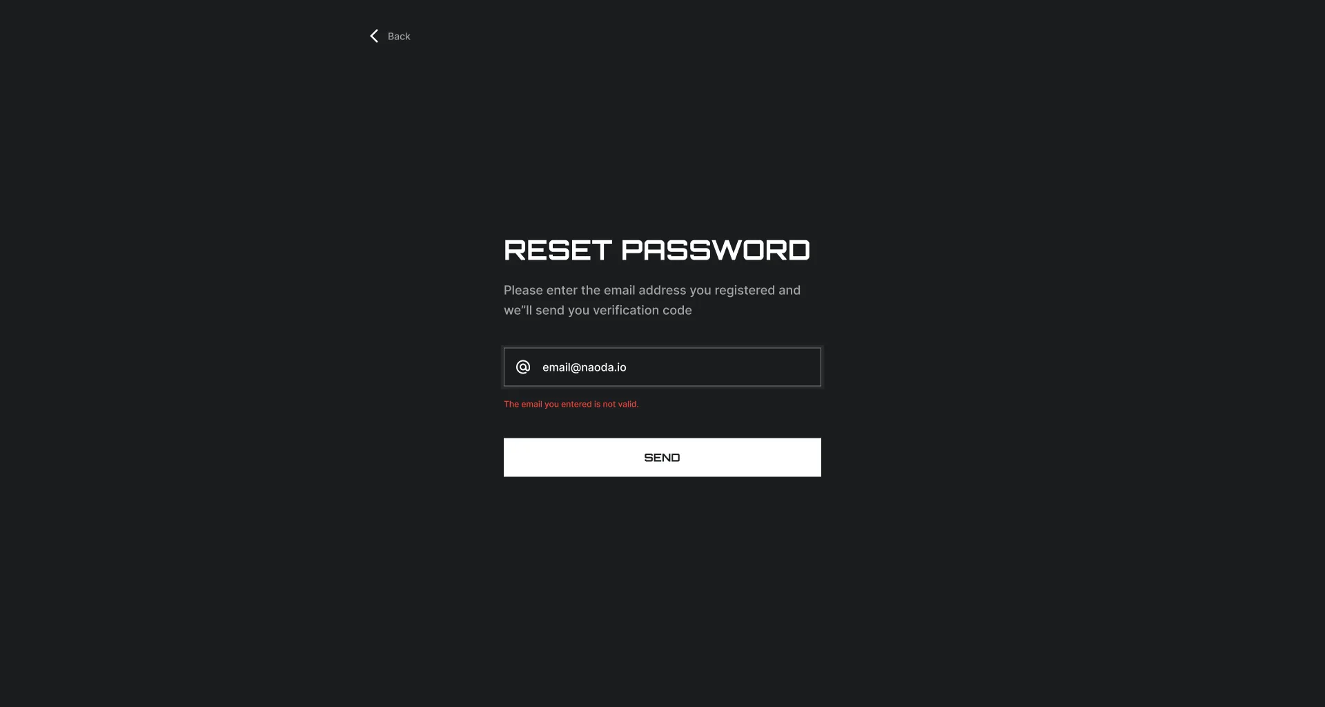
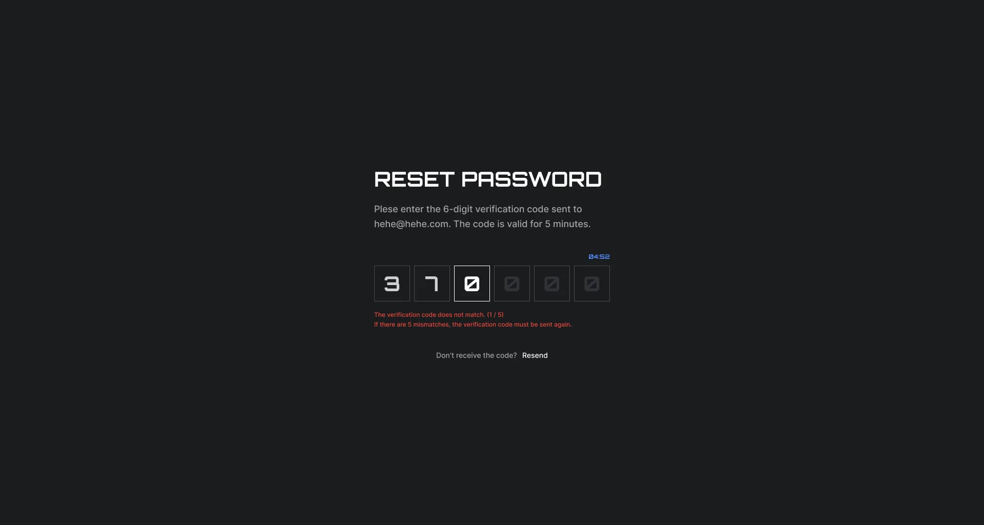
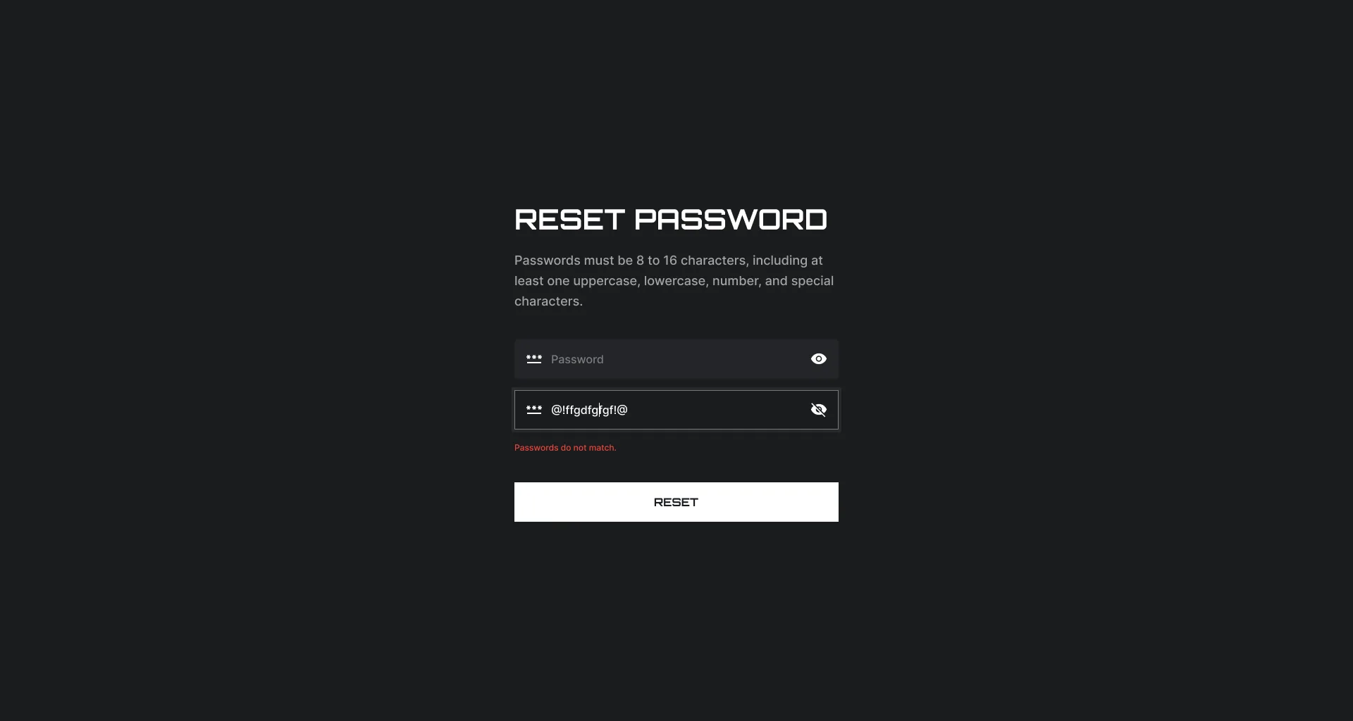
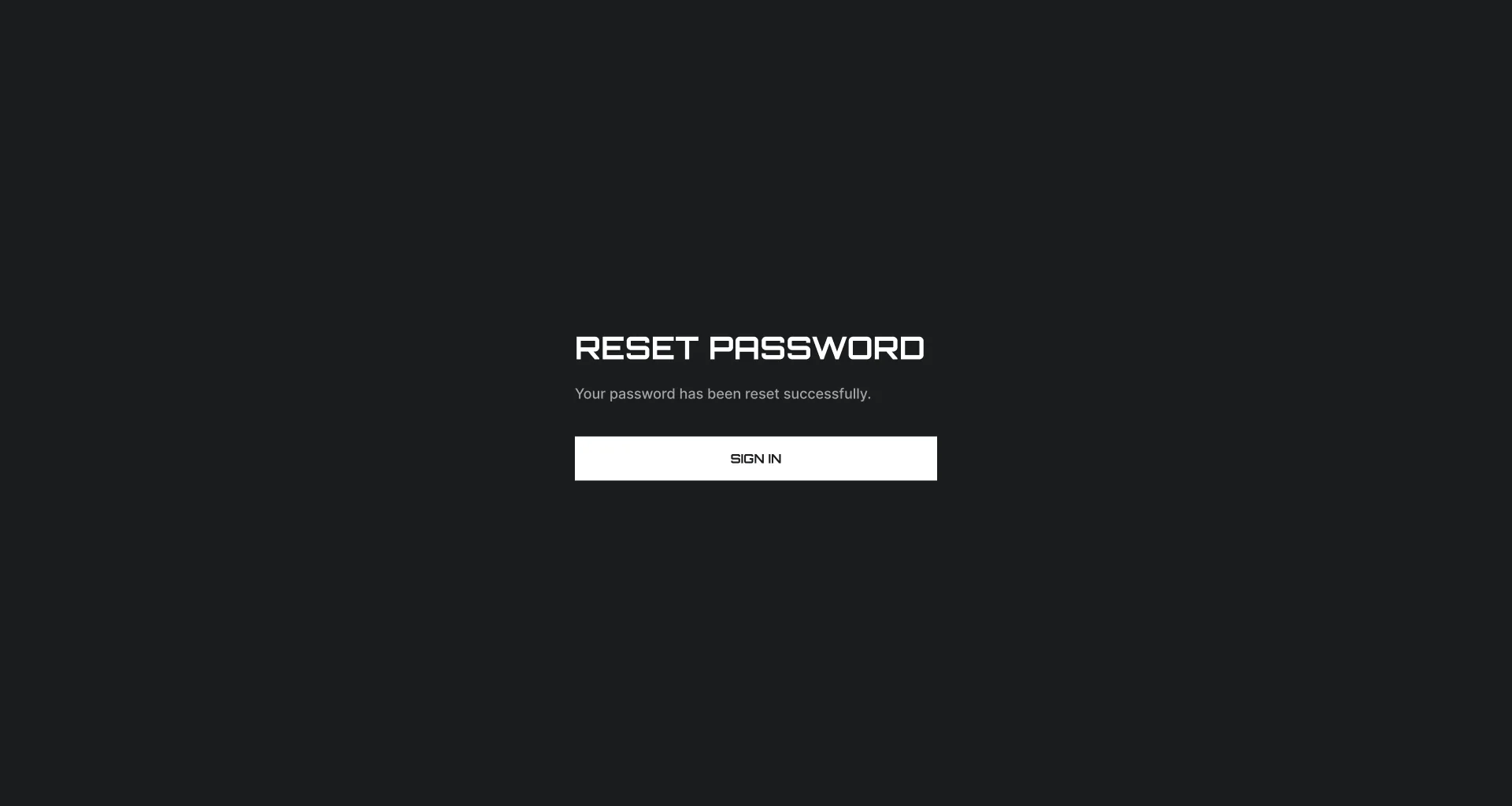
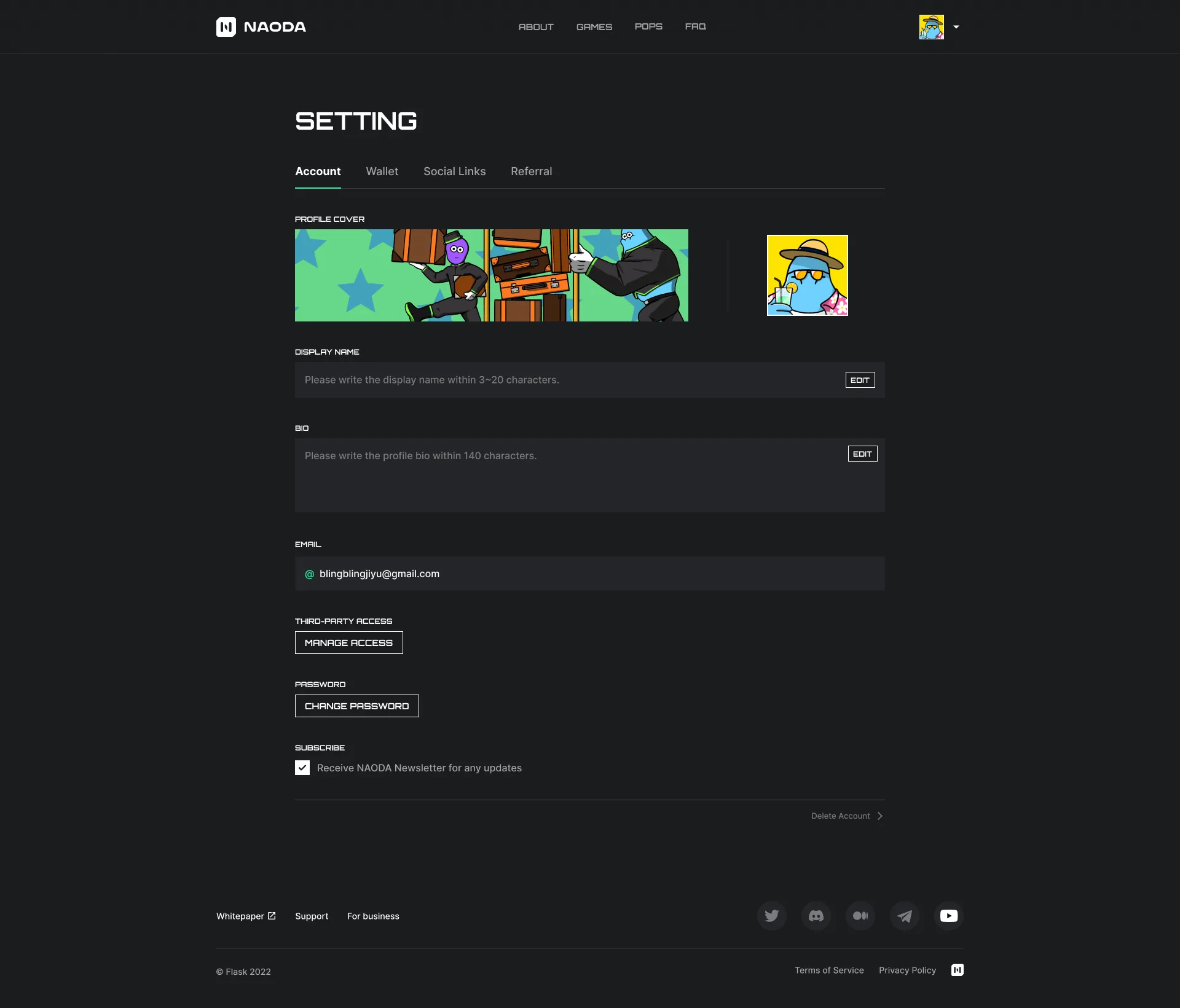
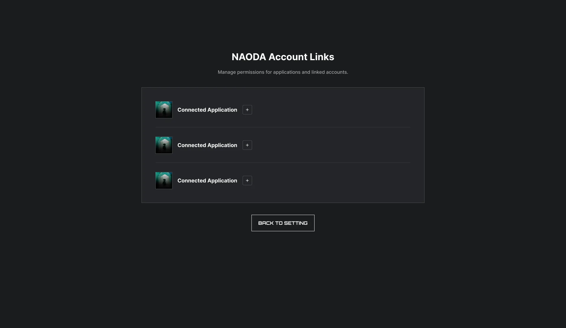
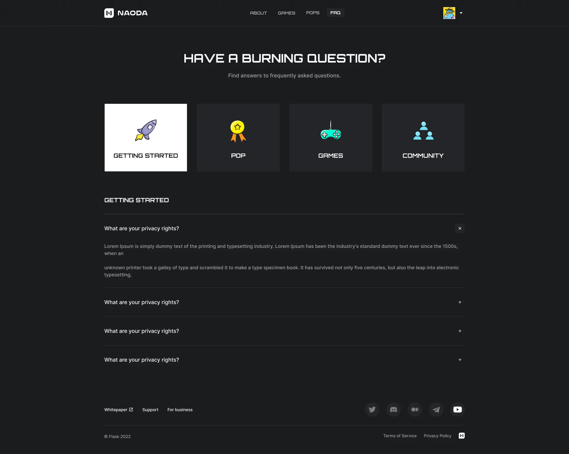
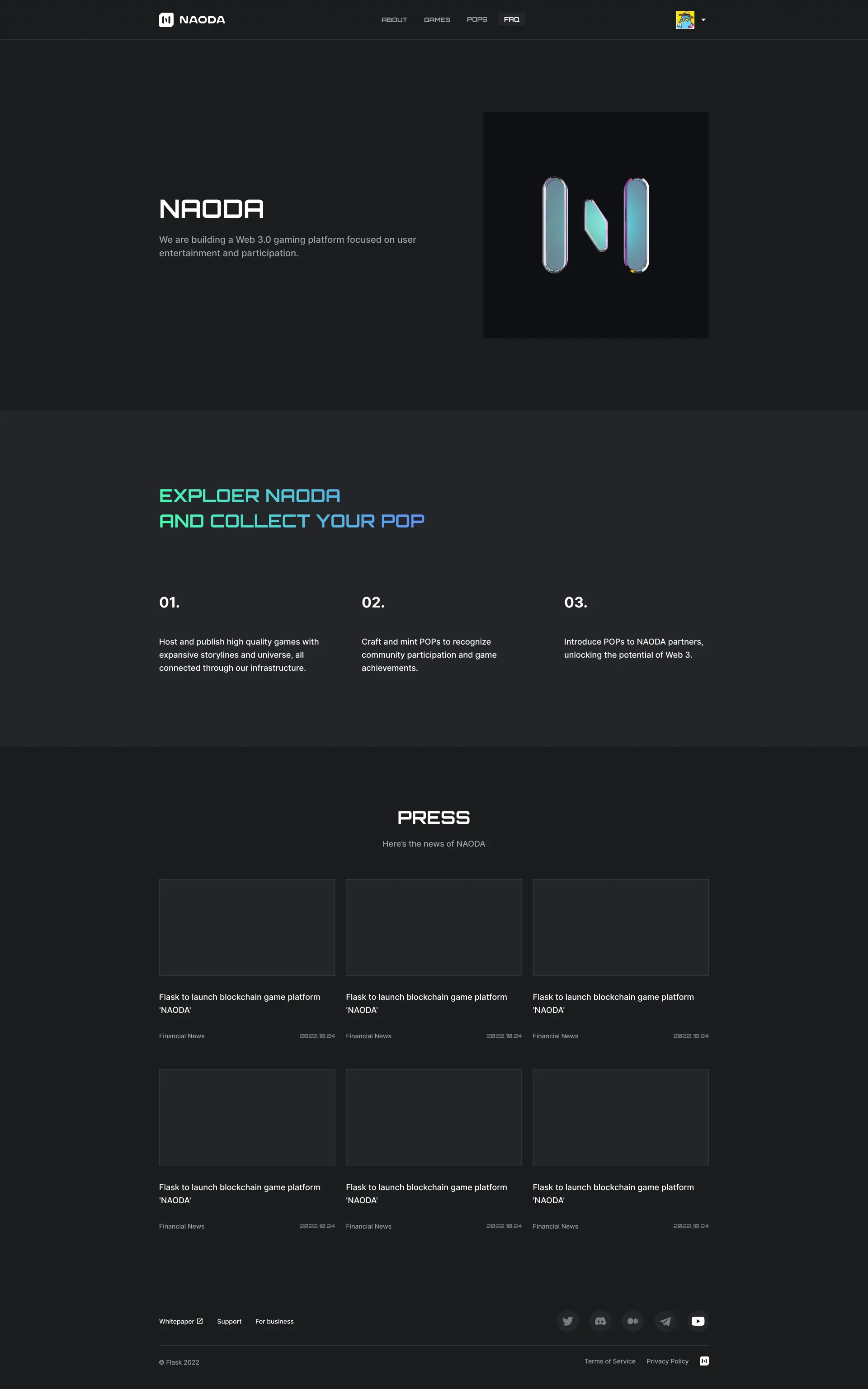
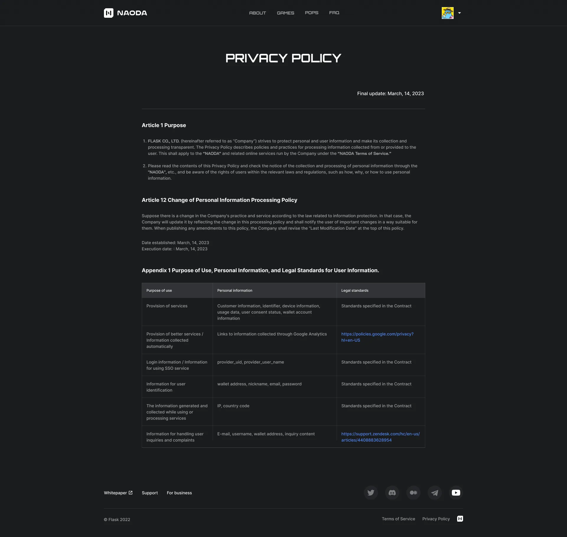
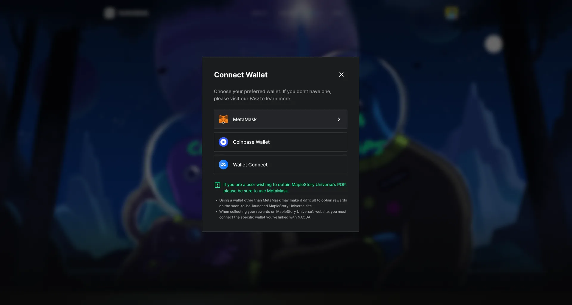
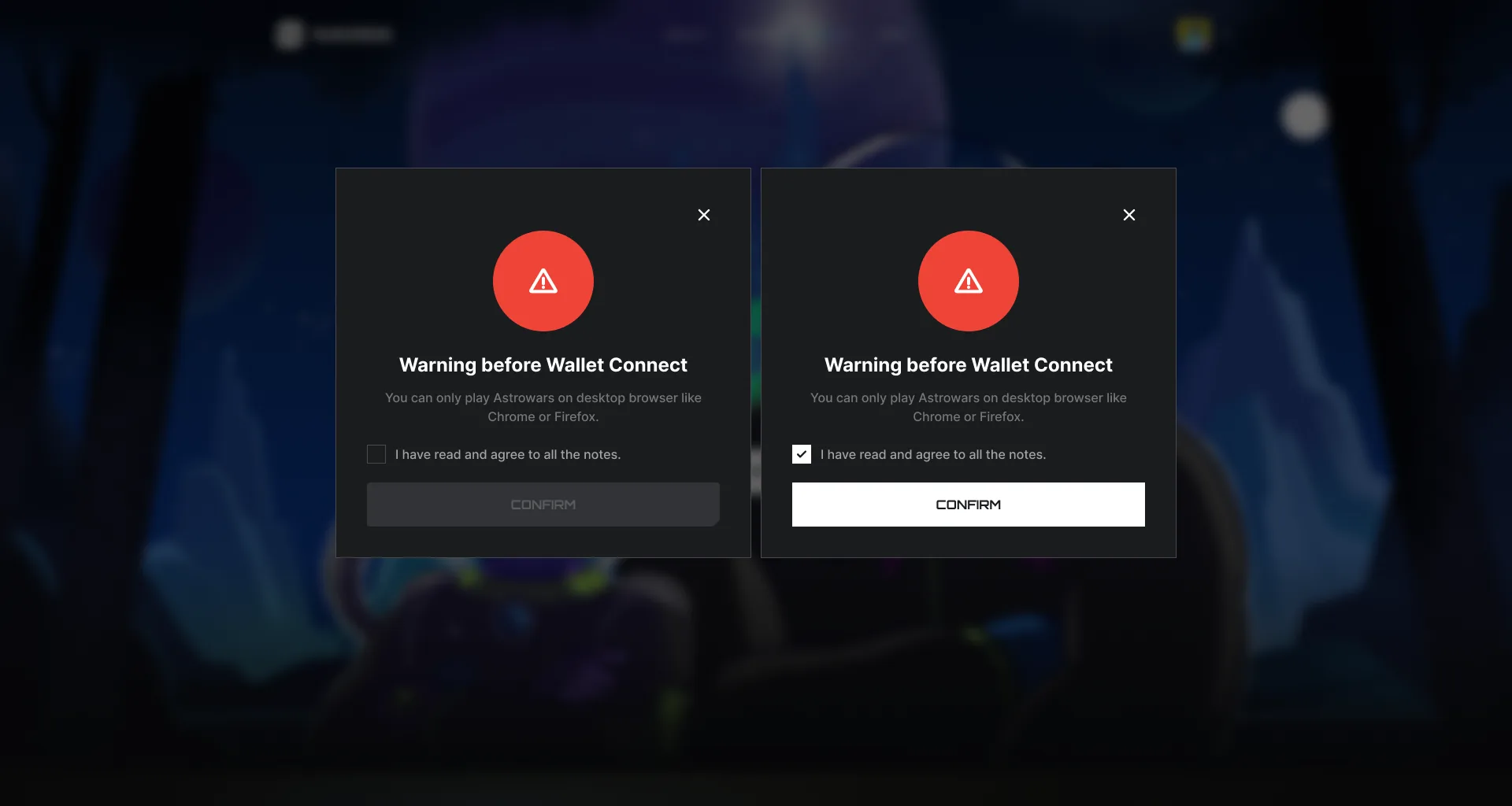
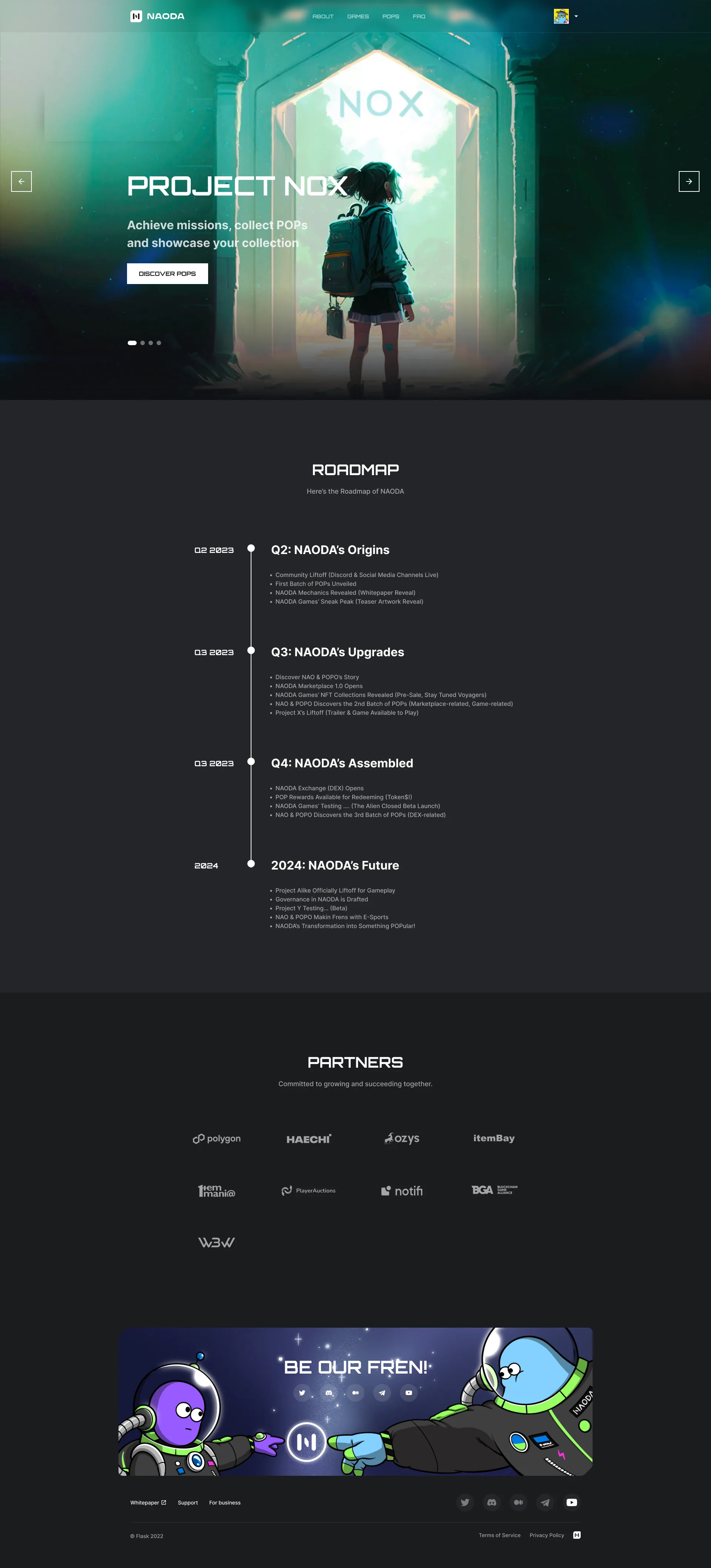
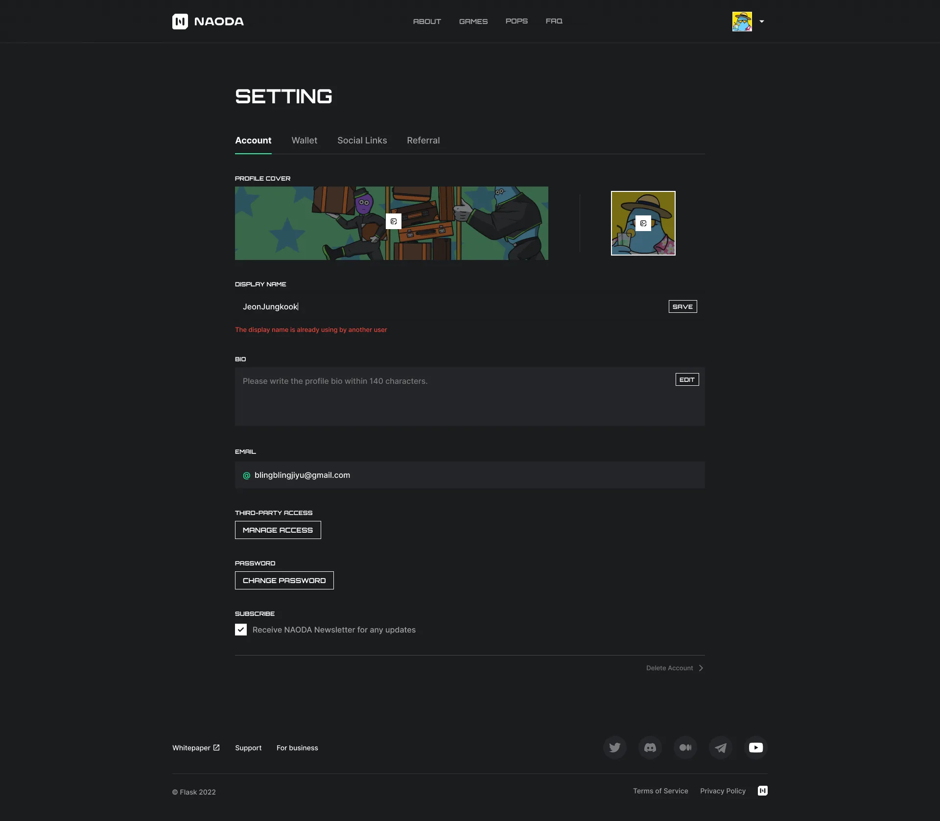
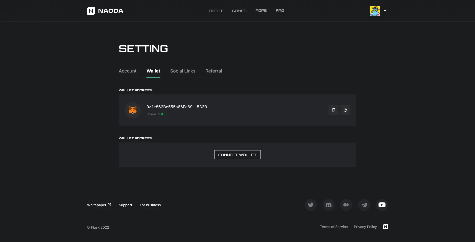
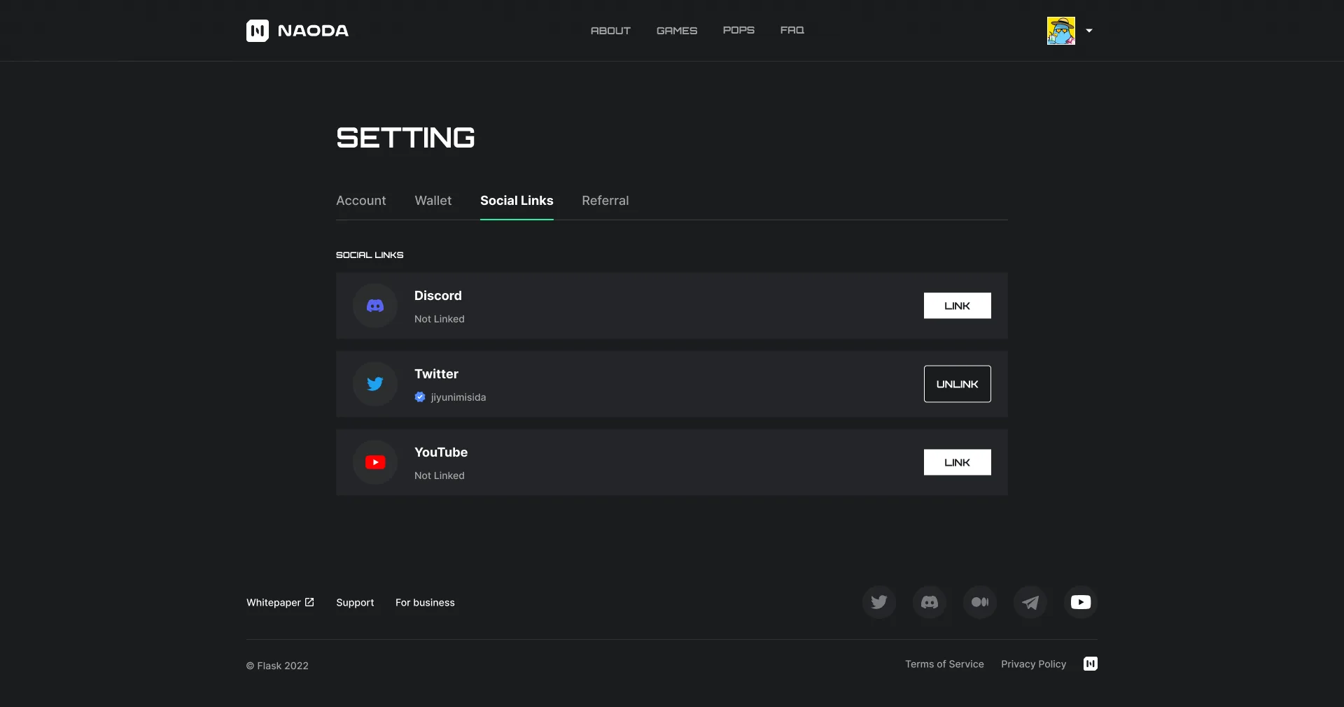
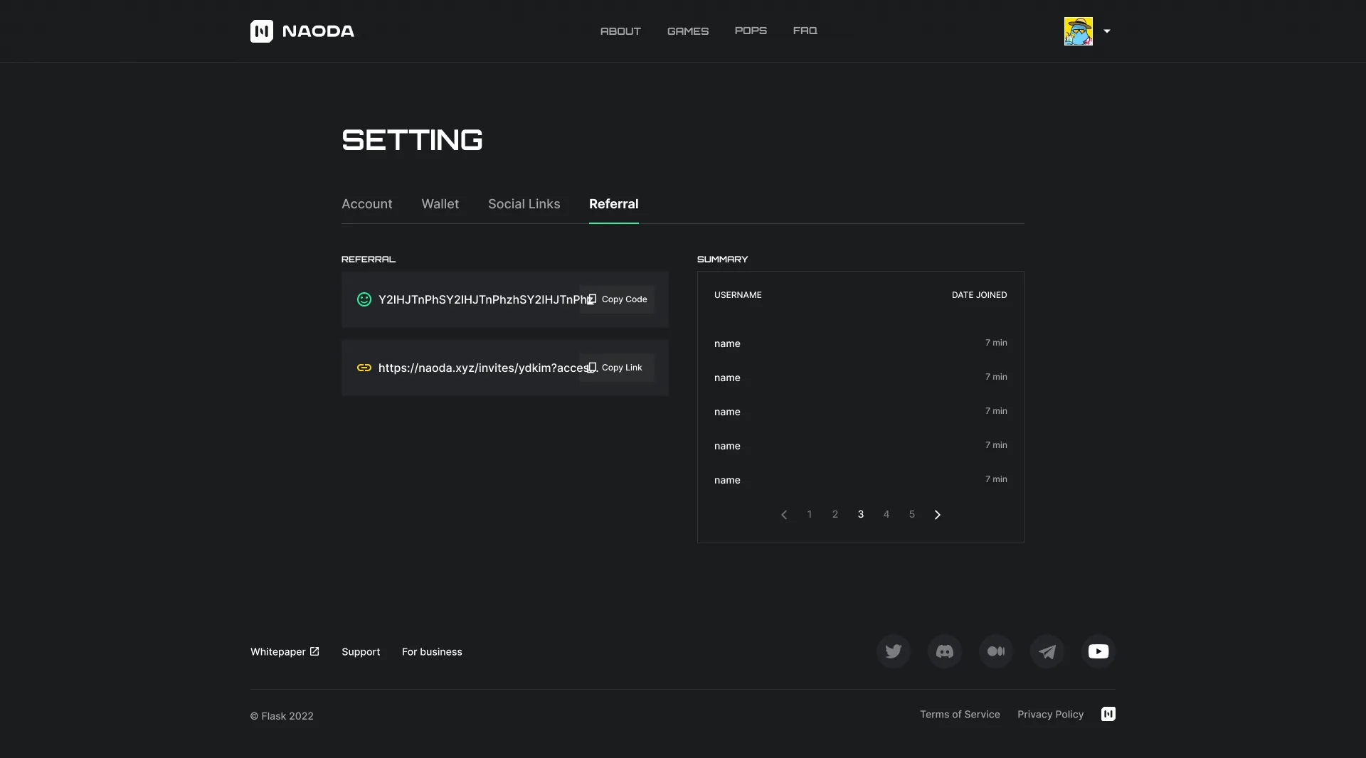
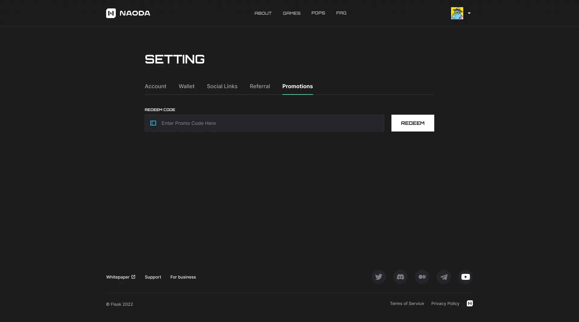
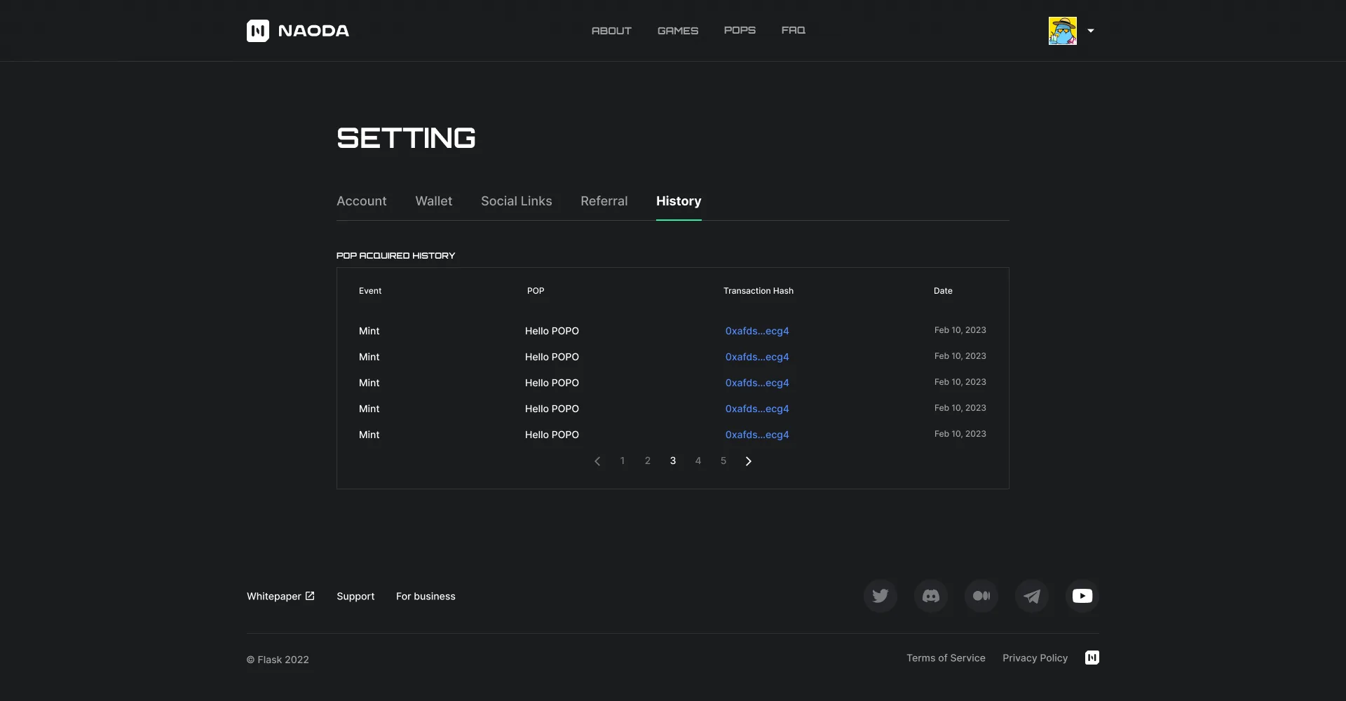
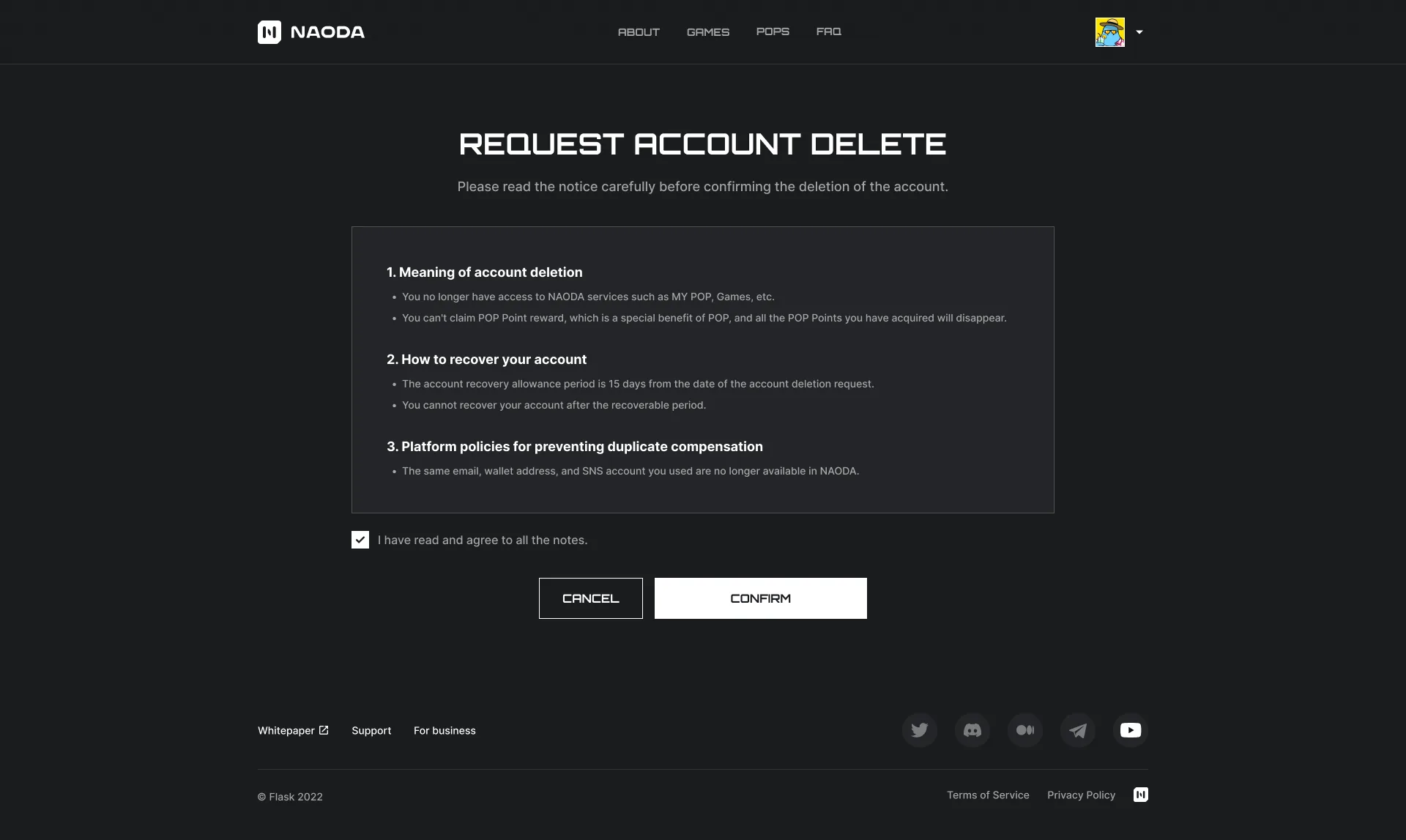
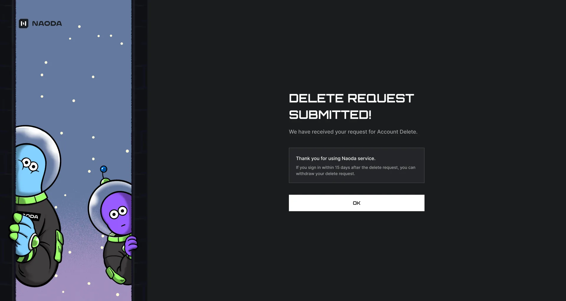
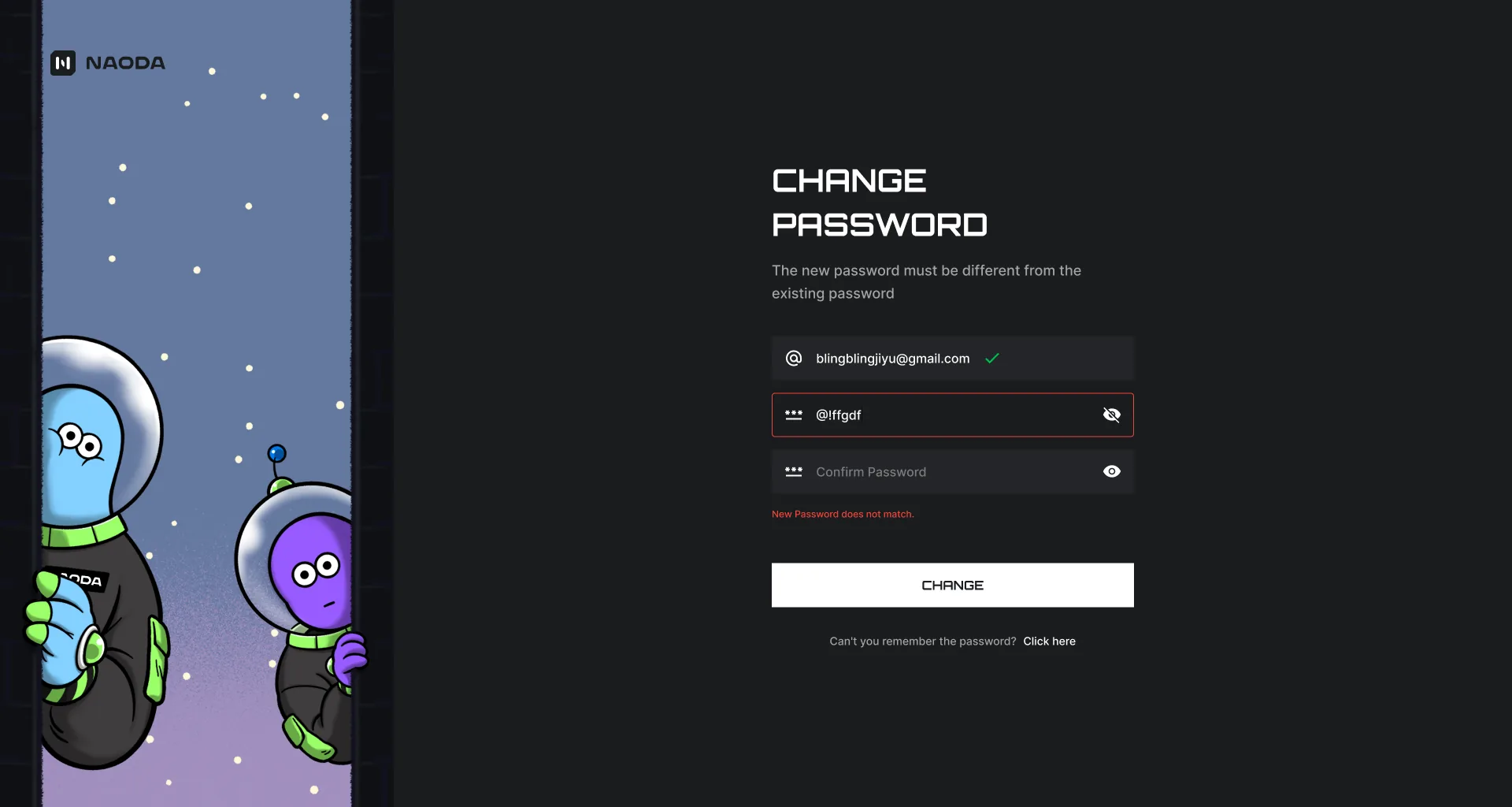
Sign inEmail and password up top, Google and Apple below. Only one button is filled on the dark ground, so the next step is never in question.Signing into another serviceWhere a NAODA account opens someone else's app. The app's icon and name head the page, and if the app is not verified yet, that warning lands above the fields - not after them.Sign-in failedWhat is malformed and what actually happened are told in two different places: the rule sits under the field, the rejection arrives as a notice in the top corner.Create an accountThe password rules are shown as a card before anything is typed. Email, password, confirmation, referral code and consent all stack into one screen.Consent to shareIt spells out what crosses over: the sign-in credentials do not, a numeric identifier does, and that is how the app recognises the account.Three ways signup failsMalformed email, weak password, mismatched confirmation - laid side by side in one frame. In all three, only the offending field is outlined; the rest stay untouched.Email code checkSix boxes with a five-minute timer beside them, and a mismatch is written under the row. The file is named for the step; what is drawn is the failed state.Finishing a social signupArriving through Google or Apple, the address is already verified, so only the referral code and consent remain. Everything already settled is dropped from the form.Signed upOne sentence that it is done, and one button. No celebration art - the screen exists to hand the person onward.Withdrawing a delete requestSigning back into an account that asked to be deleted shows the request date first. Fifteen days to take it back, and no recovery after - written under the buttons, not hidden in a policy.Confirming the withdrawalTaking it back needs a mailed code too. Five misses and the code must be reissued - the count is shown as it climbs.Request withdrawnThe account is alive again, and one button back into the service - the same skeleton as the other done screens.Reset - the addressIt takes the registered address and mails a code. A malformed one is caught under the field before sending, so nobody waits for a mail that was never going to arrive.Reset codeThe same six boxes as signup verification. Five wrong tries and the code is reissued - the tally is shown while it counts.The new passwordHere the rules sit as a sentence under the heading rather than in a card. Only the new field and its confirmation remain, and a mismatch outlines the second one.Password resetOne line that it is done, and a button to sign in - the only place it sends you, since the new password is what you now have.Settings - accountCover and avatar first, then display name, bio and address. Connected-app access and password each get their own button, and deleting the account drops to a grey link at the very bottom.Connected applicationsEvery app the account has opened, one row each, expanding to its permissions - the place that grants access and the place that takes it back are the same list.FAQFour groups as cards, the chosen one inverted to white. The accordion below opens one row at a time, and only the open row carries a close mark. The answers are still dummy text.About, full pageHero with the logo object, a three-column statement of what the place does, and a press grid - one continuous frame. Bands change brightness to mark where one section ends.Privacy policyArticles first, then a table of what is collected. Purpose, fields and basis line up in a row - the part that never gets read as prose is set as a grid.Account panel, no walletA right-hand panel over the home screen. With no wallet, the connect button holds that slot, and an over-long name is clipped rather than allowed to wrap.Account panel, wallet linkedThe same panel with the button replaced by an address chip. The address keeps only its head and tail, with copy and disconnect sitting beside it.Unsupported browserThe recommended path is the filled button, and going ahead anyway sits under it. Nothing is blocked - the recommendation is just made unambiguous.Cookie and privacy settingsThe strip at the bottom opens this panel. Each tag can be switched, the essential one stays locked, and save / deny / accept-all stand in a row.Choose a walletThree wallets as rows, with a note under them about which one a particular game's rewards require. It is a condition you need before choosing, so it sits outside the list.Warning before connecting, both statesWithout the acknowledgement ticked the confirm button is dead; ticking it brings the button to life. Both states are drawn side by side so the condition is visible, not implied.Home, end to endOpens on a game hero carousel, sets the roadmap as a quarter-by-quarter timeline, and closes on partner logos and a community banner. Only the hero is artwork; the rest is carried by type and rules.Settings - account, editingA replace icon lands on the cover and the avatar, and the display-name field opens. A name already taken is caught right under the field rather than beside the save button.Settings - walletA linked address carries its wallet mark, chain, copy and disconnect on one row, and an empty slot below shows where a second wallet would go.Settings - social linksA linked service shows its handle and an outlined button to break it; an unlinked one gets a filled Link button. The button style alone tells you which rows are connected.Settings - referralThe left column is what goes out - the code and the invite link, each with its own copy - and the right is what came back. Giving and receiving are split across the axis.Settings - promotionsOne more tab, and the page holds only a code field and a redeem button. There is no result list yet, and the space is left empty rather than filled.Settings - acquisition historyEvent, POP, transaction and date in one table, with only the hash as a link. The file is marked as a later spec - a screen parked for a subsequent phase.Requesting deletionWhat is lost, how long it can be undone, and that the same address and wallet cannot return - three blocks, and confirm only opens after the acknowledgement.Delete request submittedIt confirms receipt and leaves the way back in a card: sign in within fifteen days and the request is void. The exit screen states the return path one last time.Change passwordA two-column layout: a character band on the left, the form on the right. The condition - the new password must differ from the old - is stated under the heading, before any field.Password changedThe same two-column frame with the form taken out. One button back to settings is all that remains.