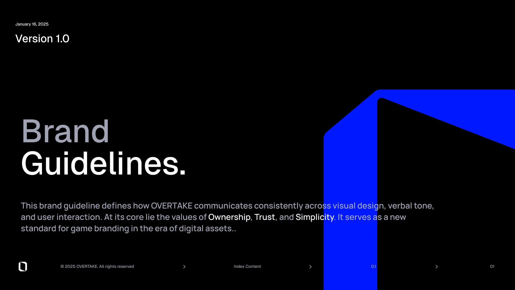
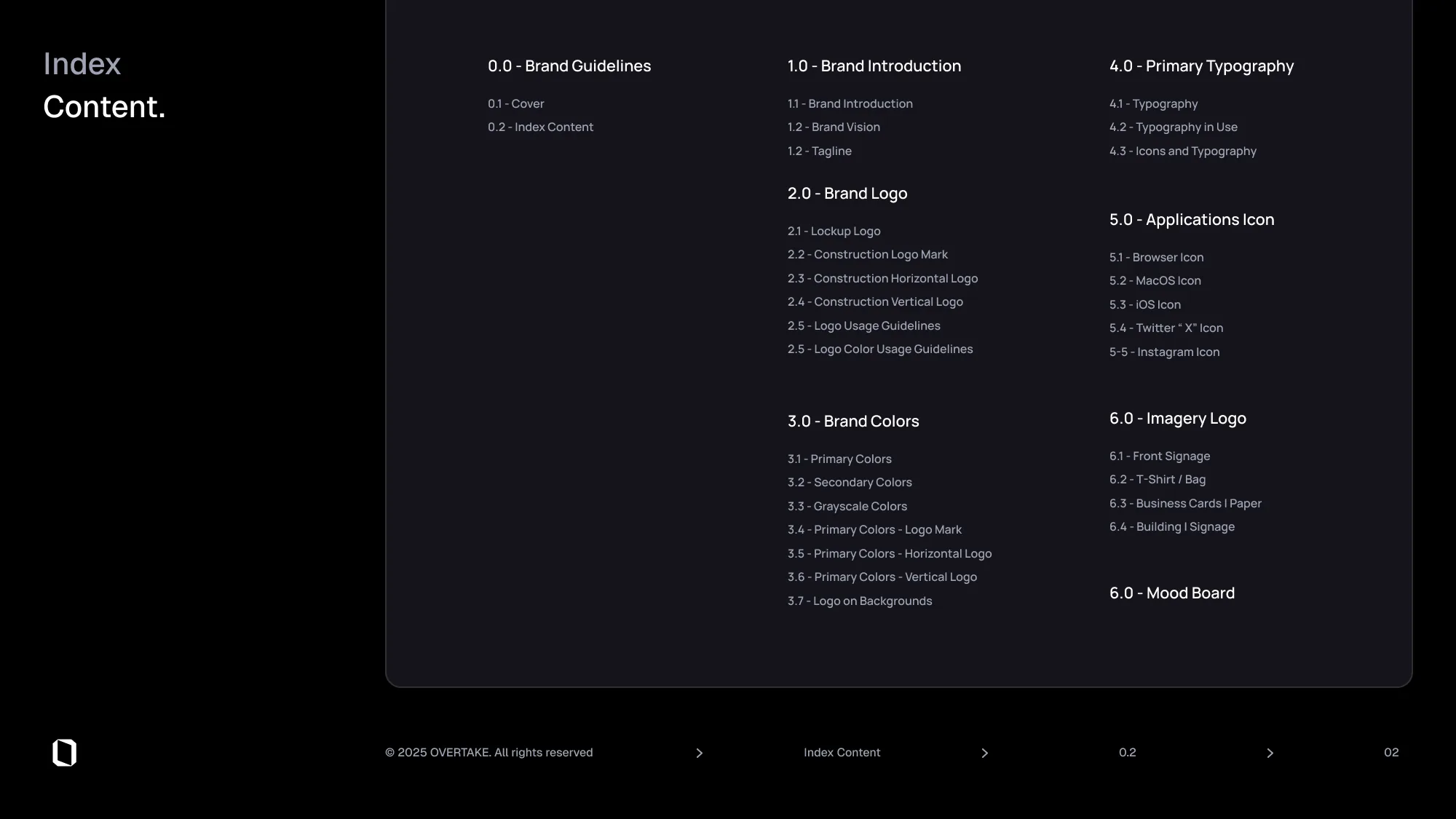
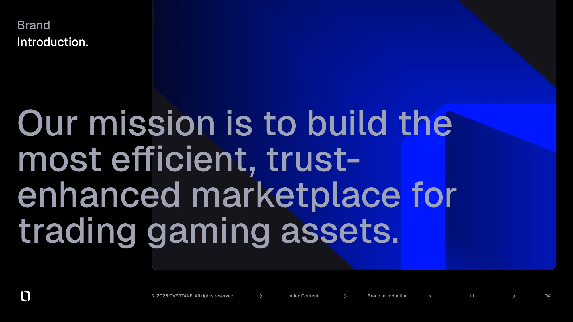
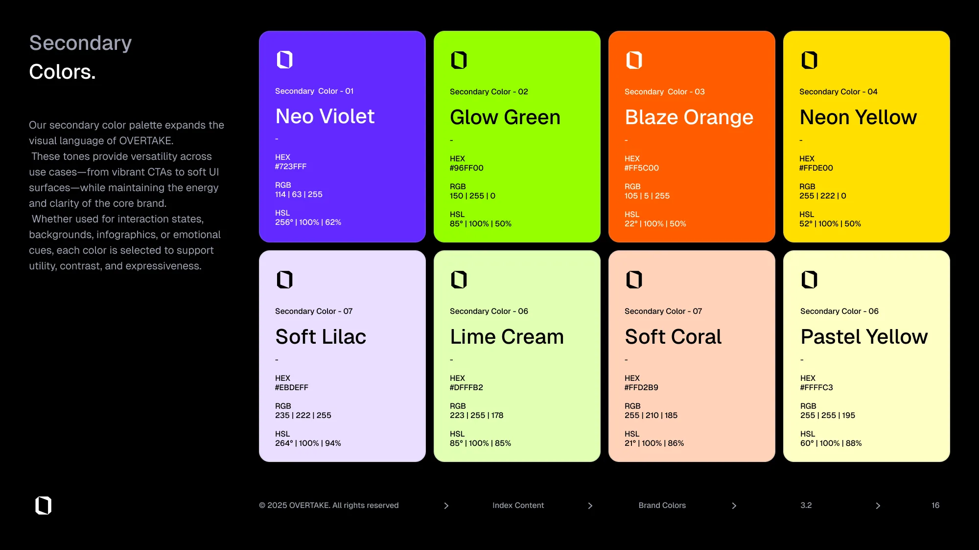
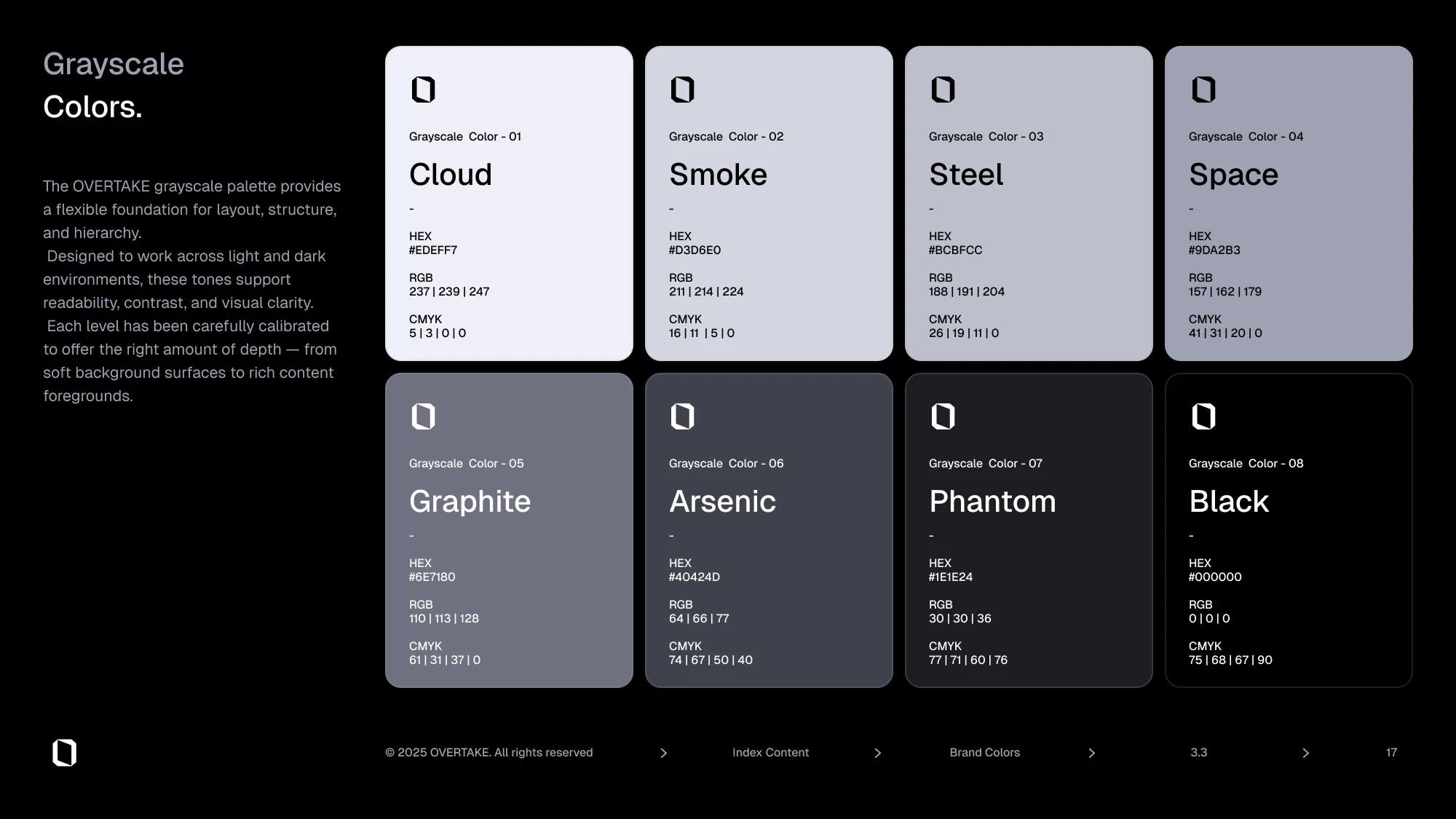
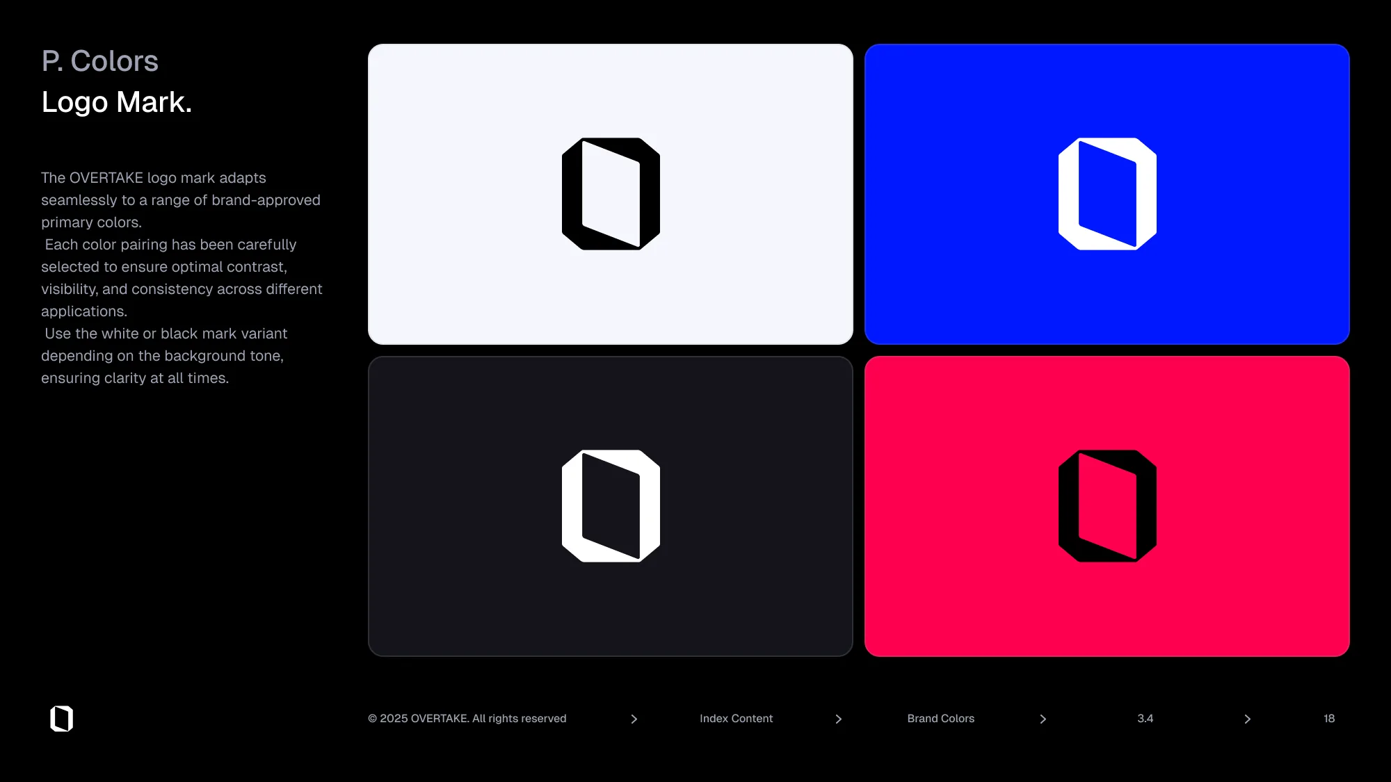
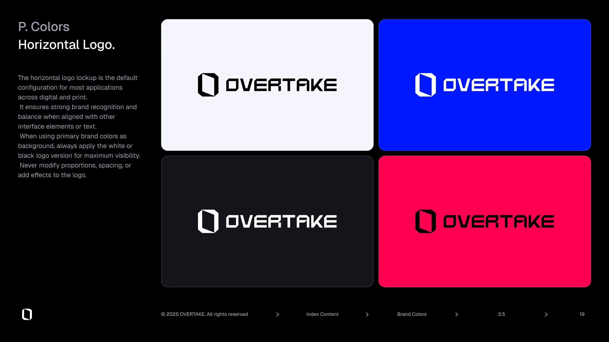
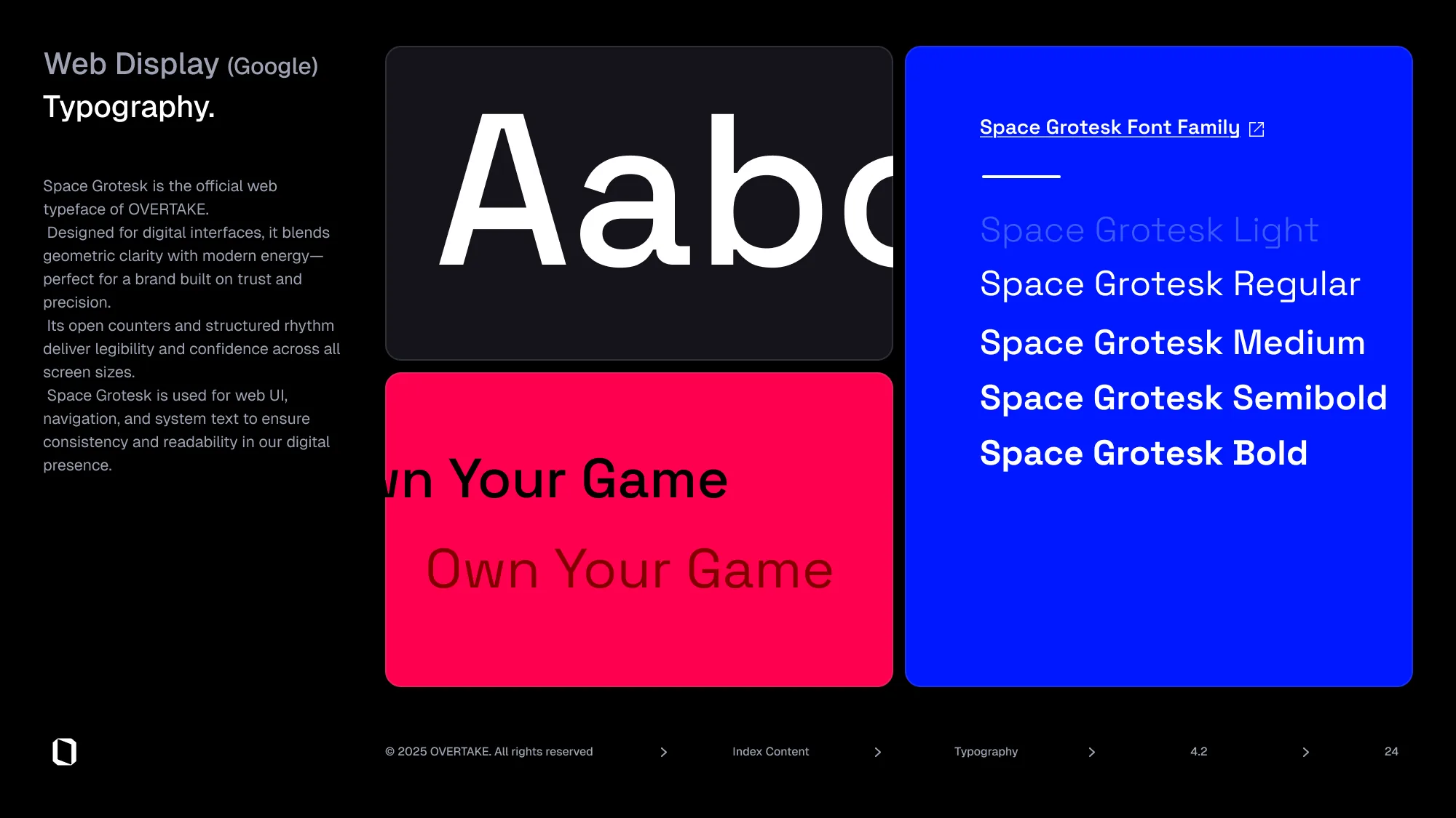
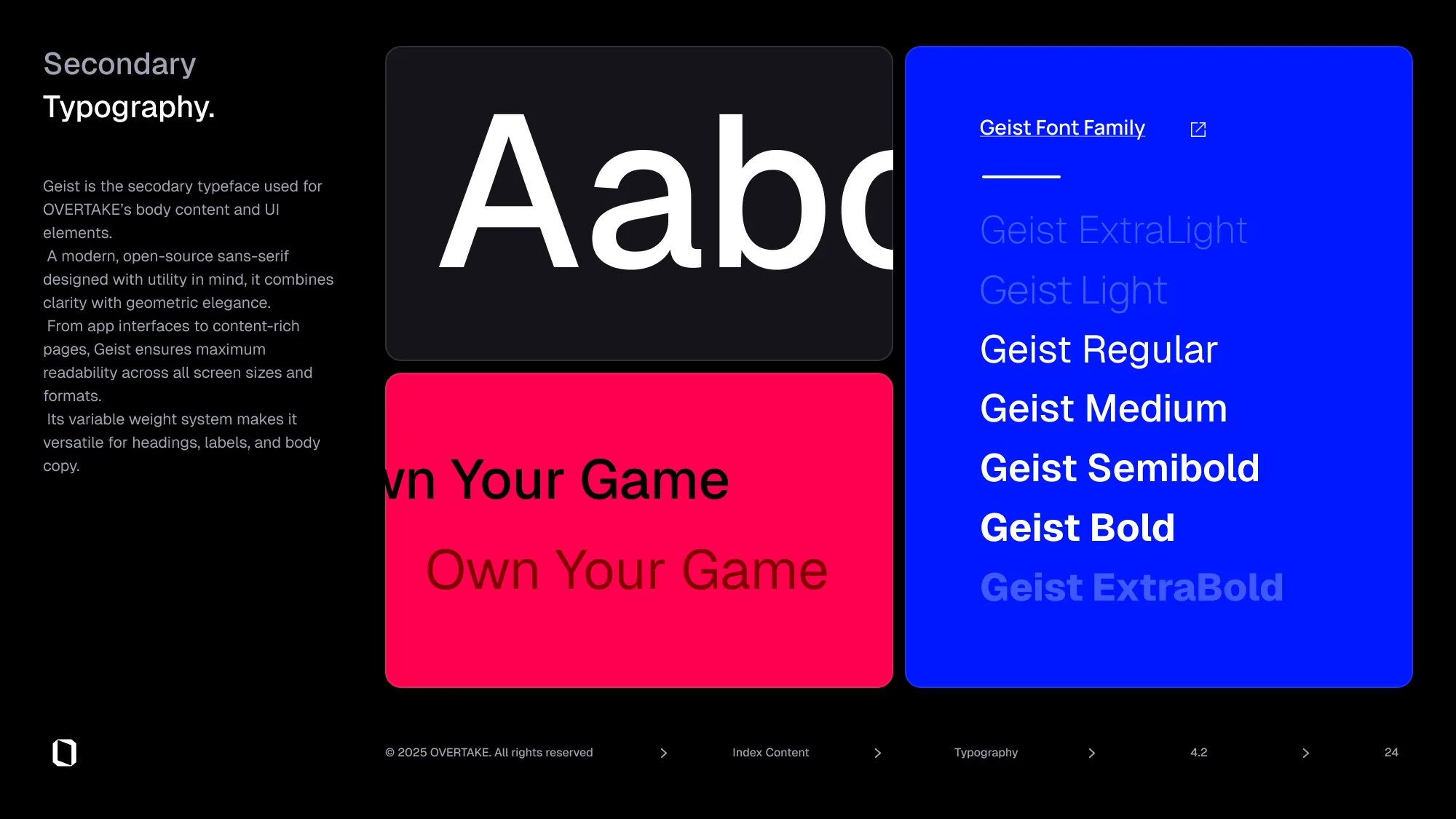
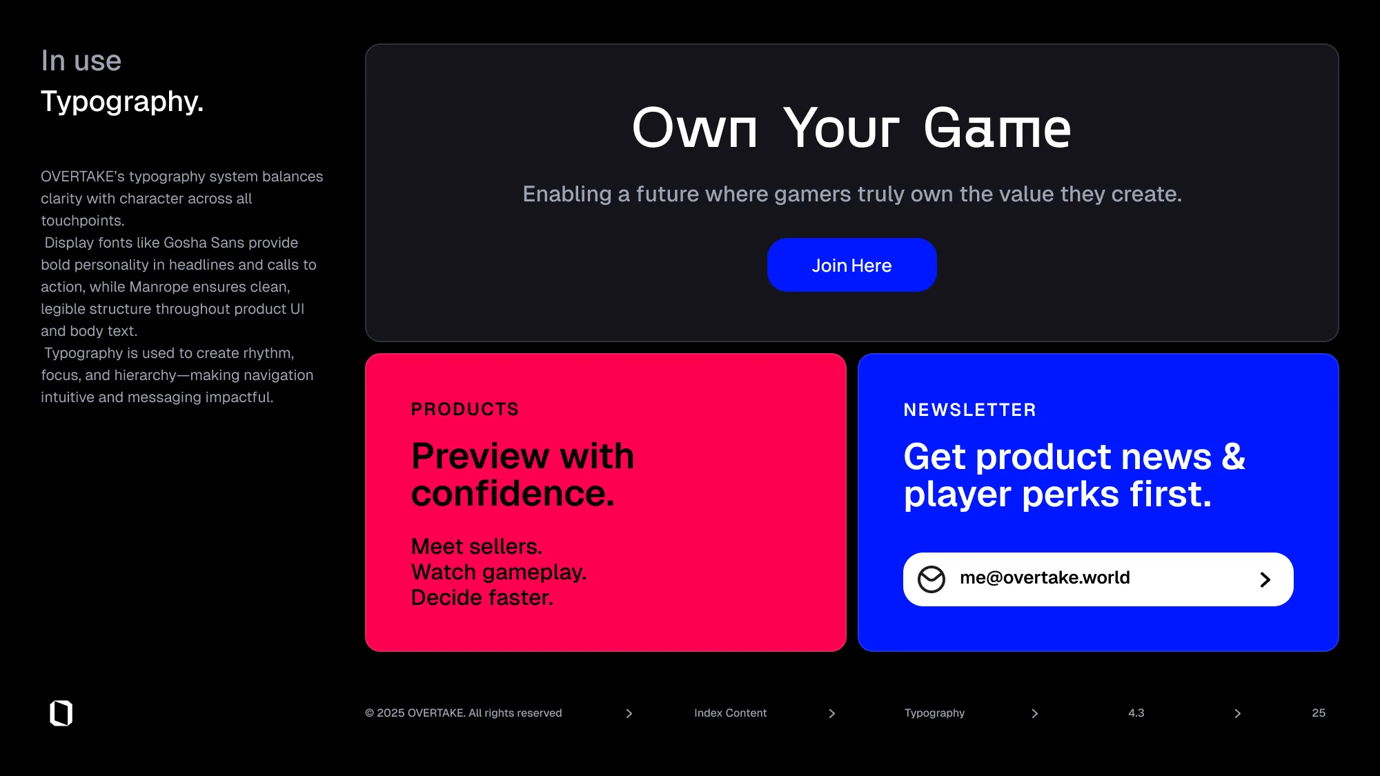
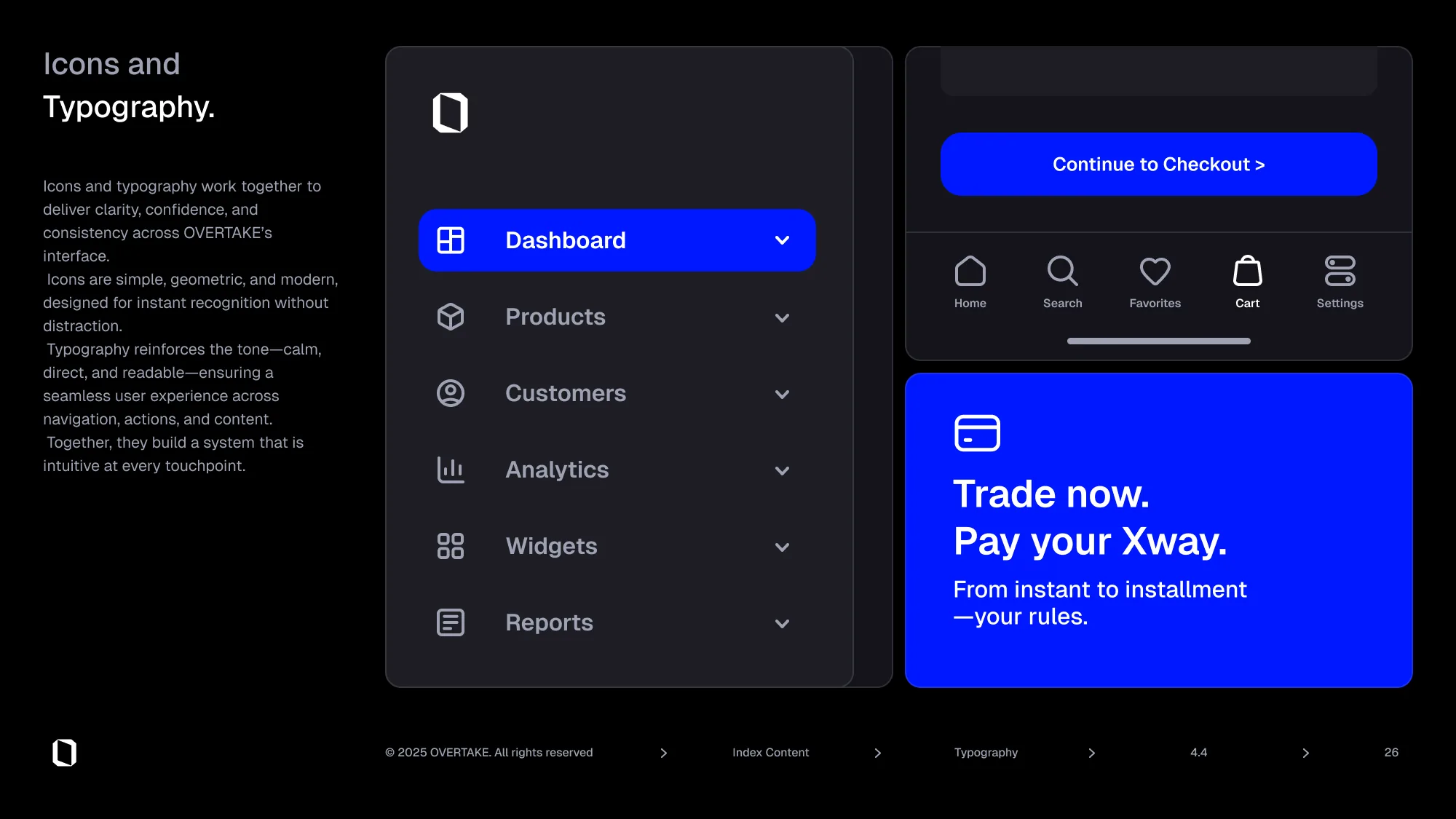
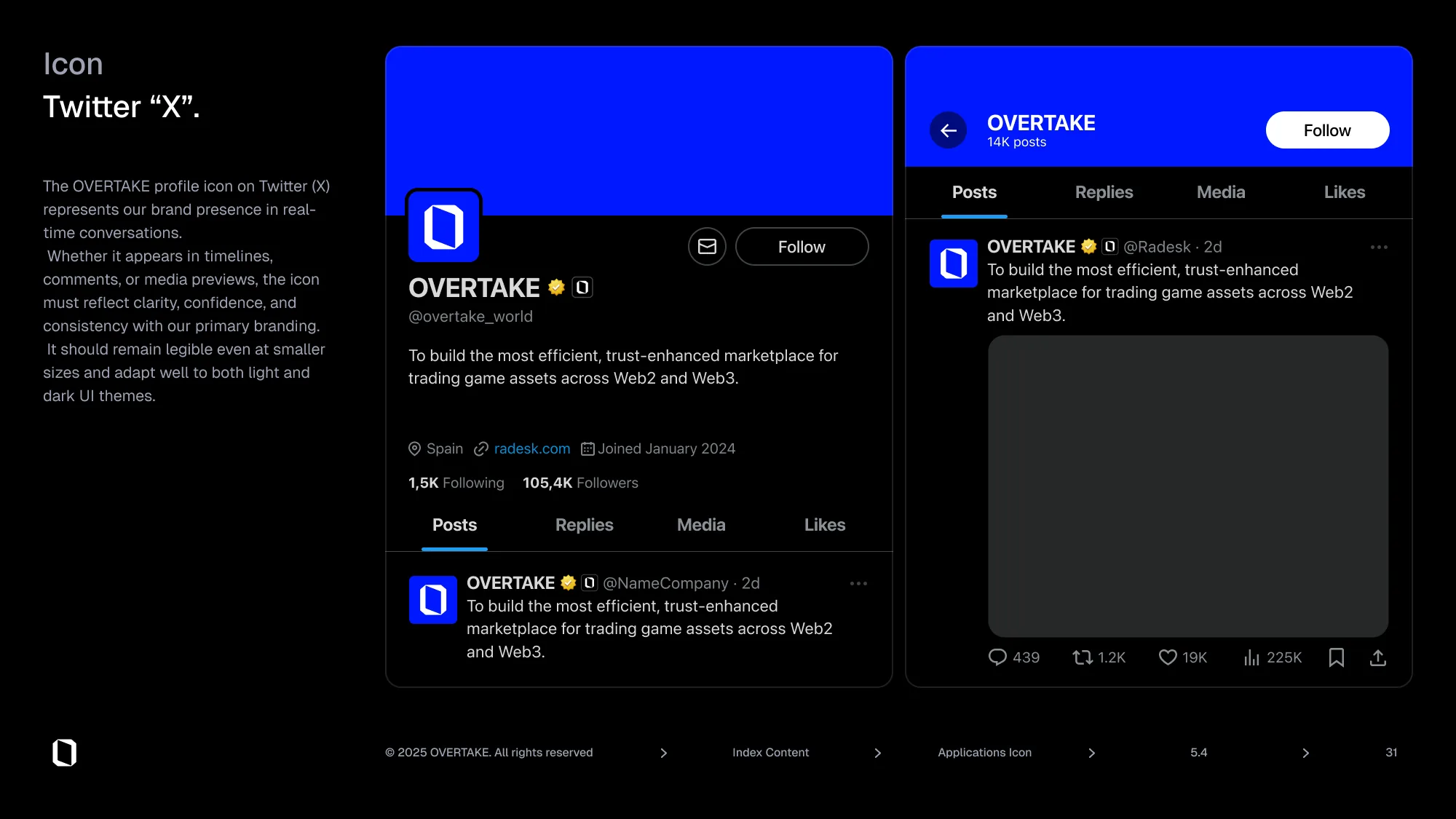
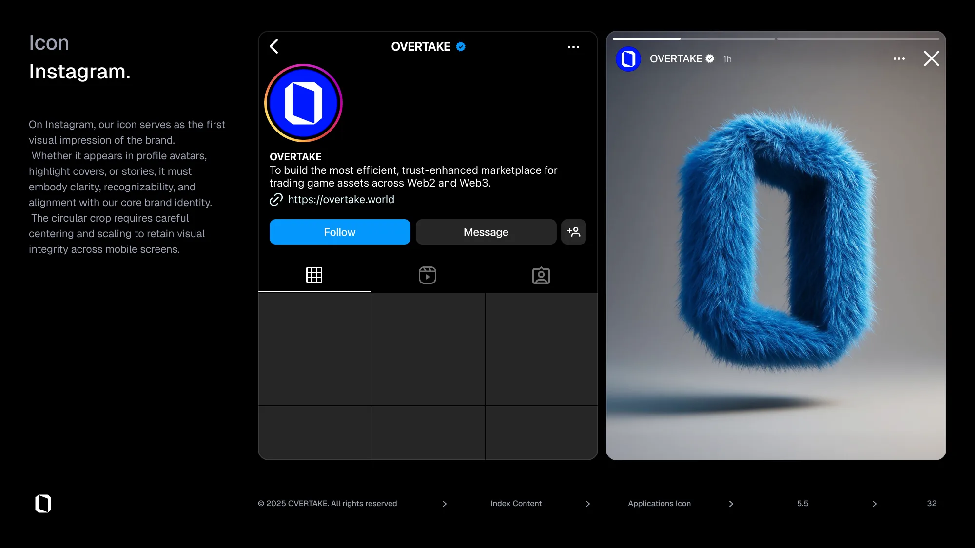
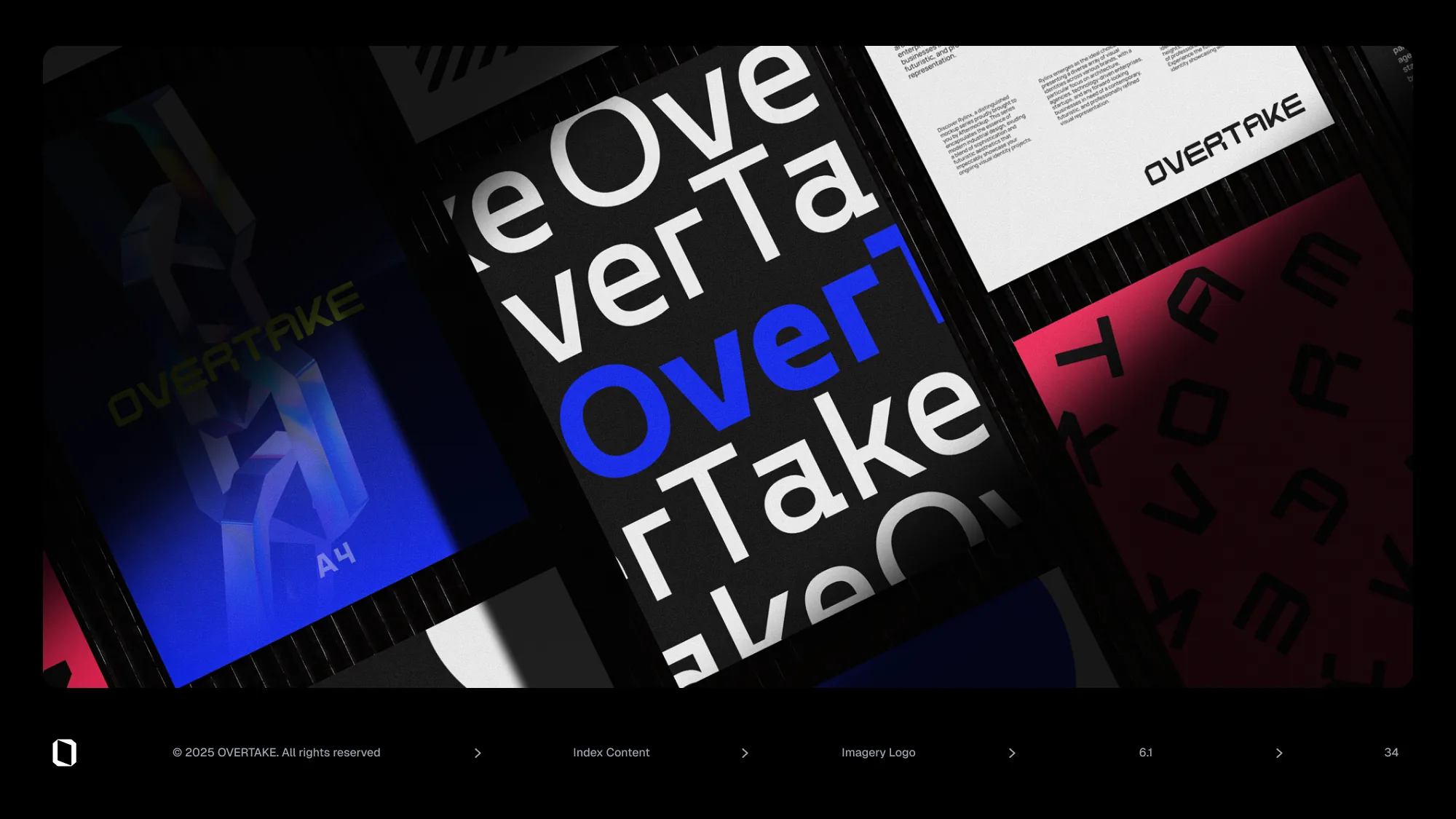
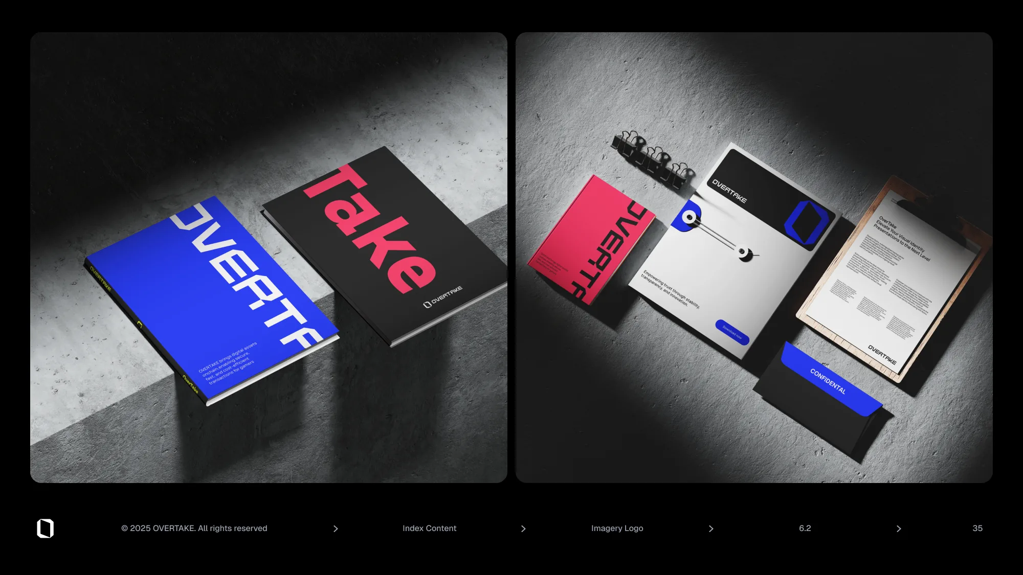
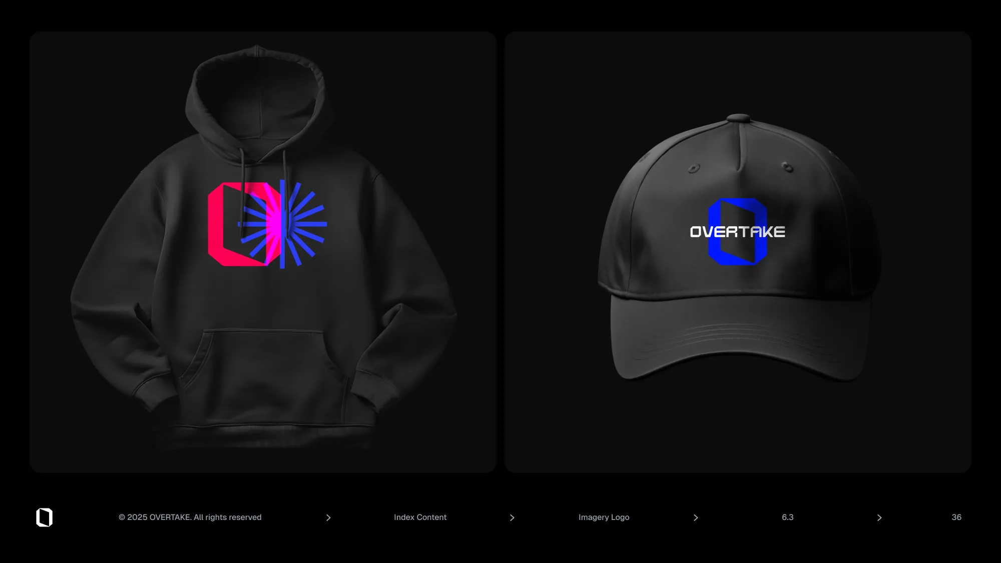
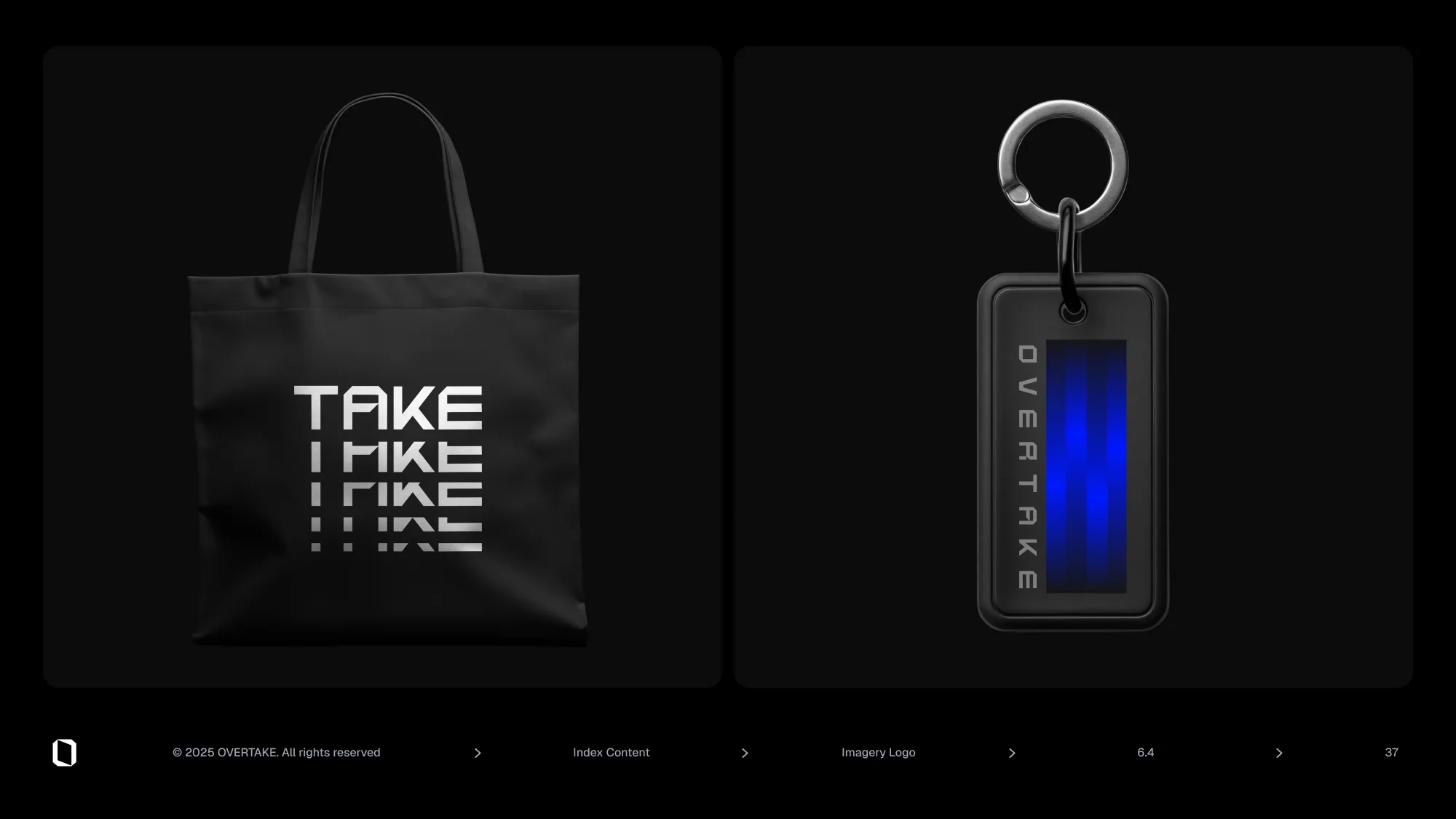
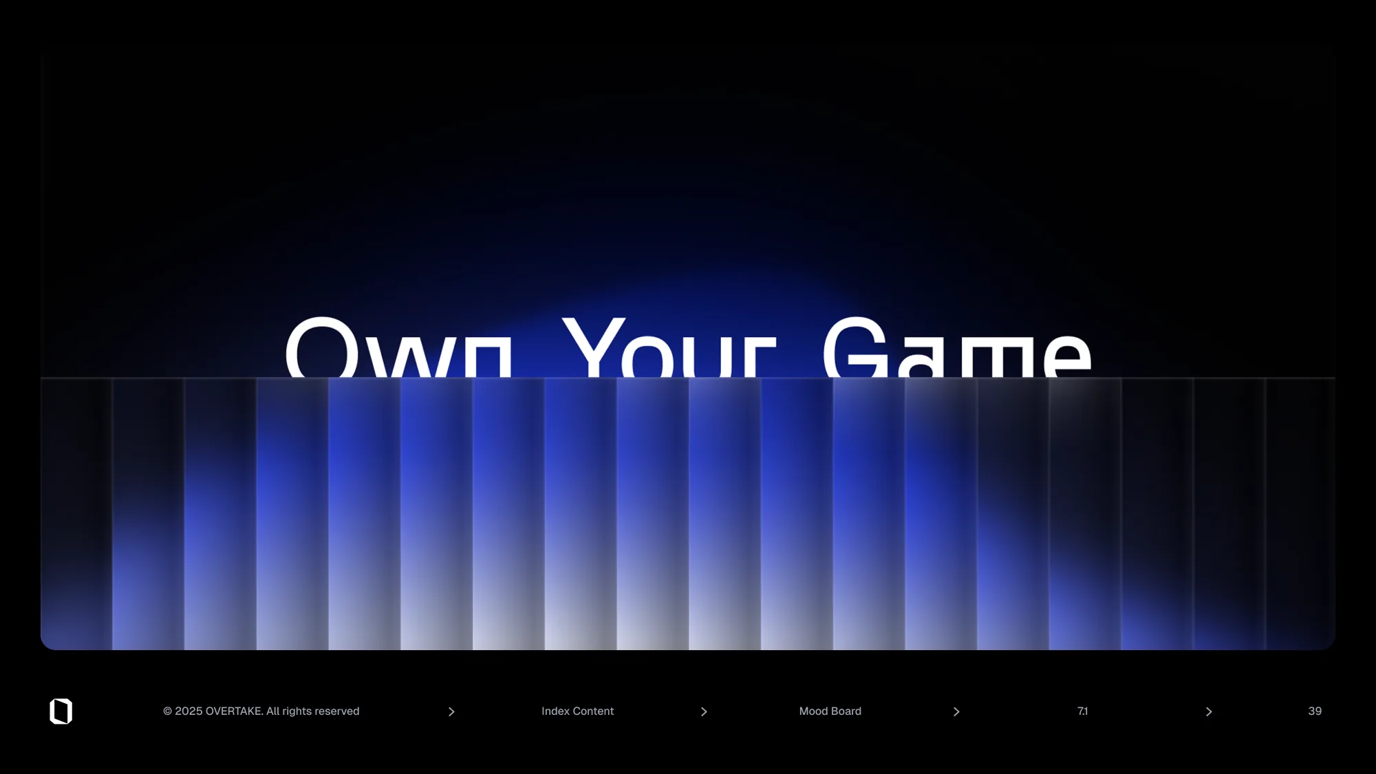
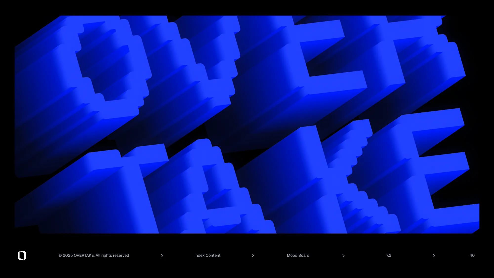
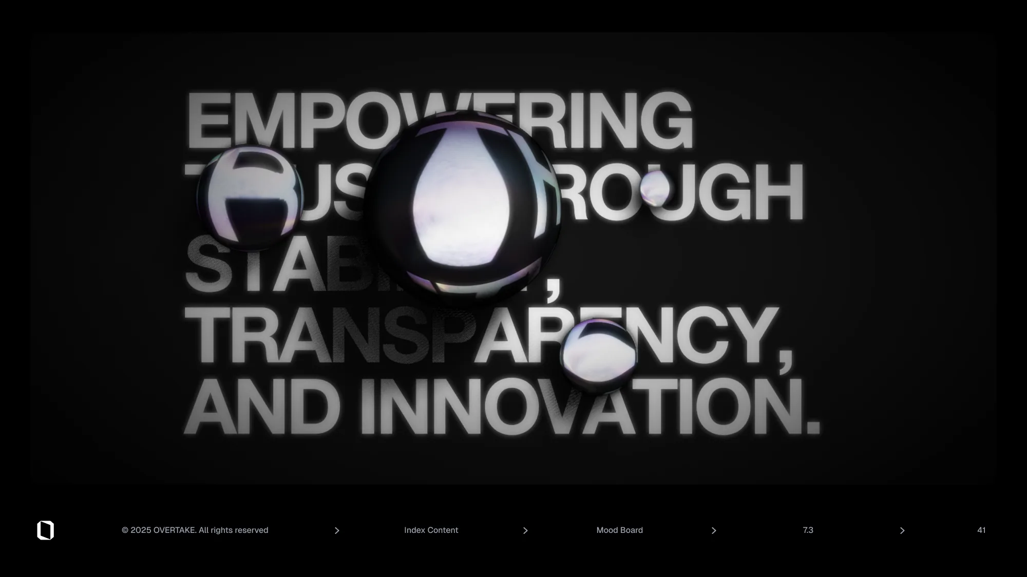
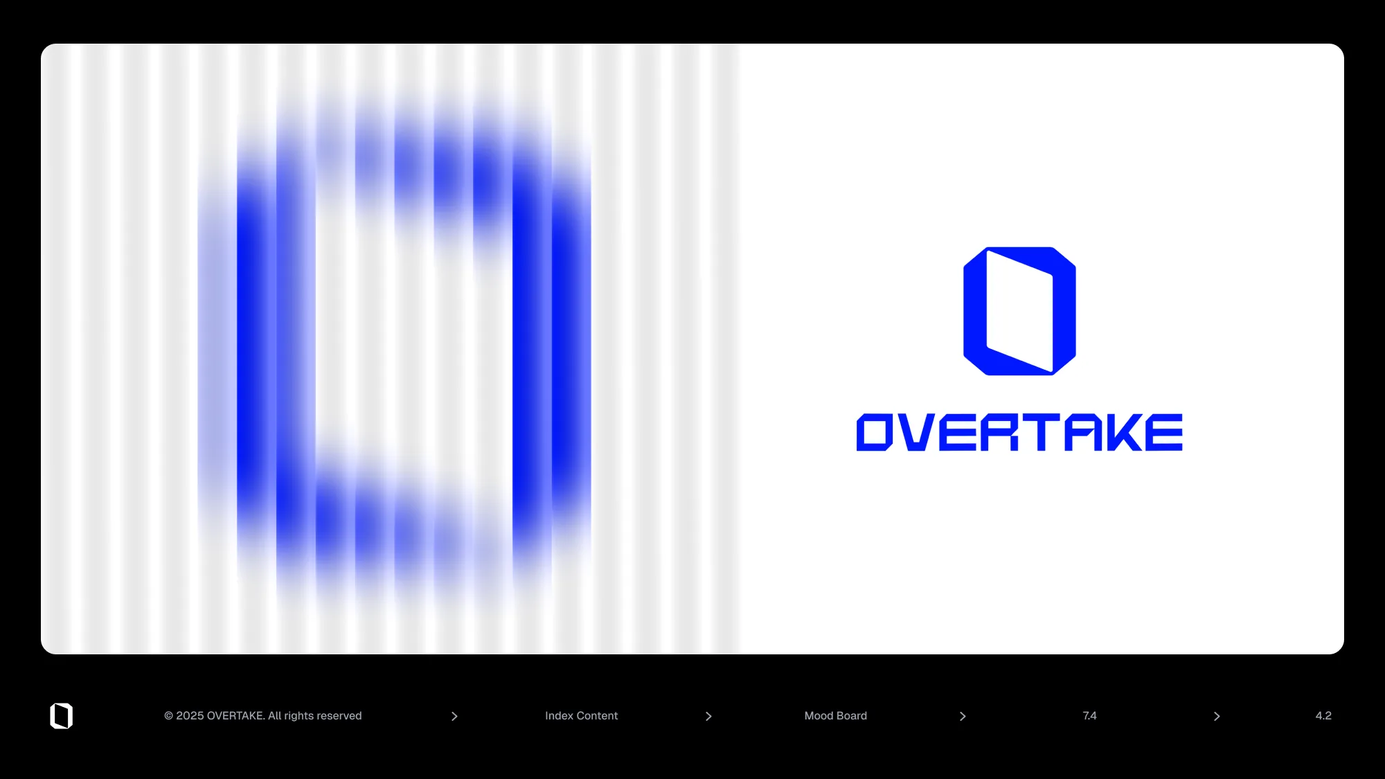
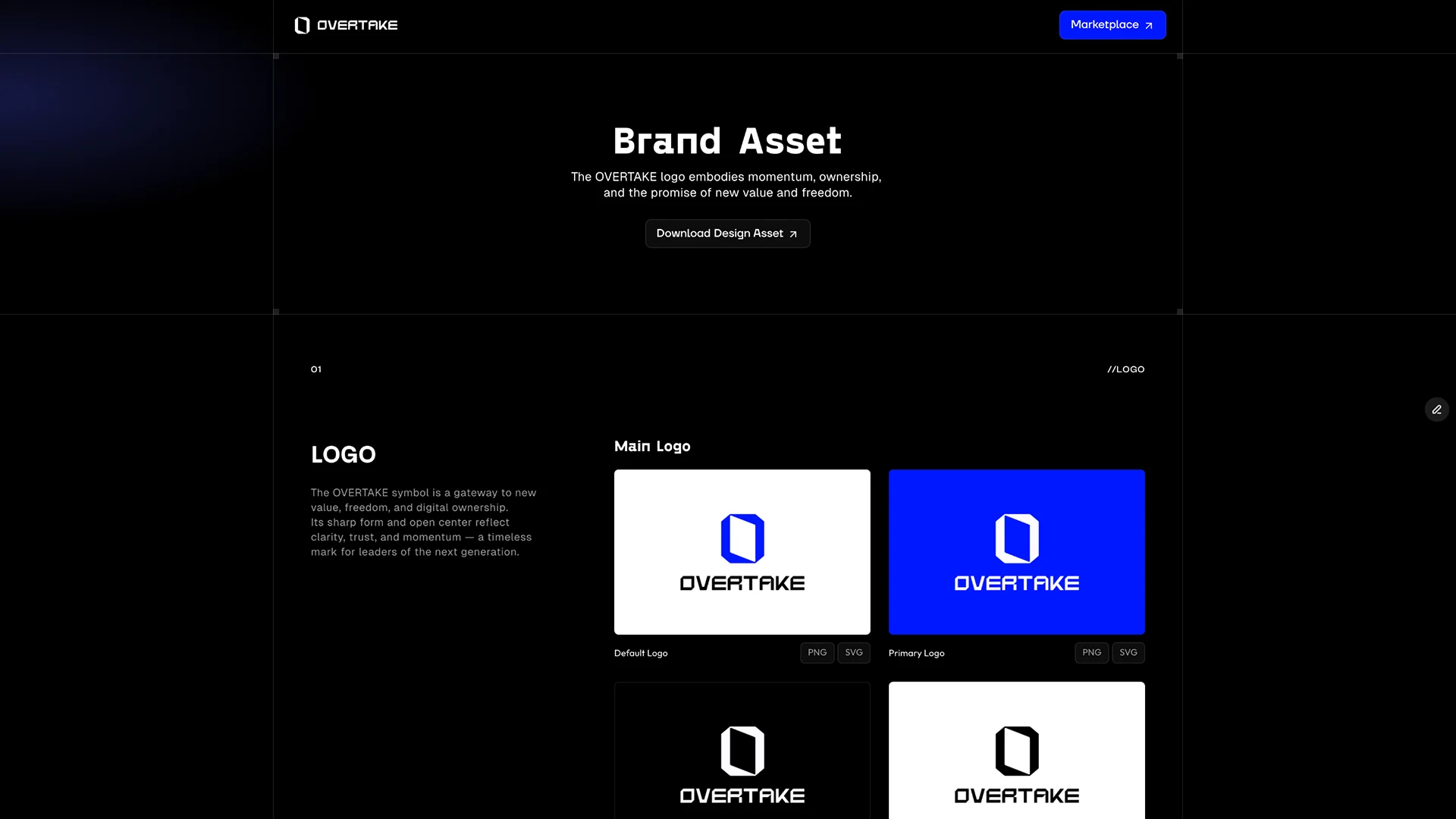
Cover"Brand Guidelines.", version 1.0, dated 16 January 2025. The opening paragraph states that the guide covers visual design, verbal tone, and user interaction together, and fixes the three values as Ownership, Trust, and Simplicity. The last sentence in the original ends with two full stops.IndexA seven-chapter contents page: introduction, logo, colour, typography, application icons, imagery, moodboard, with the section number doubling as the slide number. In the original, "1.2 - Brand Vision" and "1.2 - Tagline" carry the same number.Chapter 1 divider - introductionEach chapter opens with a divider carrying only the number and the title. It holds no content; it exists so the reader knows where they are.Mission"Our mission is to build the most efficient, trust-enhanced marketplace for trading gaming assets." One sentence over the blue diagonal graphic, with the background photograph credited to Unsplash in a footnote.Vision"Enabling a future where gamers truly own the value they create." If the mission says what gets built, the vision says who ends up owning what - which is why the two are given separate slides rather than one.Tagline"Own Your Game" - the previous two sentences compressed into three words. The layer is named "1.2 - Brand Vision" while the slide reads Brand Tagline and numbers itself 1.3, so the name was duplicated from the previous slide and never corrected.ToneThe voice is fixed in five words: Simple, Efficient, Calm, Grounded, Empowering. The section and page numbers (1.3, 06) are identical to the tagline slide before it, so one of the two should have been renumbered.Chapter 2 divider - logoSix slides on the logo start here, in an order that establishes what the mark means before it states any rules.Main logoThe stacked lockup shown large on a single blue field. The body text sets three conditions - adequate clear space, consistent proportions, approved backgrounds - and forbids distortion, recolouring, and effects. Every rule that follows is a detail of those three.Symbol constructionThe symbol is explained as a gateway: angular precision and an open centre standing for clarity, trust, and forward momentum. The construction grid behind it is what keeps that claim from being an assertion by eye.Horizontal lockup constructionThe horizontal lockup set on its grid. The body text, however, describes the vertical one - "a stacked layout", "when vertical alignment is required" - and so contradicts the title; it reads as a paragraph carried over from the next slide.Vertical lockup constructionThe grid for the vertical lockup, with the line "the grid is not just a tool - it is a foundation". That sentence summarises the whole guide's stance: rules are built as structure rather than taste.Logo usage rulesFour cells: the top two allowed - "Default Version" and "Symbol Only" - the bottom two marked "Do Not Use". The stretched version and the version carrying effects are actually drawn, so the prohibition survives as a picture rather than a sentence.Logo colour rulesThe rule is reduced to a judgement about background brightness: white on blue by default, white on dark, black on light. Nobody has to memorise colour names, which is why a rule like this actually gets followed.Chapter 3 divider - colourColour is the longest chapter at eight pages, because it does not stop at defining a palette but carries on into how the logo sits on those colours.Primary coloursFour cards - Ice White, Pure Blue, Midnight, Hot Red-Pink - each with HEX, RGB, HSL and a one-line rationale. In the original, Pure Blue is #0018FF but its RGB reads 24 | 255 | 100, so the two values name different colours.Secondary coloursEight swatches - Neo Violet, Glow Green, Blaze Orange, Neon Yellow, Soft Lilac, Lime Cream, Soft Coral, Pastel Yellow - the top row saturated and the bottom row pale, so each hue exists at both an accent and a surface strength. Scoped to interaction states, backgrounds, and infographics. Blaze Orange is #FF5C00, but its RGB reads 105 | 5 | 255, which is a blue.GrayscaleEight steps from Cloud to Black. Unlike the primary and secondary sets these carry CMYK rather than HSL, because this is the layer that has to survive print.Symbol on primary coloursThe symbol alone placed on each of the four primary colours. The rule is the same as the earlier one, but drawing the actual pairings makes a weak-contrast combination visible instead of arguable.Horizontal lockup on primary coloursStates that the horizontal lockup is the default for most applications, and limits it to the white or black version whenever a primary colour is the background.Vertical lockup on primary coloursNarrows the vertical lockup to digital interfaces, social posts, and centred layouts - splitting the use cases so it never competes with the horizontal one.Logo on imageryThe rule for photographic rather than flat backgrounds: avoid busy or low-contrast areas, and lay in a subtle overlay where needed. The slide numbers itself 3.6 where it should be 3.7, duplicating the page before it.Chapter 4 divider - typographyThe typography chapter, which does not settle on one family but splits into display, web, and body, each with its own place to be used.Display typefaceGosha Sans, credited to Eastern European and retrofuturist references and confined to headlines, hero sections, and brand statements. "Own Your Game" serves as the specimen line.Web typefaceSpace Grotesk, for web UI, navigation, and system text. Nominating a Google-hosted face separately keeps anyone from picking a substitute ad hoc wherever licensing gets in the way.Body typefaceGeist, carrying body copy and UI elements, its variable weights covering headings, labels, and text in one family. "Secodary" is a typo in the original, and the section and page numbers repeat the web-typeface slide exactly as 4.2 and 24.Typography in useShown as a screen rather than a spec sheet: the hero line "Own Your Game", the vision sentence, a "Join Here" button, a products section, and a newsletter block on one board. The body text names Manrope as the UI face, which contradicts the previous slide's choice of Geist.Icons with typeIcons are handled beside type rather than on their own, with a Dashboard-Products-Customers-Analytics-Widgets-Reports sidebar and a checkout button as the examples. The point is that icon weight has to match the type sitting next to it.Chapter 5 divider - application iconsFive pages covering where the icon actually lands, platform by platform, by drawing each platform's real screen rather than listing specifications.Browser iconThe favicon shown inside a full macOS Chrome window. As the text's "digital front door" suggests, the only test that matters is whether it survives at that size.macOS iconThe icon in Finder, in the Dock, and in a notification on one screen, following Apple's Human Interface Guidelines while keeping the brand's geometry and colour.iOS iconThe App Store listing, the home screen, and a push banner drawn together. The 4.8 rating and 150K reviews are placeholder figures filling the layout, not real numbers.X profile iconAn X profile in light and dark side by side, on @overtake_world, its bio a shortened version of the mission. The location "Spain" and the link "radesk.com" are template leftovers.Instagram iconWritten up as a circular crop that needs its own centring and scale: drop the square icon in unchanged and the corners of an angular mark get cut.Chapter 6 divider - imageryWhere the rules end and expression begins. The earlier chapters say what must be kept; the five pages from here show what can be done inside it.PostersA stack of overlapping A4 posters, the name broken as "Ove / rTa / ke" and set differently on each, across blue, red, and black. Where the rule pages insist the logo stay whole, this one tests whether it still reads when cut.StationeryBooklets, cards, an envelope, and a pen laid out on a dark surface. The three covers in blue, black, and red show how the primary colours behave against one another off-screen.ApparelA hoodie and a cap: the hoodie sets a pink burst behind the symbol, the cap swaps a letter of the wordmark for the mark itself. Embroidery and print thicken strokes, which is where the single-colour symbol rule earns its place.Bag and keyringA tote and a keyring. On the tote "TAKE" is stacked three times and allowed to crop further with each line, turning the repetition itself into the pattern.Chapter 7 divider - moodboardThe last chapter, placing where the rules came from after the rules themselves. The slide numbers itself 6.0 where it should read 7.0.LightVertical shafts of light rising out of the dark with "Own Your Game" over them - blue handled as light rather than as a colour.Extruded typeOVERTAKE extruded into heavy blue 3D lettering and cropped so it runs off the frame. It speaks the same angular language as the logo but with volume, testing whether that geometry survives being made solid.The statement"EMPOWERING TRUST THROUGH STABILITY, TRANSPARENCY, AND INNOVATION." set full-bleed with a glass droplet distorting the words beneath it - the long form of what the tagline says in three.The blurred symbol beside the logoThe symbol dissolved into vertical stripes on the left, the sharp logo set beside it on the right, closing the moodboard by returning to the mark. The page number should read 42 but the original prints "4.2".Alternate cover - Brand IdentitySame date, same paragraph, same graphic, titled "Brand Identity." instead. The final cover went with "Brand Guidelines.", and the pair records the choice between naming it a statement of identity or a book of rules.The brand asset pageNot a guideline page but a screen from the product site: under "Brand Asset", each logo is offered as PNG and SVG. It is the one live surface in this canvas, and it is what keeps the rules from stopping at the document.