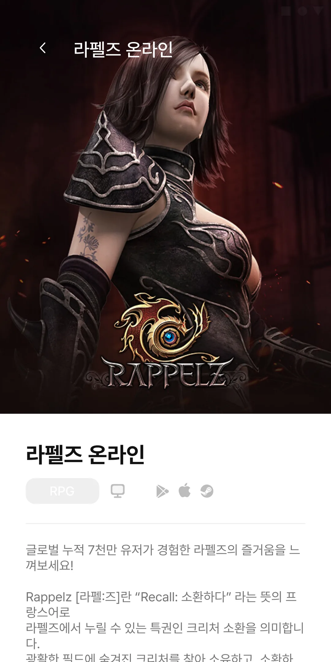
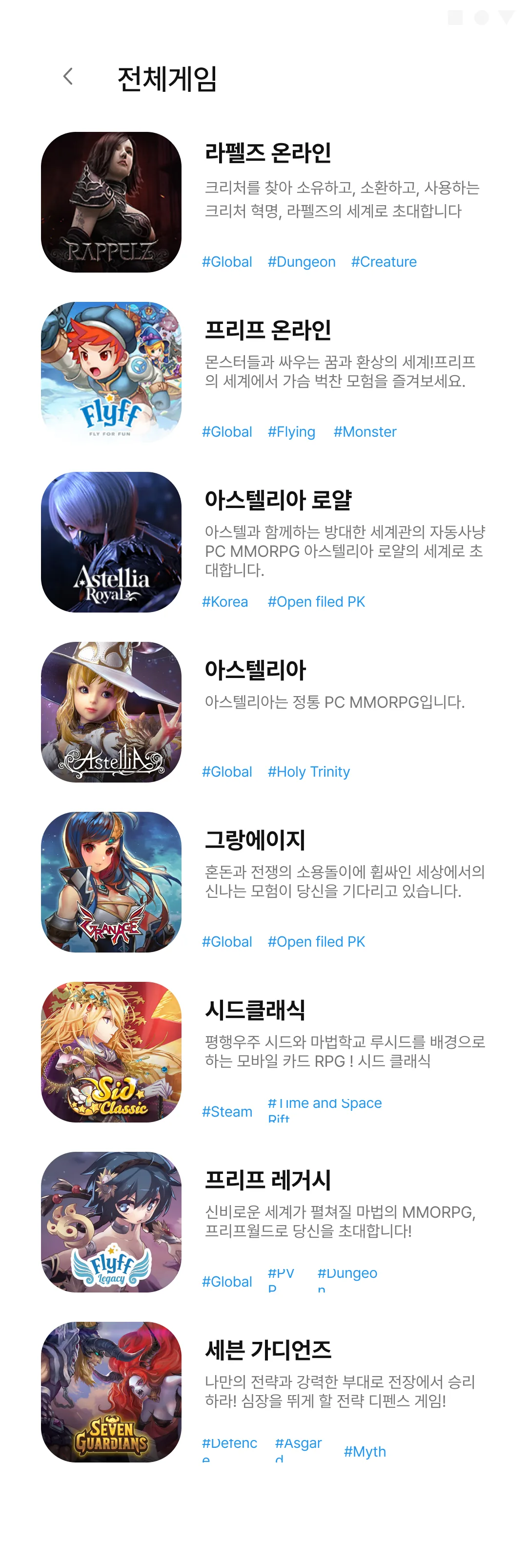
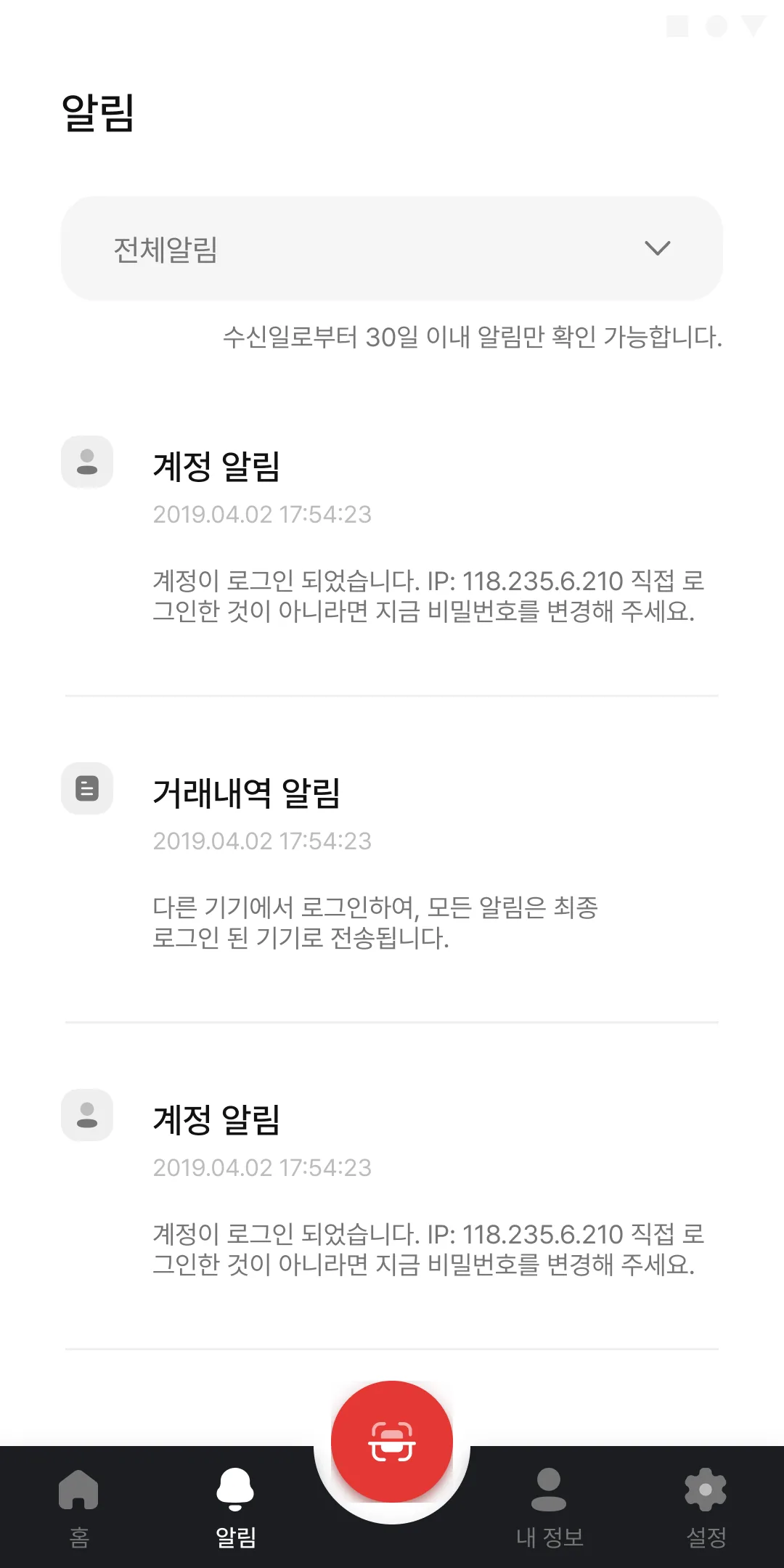
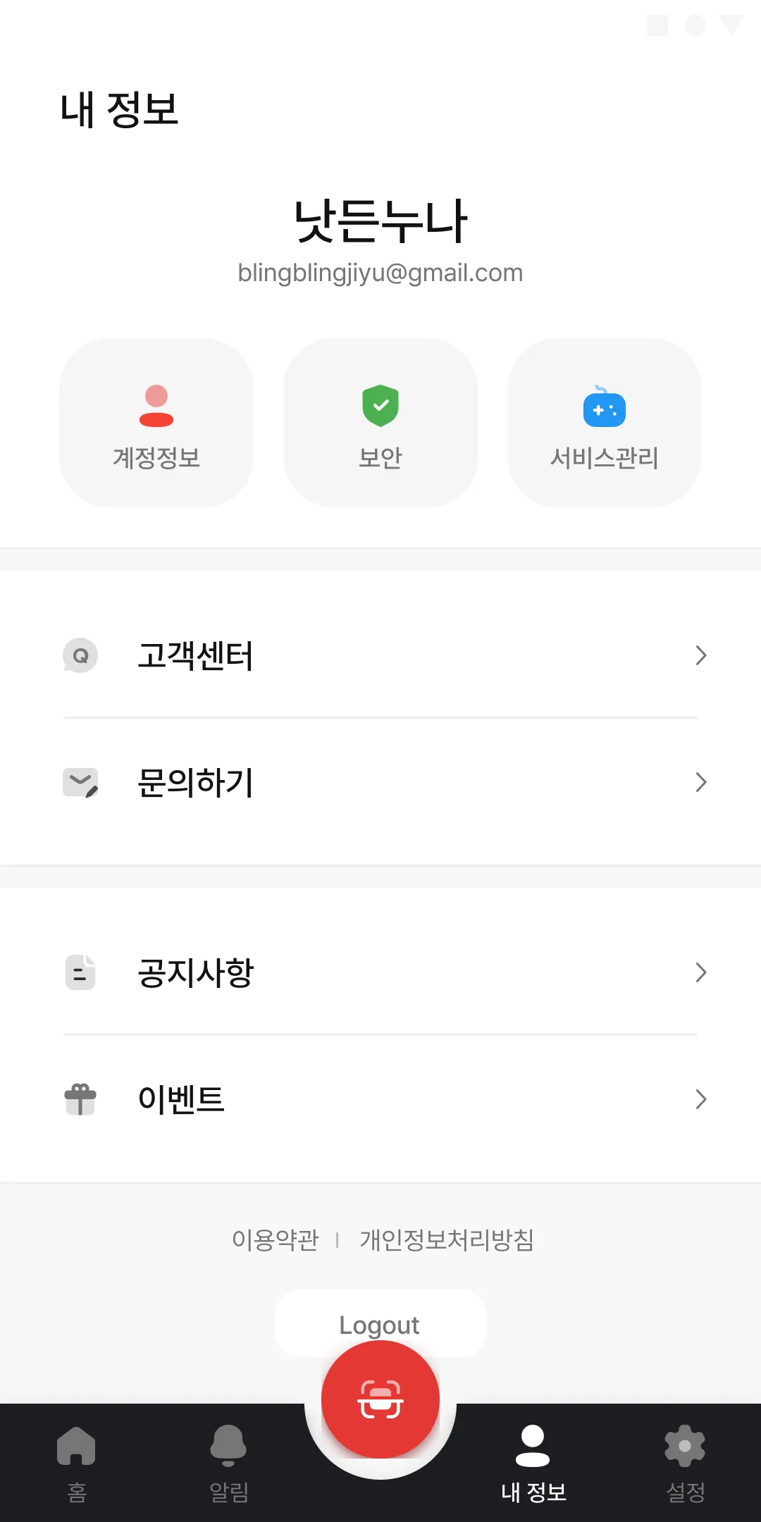
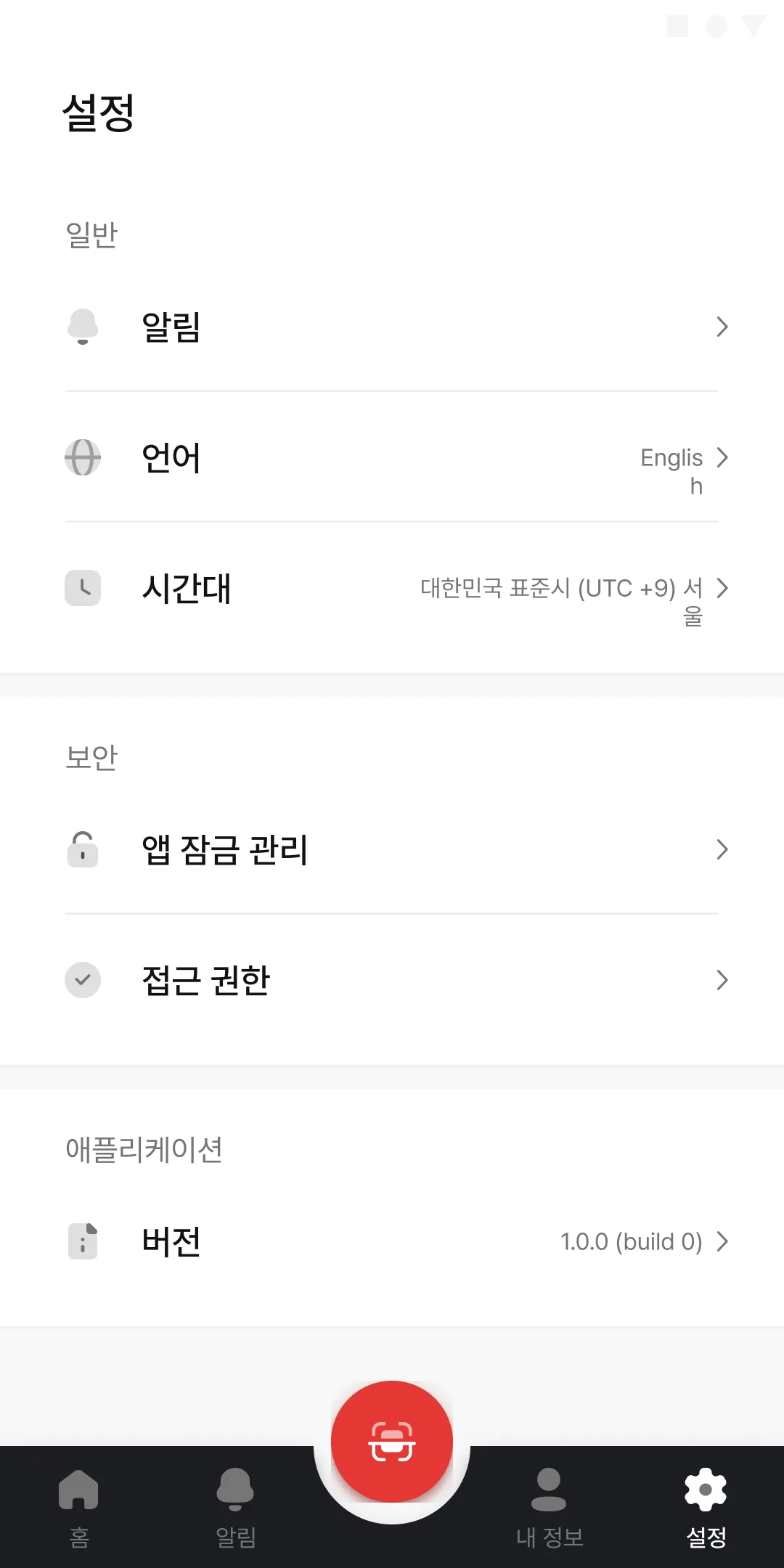
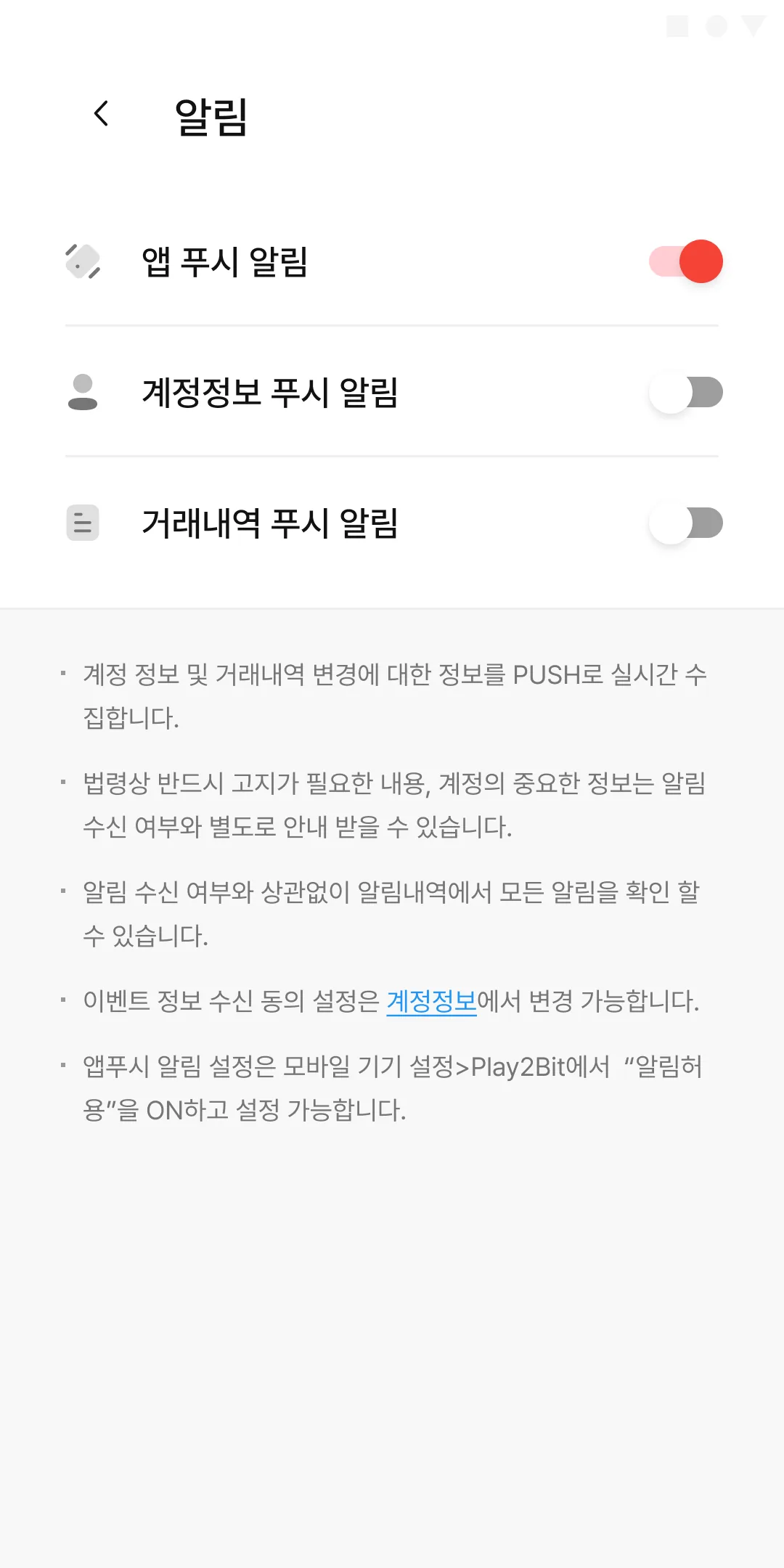
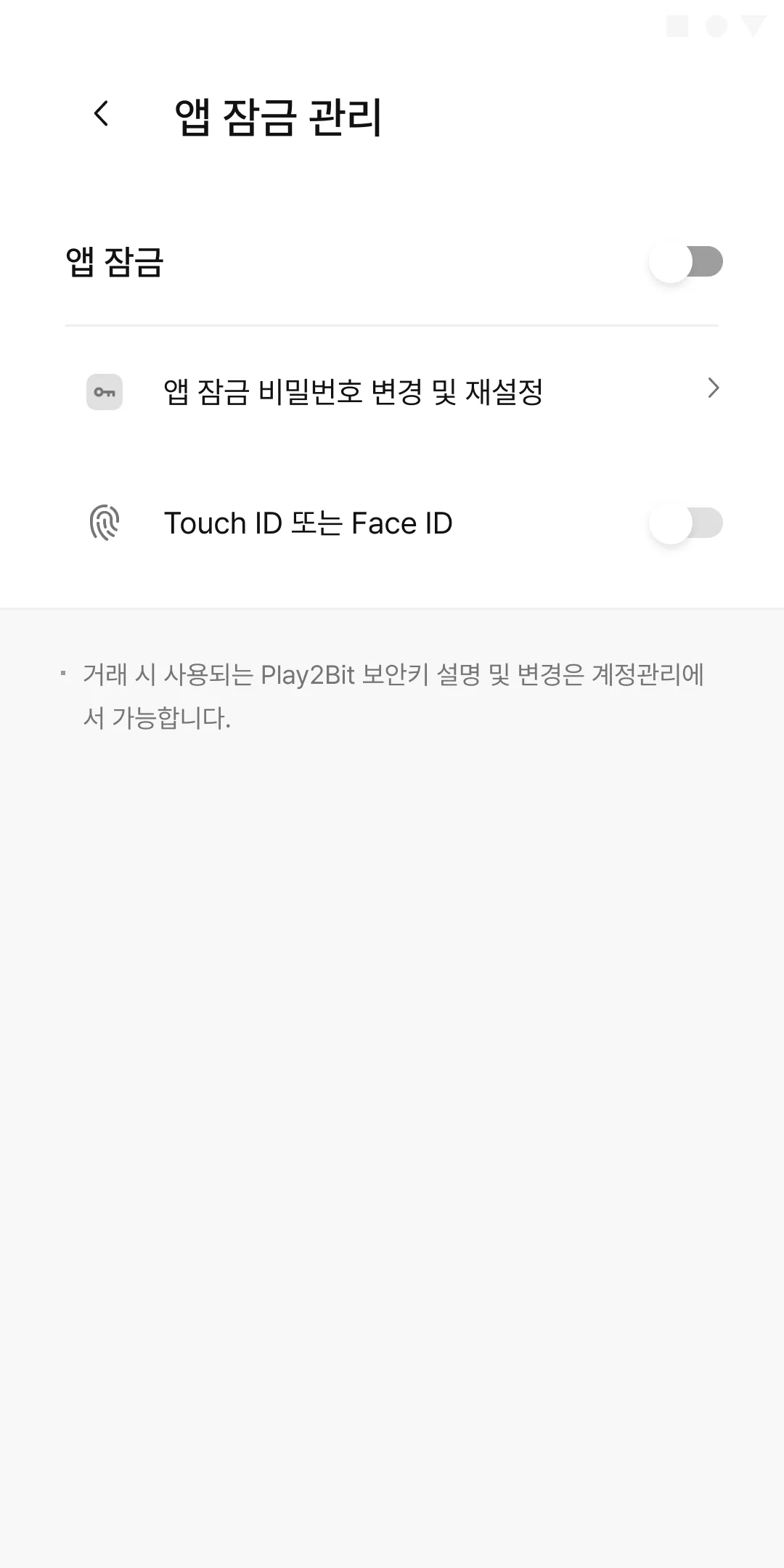
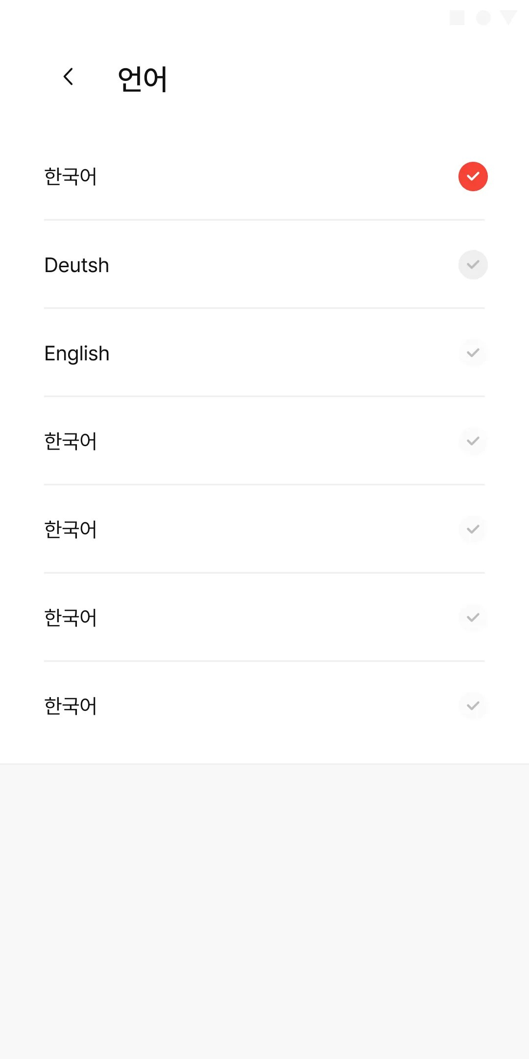
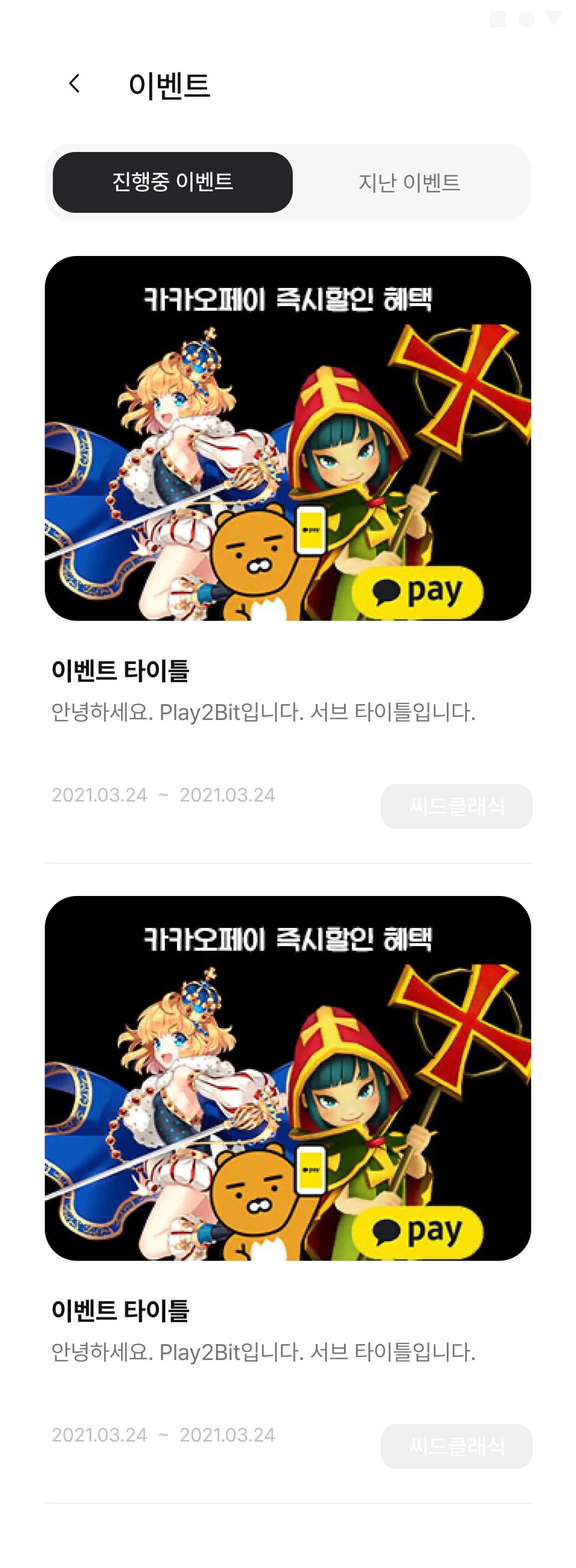
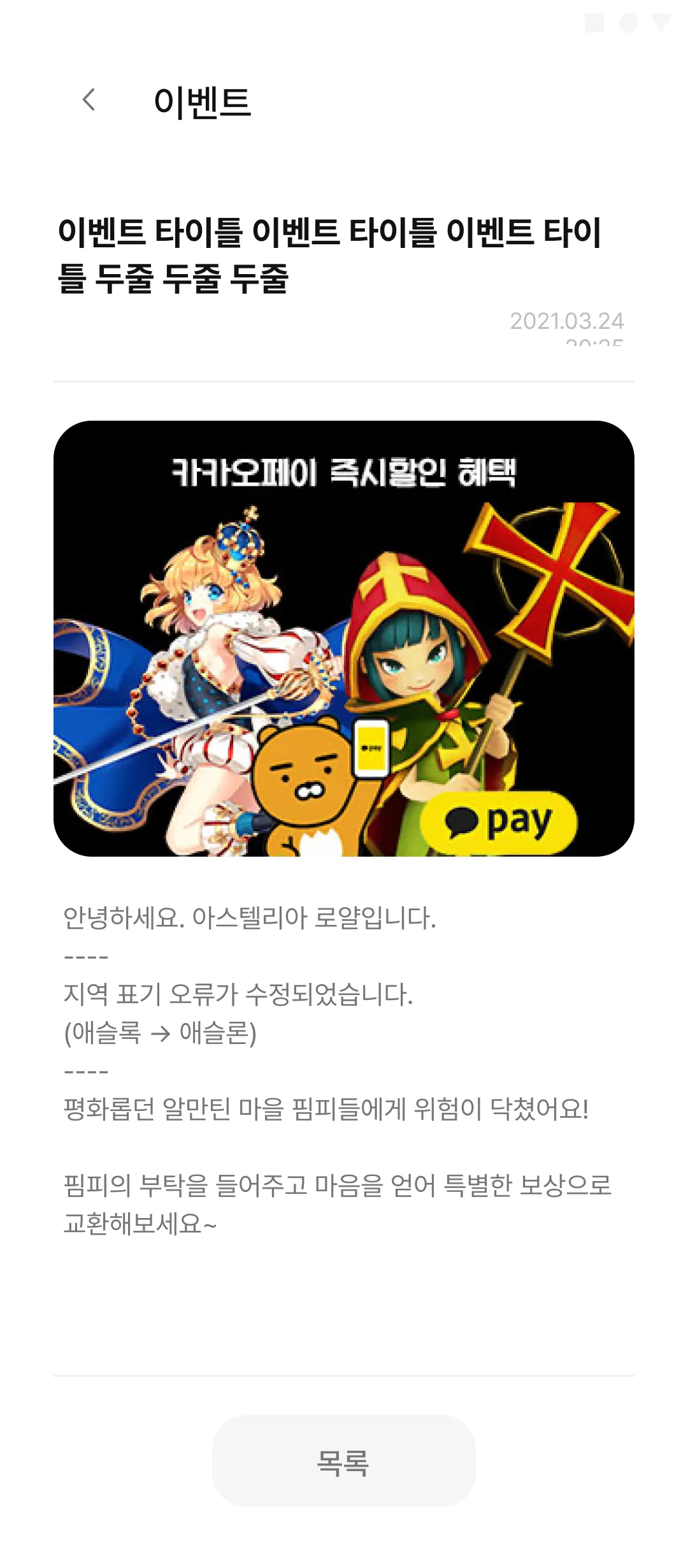
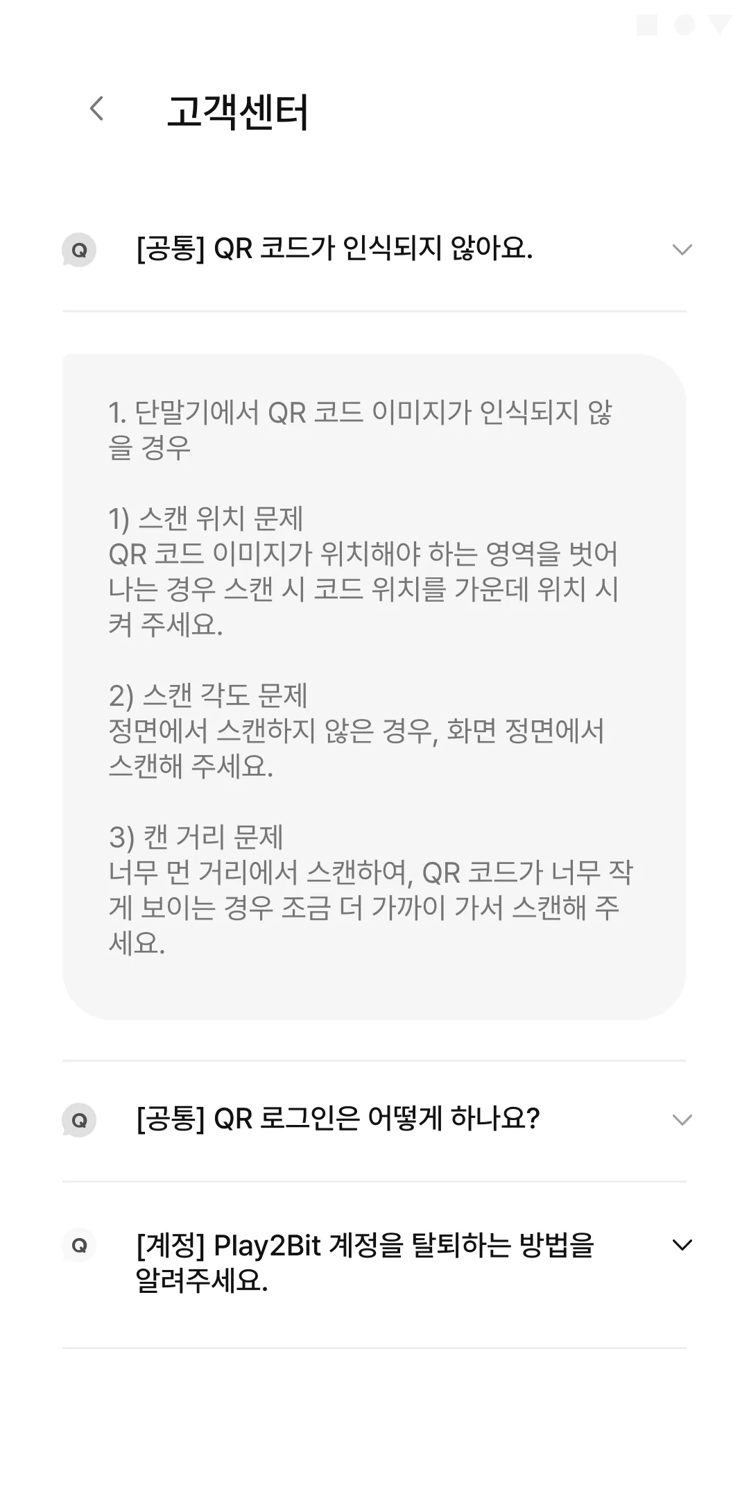
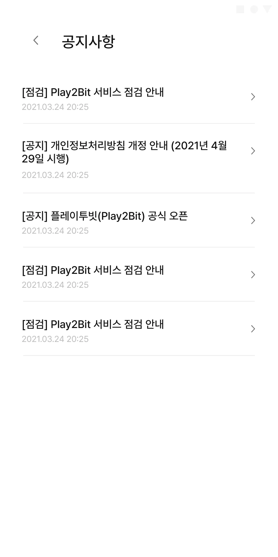
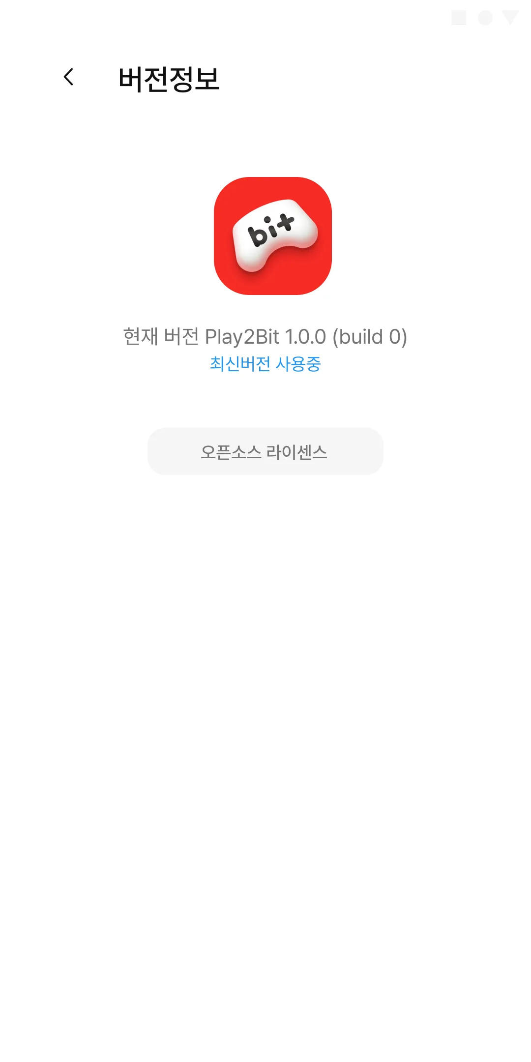
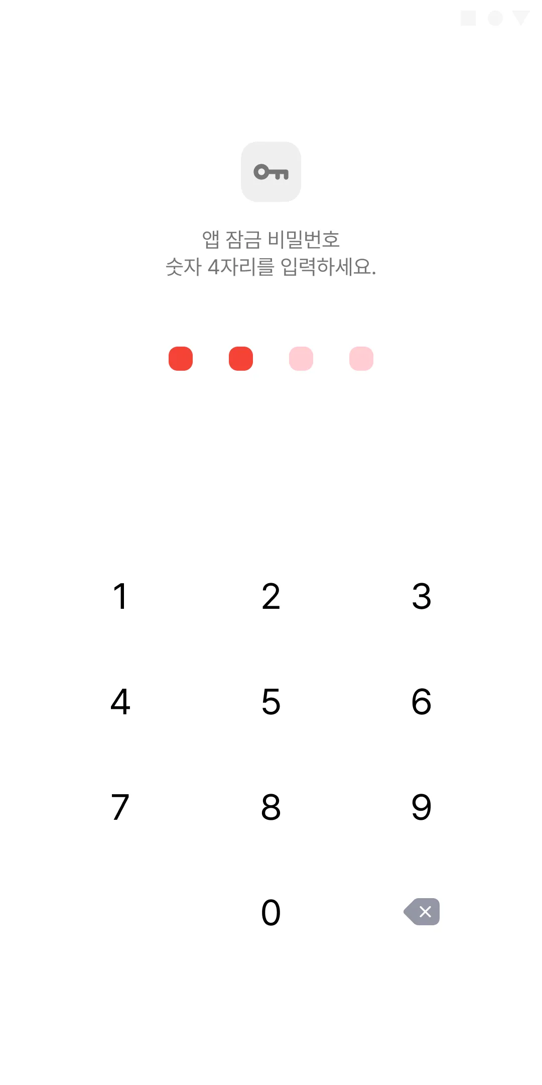
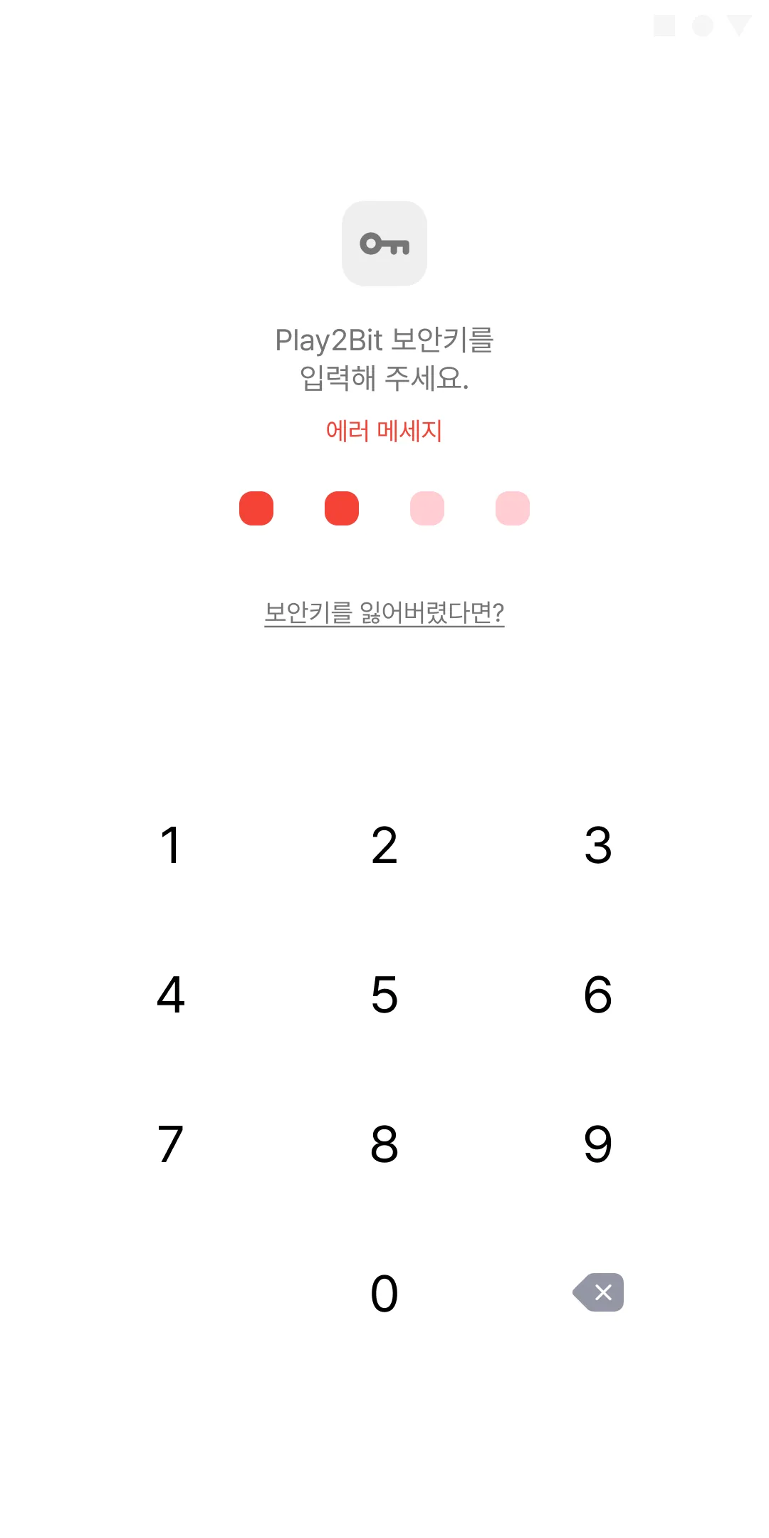
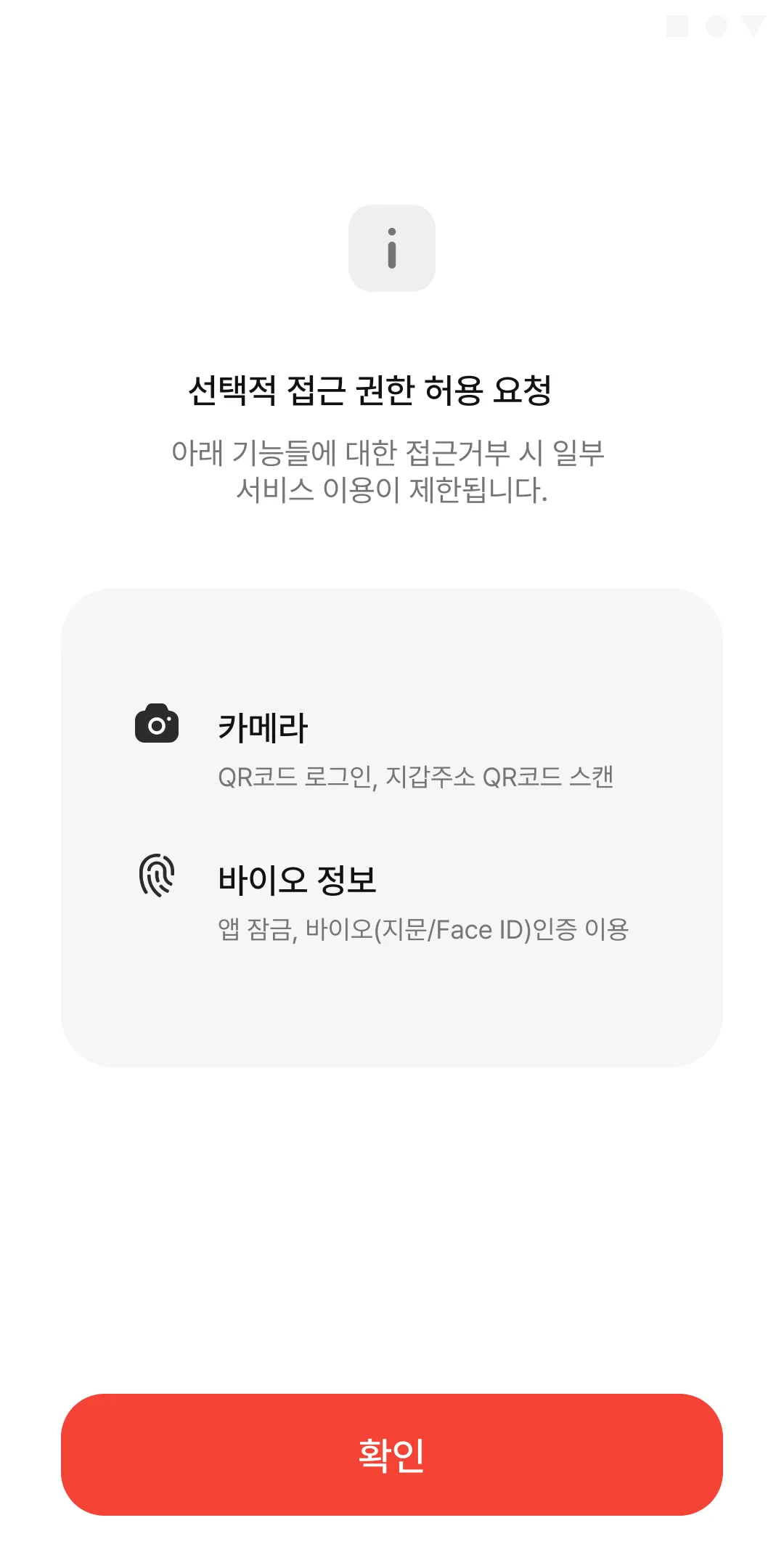
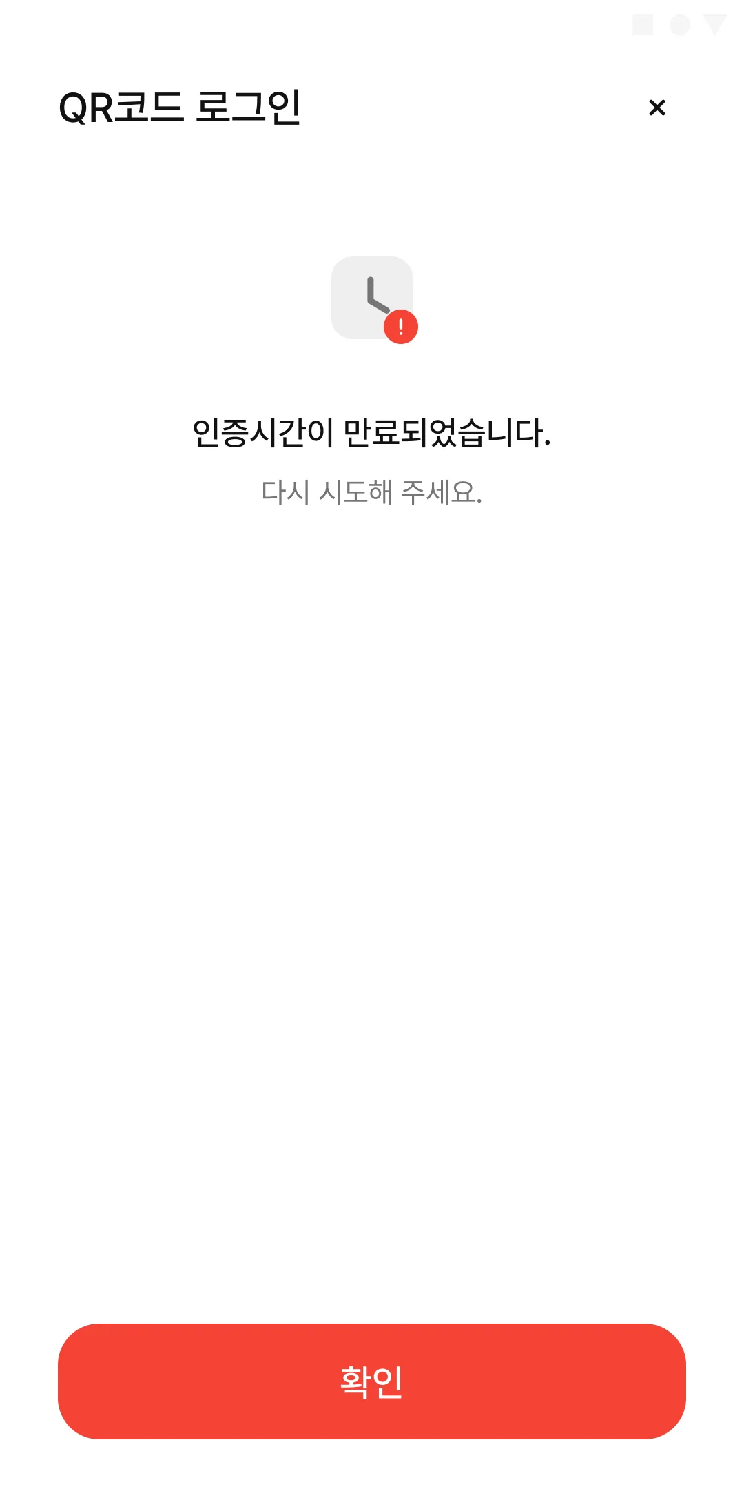
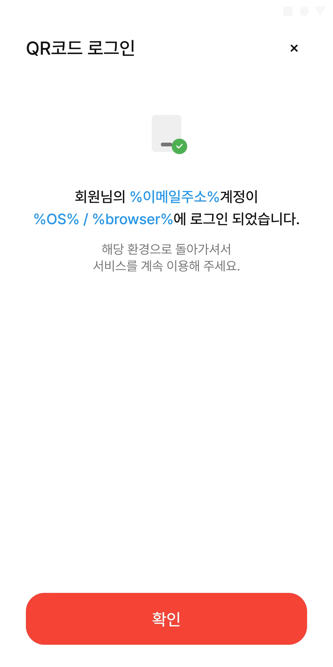
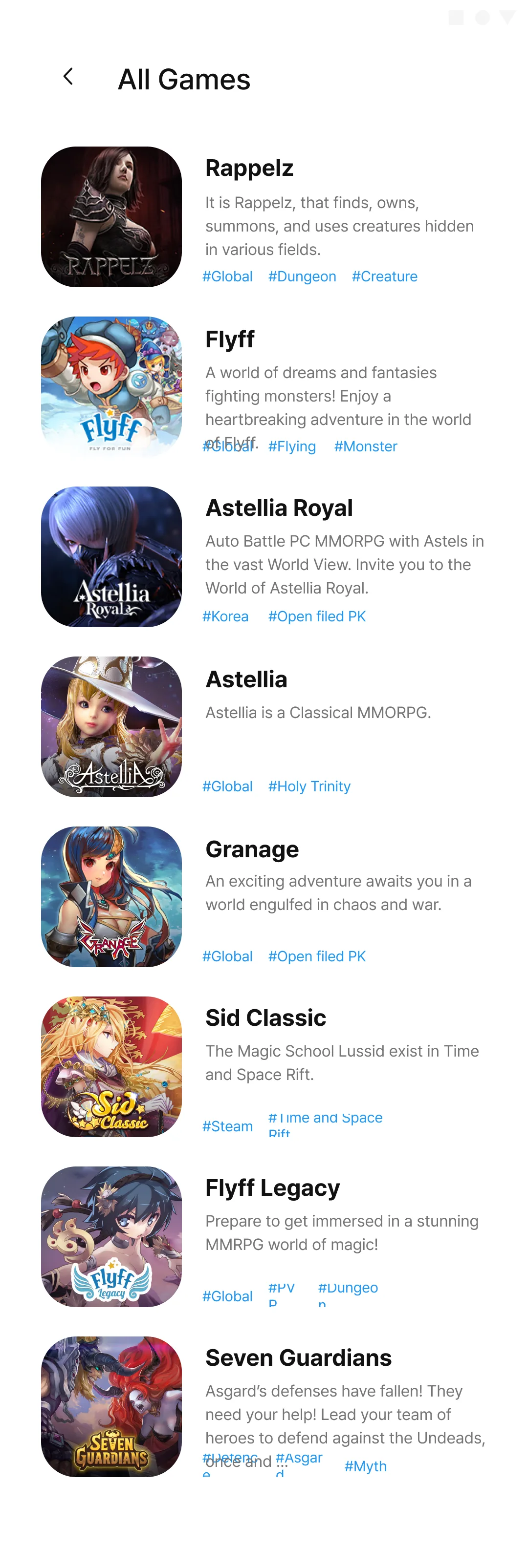
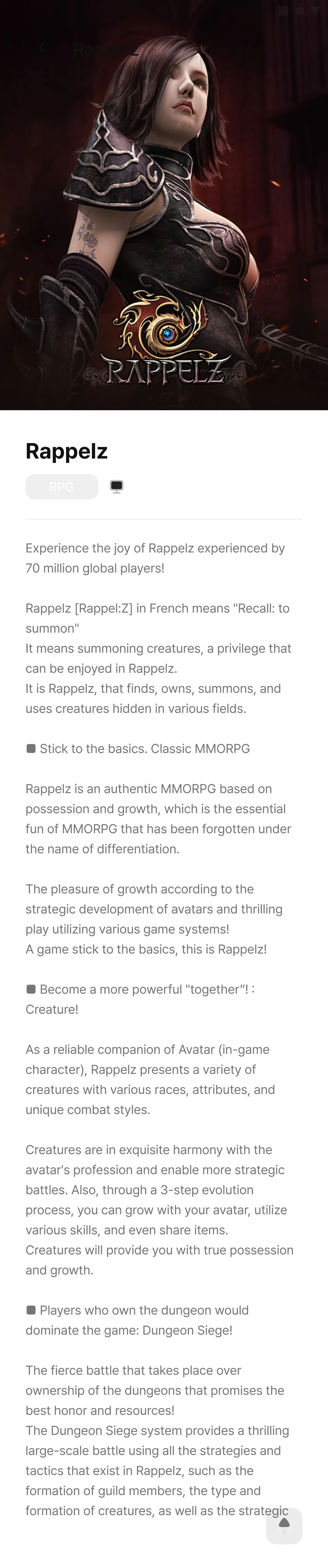
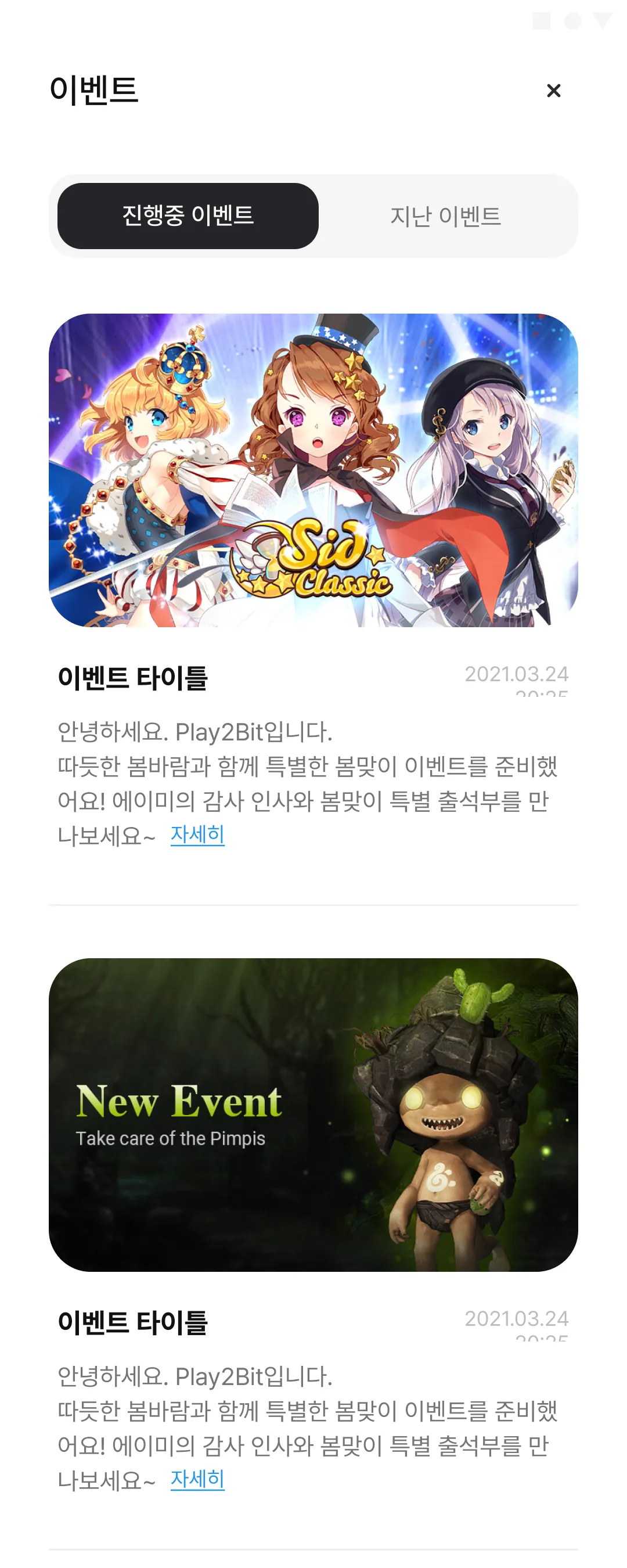
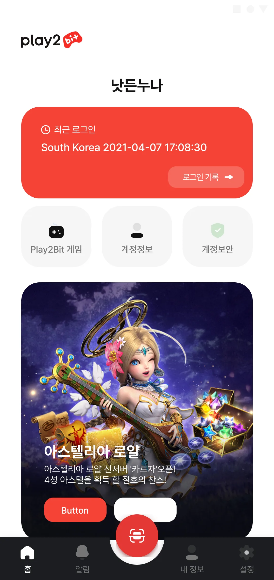
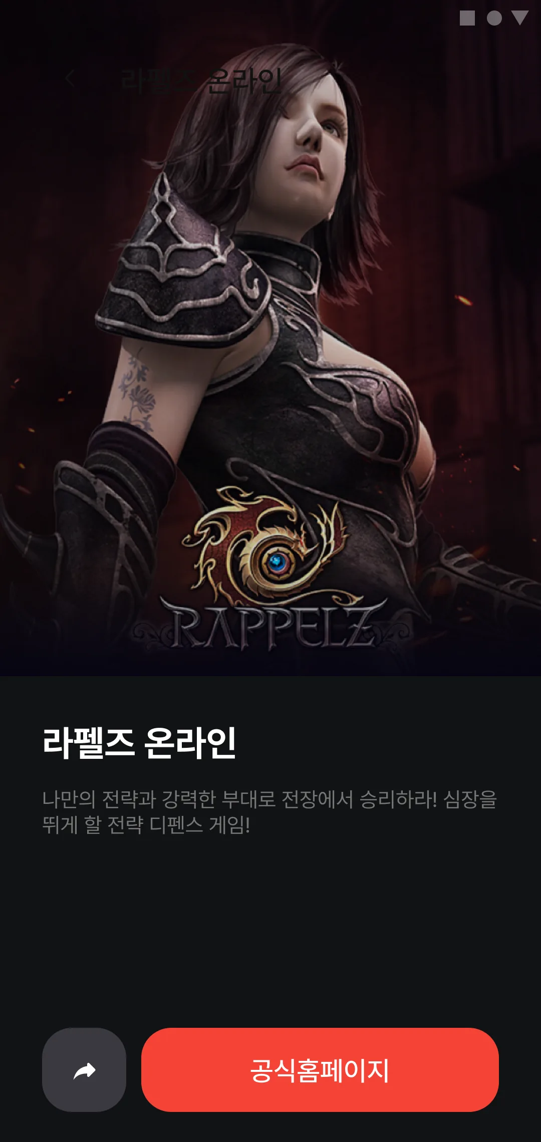
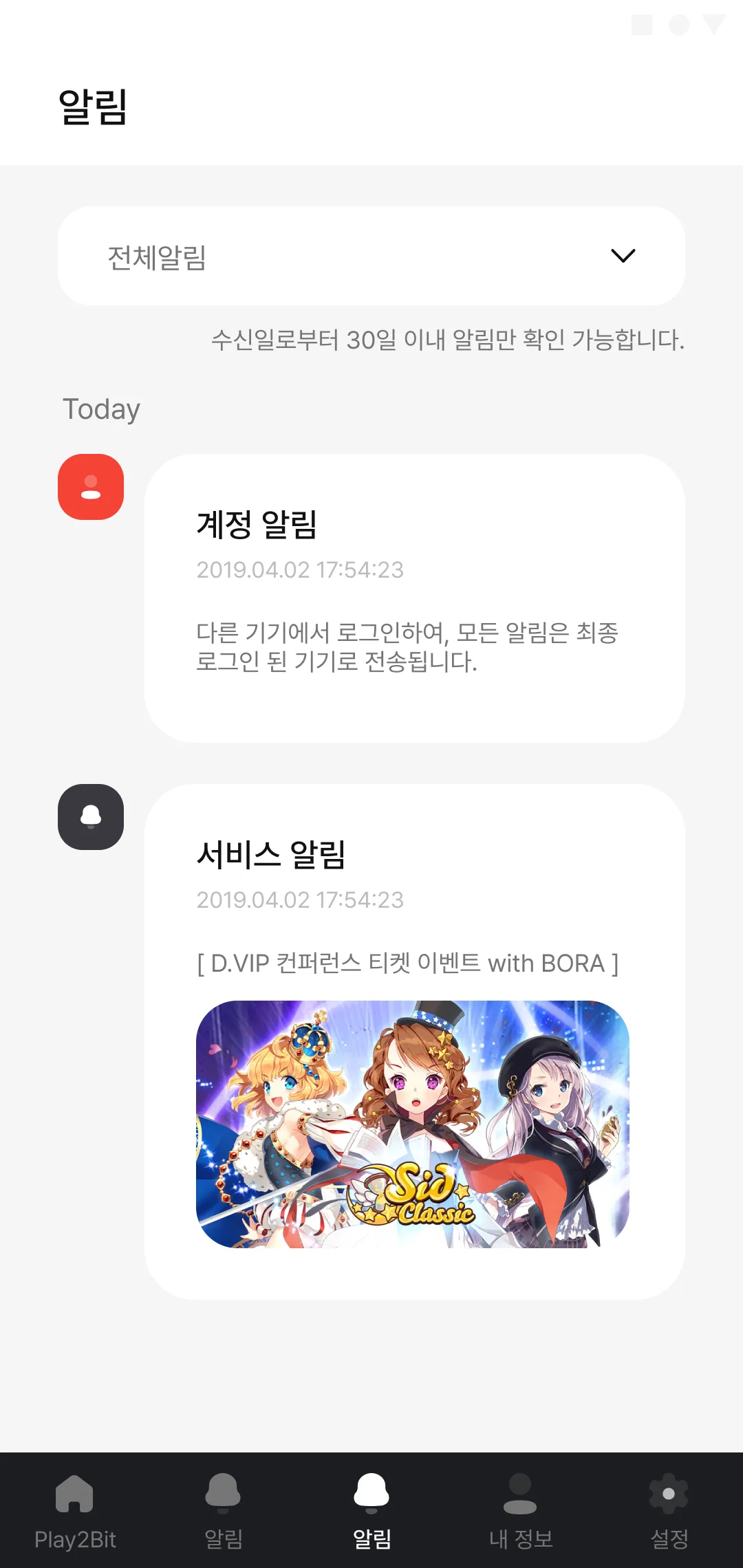
Game detail - RappelzKey art fills the top half; below it an RPG genre chip and four platform marks - PC, Google Play, App Store, Steam. The blurb opens by unpacking the name itself: Rappelz, French for "recall - to summon".All games - eight titlesOne row per title across all eight games. The tag row is too narrow, so longer tags like "#Time and Space Rift" and "#Dungeon" break and clip - and one tag is misspelled at the source (#Open filed PK).Notifications - listA 30-day retention line sits right under the filter, and account and transaction alerts are separated by hairlines. The transaction alert, though, carries the same body text as the account one.ProfileThree shortcuts under the name and address - account, security, services - then support and announcements split into two blocks. Only the last button breaks language: everything is Korean but it reads "Logout".SettingsThree groups: general, security, application. The language row reads English while the whole screen is Korean, and the long time-zone value wraps onto a second line at the right edge.Settings - notificationsApp push is on, account and transaction push are off. Five notes below spell out the exceptions up front: legally required notices arrive regardless, and muted alerts still show in the history.Settings - app lockWith the lock off, the password and biometric rows read as disabled too. A single note draws the line: the security key used for transactions is changed in account management, not here.Settings - languageKorean is selected, followed by Deutsh (a typo for Deutsch), English - and then "한국어" four more times. The placeholder rows were duplicated and never replaced.Settings - time zoneOnly two choices: Korea Standard Time and UTC. The platform bills itself as global, but the time-zone list stops at Seoul and Greenwich.EventsOngoing and past tabs over a stack of banner cards. Title and body are still placeholders, and the run dates start and end on the same day.Events - emptyThe tabs stay put and the body collapses to one icon and one line. Nothing is hidden, so a reader with no live events can still cross over to past ones.Event detailThree sources collide in one screen: a placeholder headline, a Kakao Pay banner, and a body that is actually an Astellia Royal patch note about a renamed region.Support - FAQThe first question opens by default and answers in three parts - framing, angle, distance. The third heading lost a letter and reads "can distance" instead of "scan distance".AnnouncementsThree maintenance notices and two policy items, all stamped with the same timestamp. Type is carried only by the bracketed prefix in the title.Announcements - emptyOne line: no posts. Icon, position, and tone match the empty events screen, so the two read as one pattern.VersionApp icon, current build, an "up to date" line, and a single button through to the open-source licenses. Nothing else.Open-source licenses - unbuiltTitle and close button only; the body is left as a grey slab. It marks where the license text will go rather than pretending to be finished.Announcement detail - title/body mismatchThe headline announces a privacy-policy revision; the body is Way2Bit's launch greeting, listing all eleven games it operates. The timestamp clips outside its box.Announcement detail - with imageThe same post as 018 with the "Just Play!" key visual added - the pair exists to show how far the body drops once an image sits above it.Contact - unbuiltBack arrow and title, then nothing. The inquiry form was never drawn, and the frame is kept as the placeholder it is.App lock passcodeA four-digit lock: filled dots solid, remaining dots faded, and a keypad whose only extra key is backspace - no cancel, no way back.Security key - error stateThe same four-digit field with a red line added - except the line still reads "error message" instead of an actual one. Below it, a link out to key recovery.Optional permissionsOnly two permissions are requested, each with the feature it unlocks spelled out. The subtitle says plainly that refusing limits some features rather than blocking the app.QR login - expiredA clock with a red badge and two lines. One of four failure screens, each pinned to a different cause - this one is the timer running out.QR login - signed inThe success state, with %email%, %OS% and %browser% left in blue so the substitution points are visible, then a nudge back to the device that started the login.QR login - invalid codeA QR mark with a red badge: the code itself is wrong, so the fix is to check it and scan again rather than retry the same one.QR login - not verifiedA key with a red badge - kept apart from expiry and bad codes for the case where verification simply never completed.QR login - confirm with keyIt names the requesting environment first, then asks for the key. A note explains this confirmation only happens on a PC with no login history.QR scannerA dark sheet rises with the camera preview inside it - except the preview holds a snapshot of desk figurines instead of a code, and no scan frame has been drawn yet.Home - event popupHome dims behind a Kakao Pay promo. The footer splits the two intents - dismiss for now, or never show again.Basic dialog - componentNot a screen but a component sample: dummy title, three dummy lines to fix the height when the body overflows, and a cancel/confirm pair to show the weight difference.HomeA game banner carousel counts 3 of 16, and a red card below states where and when the account last signed in. QR scan floats as a round button over the four-tab bar.Tutorial 1 - the platform"Global Game Platform / Play2Bit" over a claim of fifty million users worldwide, a large 3D illustration, and a single button.Tutorial 2 - QR loginSigning in without typing an ID and password every time is the app's reason to exist; the key-and-lock illustration carries that promise.Tutorial 3 - data protectionThe same argument from the safety side. All three slides carry the identical "Get Started" label, so advancing and finishing look the same.MaintenanceOne megaphone and a start-to-end window. It reuses the tutorial layout, but the button turns red and reads OK - this screen is a dead end, not a step.All games - EnglishThe English cut of 002. Longer copy overruns its box and collides with the tag row on Flyff and Seven Guardians, and Flyff Legacy is described as an "MMRPG".Game detail - EnglishThe tallest frame here at 5,160px. It runs long enough to need sub-heads for creatures and dungeon siege, yet stops mid-sentence - and shows one platform mark where the Korean cut shows four.Events - second takeOpens as a modal with a close button instead of a back arrow. Cards swap the run period for a posted date and end with a "more" link, so the list itself carries the reading.Home - account-firstThe nickname becomes the headline, with the login card and three shortcuts above the fold. The event banner below still carries a dummy "Button" label and an empty white pill.Home, full scroll - list viewThe entire home page as one 9,000px frame - login card, shortcuts, recent game, promo banner, full game list, announcements tab, footer. Every game in the list is named "Flyff" and carries Rappelz's blurb.Home, full scroll - darkThe dark cut of 041, and not only in colour: the lower tab opens on events rather than announcements, and the cards use a different placeholder set whose first tag is clipped to "#actio".Home, full scroll - grid viewThe same page with the game list switched to a two-column grid, toggled by the pair of icons at the top right. The grid drops the blurb for a name and a single tag - names still duplicated down the page.Home, full scroll - grid, darkThe dark cut of the grid. Seen together, the four long frames are light and dark across list and grid - the home screen tried in every combination.Game detail - darkThe dark cut of 001, trimmed to a share button and one call to action. The title still says Rappelz while the blurb is Seven Guardians' strategy-defence pitch.Notifications - cardsThe list from 003 rebuilt as cards: a "Today" group header, coloured icons to separate kinds, and room inside the card for a banner image.