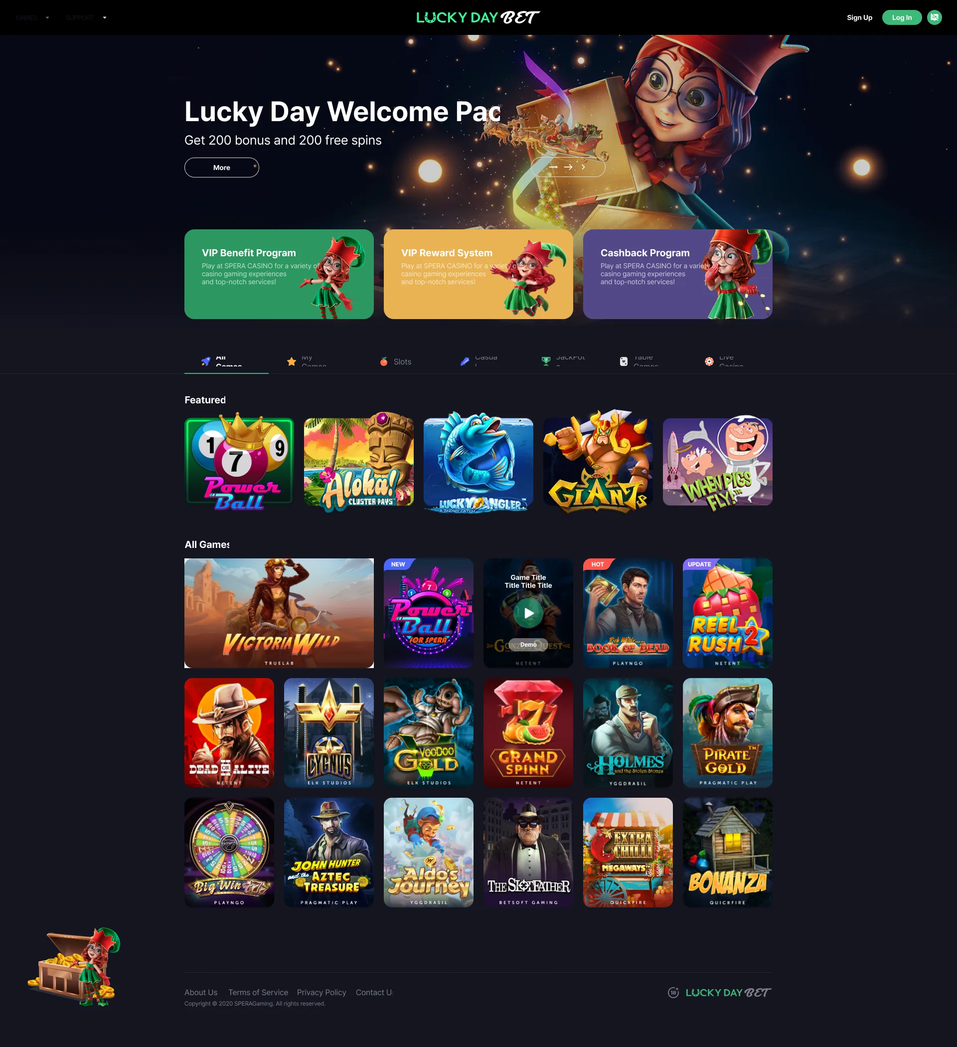
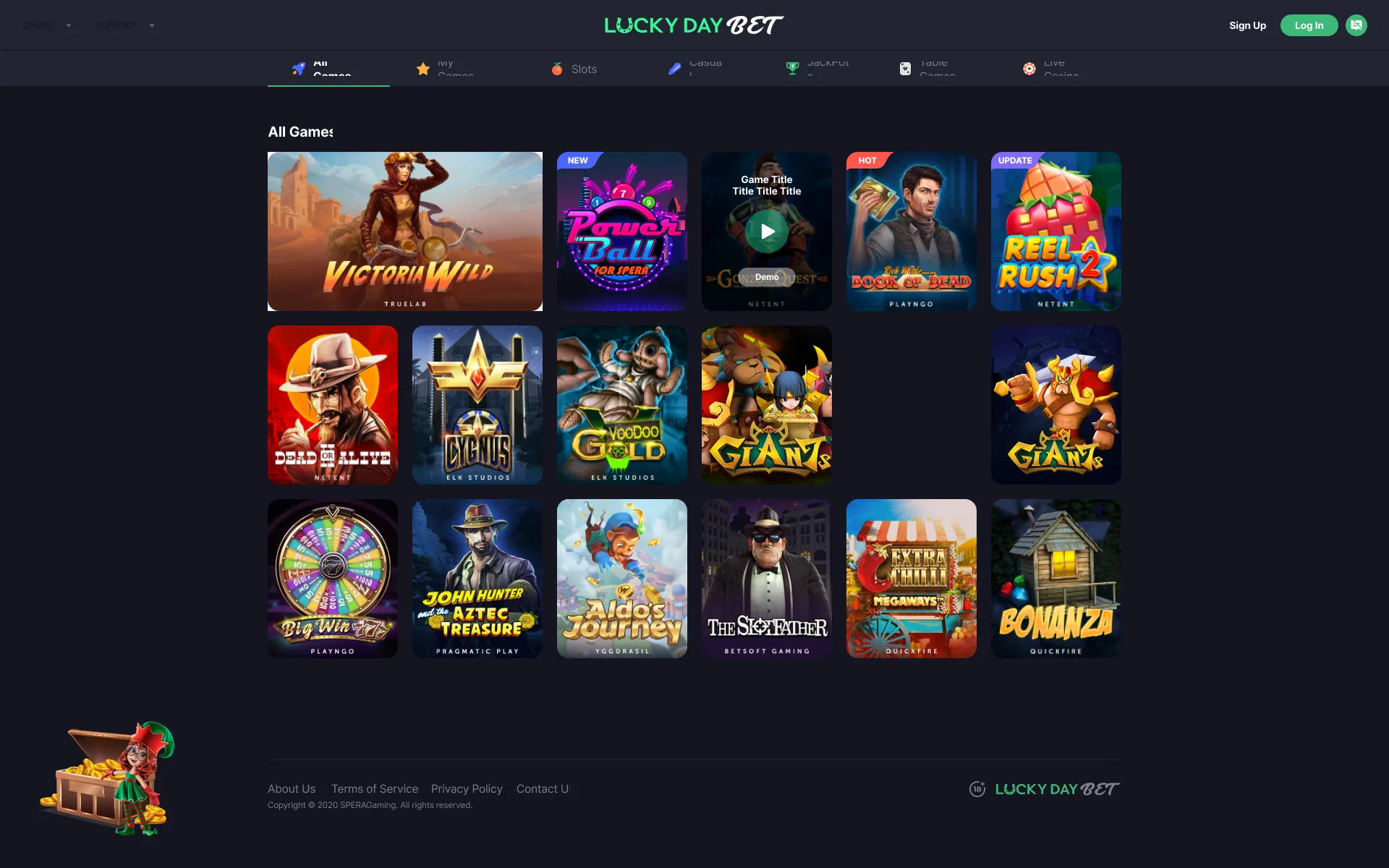
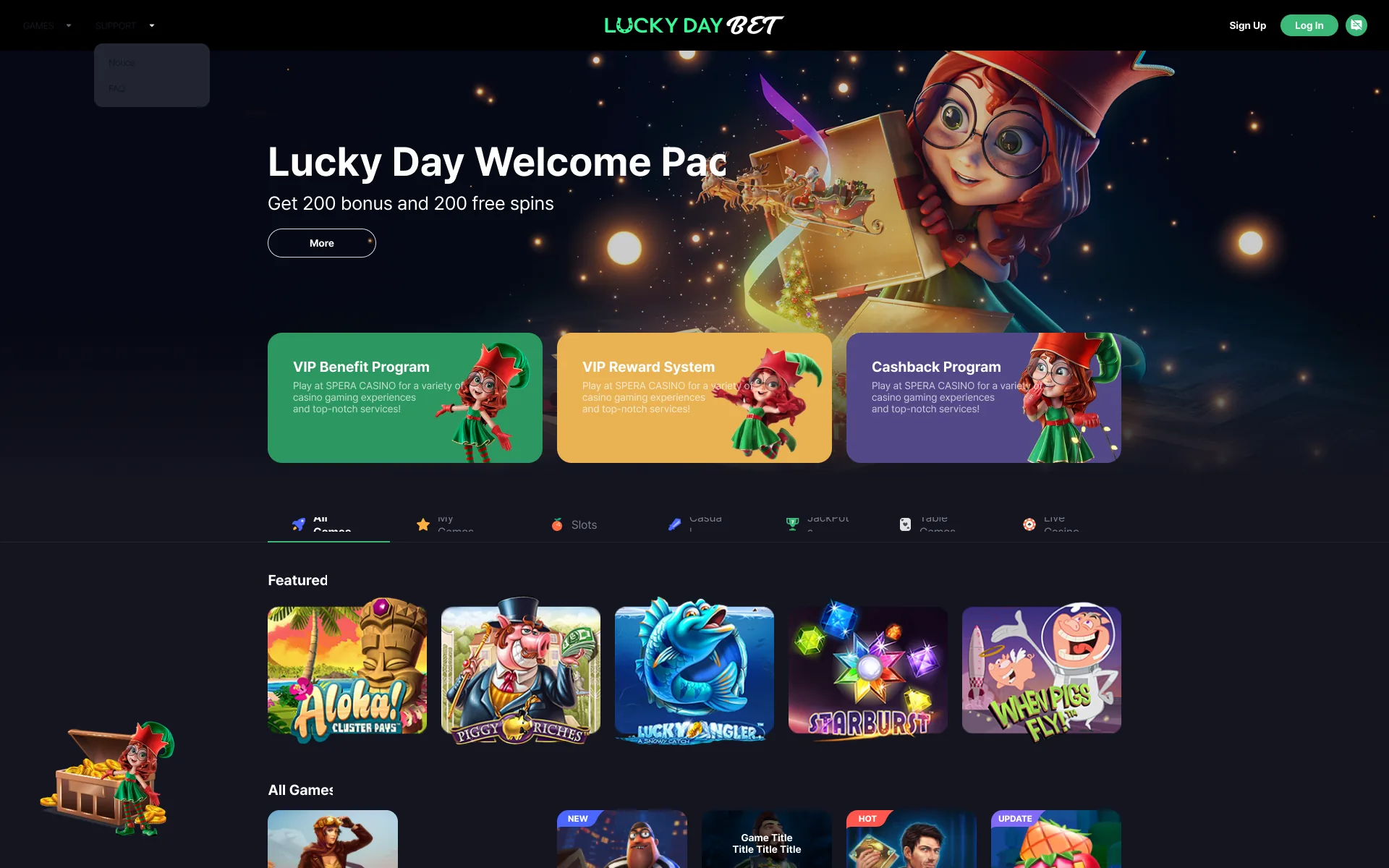
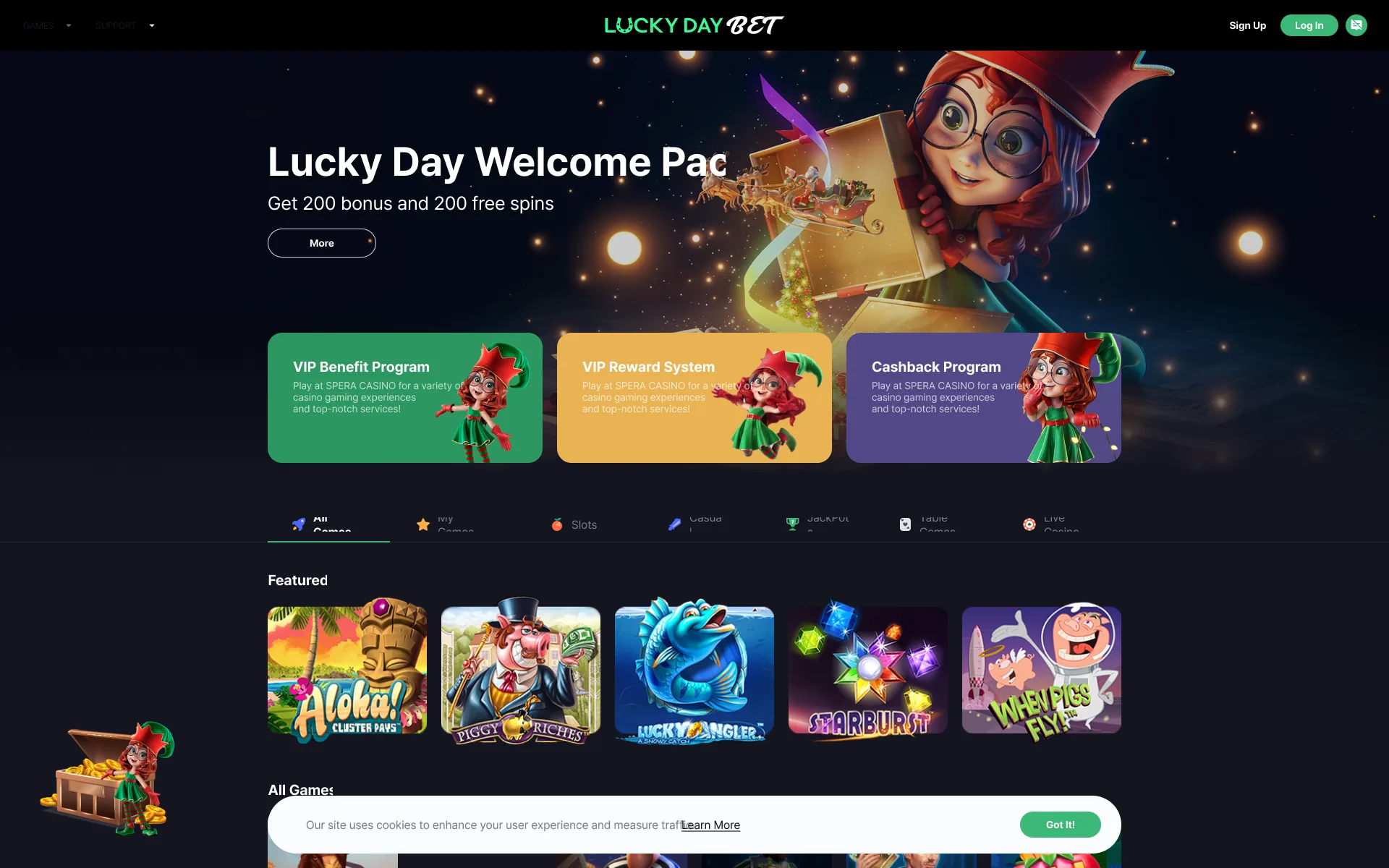
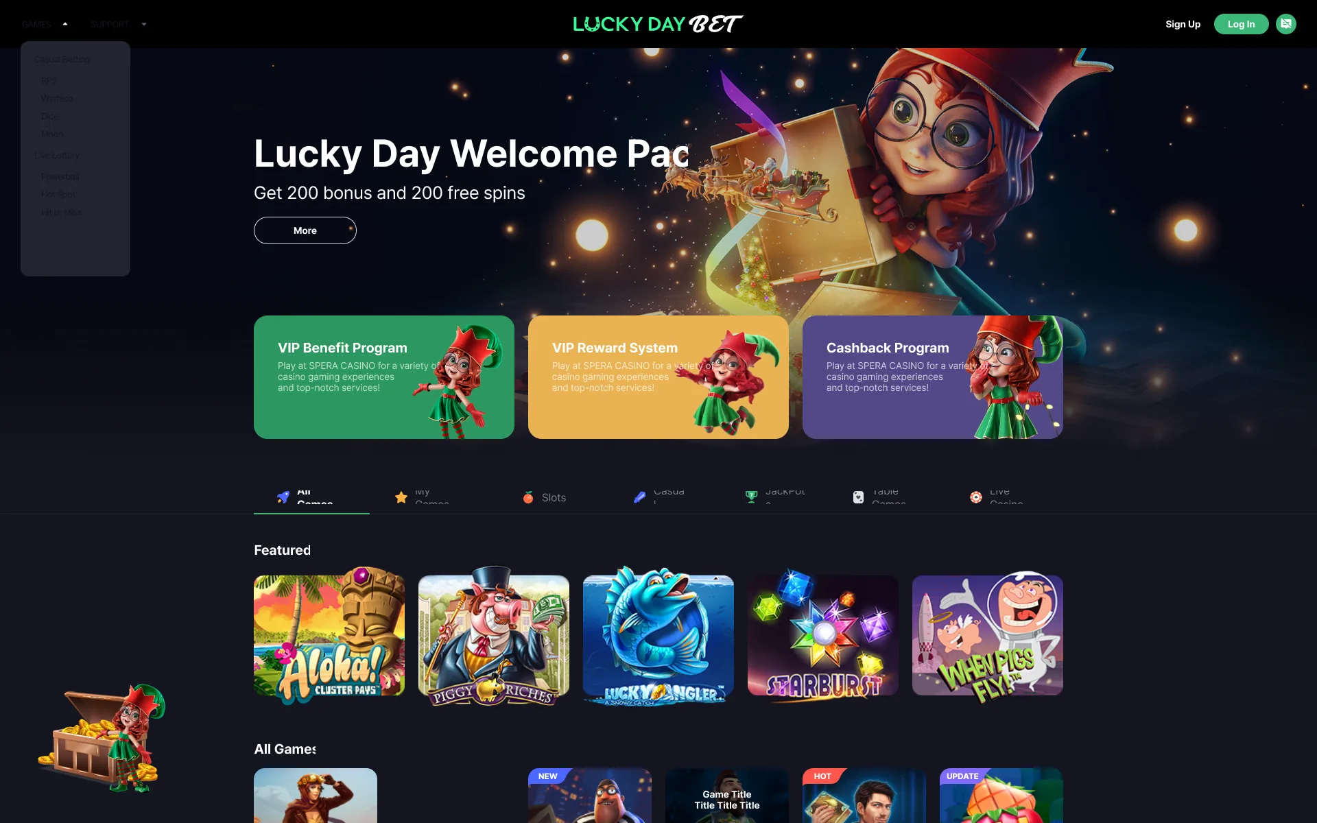
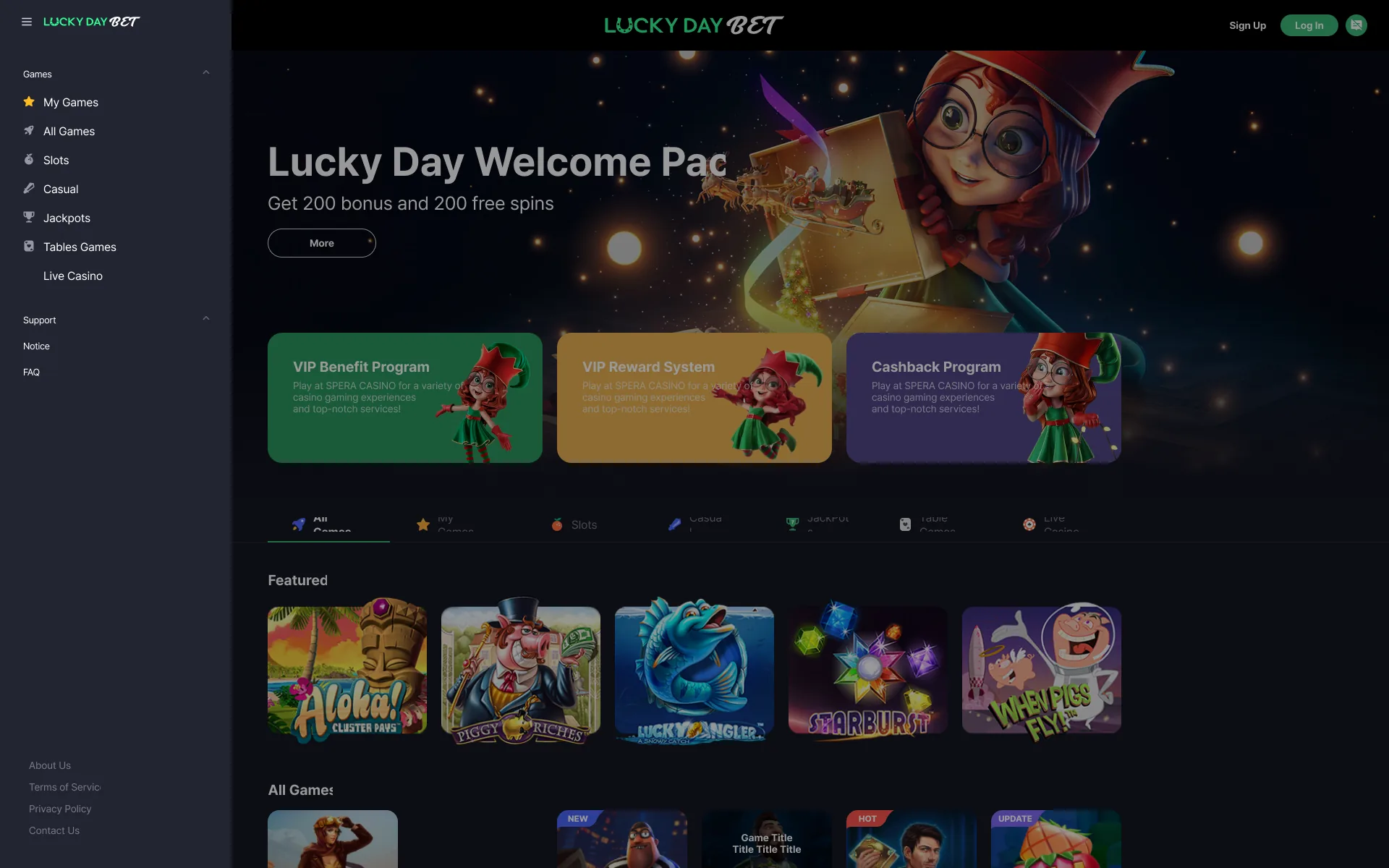
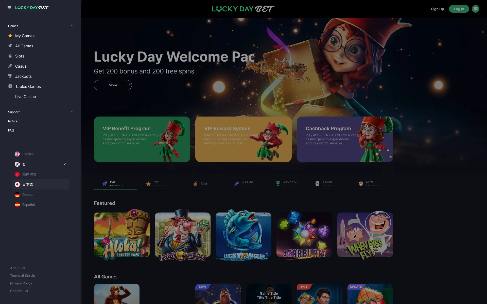
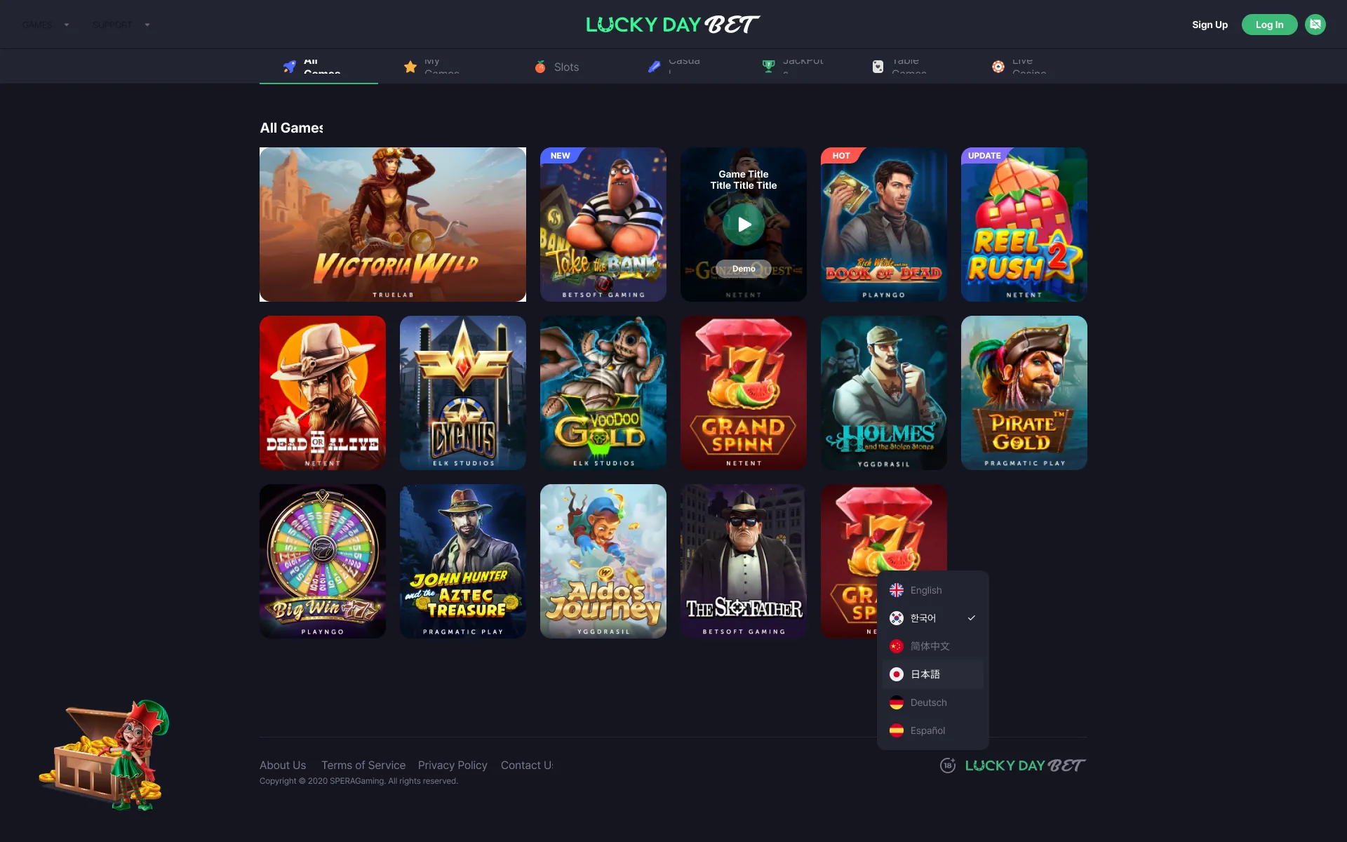
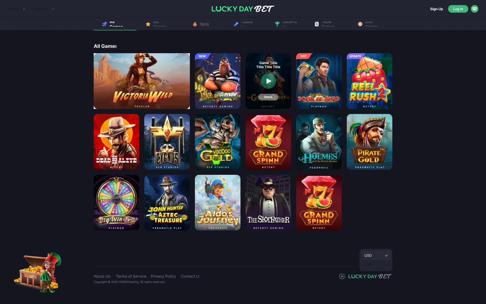
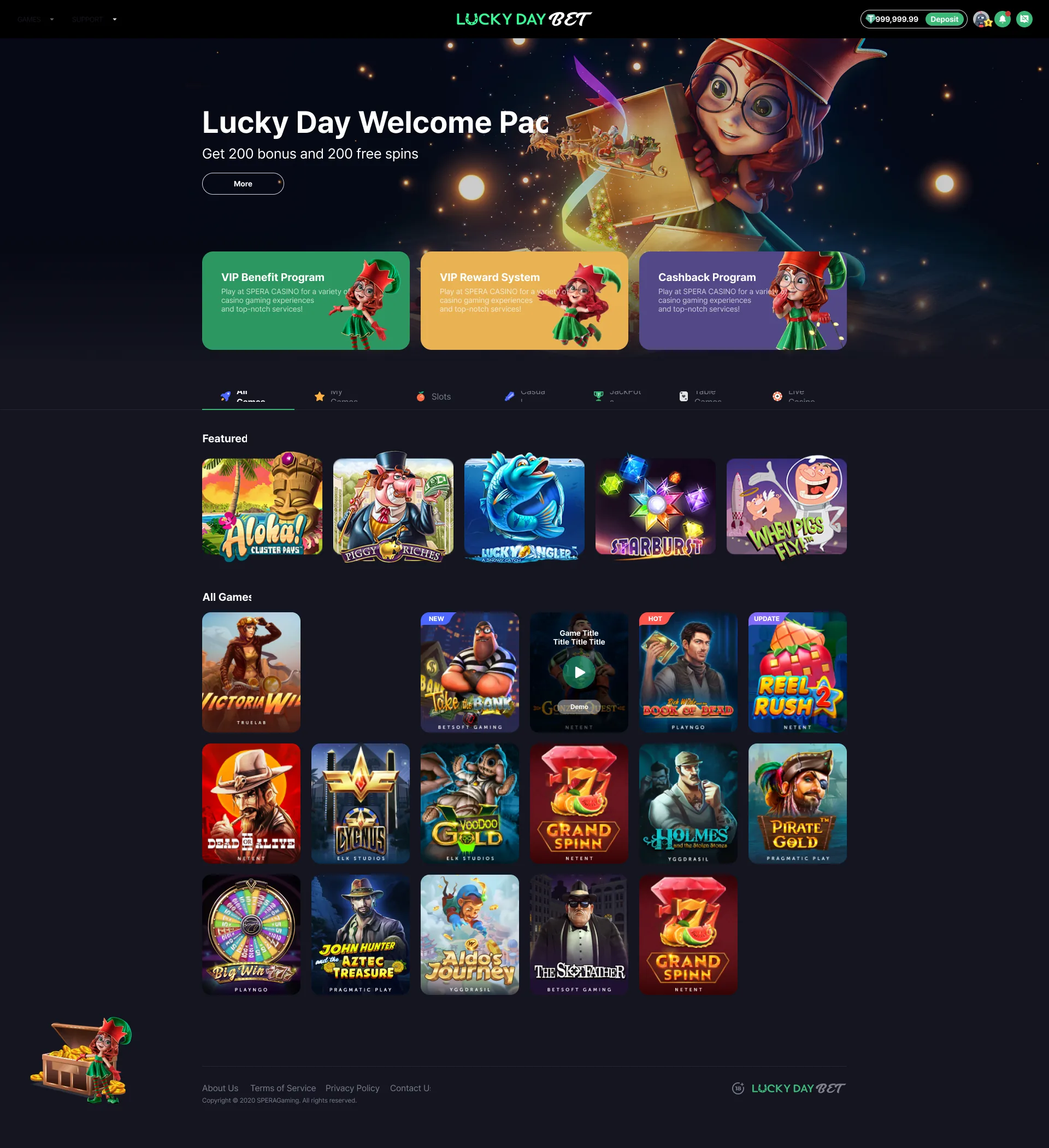
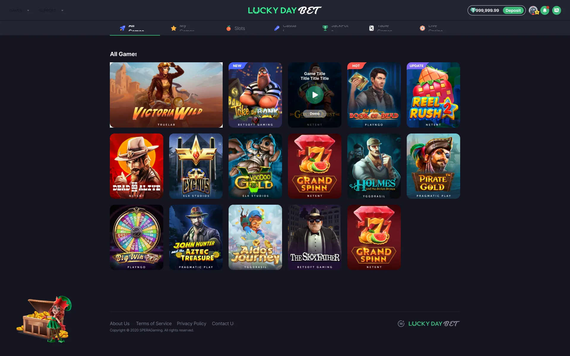
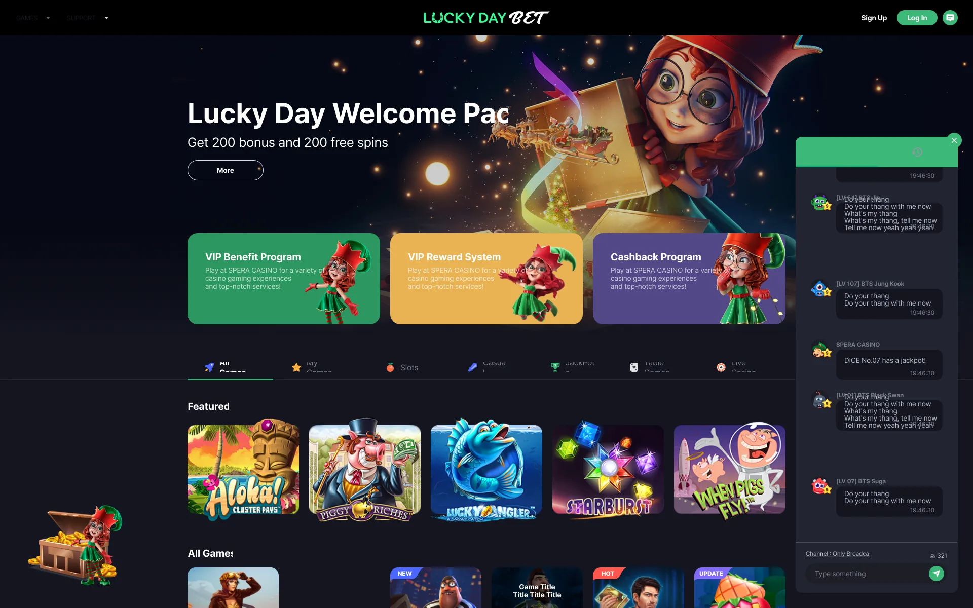
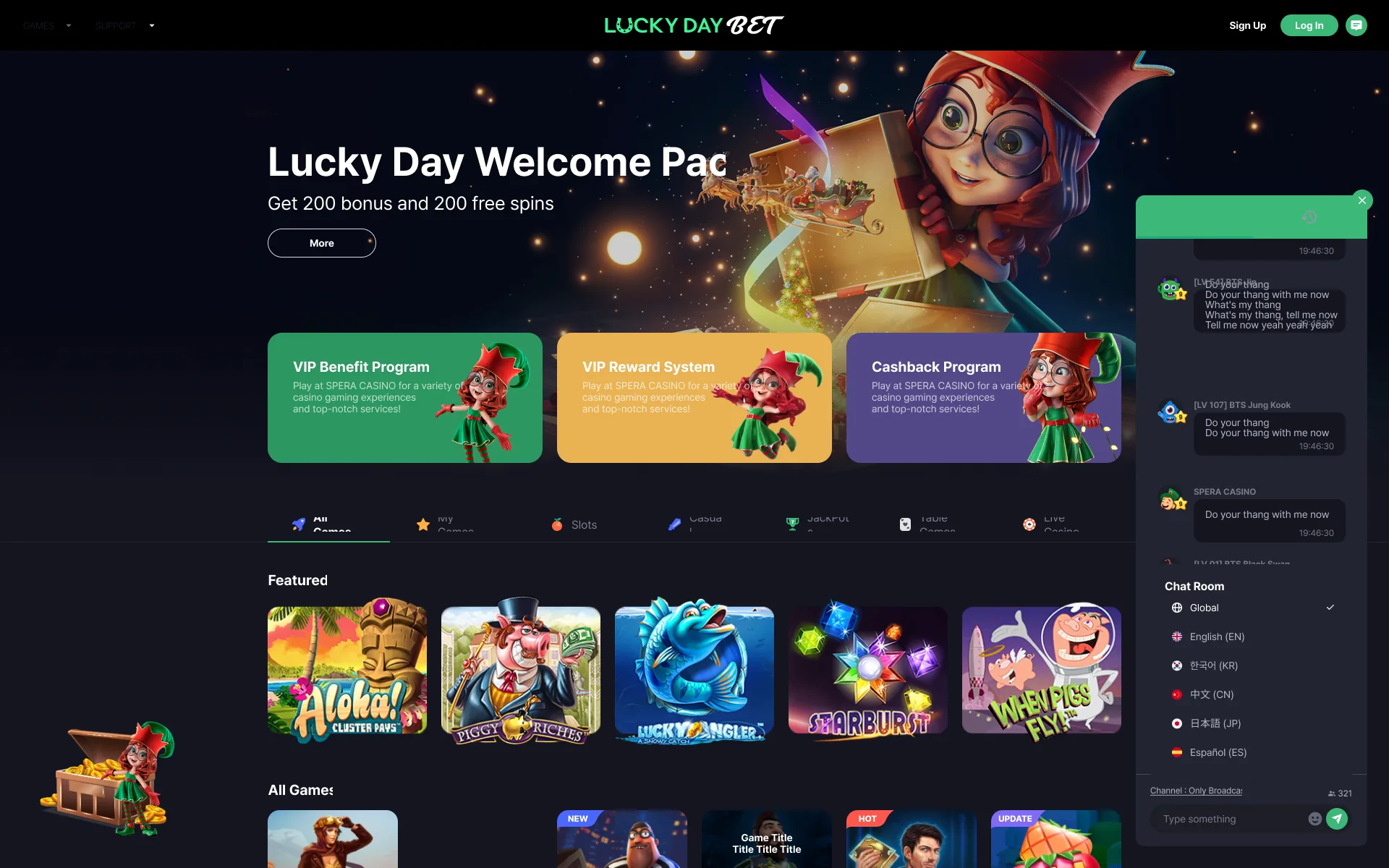
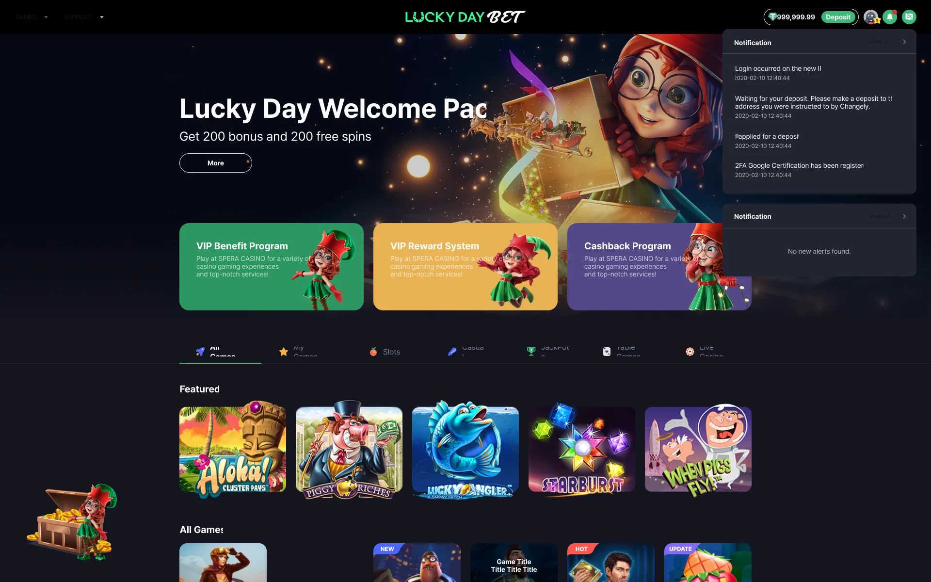
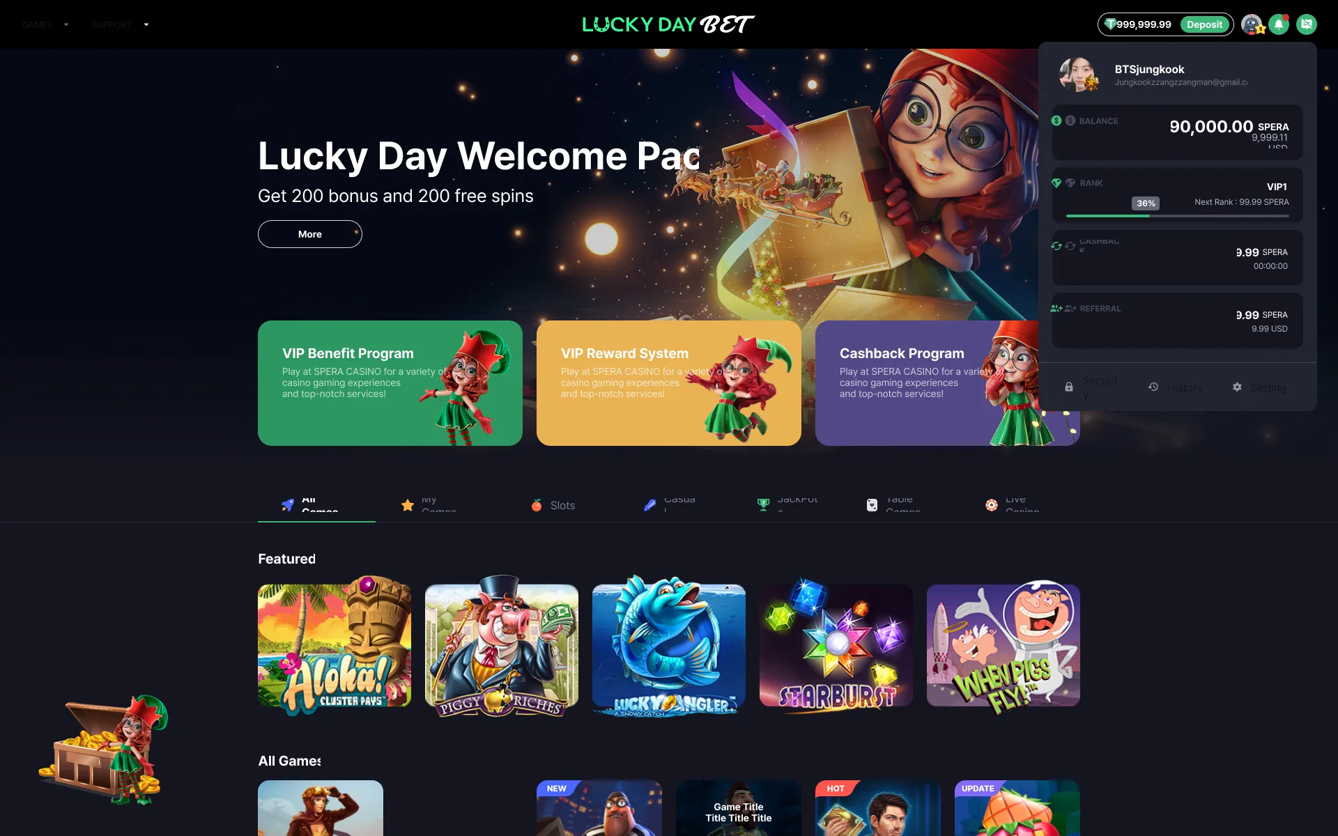
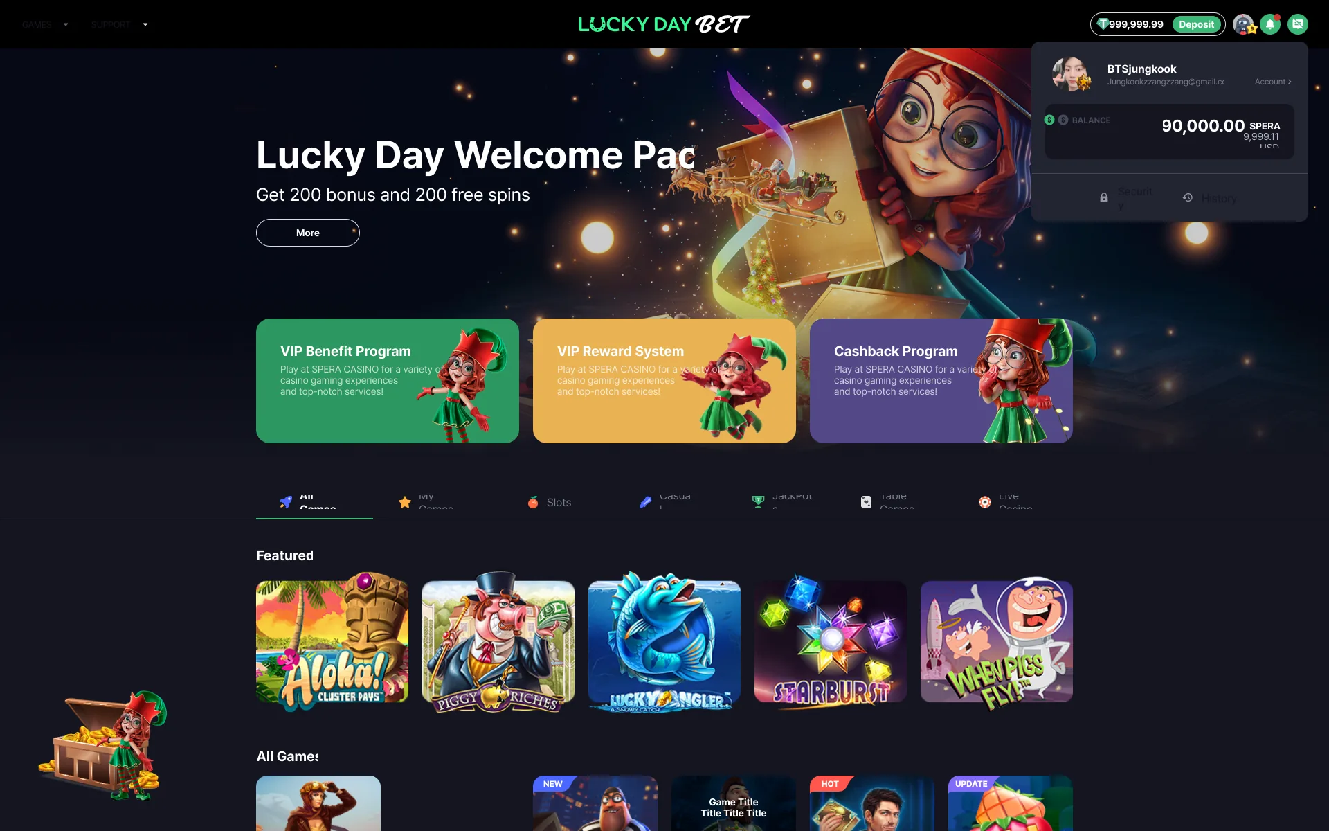
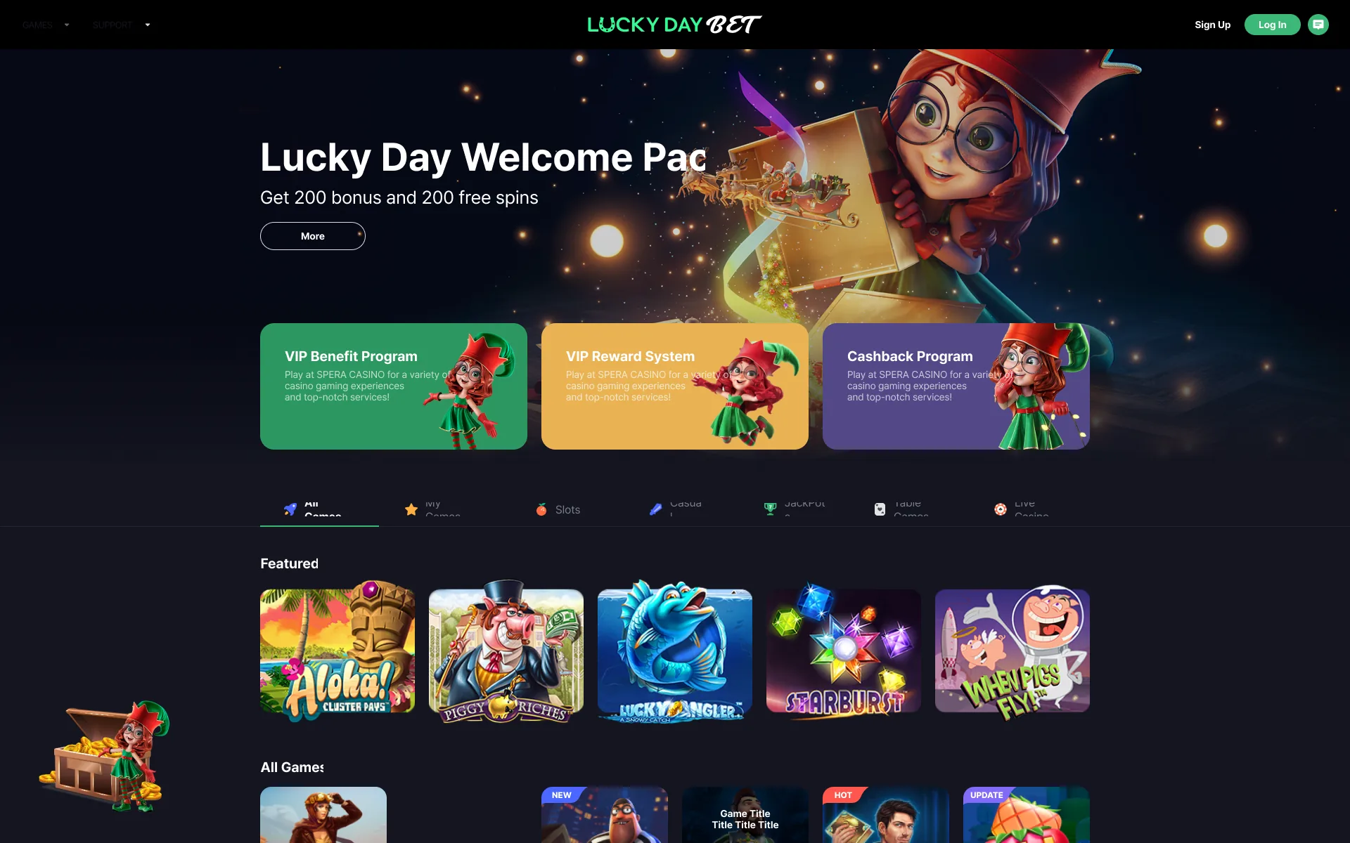
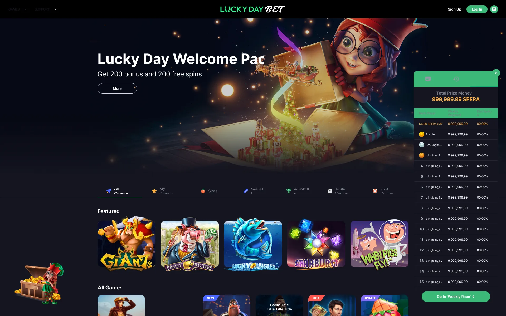
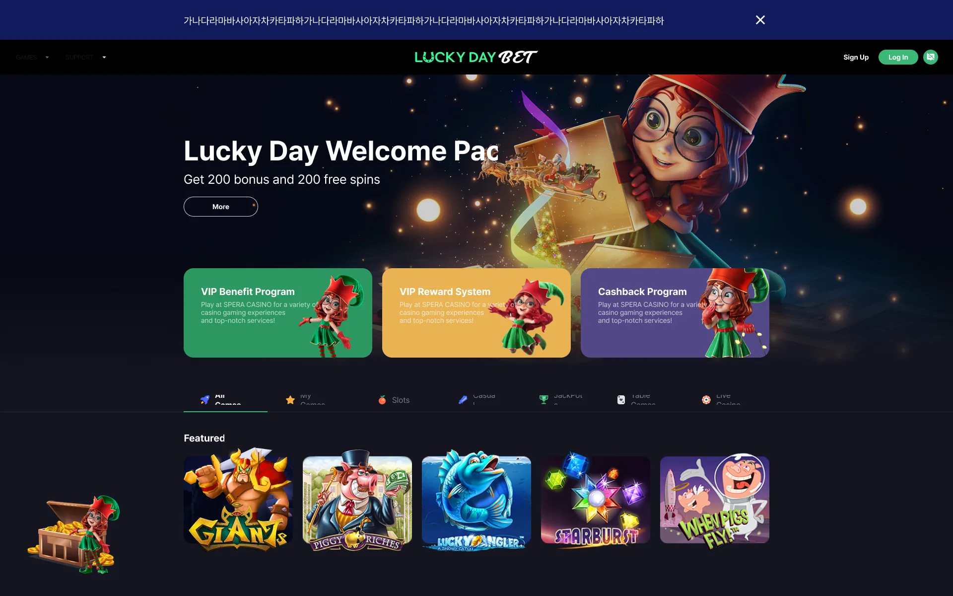
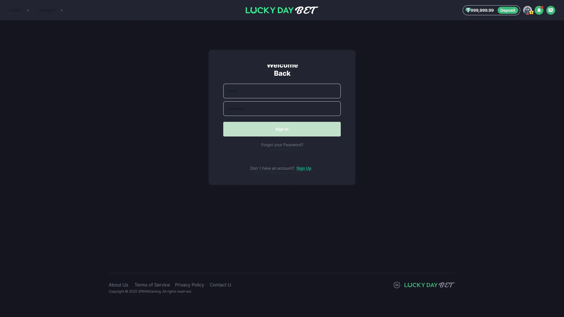
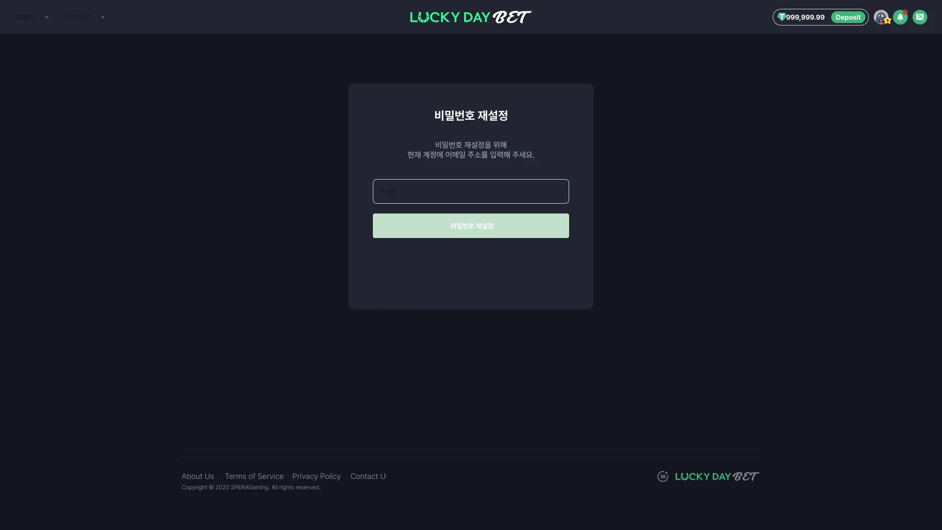
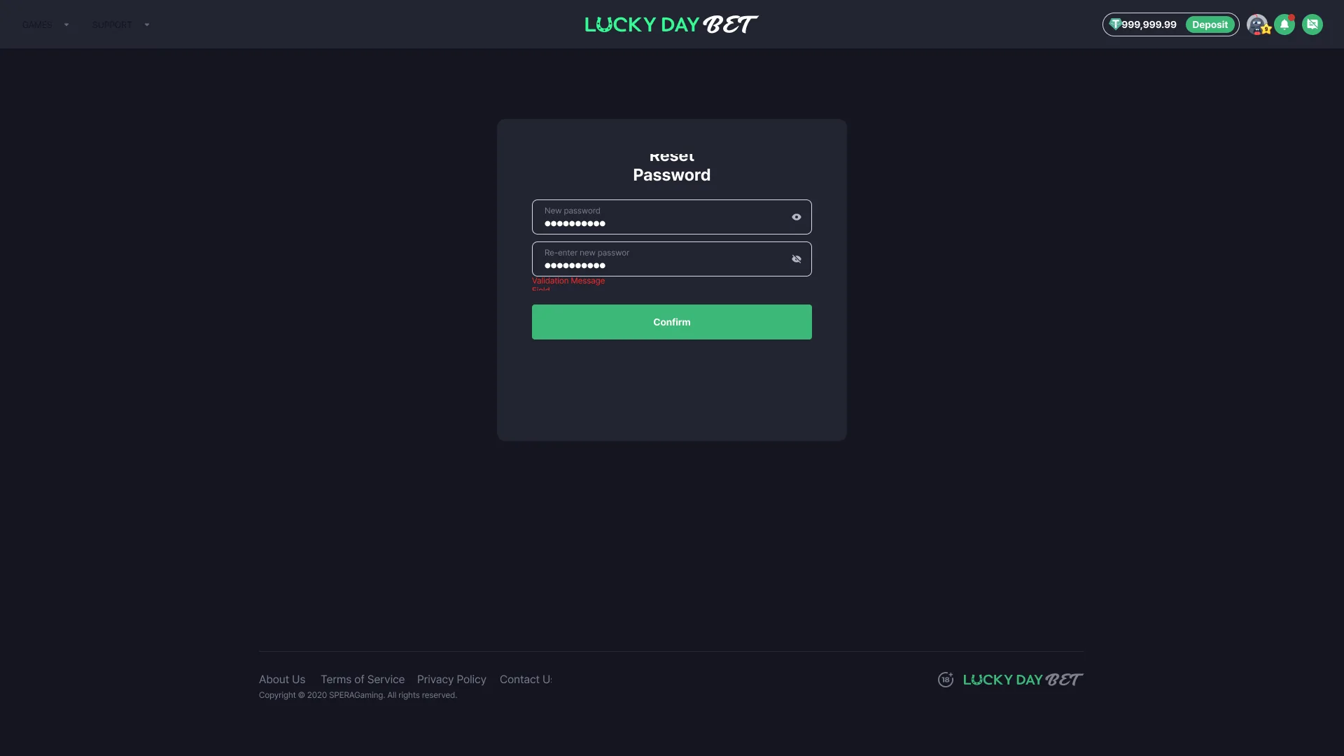
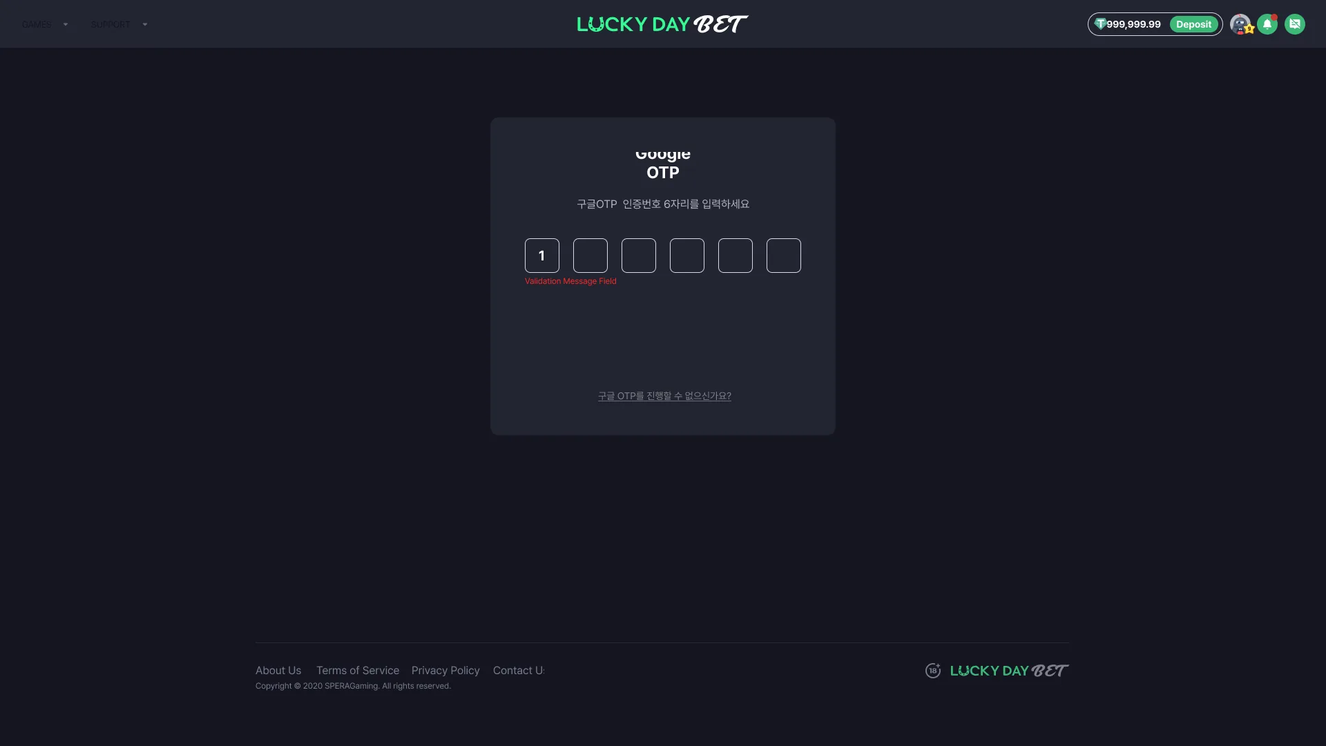
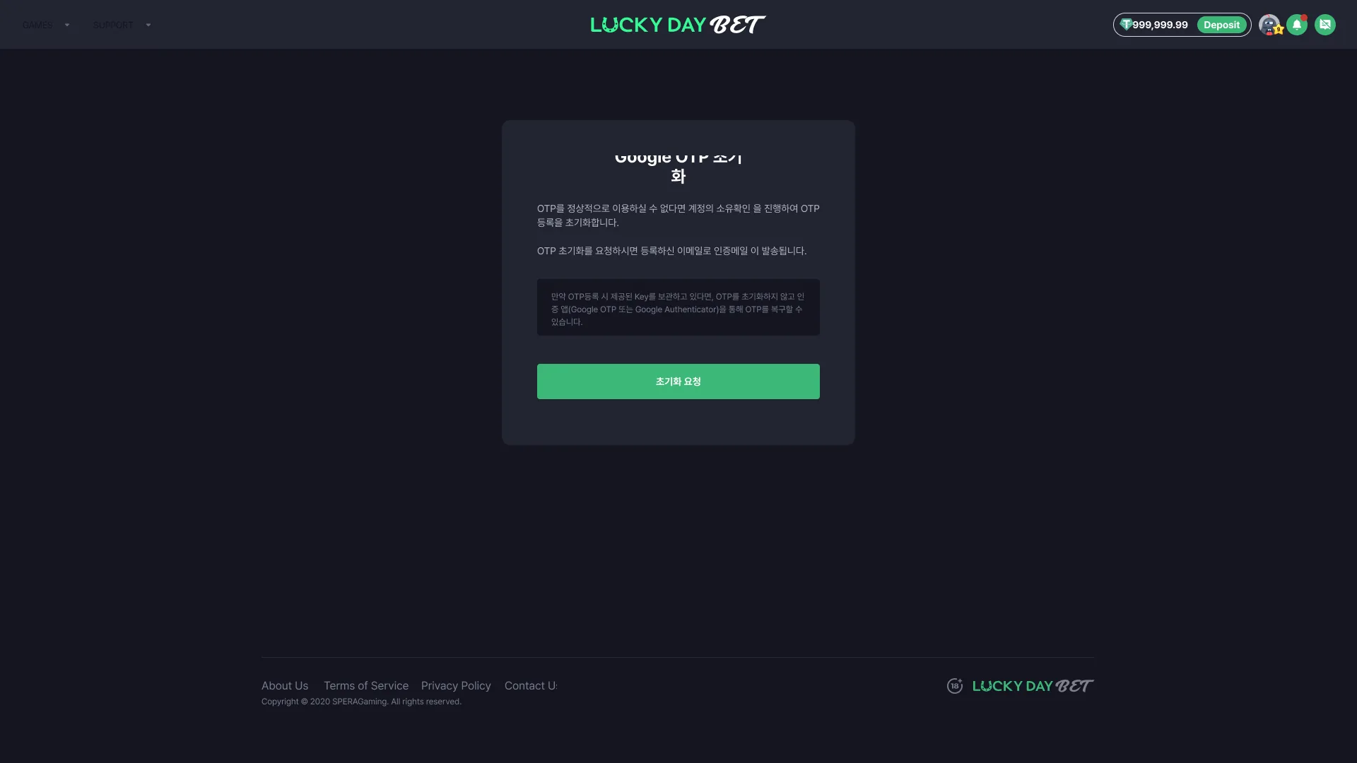
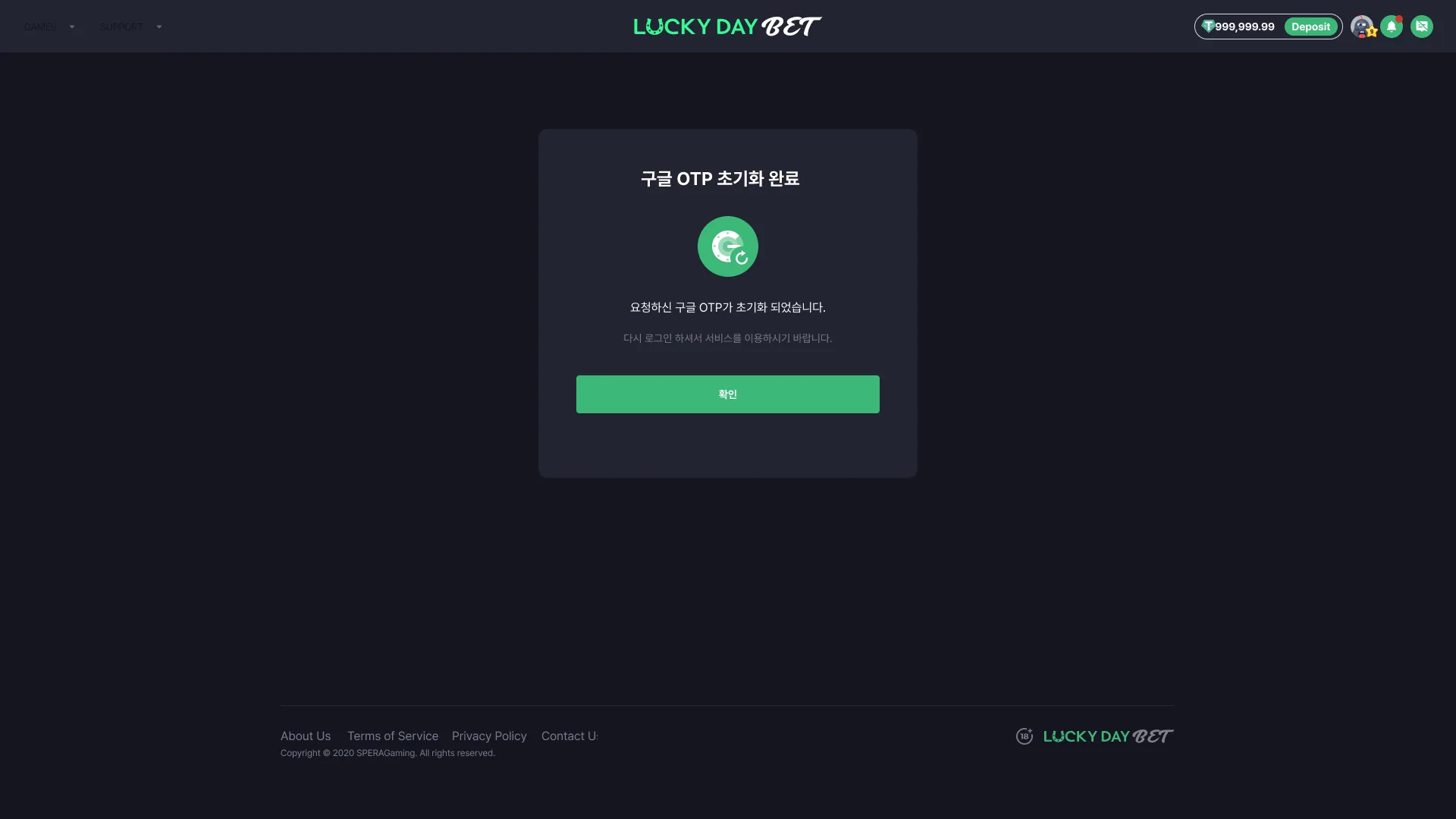
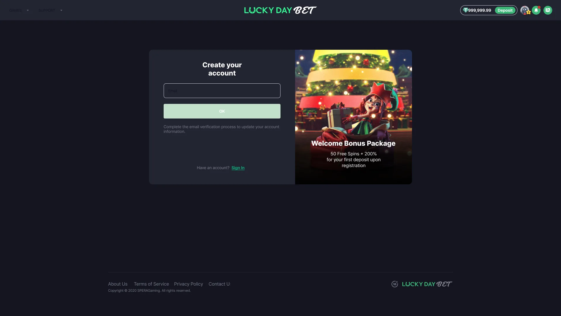
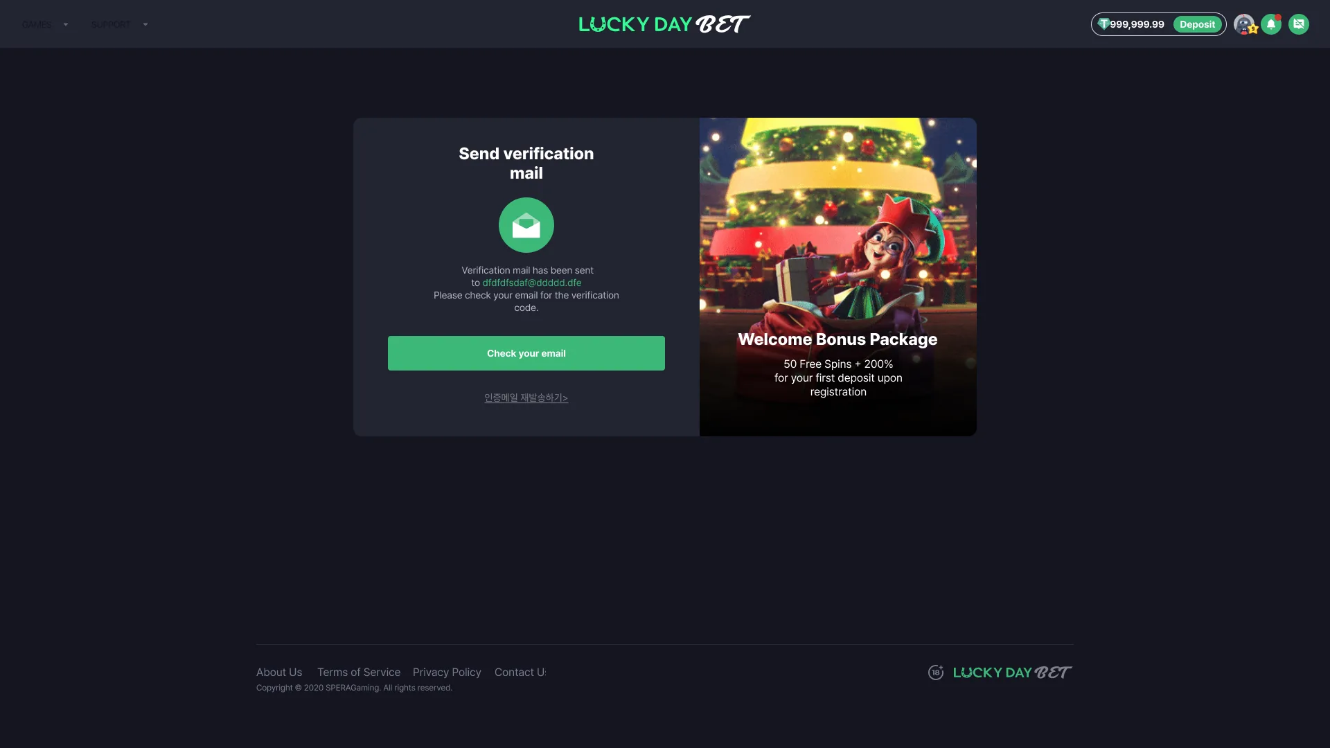
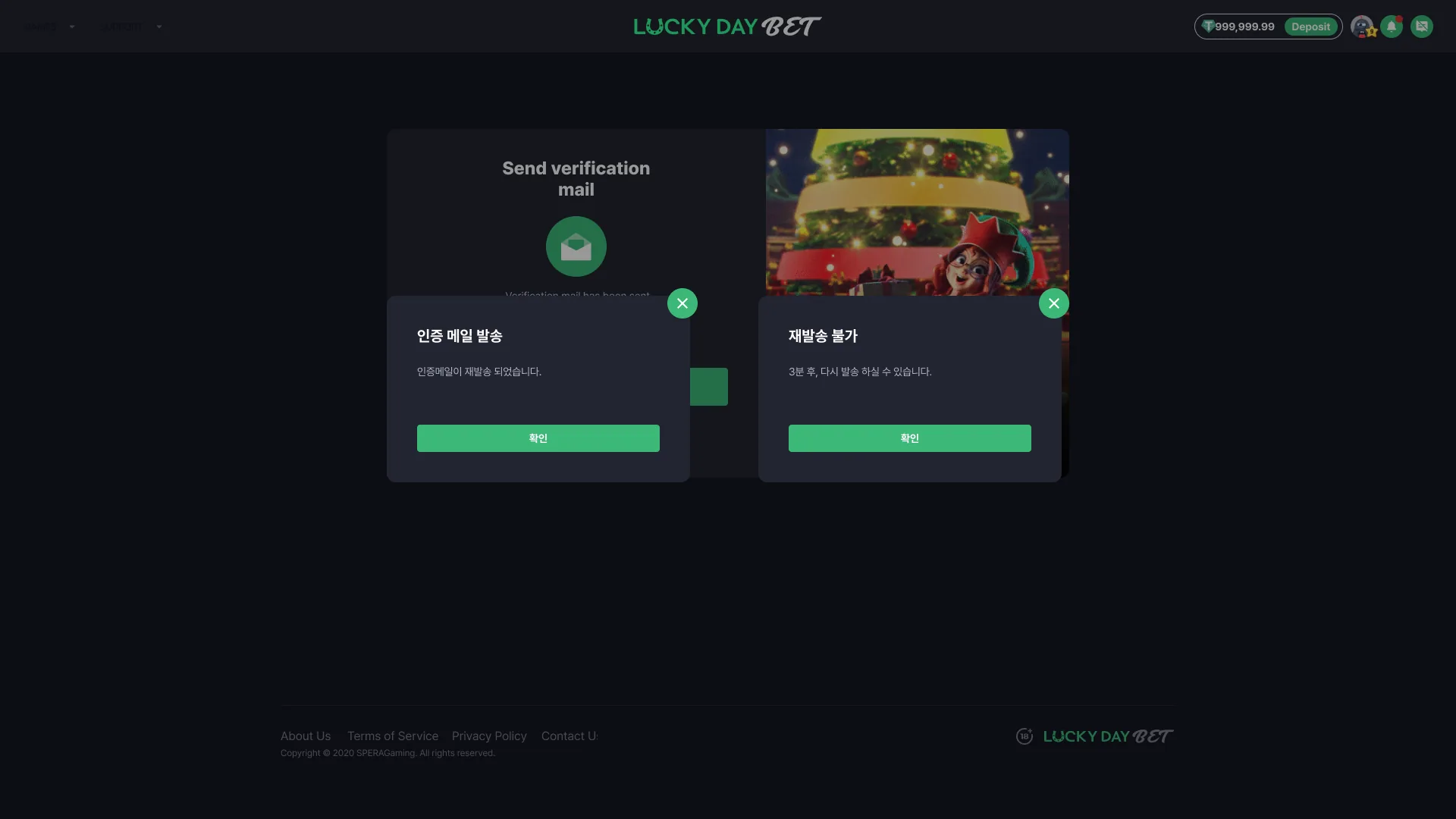
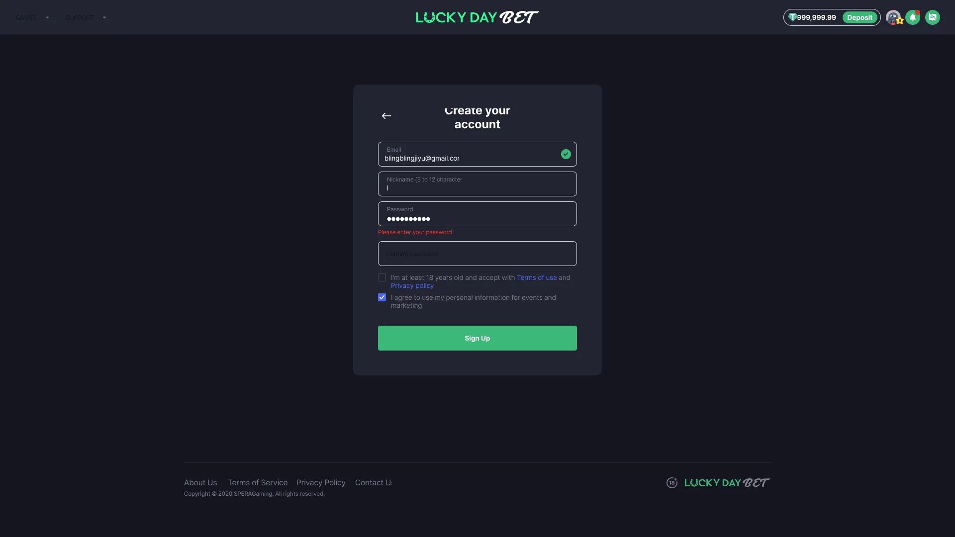
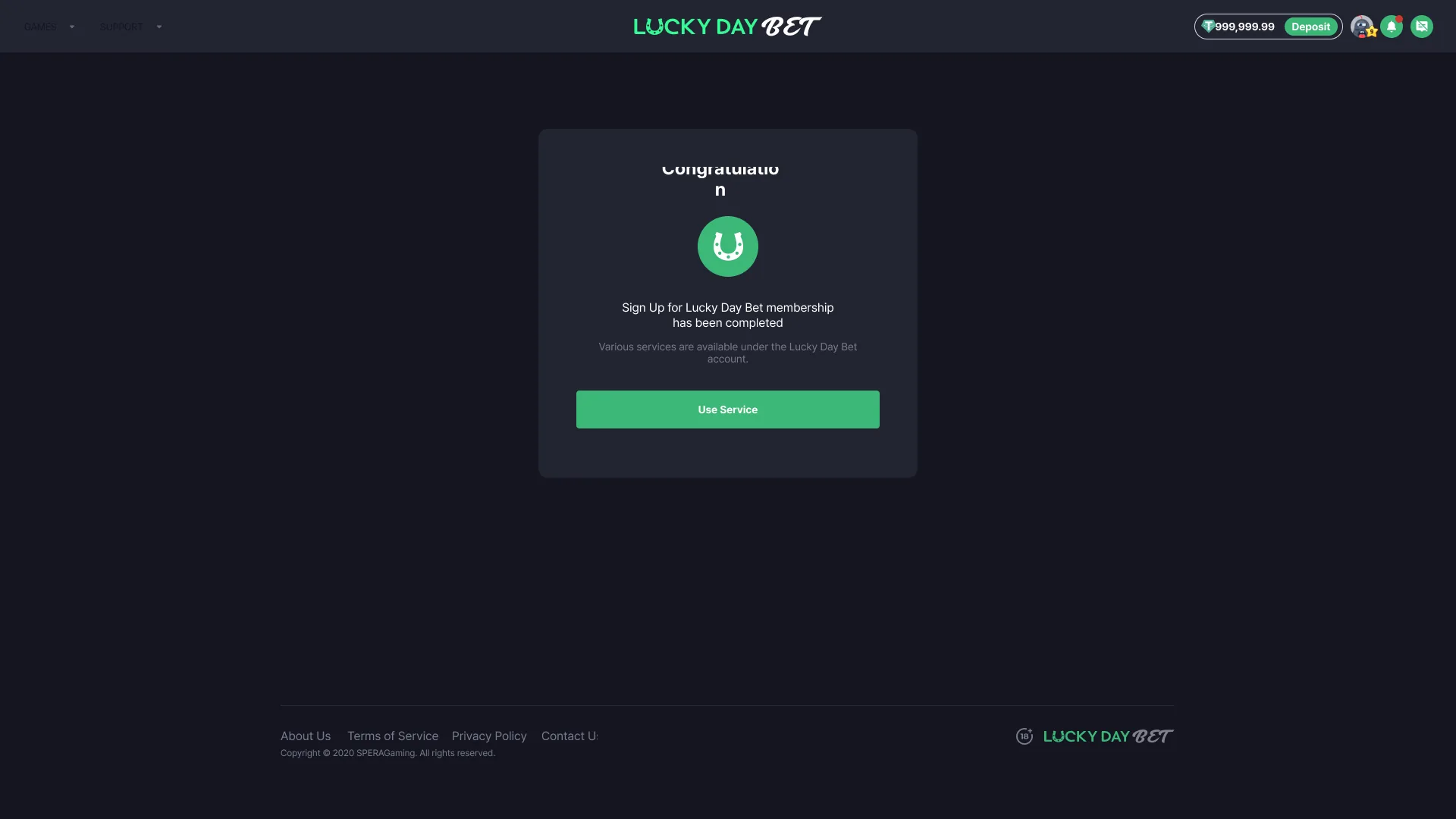
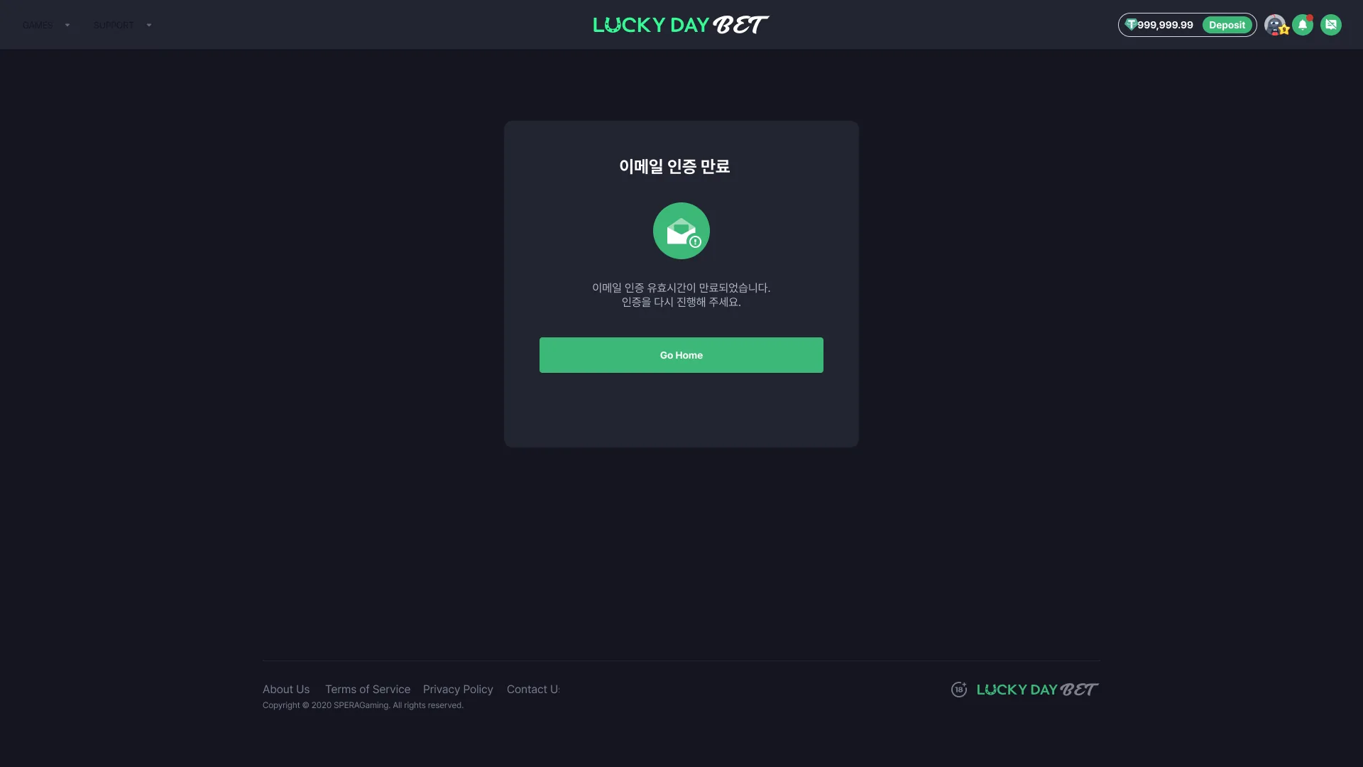
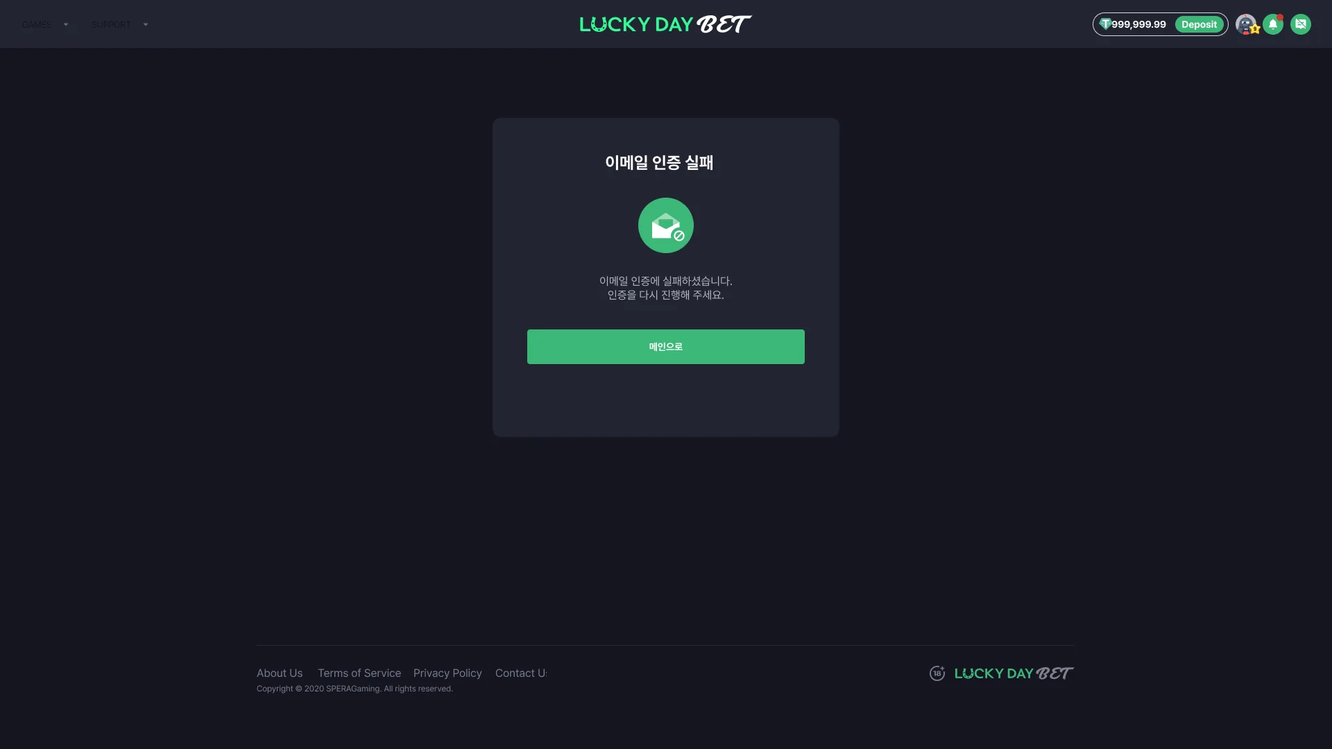
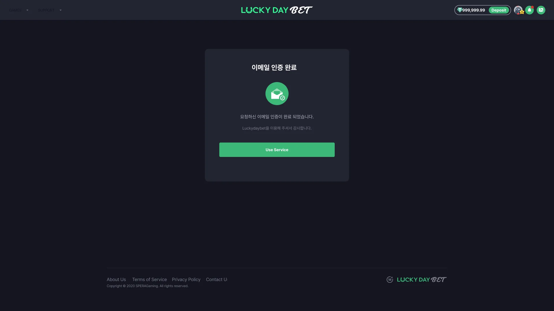
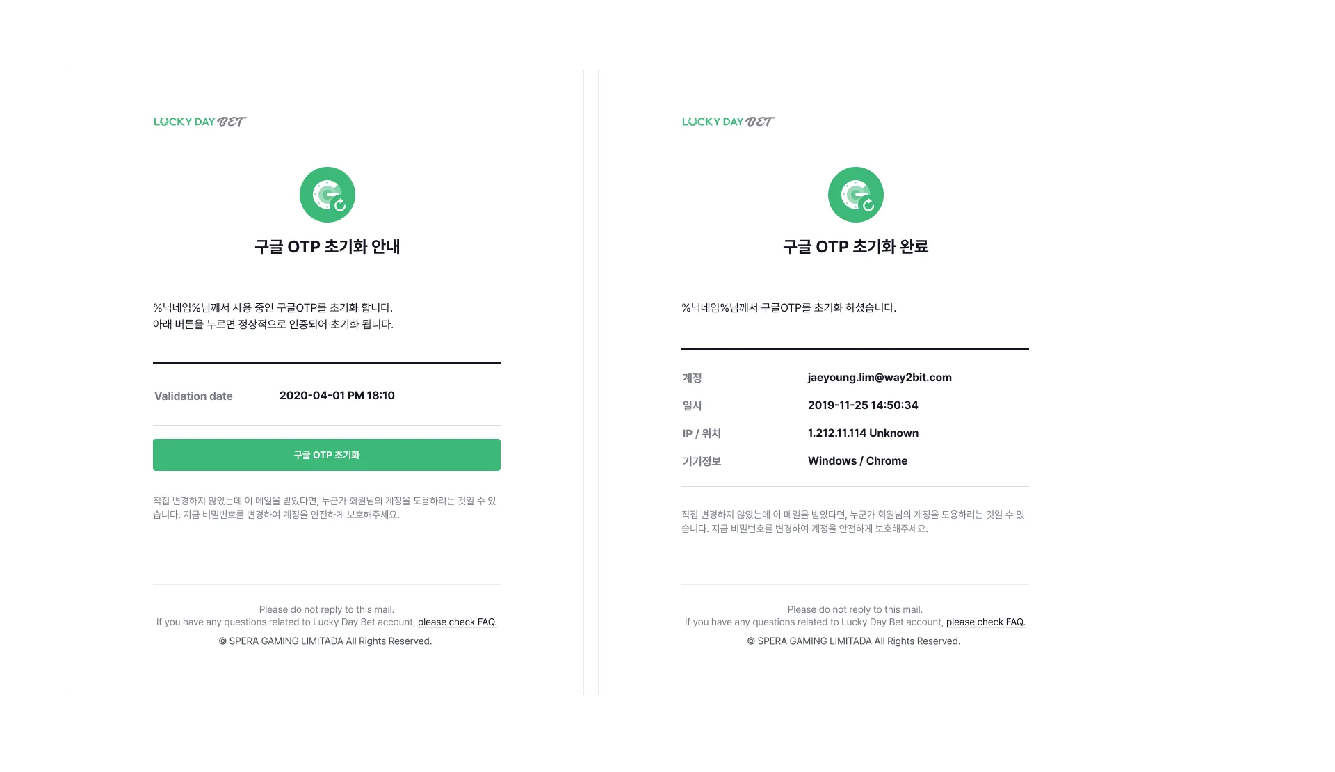
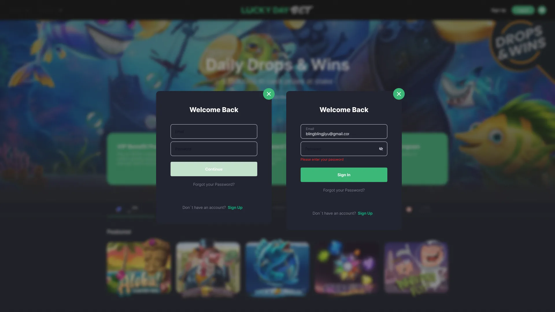
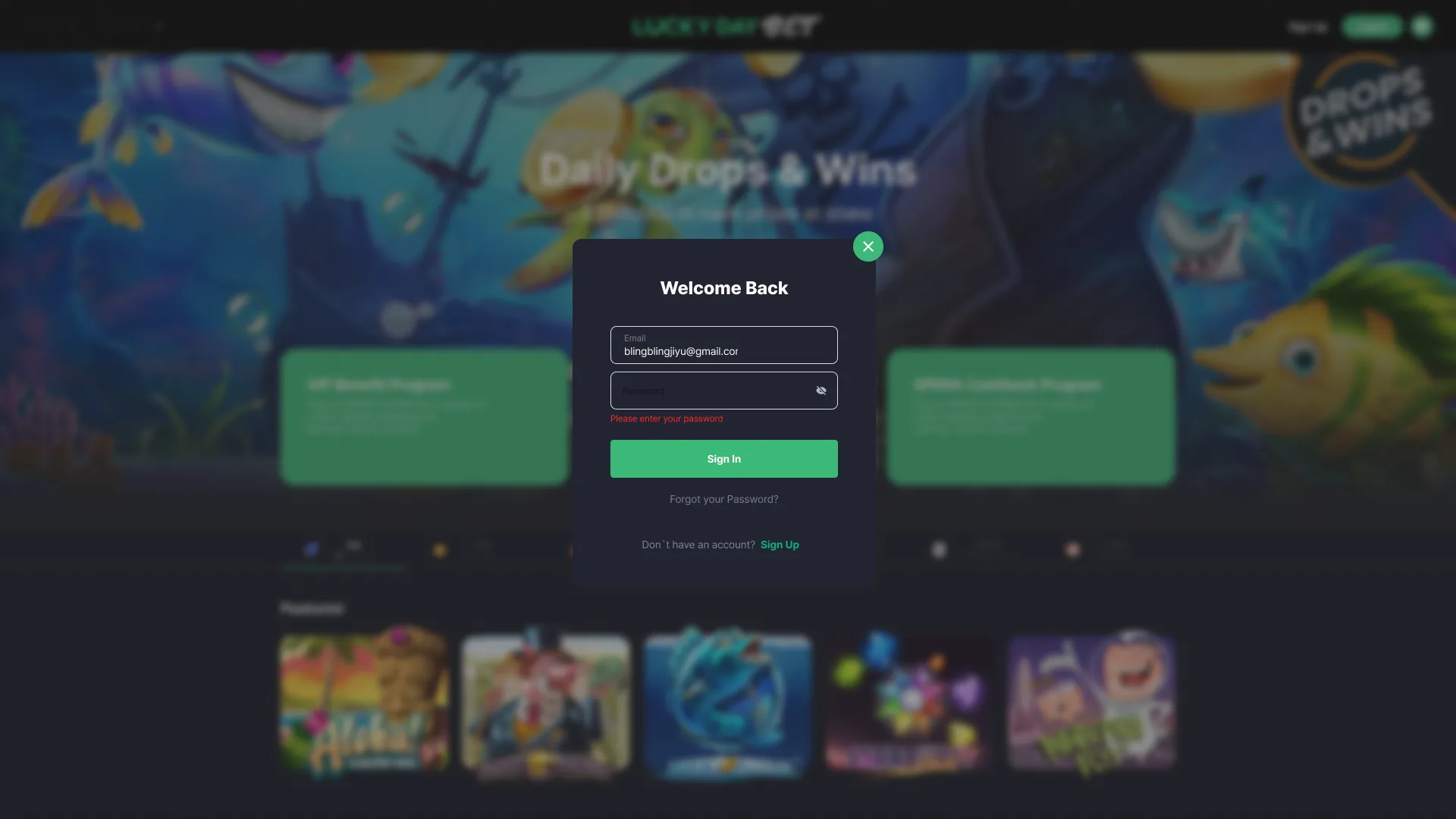
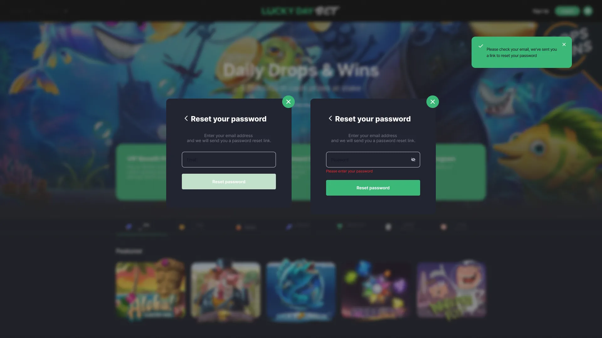
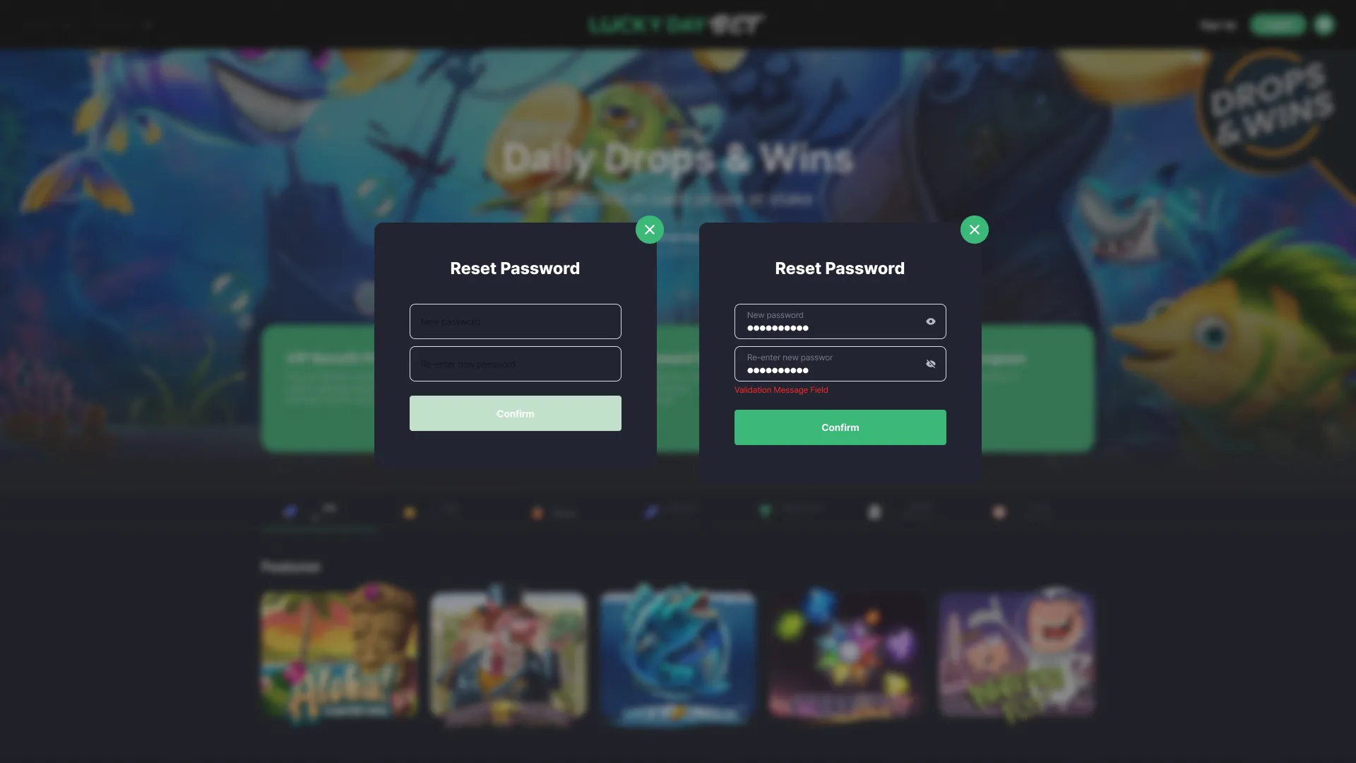
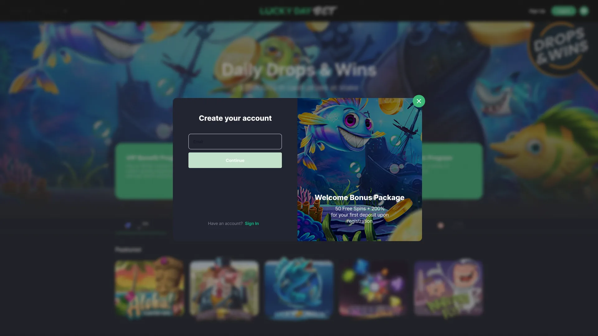
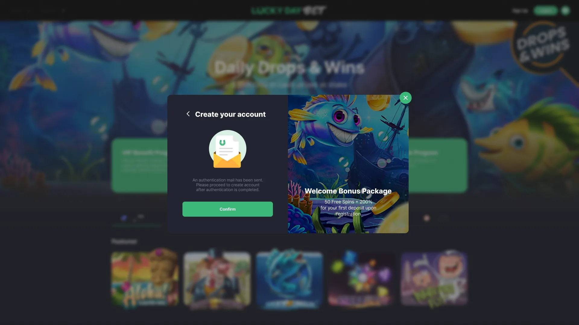
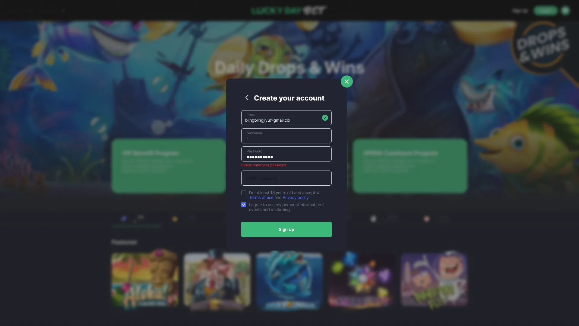
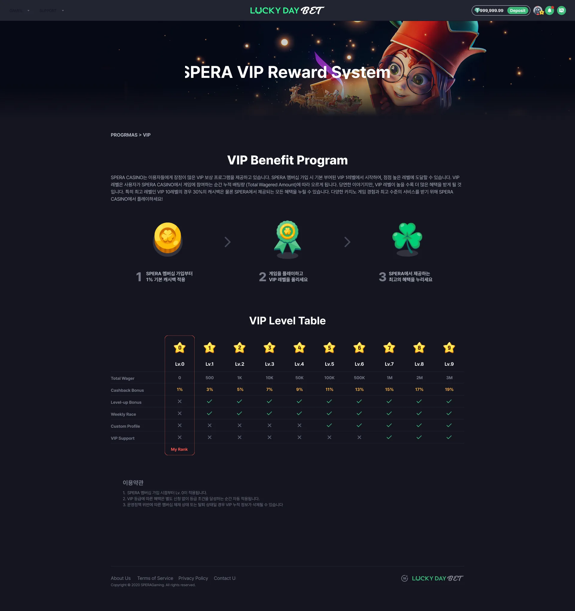
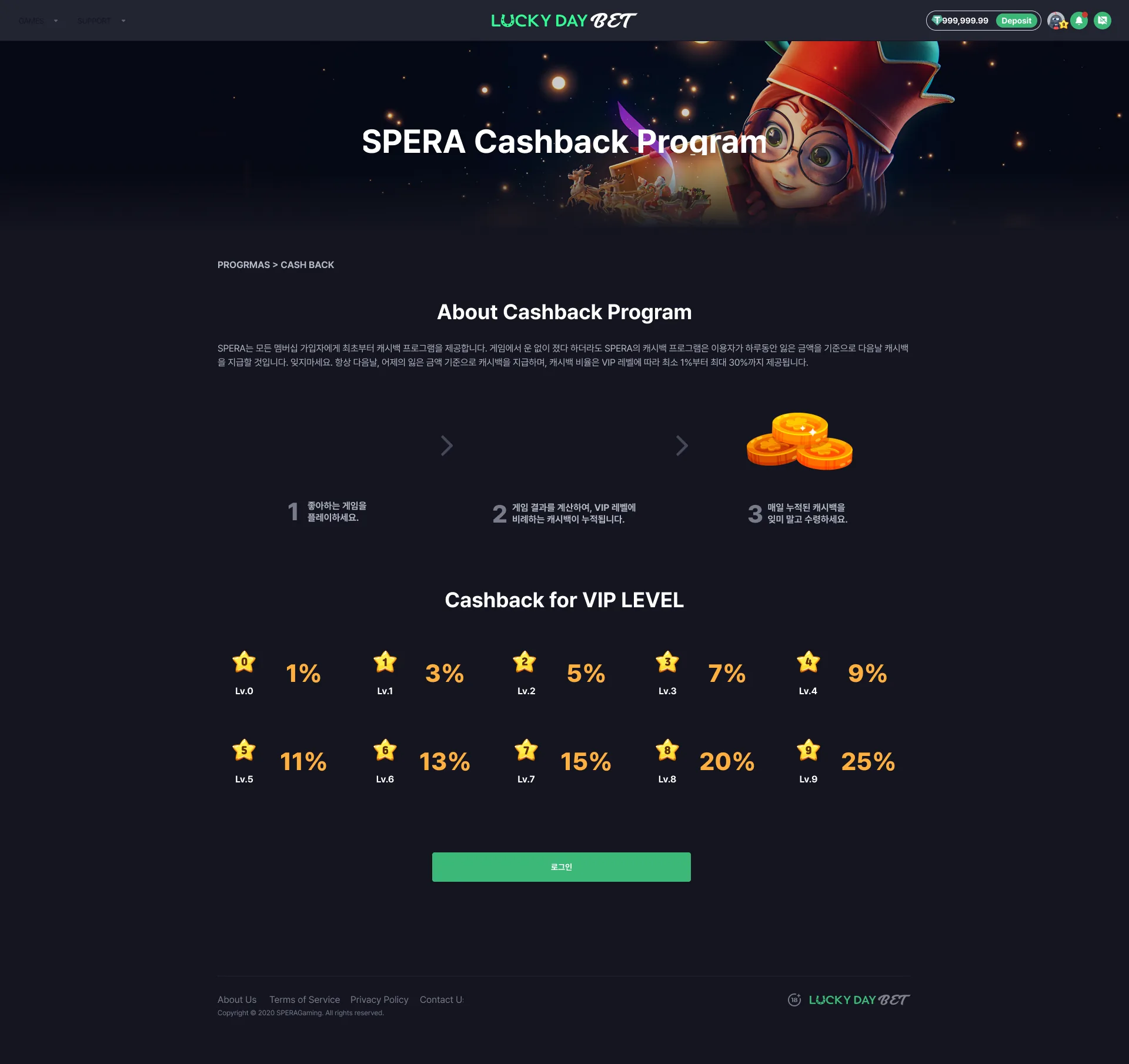
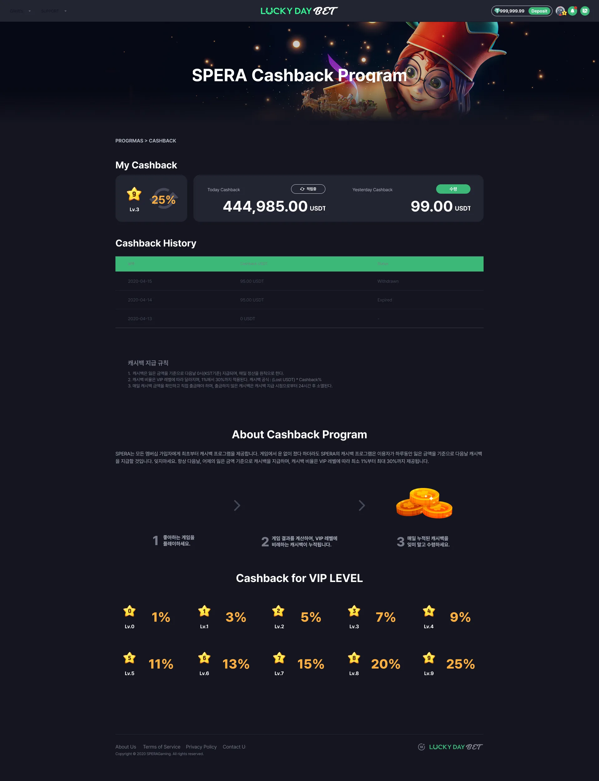
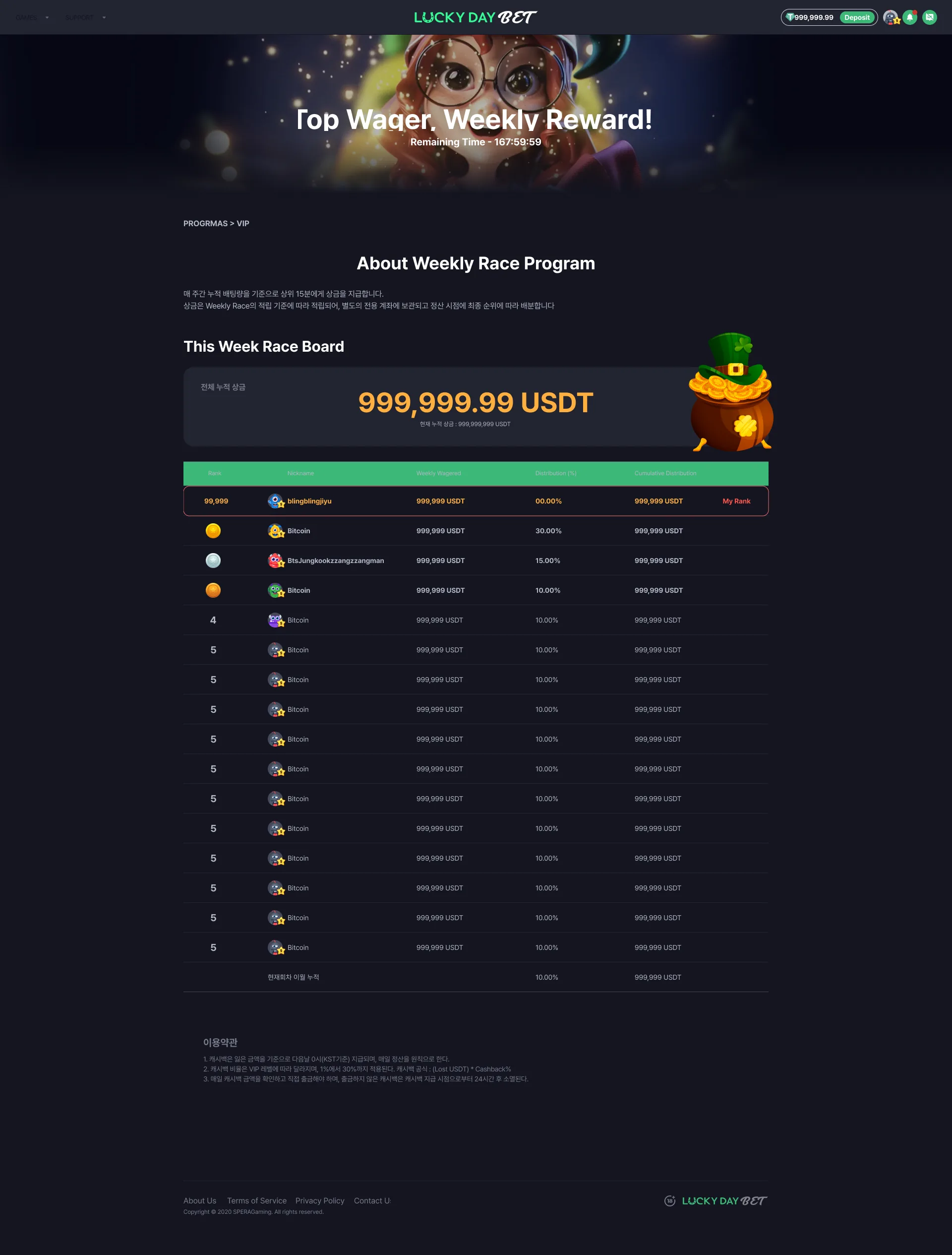
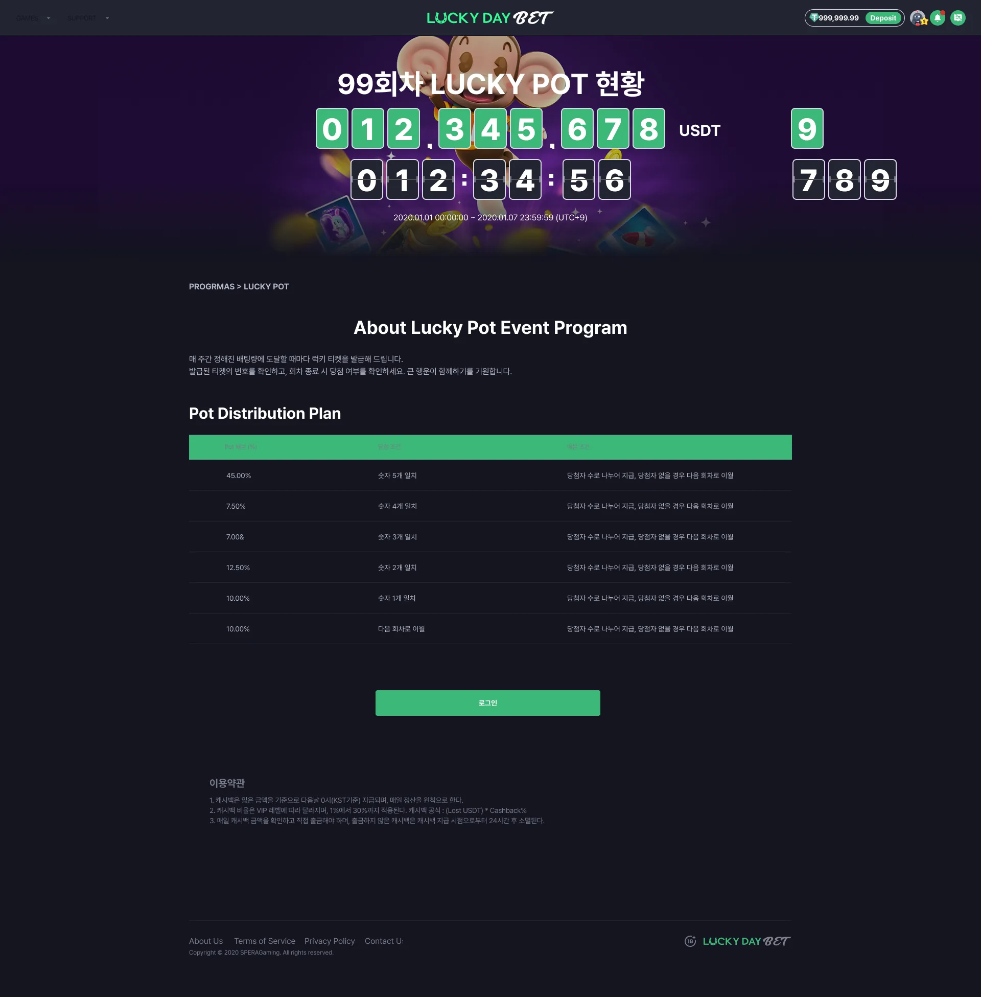
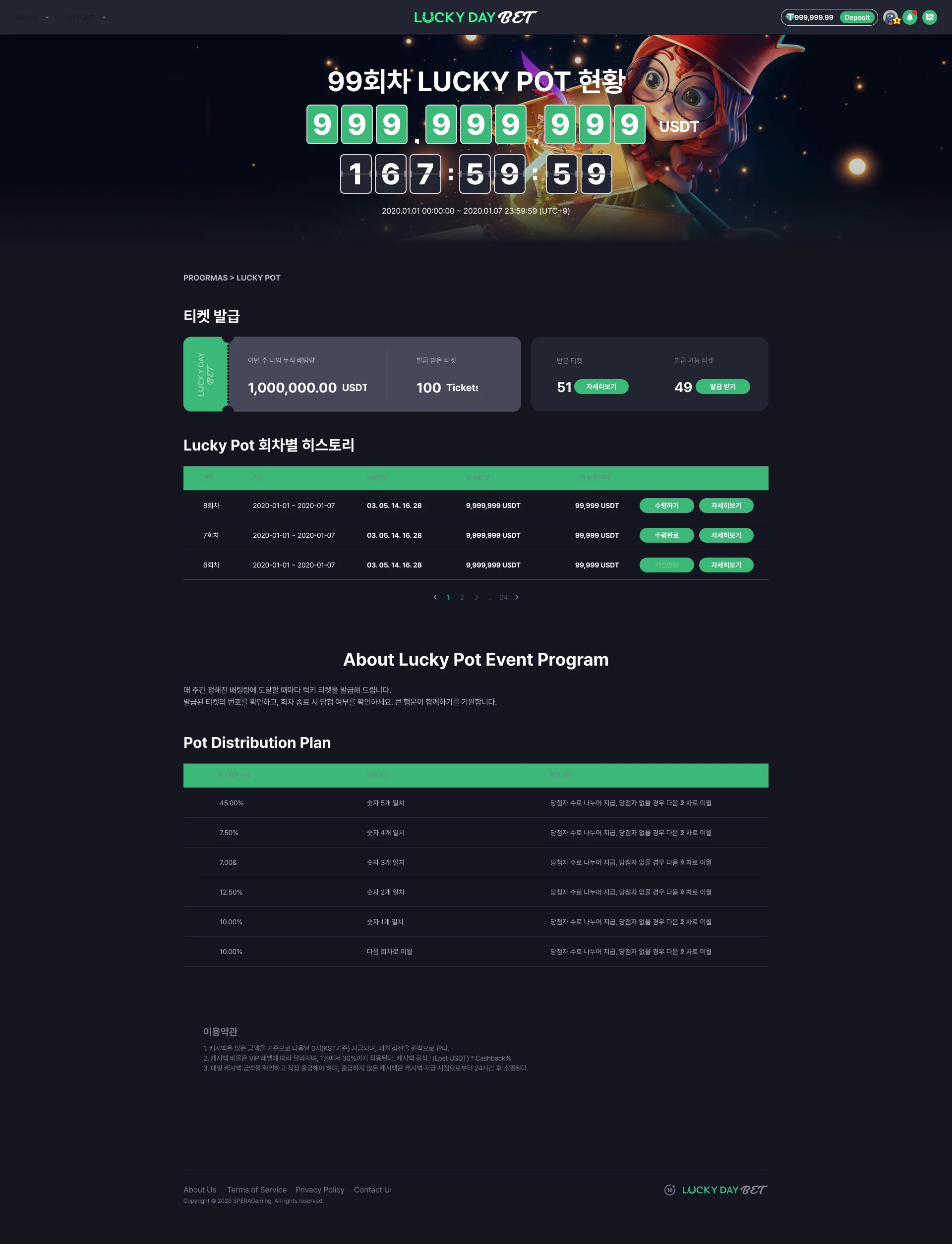
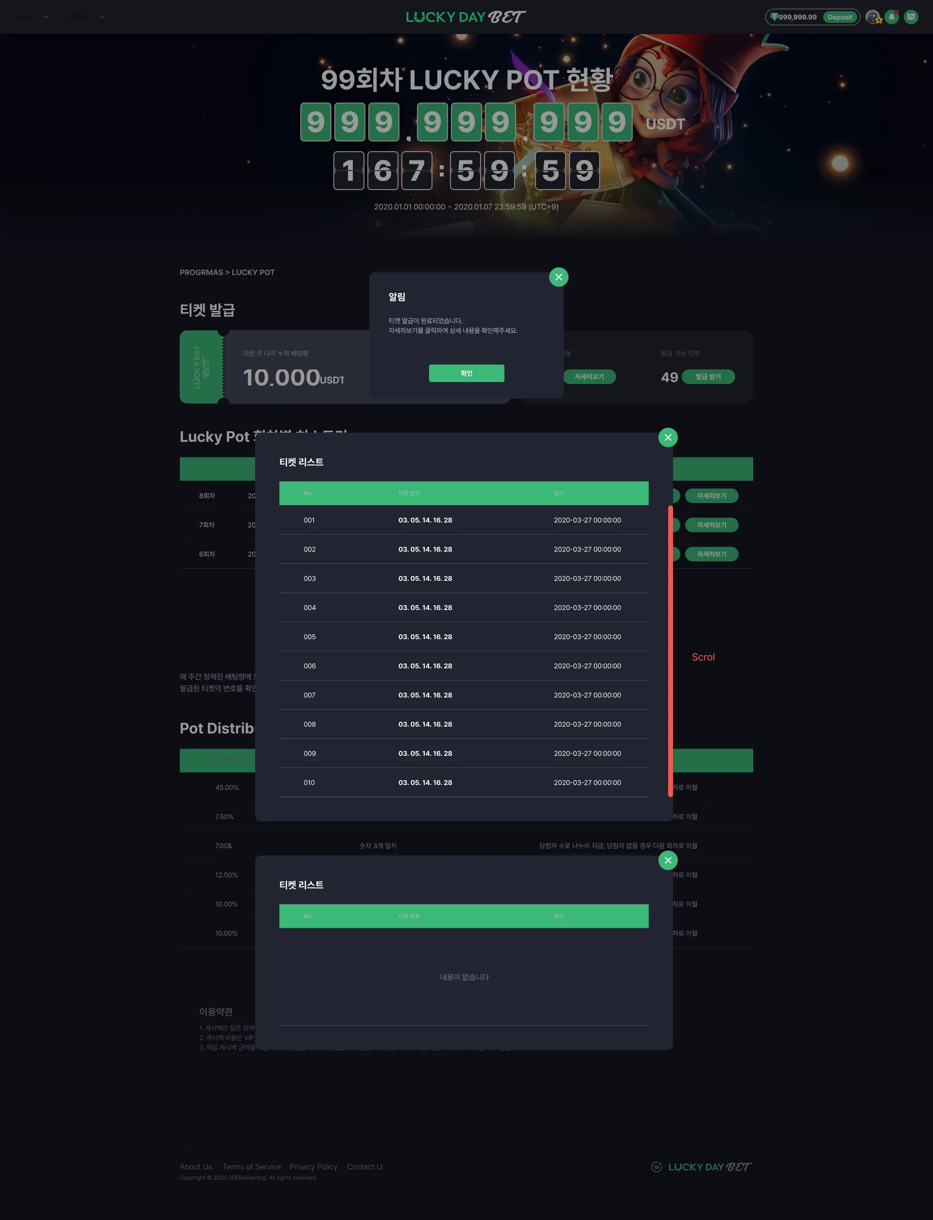
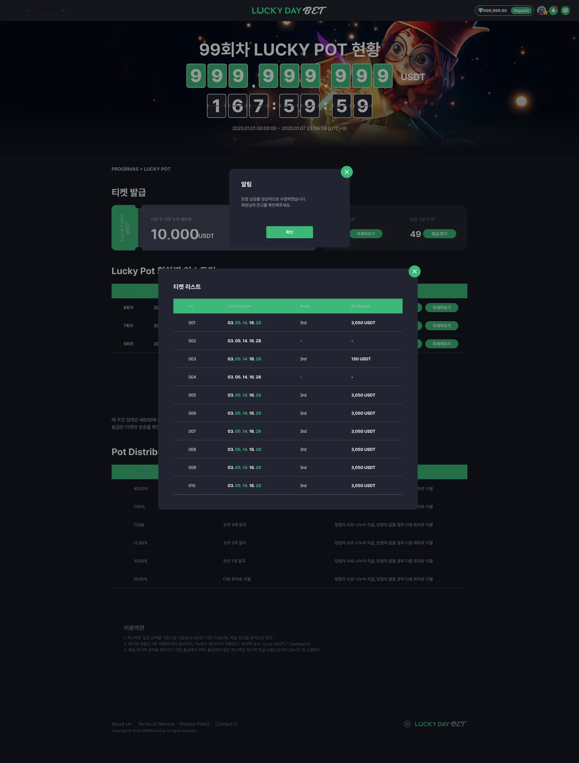
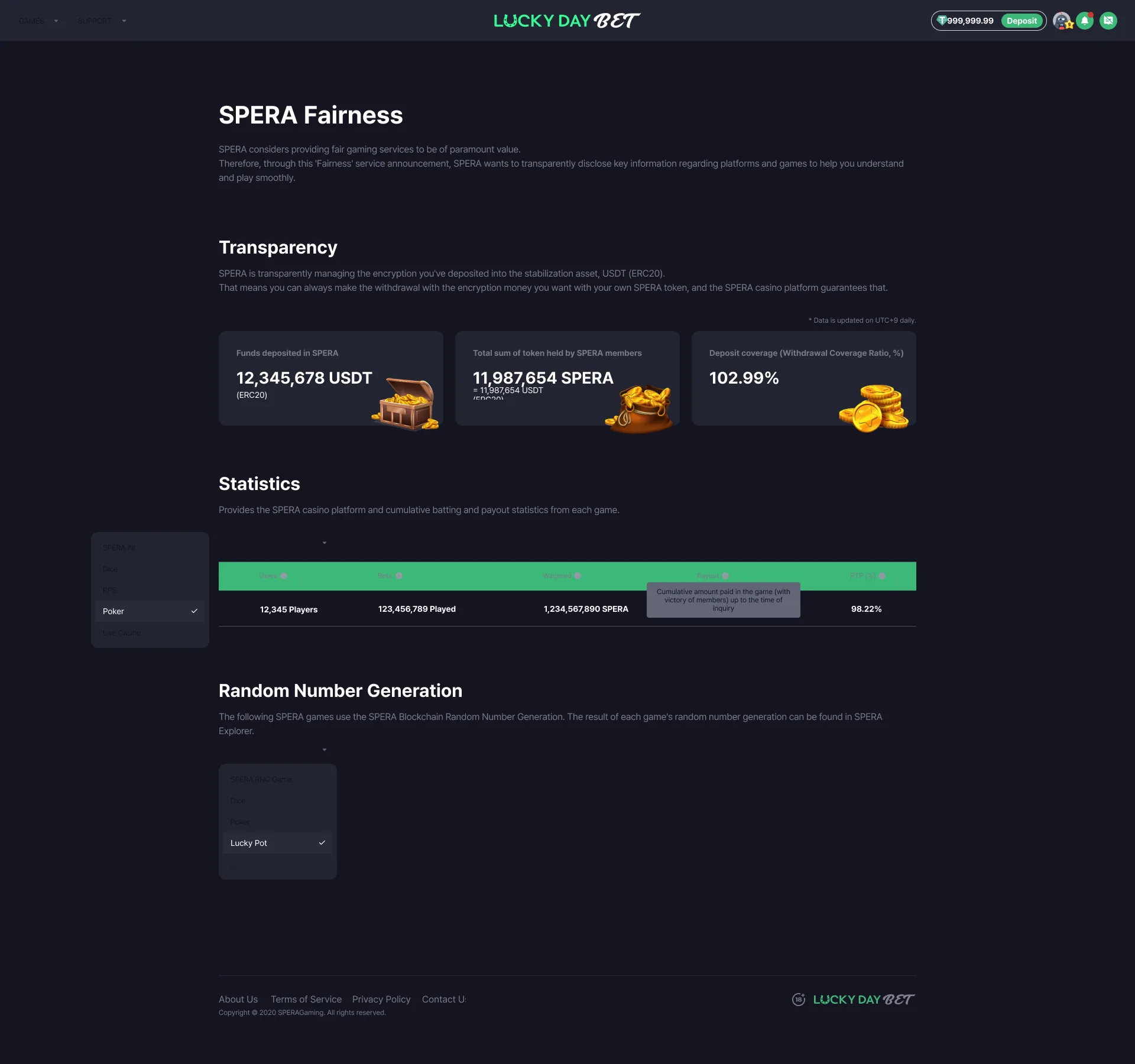
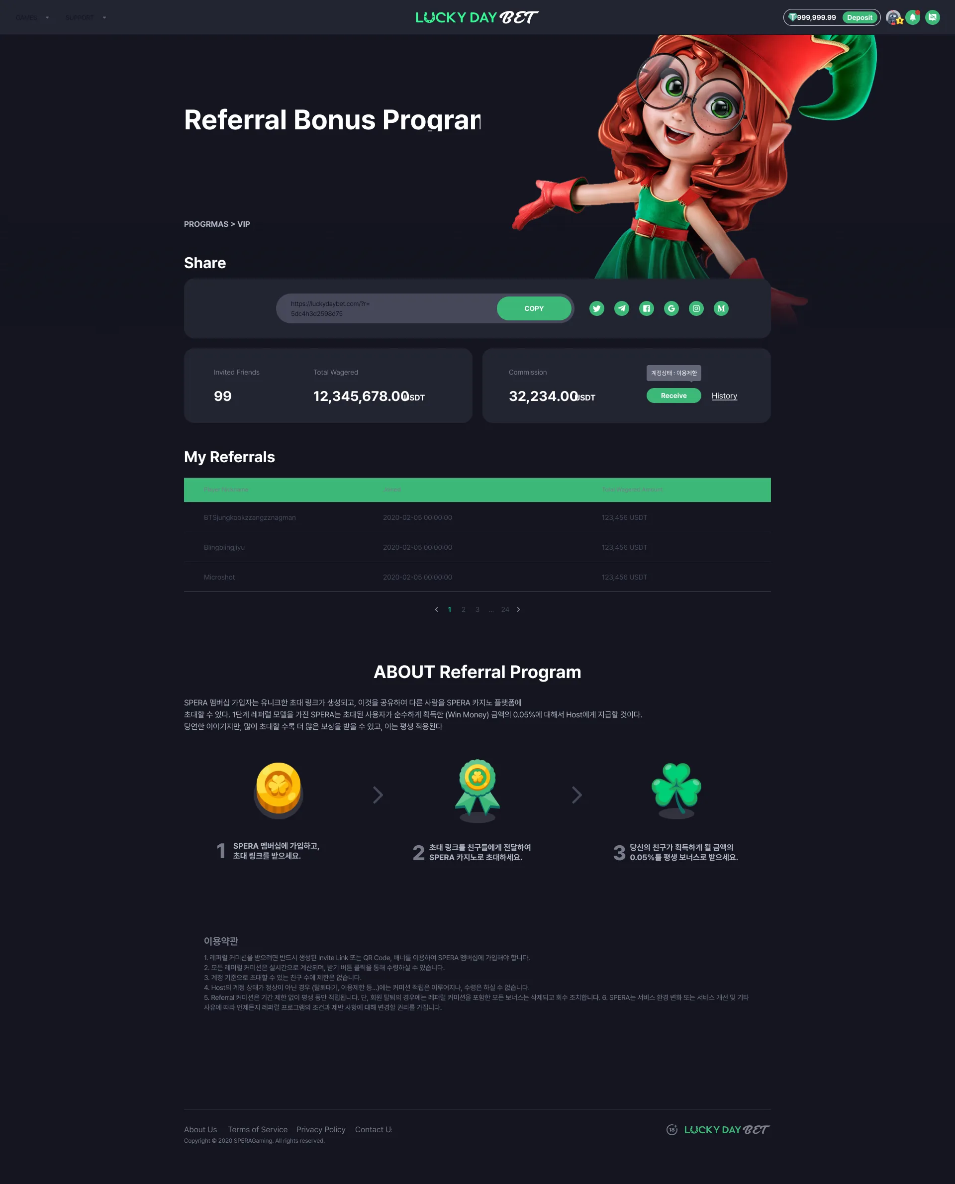
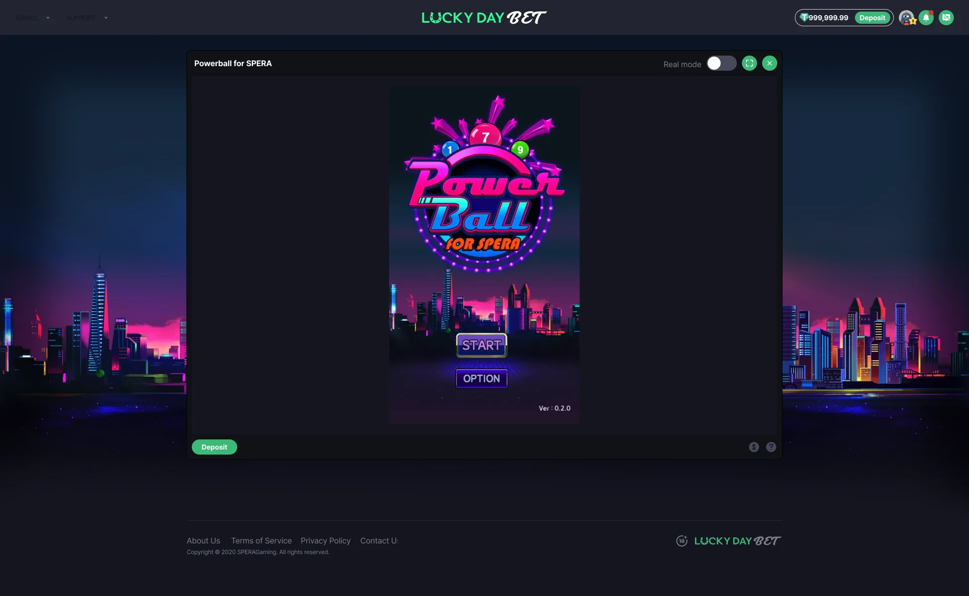
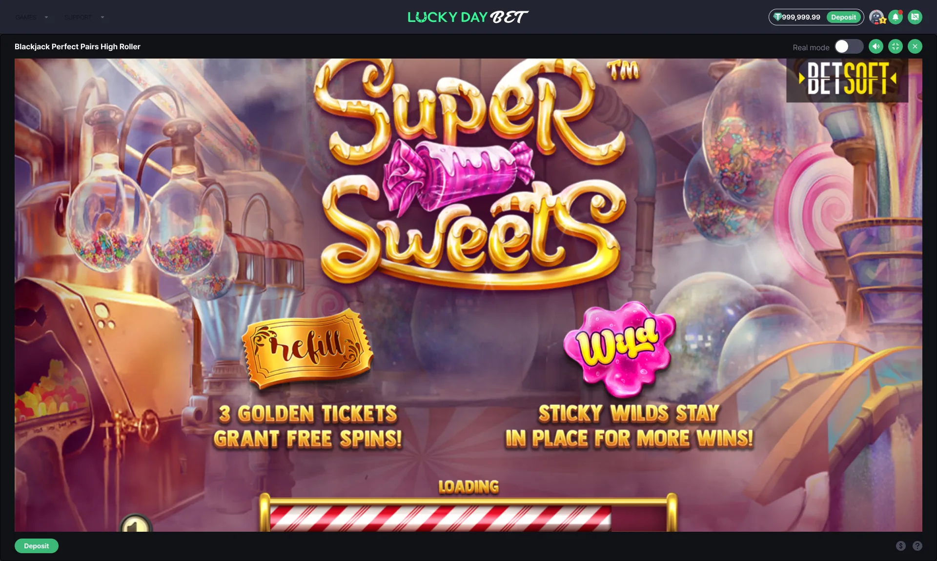
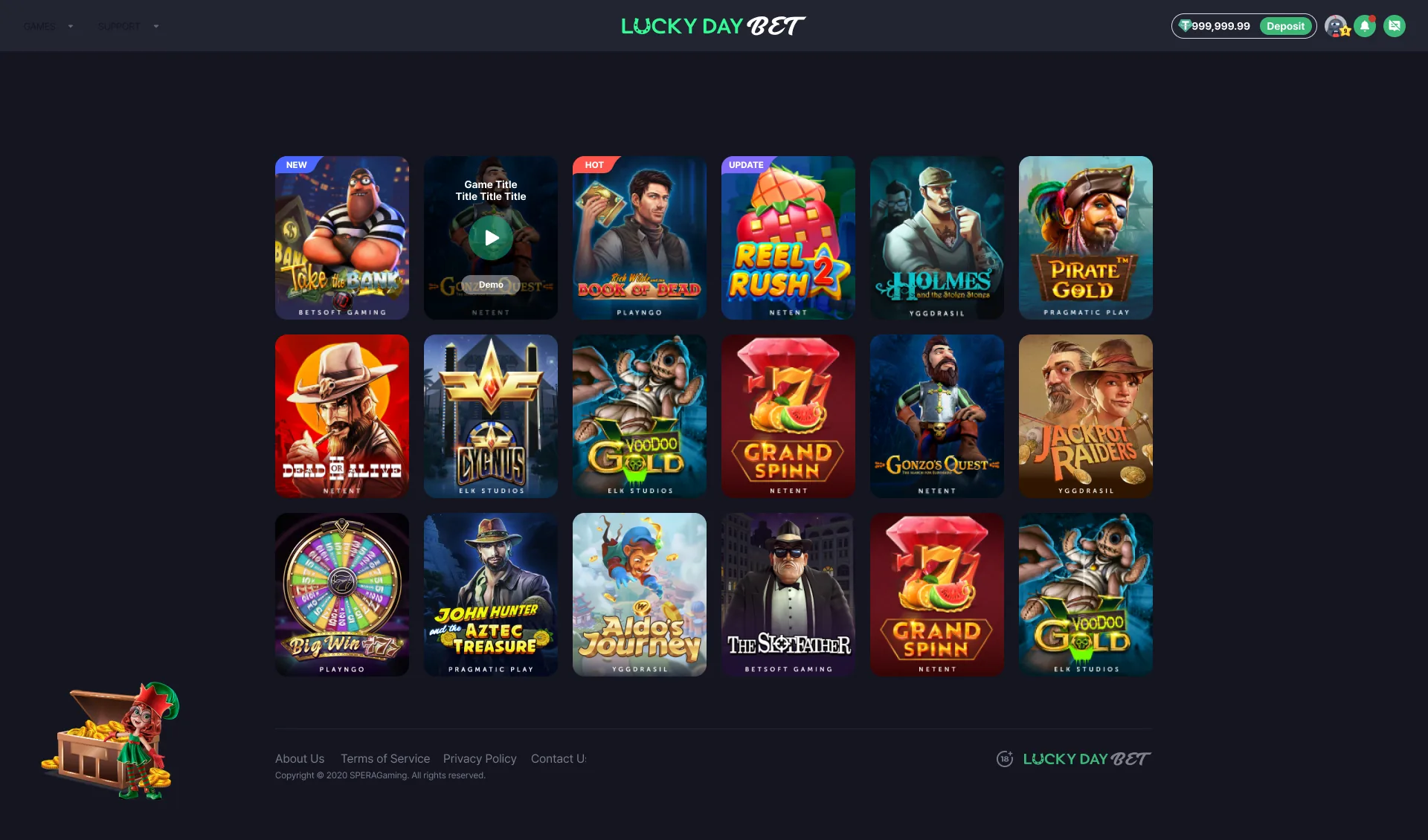
Home, logged outHero to footer in one frame. Three program cards sit under the welcome-pack hero, then the game tabs, Featured, and All Games. The top bar carries only GAMES and SUPPORT, with Sign Up and Log In on the right.Scrolled to the gridScrolling drops the hero and pins the game tabs under the top bar. One cell in the second row is empty - that gap is in the original.The SUPPORT menuNotice and FAQ, nothing else. The menu is short enough to open flat instead of nesting.Cookie noticeA white bar laid across the bottom of the dark page. The "cookey" in the filename is a typo in the original.The GAMES menu - house gamesWhat hangs off GAMES here is not the casino categories but the house games - Casual Betting with RPS, Warface, Dice, Moon; Live Lottery with Powerball, Hot Spot, Hit or Miss. The side panel in 006 opens a different list under the same word.The side panelThe hamburger swaps the top menu for a left panel: My Games, All Games, Slots, Casual, Jackpots, Tables Games, Live Casino under Games; Notice and FAQ under Support. The policy links move to the foot of the panel.Language inside the panelSix languages with their flags, a check on the Korean currently in use. The same switch also sits in the footer (008), so it is reachable from both.Language popover in the footerThe footer select opens upward - the page ends right below it, so there is nowhere to drop.Currency popover in the footerUSD is checked and the entry below is dimmed - only one currency is live yet.Home after signing inThe right of the bar turns from Sign Up / Log In into balance, Deposit, and three icons. Everything else stays where it was.Signed in, scrolled to the gridThe same place as 002, except the balance chip rides along.The chat panelA panel docked to the right. Level and nickname sit above each bubble, and the operator's line (SPERA CASINO) is split out in red. In the original render the tab header smears into green and overlaps the first message.Picking a chat roomOne Global room plus five by language. This moves you to another room rather than changing the interface language, so it is kept apart from the language switch.Notifications, both statesTwo states stacked in one frame: the list on top - new-device login, deposit pending, 2FA registered - and the empty "No new alerts found." below it.Account popoverBalance, rank, cashback, and referral stacked one per row, with Security, History, and Setting along the bottom. The rank row shows how far the next tier is as a bar.Account popover, trimmedThe same popover cut down to the balance alone, with an "Account >" link at the top right handing off to the full page. Only Security and History remain below.An empty slotNamed for the history view, but the frame holds only the logged-out home with nothing on top of it. It was never drawn - the actual history page is frame 12 in the Product tour tab.Weekly standings panelThe third tab of the same right-hand panel. Total prize money at the head, fifteen rows of standings, and a hand-off to the Weekly Race page at the foot. The table header smears green in the original.Announcement barOne more row pushes in above the top bar and everything shifts down by that much. The copy is still lorem.Sign inEmail, password, one button. This is the standalone-page version; the same screen as a modal is at 062. The top bar is still in its signed-in state with a balance showing - that is how the original is.Password reset - send the mailThe filename says password, but this is where a reset starts: it takes the signup address and sends the link.Enter the new passwordTyped twice and compared; a mismatch drops red text under the second field.Google OTP, six digitsSix separate boxes, one digit each. The line below - "Can't use Google OTP?" - is the only way through to a reset.Requesting an OTP resetIt states why a reset is needed, says a verification mail goes to the registered address, then offers the button. The grey box points to recovering the code instead of resetting it.Reset doneOne line saying it is done and to sign in again, plus a confirm button.Sign up - email firstOne email field on the left, the bonus artwork on the right. The password waits until after verification.Verification mail sentIt echoes the address back in green. The button sends you to your inbox; resending is the small link below it.Resend alerts, bothSuccess and cooldown side by side in one frame - the mail was resent, or you can send again in three minutes.Create the accountThe verified email carries over with a check on it; nickname, password, and confirmation follow. Of the two consents, age and terms are required and marketing is not - the checkbox states show which is which.Signed upA horseshoe, the completion line, and one button into the service. The title breaks awkwardly because the original text box is too narrow.Verification expiredThe mail link timed out. It says to try again and offers Go Home - there is no resend from here.Verification failedThe same shell as 058 with a different mark on the icon and a different button label. Expiry and failure were kept apart rather than folded into one screen.VerifiedThe success case. All three swap only the badge on the icon, so the layout never moves as the state changes.Two OTP emailsNot screens but mail templates. The left asks you to confirm the reset; the right reports it done with account, time, IP, and device. Unlike the site, these sit on white.Sign-in modal, two stepsThe same sign-in raised as a modal over the home page. Empty on the left, so the button reads "Continue"; filled on the right, where it becomes "Sign In" and a password error appears. The hero behind it is "Daily Drops & Wins", not the one behind the standalone page at 047.The sign-in modal aloneThe right-hand state of 062, centred and shown on its own.Reset-request modalEmpty and errored side by side, plus the "check your email" toast at the top right - three outcomes in one frame.New-password modalConfirm is dead on the empty one and live on the filled one, where the validation line appears.Sign-up modal - emailForm left, bonus art right - the same split as the standalone page at 053, but the artwork is the fish hero here.Sign-up modal - verifyA back arrow appears left of the title, showing the steps are chained.Sign-up modal - create the accountFour fields stretch the modal and the artwork panel drops out - unlike the page version at 056, only the form is left.VIP benefitsHero, then three steps, then the Lv.0-Lv.9 table. Checks mark where wagering tier, cashback, level-up bonus, weekly race, custom profile, and VIP support switch on. The reader's own tier is boxed in red and labelled "My Rank". The body text says VIP level 10 while the table stops at 9.Cashback intro, signed outWith no figures to show, it lays out the per-tier rates and ends on a Sign in button. Two of the three step icons are still empty.Cashback, signed inMy cashback and the payout history land on top of the same page and push the explainer down. Today's is still accruing; yesterday's carries a claim button.Weekly raceTime remaining sits in the hero, the pooled prize follows in large type, then the table runs to fifteenth. Only the reader's row is boxed in red so it can be found at a glance. Every rank after fourth reads 5 - dummy data.Lucky Pot, signed outThe round's pot and countdown are set as flip digits. It shows the distribution plan and stops at a Sign in button. In the original the last digits break away from the boards.Lucky Pot, signed inThe ticket card goes to the top: tickets already issued against this week's wagering versus tickets still to claim, with the per-round history below.After issuing - the list and the empty stateThe issued alert, the ticket list, and the "nothing here" empty state all stacked in one frame. The red "Scrol" beside the list is a designer's note left in the original.After claiming - the list with resultsThe same shell as 082 with the alert changed to a payout confirmation and two columns added for result and reward. Only the matched digits stay white, so you can see which numbers hit.Referral bonus, signed outIt unpacks the lifetime 0.05% of a friend's winnings in three steps and closes on a Sign in button. The hero here is the character alone, with no scene behind her.Fairness disclosureUnlike the other program pages it opens on the title with no hero. Deposits held, tokens issued, and coverage ratio sit as three cards, with per-game statistics and random-number generation each behind a select below. Both selects are drawn open at once, and the table header is smeared in the original.Referral bonus, signed inThe invite link and its copy button come first, with six share targets beside them. Invited friends, total wagered, and commission sit in one row, and the claim button carries an "account restricted" tooltip that says on the spot why it cannot be used.A house game in its framePowerball for SPERA opened in a frame inside the site. The game is portrait, so it takes the middle and leaves its own art at the sides. The Real mode toggle in the header splits practice from real play, and Deposit at the bottom left is the way out when the balance runs short.A third-party game, full widthA vendor slot is landscape, so the frame takes the full width. The header reads "Blackjack Perfect Pairs High Roller" while the game loading inside is Super Sweets - the original does not match itself.The grid on its ownNo tabs, no heading, just the grid - a frame kept aside to look only at card size and row rhythm.