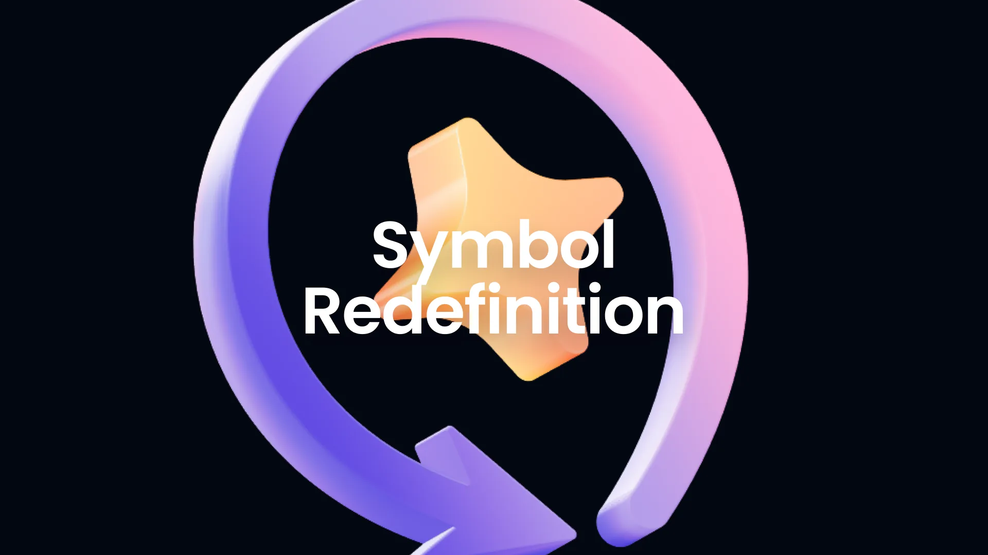
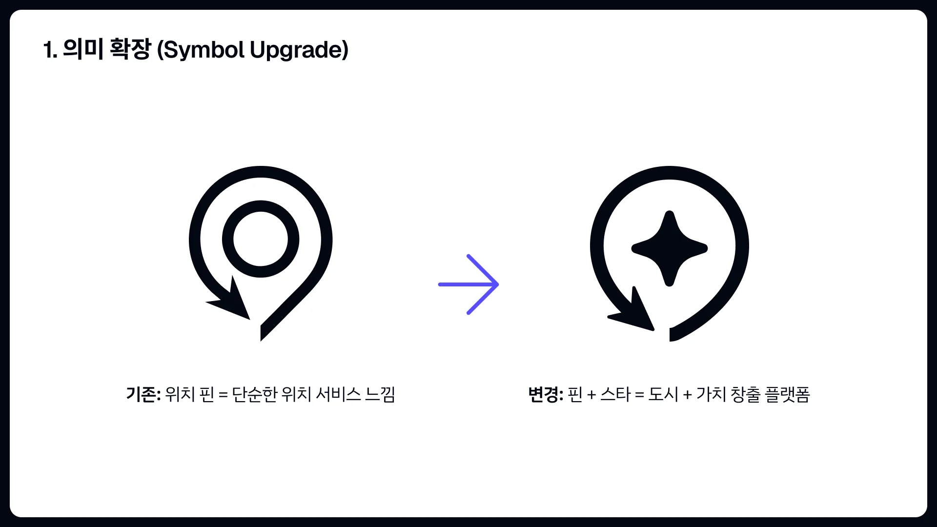
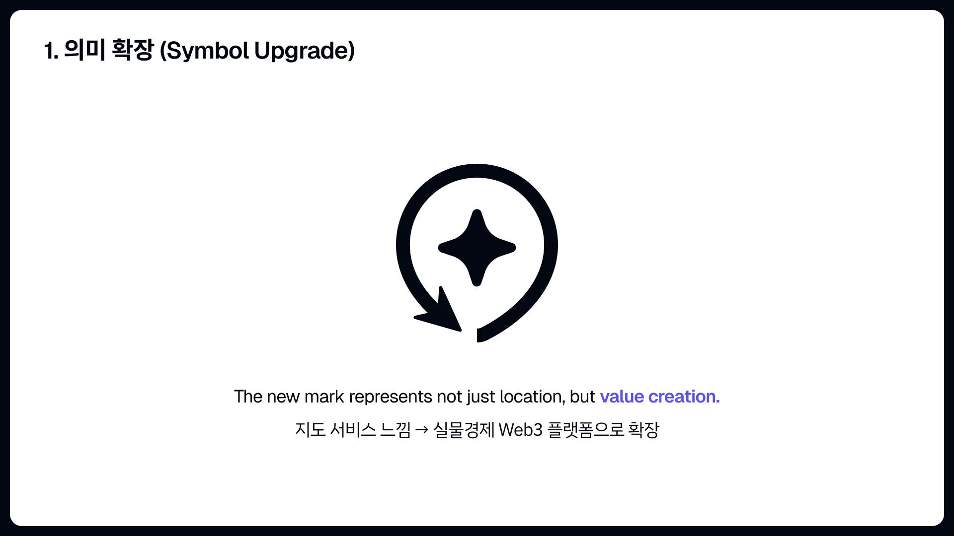
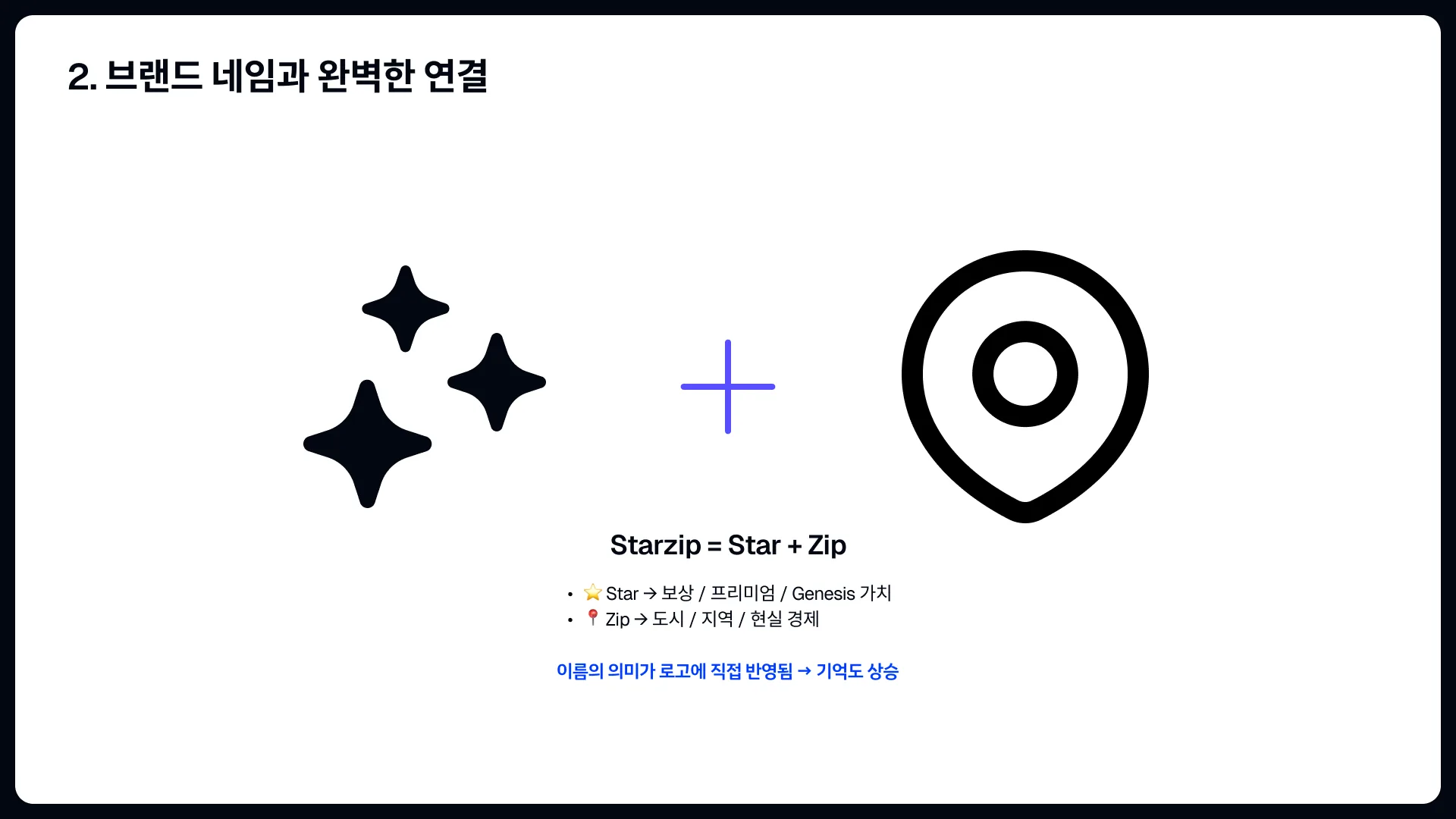
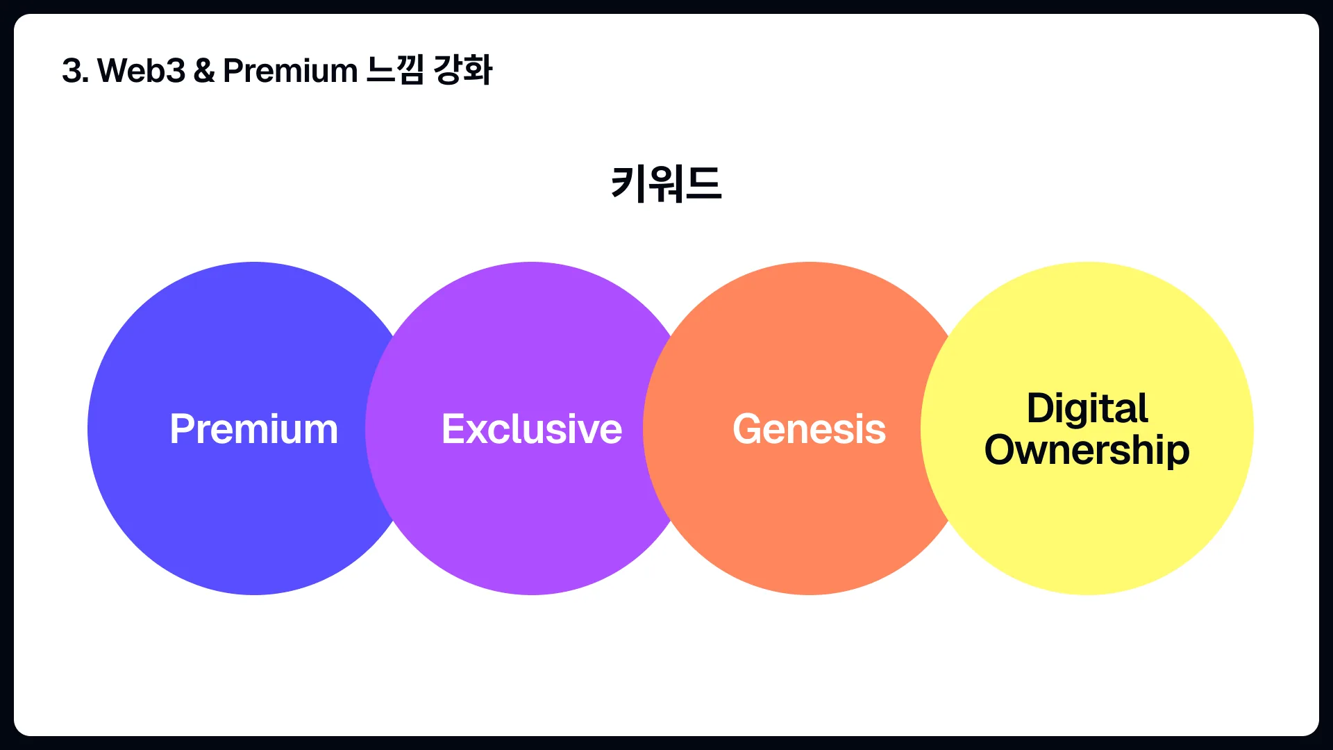
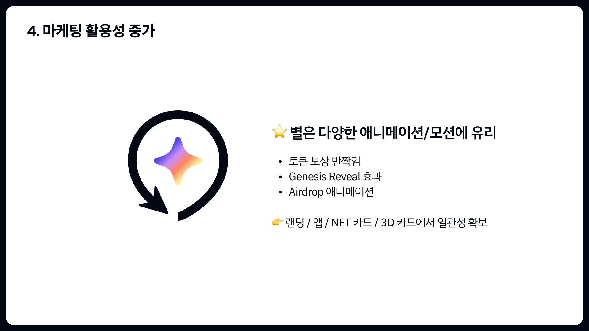
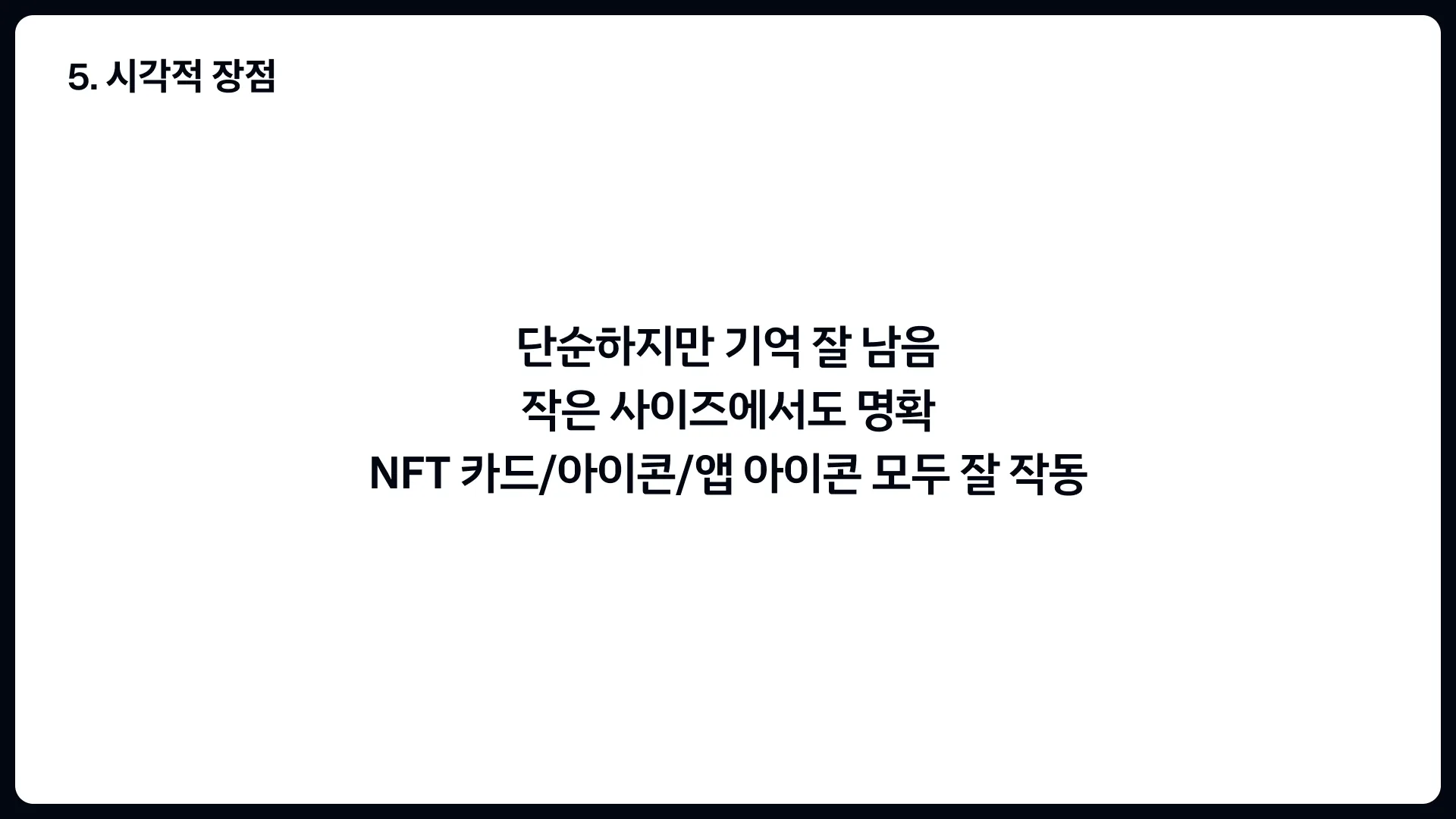
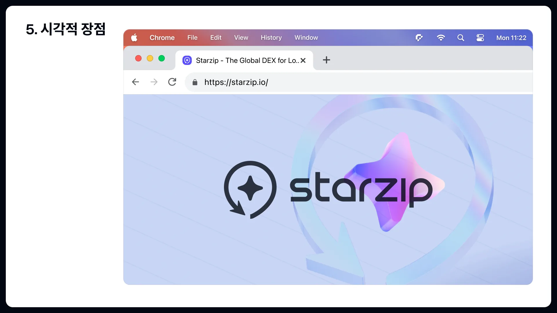
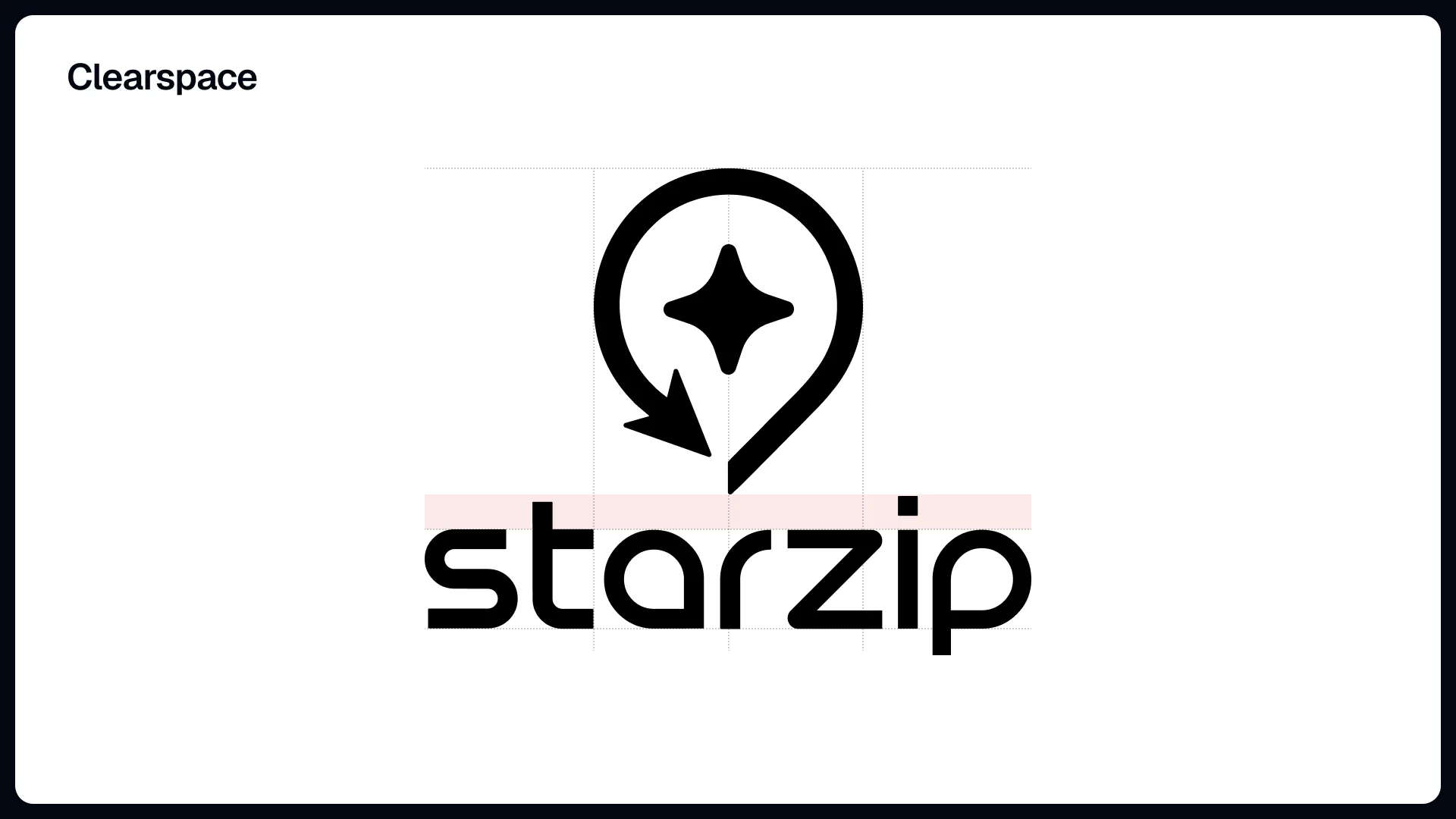
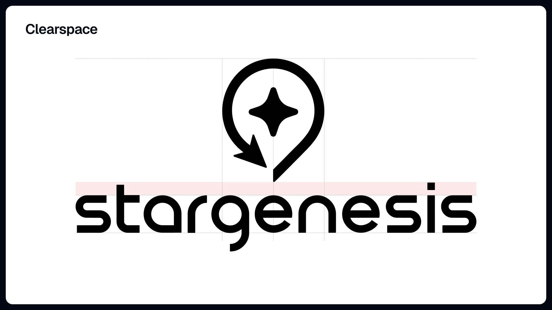
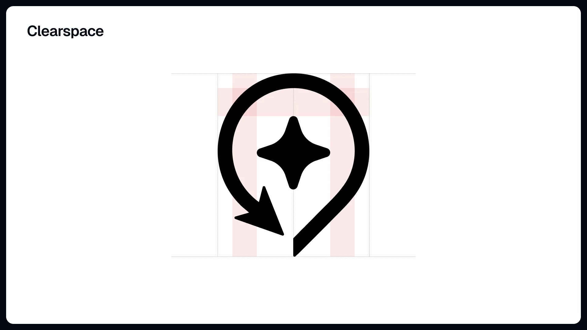
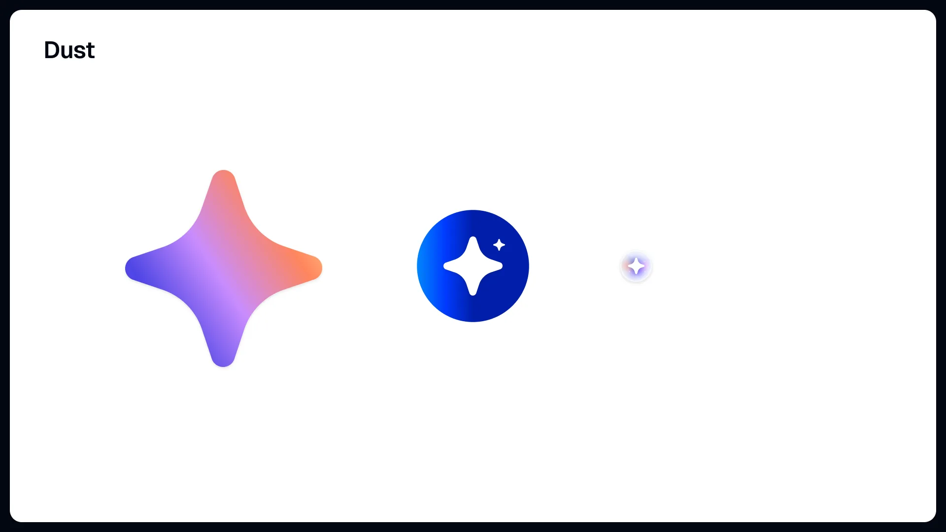
CoverThe cover states the conclusion first. The star modelled in 3D inside the ring is the new mark's subject, and the arrow curling behind it is the part of the old pin that stays.Argument 1 - widening the meaningThe reason for the change on one slide. The old pin on the left reads as "a location pin, a plain location service"; the right reads as "pin plus star, a city and a place value is made". The comparison is about what the mark says, not how it looks.Argument 1 - the English lineThe same argument reduced to one mark and one sentence: "The new mark represents not just location, but value creation", with the Korean line beneath reading "from a map service to a real-economy Web3 platform".Argument 2 - tying the name to the markStar plus pin is set out as an equation: Starzip = Star + Zip. Star stands for reward, premium, and Genesis value; Zip for the city, the neighbourhood, the real economy. The point of the slide is that the first half of the name was missing from the mark.Argument 3 - four keywordsThe impression being aimed at is pinned to four words rather than adjectives: Premium, Exclusive, Genesis, Digital Ownership, set as overlapping circles whose colours become the gradient used in the later studies.Argument 3 - compared as app iconsThe argument is tested where the mark is smallest. The blue square on the left reads as a navigation app; the gradient icon on the right reads as a global brand and as NFT, Genesis, digital asset. The test is what it looks like on a home screen.Argument 4 - a shape that can moveThe practical reason for choosing a star. Reward sparkles, the Genesis reveal, and airdrop animations all come out of it, and the landing page, the app, the NFT card, and the 3D card can share one motion. The mark was chosen for where it has to work, not as a fixed picture.Argument 5 - what the shape gives youThree lines and done: simple but memorable, legible at small sizes, and working across NFT cards, icons, and app icons. The next two slides prove the claim with mockups.On the webA macOS Safari window with starzip.io loaded. The gradient symbol and wordmark sit in the middle of the hero, and the tab title truncates to "Starzip - The Global DEX for Lo…".On a social profileAn X profile in both web and app layouts. The app icon drops straight into the avatar slot and the cover is the four-keyword gradient. This is where you check whether the star survives at roughly forty pixels across.Clearspace - starzip, horizontalThe minimum clearance around the horizontal lockup, drawn as a grid. The unit is a letterform width rather than pixels, so the rule scales with the logo.Clearspace - stargenesis, horizontalThe same rule applied to the longer wordmark. The clearance unit does not change with the length of the word, so the two brands keep the same spacing when they sit side by side.Two weights of the starThe pin stays fixed while the star inside changes size and weight. A small star lets the pin win; a large one thins the ring - this slide picks the point between them by eye.Four shapes for the starFour candidates in a row, the last one a five-pointed star rather than a four-pointed one. The five-pointed star reads first as a game or rating star, which is not what this brand is saying.Final divider"Symbol Final". From here on the deck stops exploring and starts delivering assets; the divider keeps the two halves from being read as one.Final clearspace - starzipThe clearance rule restated against the final mark. The section number is gone and only "Clearspace" remains, because this is a page of the guideline rather than an item in the proposal.Final clearspace - stargenesisClearance for the final stargenesis horizontal lockup. Both brands share one grid, so neither can drift while the other stays put.starzip horizontal - on darkWhite lockup on dark. The next nine slides run the same lockups through backgrounds and colours, settling by picture which version belongs where.stargenesis horizontal - on darkThe stargenesis version under the same conditions. The longer word makes the symbol look smaller by comparison, and the clearance rule is what fixes that ratio.starzip horizontal - on lightBlack lockup on light. It is redrawn at the same weight rather than colour-inverted, so it avoids the stroke bloom you get from simply flipping a white logo.stargenesis horizontal - on lightThe stargenesis horizontal lockup on light. This is the default wherever the background cannot be chosen, such as documents and print.Clearspace - starzip, stackedClearance for the stacked lockup, symbol above and word below. The rule matches the horizontal one but measures from a different edge, so it has to be written separately.starzip stacked - on darkThe stacked lockup, for places too narrow for the horizontal one. Stacking beats shrinking because shrinking loses the word before it loses the mark.starzip stacked - on lightThe stacked lockup on light, set against the dark version so both can be checked for equal presence at equal size.Clearspace - stargenesis, stackedClearance for the stacked stargenesis lockup. The longer word makes the lower margin look wider, but the unit being measured is the same as for starzip.stargenesis stacked - on darkThe stacked stargenesis lockup on dark, aimed at surfaces that sit on black such as the Genesis sale screens.stargenesis stacked - on lightThe stacked stargenesis lockup on light. This closes the colourless base set; colour begins on the next slide.Clearspace - symbol aloneClearance for the symbol used without the word. Icons, favicons, and avatars all follow this page, which makes it the most-used rule in the set.Symbol alone - on darkThe white symbol on its own. At this size the relationship between the ring, the tail, and the star inside is easiest to read.Symbol alone - on lightThe black symbol on its own, for anywhere it has to be reproduced in a single colour such as a stamp or embroidery.starzip horizontal - brand blueColour starts here. starzip takes a single blue while stargenesis, later in the deck, takes a gradient: the two brands are separated by colour treatment.starzip stacked - brand blueThe stacked lockup in brand blue, using the same blue as the horizontal one so the two arrangements never clash on one screen.Symbol alone - brand blueThe symbol alone in brand blue. The app icon and the favicon take their default from here.stargenesis horizontal - gradientA violet-to-orange gradient carried across both symbol and word. The colours come from the four-keyword circles, so the treatment traces back to the argument.stargenesis stacked - soft gradientThe first gradient pass on the stacked lockup, weighted toward pink and low in contrast. The next slide runs the same arrangement harder.stargenesis stacked - strong gradientThe same stacked lockup with the gradient stretched from violet to orange. Set beside the previous slide, the pair makes clear that the question being settled is how far the gradient should travel.Icon and word, splitThe gradient stays on the symbol and the word is left black. Two colour events compete with each other, so on light backgrounds this is the safer pairing.Symbol alone - gradientThe gradient symbol on its own. This one frame is what the stargenesis app icons are built from.Wordmark aloneThe symbol dropped, the word left carrying the gradient. It exists so the mark is not repeated where the symbol already sits alongside or above.Dust - the star as particlesThe star lifted out of the logo as three particles: a large gradient star, a white star inside a blue disc, and one small enough to read as a dot. These are the actual pieces behind the sparkle and reveal effects promised in argument four.App icon - gradientThe 1024 square app icon: a white symbol over a violet-to-orange field, at the size the stores take.App icon - blueThe blue version of the same icon and the starzip default. The shape holds steadier at small sizes than the gradient one does.App icon - indigoAn indigo pass sitting between the flat blue and the gradient. The three are presented together so the choice can be made on which reads from furthest away on a home screen.